- Published on
3 Things You Must Know To Make A Pricing Section Checkbox Select With Tailwind CSS
- What is Tailwind CSS?
- The description of Pricing section checkbox select UI component
- Why use Tailwind CSS to create a Pricing section checkbox select UI component?
- The preview of Pricing section checkbox select UI component
- The source code of Pricing section checkbox select UI component
- How to create a Pricing section checkbox select with Tailwind CSS?
- Conclusion
If you are looking for a way to create a pricing section checkbox select with Tailwind CSS, then you have come to the right place. In this article, we will discuss three things that you must know to create this UI component. We will start by introducing Tailwind CSS and then move on to the description of the pricing section checkbox select UI component. We will then discuss why Tailwind CSS is the perfect tool for creating this component. Finally, we will provide a preview and source code of the pricing section checkbox select UI component and explain how to create it.
What is Tailwind CSS?
Tailwind CSS is a utility-first CSS framework that allows you to quickly create custom designs without writing any CSS code. It provides a set of pre-defined classes that you can use to style your HTML elements. With Tailwind CSS, you can create responsive designs, custom themes, and complex UI components.
The description of Pricing section checkbox select UI component
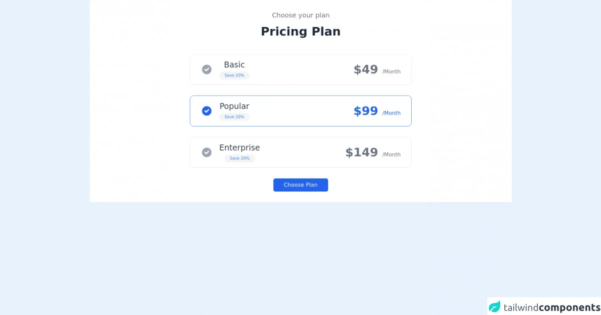
The pricing section checkbox select UI component is a common design pattern used in pricing pages. It allows users to select the pricing plan that best suits their needs. The component consists of a set of checkboxes that represent the different pricing plans. When a user selects a checkbox, the corresponding plan is highlighted, and the other plans are dimmed.
Why use Tailwind CSS to create a Pricing section checkbox select UI component?
Tailwind CSS is the perfect tool for creating the pricing section checkbox select UI component because it provides a set of pre-defined classes that you can use to style the component. With Tailwind CSS, you can easily create custom styles for the checkboxes, labels, and other elements of the component. You can also use Tailwind CSS to create responsive designs that work well on different screen sizes.
The preview of Pricing section checkbox select UI component
To create the pricing section checkbox select UI component, you will need to use HTML and CSS code. Here is a preview of what the component will look like:
Free download of the Pricing section checkbox select's source code
The source code of Pricing section checkbox select UI component
To create the pricing section checkbox select UI component, you will need to use HTML and CSS code. Here is the source code of the component:
<div class="bg-white dark:bg-gray-900">
            <div class="container px-6 py-8 mx-auto">
                <p class="text-xl text-center text-gray-500 dark:text-gray-300">
                    Choose your plan
                </p>

                <h1 class="mt-4 text-3xl font-semibold text-center text-gray-800 capitalize lg:text-4xl dark:text-white">Pricing Plan</h1>


                <div class="mt-6 space-y-8 xl:mt-12">
                    <div class="flex items-center justify-between max-w-2xl px-8 py-4 mx-auto border cursor-pointer rounded-xl dark:border-gray-700">
                        <div class="flex items-center">
                            <svg xmlns="http://www.w3.org/2000/svg" class="w-5 h-5 text-gray-400 sm:h-9 sm:w-9" viewBox="0 0 20 20" fill="currentColor">
                                <path fill-rule="evenodd" d="M10 18a8 8 0 100-16 8 8 0 000 16zm3.707-9.293a1 1 0 00-1.414-1.414L9 10.586 7.707 9.293a1 1 0 00-1.414 1.414l2 2a1 1 0 001.414 0l4-4z" clip-rule="evenodd" />
                            </svg>

                            <div class="flex flex-col items-center mx-5 space-y-1">
                                <h2 class="text-lg font-medium text-gray-700 sm:text-2xl dark:text-gray-200">Basic</h2>
                                <div class="px-2 text-xs text-blue-500 bg-gray-100 rounded-full sm:px-4 sm:py-1 dark:bg-gray-700 ">
                                    Save 20%
                                </div>
                            </div>
                        </div>

                        <h2 class="text-2xl font-semibold text-gray-500 sm:text-4xl dark:text-gray-300">$49 <span class="text-base font-medium">/Month</span></h2>
                    </div>

                    <div class="flex items-center justify-between max-w-2xl px-8 py-4 mx-auto border border-blue-500 cursor-pointer rounded-xl">
                        <div class="flex items-center">
                            <svg xmlns="http://www.w3.org/2000/svg" class="w-5 h-5 text-blue-600 sm:h-9 sm:w-9" viewBox="0 0 20 20" fill="currentColor">
                                <path fill-rule="evenodd" d="M10 18a8 8 0 100-16 8 8 0 000 16zm3.707-9.293a1 1 0 00-1.414-1.414L9 10.586 7.707 9.293a1 1 0 00-1.414 1.414l2 2a1 1 0 001.414 0l4-4z" clip-rule="evenodd" />
                            </svg>

                            <div class="flex flex-col items-center mx-5 space-y-1">
                                <h2 class="text-lg font-medium text-gray-700 sm:text-2xl dark:text-gray-200">Popular</h2>
                                <div class="px-2 text-xs text-blue-500 bg-gray-100 rounded-full sm:px-4 sm:py-1 dark:bg-gray-700 ">
                                    Save 20%
                                </div>
                            </div>
                        </div>

                        <h2 class="text-2xl font-semibold text-blue-600 sm:text-4xl">$99 <span class="text-base font-medium">/Month</span></h2>
                    </div>

                    <div class="flex items-center justify-between max-w-2xl px-8 py-4 mx-auto border cursor-pointer rounded-xl dark:border-gray-700">
                        <div class="flex items-center">
                            <svg xmlns="http://www.w3.org/2000/svg" class="w-5 h-5 text-gray-400 sm:h-9 sm:w-9" viewBox="0 0 20 20" fill="currentColor">
                                <path fill-rule="evenodd" d="M10 18a8 8 0 100-16 8 8 0 000 16zm3.707-9.293a1 1 0 00-1.414-1.414L9 10.586 7.707 9.293a1 1 0 00-1.414 1.414l2 2a1 1 0 001.414 0l4-4z" clip-rule="evenodd" />
                            </svg>

                            <div class="flex flex-col items-center mx-5 space-y-1">
                                <h2 class="text-lg font-medium text-gray-700 sm:text-2xl dark:text-gray-200">Enterprise</h2>
                                <div class="px-2 text-xs text-blue-500 bg-gray-100 rounded-full sm:px-4 sm:py-1 dark:bg-gray-700 ">
                                    Save 20%
                                </div>
                            </div>
                        </div>

                        <h2 class="text-2xl font-semibold text-gray-500 sm:text-4xl dark:text-gray-300">$149 <span class="text-base font-medium">/Month</span></h2>
                    </div>

                    <div class="flex justify-center">
                        <button class="px-8 py-2 tracking-wide text-white capitalize transition-colors duration-200 transform bg-blue-600 rounded-md hover:bg-blue-500 focus:outline-none focus:bg-blue-500 focus:ring focus:ring-blue-300 focus:ring-opacity-80">
                            Choose Plan
                        </button>
                    </div>
                </div>
            </div>
        </div>
How to create a Pricing section checkbox select with Tailwind CSS?
To create the pricing section checkbox select UI component with Tailwind CSS, you will need to follow these steps:
Create the HTML structure of the component. This will include a set of checkboxes, labels, and other elements.
Use Tailwind CSS classes to style the checkboxes, labels, and other elements of the component. You can use classes like
bg-gray-100,border-gray-300, andtext-gray-700to create a consistent design.Use JavaScript to add interactivity to the component. You can use JavaScript to highlight the selected plan and dim the other plans.
Conclusion
In conclusion, creating a pricing section checkbox select UI component with Tailwind CSS is easy and straightforward. By following the steps outlined in this article, you can create a custom pricing section checkbox select that looks great and works well on different screen sizes. So, what are you waiting for? Start creating your pricing section checkbox select UI component today!