- Published on
The 5 Really Obvious Ways To Build A Pricing Plans With Tailwind CSS Better That You Ever Did
- What is Tailwind CSS?
- The Description of Pricing Plans UI Component
- Why Use Tailwind CSS to Create a Pricing Plans UI Component?
- The Preview of Pricing Plans UI Component
- The Source Code of Pricing Plans UI Component
- How to Create a Pricing Plans with Tailwind CSS?
- Step 1: Set up your HTML
- Step 2: Style the container
- Step 3: Create the pricing plan elements
- Step 4: Style the pricing plan elements
- Conclusion
Are you struggling to create a pricing plans UI component for your website? Look no further than Tailwind CSS! In this article, we'll explore the benefits of using Tailwind CSS to create a pricing plans UI component and provide you with a step-by-step guide on how to do it.
What is Tailwind CSS?
Tailwind CSS is a utility-first CSS framework that allows you to create custom designs quickly and efficiently. It provides a set of pre-defined classes that you can use to style your HTML elements without having to write custom CSS.
The Description of Pricing Plans UI Component
A pricing plans UI component is a design element that displays different pricing options for a product or service. It typically includes information such as the price, features, and benefits of each plan.
Why Use Tailwind CSS to Create a Pricing Plans UI Component?
Tailwind CSS offers several benefits when it comes to creating a pricing plans UI component:
Efficiency: With Tailwind CSS, you can create a pricing plans UI component quickly and easily. The pre-defined classes allow you to style your HTML elements without having to write custom CSS.
Consistency: Tailwind CSS provides a consistent design language, making it easier to maintain a cohesive look and feel across your website.
Flexibility: Tailwind CSS allows you to customize your designs easily. You can create your own utility classes or modify existing ones to fit your specific needs.
Responsive: Tailwind CSS is built with responsiveness in mind. You can easily create designs that adapt to different screen sizes.
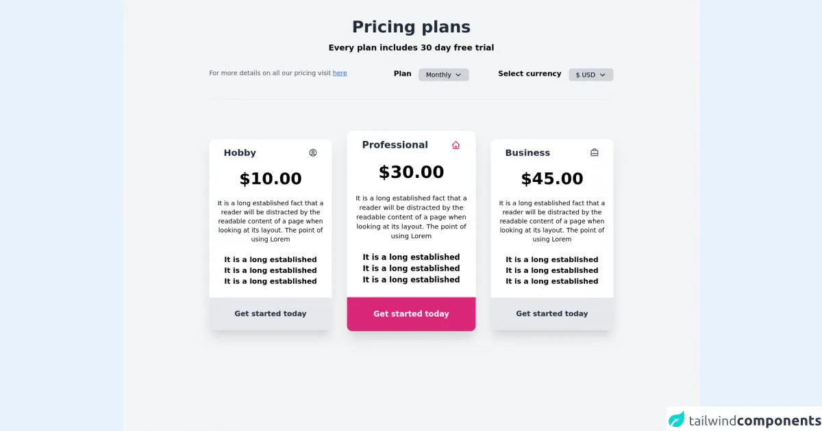
The Preview of Pricing Plans UI Component
Free download of the Pricing plans's source code
The Source Code of Pricing Plans UI Component
<div class="min-h-screen bg-gray-100 overflow-auto">
  <div class="container mx-auto max-w-4xl">
    <div class="mt-10 text-center">
      <h1 class="text-4xl font-bold text-gray-800">Pricing plans</h1>
      <p class="text-lg mt-3 font-semibold">Every plan includes 30 day free trial</p>
    </div>
    <div class="mt-8">
      <div class="flex justify-between">
        <div>
          <p class="text-sm text-gray-600">For more details on all our pricing visit <span class="underline cursor-pointer text-blue-600">here</span></p>
        </div>
        <div class="flex space-x-16">
          <div class="flex">
            <span class="font-semibold inline mr-4">Plan</span>
            <span class="px-4 py-1 rounded-md text-sm bg-gray-300 flex items-center cursor-pointer"
              >Monthly
              <svg xmlns="http://www.w3.org/2000/svg" class="h-4 w-4 ml-2" fill="none" viewBox="0 0 24 24" stroke="currentColor">
                <path stroke-linecap="round" stroke-linejoin="round" stroke-width="2" d="M19 9l-7 7-7-7" />
              </svg>
            </span>
          </div>
          <div class="flex">
            <span class="font-semibold inline mr-4 ">Select currency</span>
            <span class="px-4 py-1 rounded-md text-sm bg-gray-300 flex items-center cursor-pointer">$ USD
              <svg xmlns="http://www.w3.org/2000/svg" class="h-4 w-4 ml-2" fill="none" viewBox="0 0 24 24" stroke="currentColor">
                <path stroke-linecap="round" stroke-linejoin="round" stroke-width="2" d="M19 9l-7 7-7-7" />
              </svg>
            </span>
          </div>
        </div>
      </div>
      <div></div>
    </div>
    <hr class="mt-10" />
    <div class="flex space-x-10 pt-10">
    <div class="py-12">
      <div class="bg-white pt-4 rounded-xl space-y-6 overflow-hidden  transition-all duration-500 transform hover:-translate-y-6 hover:scale-105 shadow-xl hover:shadow-2xl cursor-pointer">
        <div class="px-8 flex justify-between items-center">
          <h4 class="text-xl font-bold text-gray-800">Hobby</h1>
          <svg xmlns="http://www.w3.org/2000/svg" class="h-5 w-5 text-gray-700" fill="none" viewBox="0 0 24 24" stroke="currentColor">
            <path stroke-linecap="round" stroke-linejoin="round" stroke-width="2" d="M5.121 17.804A13.937 13.937 0 0112 16c2.5 0 4.847.655 6.879 1.804M15 10a3 3 0 11-6 0 3 3 0 016 0zm6 2a9 9 0 11-18 0 9 9 0 0118 0z" />
          </svg>
          </div>
          <h1 class="text-4xl text-center font-bold">$10.00</h1>
          <p class="px-4 text-center text-sm ">It is a long established fact that a reader will be distracted by the readable content of a page when looking at its layout. The point of using Lorem</p>
          <ul class="text-center">
            <li><a href="#" class="font-semibold">It is a long established</a></li>
            <li><a href="#" class="font-semibold">It is a long established</a></li>
            <li><a href="#" class="font-semibold">It is a long established</a></li>
          </ul>
          <div class="text-center bg-gray-200 ">
        <button class="inline-block my-6 font-bold text-gray-800">Get started today</button>
          </div>
      </div>
    </div>
    <div class="py-12">
      <div class="bg-white  pt-4 rounded-xl space-y-6 overflow-hidden transition-all duration-500 transform hover:-translate-y-6 -translate-y-2 scale-105 shadow-xl hover:shadow-2xl cursor-pointer">
        <div class="px-8 flex justify-between items-center">
          <h4 class="text-xl font-bold text-gray-800">Professional</h1>
          <svg xmlns="http://www.w3.org/2000/svg" class="h-5 w-5 text-pink-600" fill="none" viewBox="0 0 24 24" stroke="currentColor">
          <path stroke-linecap="round" stroke-linejoin="round" stroke-width="2" d="M3 12l2-2m0 0l7-7 7 7M5 10v10a1 1 0 001 1h3m10-11l2 2m-2-2v10a1 1 0 01-1 1h-3m-6 0a1 1 0 001-1v-4a1 1 0 011-1h2a1 1 0 011 1v4a1 1 0 001 1m-6 0h6" />
          </div>
          <h1 class="text-4xl text-center font-bold">$30.00</h1>
          <p class="px-4 text-center text-sm ">It is a long established fact that a reader will be distracted by the readable content of a page when looking at its layout. The point of using Lorem</p>
          <ul class="text-center">
            <li><a href="#" class="font-semibold">It is a long established</a></li>
            <li><a href="#" class="font-semibold">It is a long established</a></li>
            <li><a href="#" class="font-semibold">It is a long established</a></li>
          </ul>
          <div class="text-center bg-pink-600 ">
        <button class="inline-block my-6 font-bold text-white">Get started today</button>
          </div>
      </div>
    </div>
    <div class="py-12">
      <div class="bg-white pt-4 rounded-xl space-y-6 overflow-hidden transition-all duration-500 transform hover:-translate-y-6 hover:scale-105 shadow-xl hover:shadow-2xl cursor-pointer">
        <div class="px-8 flex justify-between items-center">
          <h4 class="text-xl font-bold text-gray-800">Business</h1>
          <svg xmlns="http://www.w3.org/2000/svg" class="h-5 w-5 text-gray-700" fill="none" viewBox="0 0 24 24" stroke="currentColor">
              <path stroke-linecap="round" stroke-linejoin="round" stroke-width="2" d="M21 13.255A23.931 23.931 0 0112 15c-3.183 0-6.22-.62-9-1.745M16 6V4a2 2 0 00-2-2h-4a2 2 0 00-2 2v2m4 6h.01M5 20h14a2 2 0 002-2V8a2 2 0 00-2-2H5a2 2 0 00-2 2v10a2 2 0 002 2z" />
            </svg>
          </div>
          <h1 class="text-4xl text-center font-bold">$45.00</h1>
          <p class="px-4 text-center text-sm ">It is a long established fact that a reader will be distracted by the readable content of a page when looking at its layout. The point of using Lorem</p>
          <ul class="text-center">
            <li><a href="#" class="font-semibold">It is a long established</a></li>
            <li><a href="#" class="font-semibold">It is a long established</a></li>
            <li><a href="#" class="font-semibold">It is a long established</a></li>
          </ul>
          <div class="text-center bg-gray-200 ">
        <button class="inline-block my-6 font-bold text-gray-800">Get started today</button>
          </div>
      </div>
    </div>
    </div>
  </div>
</div>
How to Create a Pricing Plans with Tailwind CSS?
Now that we've covered the benefits of using Tailwind CSS to create a pricing plans UI component, let's dive into the steps to create one.
Step 1: Set up your HTML
The first step is to set up your HTML. You'll need to create a container element to hold your pricing plans. Inside the container, you'll create individual pricing plan elements.
<div class="container mx-auto">
  <div class="flex justify-center">
    <div class="w-1/3">
      <!-- Pricing plan 1 -->
    </div>
    <div class="w-1/3">
      <!-- Pricing plan 2 -->
    </div>
    <div class="w-1/3">
      <!-- Pricing plan 3 -->
    </div>
  </div>
</div>
Step 2: Style the container
Next, you'll style the container element to center the pricing plans on the page.
<div class="container mx-auto py-8">
  <!-- Pricing plans -->
</div>
Step 3: Create the pricing plan elements
Inside the container, you'll create individual pricing plan elements. Each pricing plan element will include the plan name, price, features, and a call-to-action button.
<div class="flex flex-col rounded-lg shadow-lg overflow-hidden">
  <div class="bg-white px-6 py-8">
    <h3 class="text-2xl font-bold text-gray-700 mb-2">Basic</h3>
    <p class="text-gray-600 text-sm">Perfect for individuals or small teams.</p>
    <div class="flex items-baseline mt-4">
      <span class="text-5xl font-bold">$10</span>
      <span class="text-gray-600 ml-2">/month</span>
    </div>
  </div>
  <div class="flex-1 bg-gray-100 px-6 py-8">
    <ul class="list-disc">
      <li class="flex items-center">
        <span class="text-green-500 mr-2">
          <svg class="fill-current h-4 w-4" xmlns="http://www.w3.org/2000/svg" viewBox="0 0 20 20"><path d="M0 11l2-2 5 5L18 3l2 2L7 18z"/></svg>
        </span>
        <span class="text-gray-700">Unlimited projects</span>
      </li>
      <li class="flex items-center">
        <span class="text-green-500 mr-2">
          <svg class="fill-current h-4 w-4" xmlns="http://www.w3.org/2000/svg" viewBox="0 0 20 20"><path d="M0 11l2-2 5 5L18 3l2 2L7 18z"/></svg>
        </span>
        <span class="text-gray-700">10GB storage</span>
      </li>
      <li class="flex items-center">
        <span class="text-green-500 mr-2">
          <svg class="fill-current h-4 w-4" xmlns="http://www.w3.org/2000/svg" viewBox="0 0 20 20"><path d="M0 11l2-2 5 5L18 3l2 2L7 18z"/></svg>
        </span>
        <span class="text-gray-700">Email support</span>
      </li>
    </ul>
  </div>
  <div class="bg-white px-6 py-6">
    <button class="bg-blue-500 hover:bg-blue-700 text-white font-bold py-2 px-4 rounded-full">
      Sign up
    </button>
  </div>
</div>
Step 4: Style the pricing plan elements
Finally, you'll style the pricing plan elements to match your design.
/* Pricing plan container */
.container {
  max-width: 1200px;
}

/* Pricing plan element */
.pricing-plan {
  display: flex;
  flex-direction: column;
  border-radius: 0.5rem;
  box-shadow: 0 0.5rem 1rem rgba(0, 0, 0, 0.15);
  overflow: hidden;
}

/* Pricing plan header */
.pricing-plan-header {
  background-color: #fff;
  padding: 2rem;
}

.pricing-plan-header h3 {
  font-size: 2rem;
  font-weight: bold;
  color: #333;
  margin-bottom: 1rem;
}

.pricing-plan-header p {
  font-size: 1rem;
  color: #666;
  margin-bottom: 2rem;
}

.pricing-plan-header .price {
  font-size: 3rem;
  font-weight: bold;
  color: #333;
  margin-bottom: 1rem;
}

.pricing-plan-header .price span {
  font-size: 1.5rem;
  font-weight: normal;
  color: #666;
  margin-left: 0.5rem;
}

/* Pricing plan features */
.pricing-plan-features {
  background-color: #f9fafb;
  padding: 2rem;
}

.pricing-plan-features ul {
  list-style: disc;
  margin-left: 2rem;
}

.pricing-plan-features li {
  font-size: 1rem;
  color: #333;
  margin-bottom: 1rem;
}

.pricing-plan-features li svg {
  fill: #48bb78;
  margin-right: 0.5rem;
}

/* Pricing plan call-to-action */
.pricing-plan-cta {
  background-color: #fff;
  padding: 2rem;
  text-align: center;
}

.pricing-plan-cta button {
  background-color: #48bb78;
  color: #fff;
  font-weight: bold;
  font-size: 1.25rem;
  padding: 1rem 2rem;
  border-radius: 2rem;
  transition: all 0.2s ease-in-out;
}

.pricing-plan-cta button:hover {
  background-color: #38a169;
}
Conclusion
Creating a pricing plans UI component can be a daunting task, but with Tailwind CSS, it doesn't have to be. By following the steps outlined in this article, you can create a beautiful and functional pricing plans UI component in no time. So what are you waiting for? Give it a try today!