- Published on
How To Make A Pricing Section Checkbox With Tailwind CSS From Scratch
- What is Tailwind CSS?
- The description of Pricing section checkbox ui component
- Why use Tailwind CSS to create a Pricing section checkbox ui component?
- The preview of Pricing section checkbox ui component
- The source code of Pricing section checkbox ui component
- How to create a Pricing section checkbox with Tailwind CSS?
- Conclusion
What is Tailwind CSS?
Tailwind CSS is a utility-first CSS framework that provides you with a set of pre-defined classes to style your HTML elements. It allows you to build custom designs quickly without writing any CSS code from scratch. With Tailwind CSS, you can create responsive and mobile-first designs easily.
The description of Pricing section checkbox ui component
A pricing section checkbox is a user interface component that allows users to select the pricing plan they want to use. It is commonly used in pricing pages of websites and applications. The pricing section checkbox usually consists of a set of options, each with its own price and features. When the user selects an option, the price and features of that option are displayed.
Why use Tailwind CSS to create a Pricing section checkbox ui component?
Tailwind CSS provides a set of pre-defined classes that make it easy to create custom designs quickly. With Tailwind CSS, you don't need to write any CSS code from scratch. You can use the pre-defined classes to style your HTML elements. This saves you time and effort and allows you to focus on the functionality of your application.
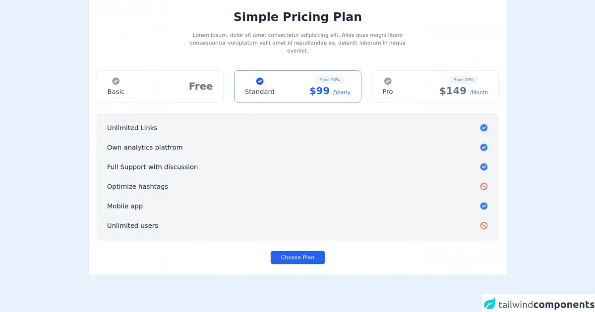
The preview of Pricing section checkbox ui component
To create a pricing section checkbox with Tailwind CSS, you can use the flex and space-between classes to align the options horizontally. You can use the border and rounded classes to add borders and rounded corners to the options. You can also use the hover:bg-gray-100 class to change the background color of the option when the user hovers over it.
Free download of the Pricing section checkbox's source code
The source code of Pricing section checkbox ui component
To create a pricing section checkbox with Tailwind CSS, you can use the following HTML and CSS code:
<div class="bg-white dark:bg-gray-900">
            <div class="container px-6 py-8 mx-auto">
                <h1 class="text-3xl font-semibold text-center text-gray-800 capitalize lg:text-4xl dark:text-white">Simple pricing plan</h1>

                <p class="max-w-2xl mx-auto mt-4 text-center text-gray-500 xl:mt-6 dark:text-gray-300">
                    Lorem ipsum, dolor sit amet consectetur adipisicing elit. Alias quas magni libero consequuntur voluptatum velit amet id repudiandae ea, deleniti laborum in neque eveniet.
                </p>

                <div class="grid grid-cols-1 gap-8 mt-6 lg:grid-cols-3 xl:mt-12">
                    <div class="flex items-center justify-between px-8 py-4 border cursor-pointer rounded-xl dark:border-gray-700">
                        <div class="flex flex-col items-center space-y-1">
                            <svg xmlns="http://www.w3.org/2000/svg" class="w-5 h-5 text-gray-400 sm:h-7 sm:w-7" viewBox="0 0 20 20" fill="currentColor">
                                <path fill-rule="evenodd" d="M10 18a8 8 0 100-16 8 8 0 000 16zm3.707-9.293a1 1 0 00-1.414-1.414L9 10.586 7.707 9.293a1 1 0 00-1.414 1.414l2 2a1 1 0 001.414 0l4-4z" clip-rule="evenodd" />
                            </svg>

                            <h2 class="text-lg font-medium text-gray-700 sm:text-xl dark:text-gray-200">Basic</h2>
                        </div>

                        <h2 class="text-2xl font-semibold text-gray-500 sm:text-3xl dark:text-gray-300">Free</h2>
                    </div>

                    <div class="flex items-center justify-between px-8 py-4 border border-blue-500 cursor-pointer rounded-xl">
                        <div class="flex flex-col items-center space-y-1">
                            <svg xmlns="http://www.w3.org/2000/svg" class="w-5 h-5 text-blue-600 dark:text-blue-500 sm:h-7 sm:w-7" viewBox="0 0 20 20" fill="currentColor">
                                <path fill-rule="evenodd" d="M10 18a8 8 0 100-16 8 8 0 000 16zm3.707-9.293a1 1 0 00-1.414-1.414L9 10.586 7.707 9.293a1 1 0 00-1.414 1.414l2 2a1 1 0 001.414 0l4-4z" clip-rule="evenodd" />
                            </svg>

                            <h2 class="text-lg font-medium text-gray-700 sm:text-xl dark:text-gray-200">Standard</h2>
                        </div>


                        <div class="flex flex-col items-center space-y-1">
                            <div class="px-2 text-xs text-blue-500 bg-gray-100 rounded-full dark:text-blue-400 sm:px-4 sm:py-1 dark:bg-gray-700 ">
                                Save 30%
                            </div>

                            <h2 class="text-2xl font-semibold text-blue-600 dark:text-blue-500 sm:text-3xl">$99 <span class="text-base font-medium">/Yearly</span></h2>
                        </div>
                    </div>

                    <div class="flex items-center justify-between px-8 py-4 border cursor-pointer rounded-xl dark:border-gray-700">
                        <div class="flex flex-col items-center space-y-1">
                            <svg xmlns="http://www.w3.org/2000/svg" class="w-5 h-5 text-gray-400 sm:h-7 sm:w-7" viewBox="0 0 20 20" fill="currentColor">
                                <path fill-rule="evenodd" d="M10 18a8 8 0 100-16 8 8 0 000 16zm3.707-9.293a1 1 0 00-1.414-1.414L9 10.586 7.707 9.293a1 1 0 00-1.414 1.414l2 2a1 1 0 001.414 0l4-4z" clip-rule="evenodd" />
                            </svg>

                            <h2 class="text-lg font-medium text-gray-700 sm:text-xl dark:text-gray-200">Pro</h2>
                        </div>

                        <div class="flex flex-col items-center space-y-1">
                                <div class="px-2 text-xs text-blue-500 bg-gray-100 rounded-full dark:text-blue-400 sm:px-4 sm:py-1 dark:bg-gray-700 ">
                                    Save 20%
                                </div>

                                <h2 class="text-2xl font-semibold text-gray-500 sm:text-3xl dark:text-gray-300">$149 <span class="text-base font-medium">/Month</span></h2>
                            </div>
                    </div>
                </div>

                <div class="p-8 mt-8 space-y-8 bg-gray-100 dark:bg-gray-800 rounded-xl">
                    <div class="flex items-center justify-between text-gray-800 dark:text-gray-200">
                        <p class="textlg sm:text-xl">Unlimited Links</p>

                        <svg xmlns="http://www.w3.org/2000/svg" class="w-5 h-5 text-blue-500 sm:h-7 sm:w-7" viewBox="0 0 20 20" fill="currentColor">
                            <path fill-rule="evenodd" d="M10 18a8 8 0 100-16 8 8 0 000 16zm3.707-9.293a1 1 0 00-1.414-1.414L9 10.586 7.707 9.293a1 1 0 00-1.414 1.414l2 2a1 1 0 001.414 0l4-4z" clip-rule="evenodd" />
                        </svg>
                    </div>

                    <div class="flex items-center justify-between text-gray-800 dark:text-gray-200">
                        <p class="textlg sm:text-xl">Own analytics platfrom</p>

                        <svg xmlns="http://www.w3.org/2000/svg" class="w-5 h-5 text-blue-500 sm:h-7 sm:w-7" viewBox="0 0 20 20" fill="currentColor">
                            <path fill-rule="evenodd" d="M10 18a8 8 0 100-16 8 8 0 000 16zm3.707-9.293a1 1 0 00-1.414-1.414L9 10.586 7.707 9.293a1 1 0 00-1.414 1.414l2 2a1 1 0 001.414 0l4-4z" clip-rule="evenodd" />
                        </svg>
                    </div>

                    <div class="flex items-center justify-between text-gray-800 dark:text-gray-200">
                        <p class="textlg sm:text-xl">Full Support with discussion</p>

                        <svg xmlns="http://www.w3.org/2000/svg" class="w-5 h-5 text-blue-500 sm:h-7 sm:w-7" viewBox="0 0 20 20" fill="currentColor">
                            <path fill-rule="evenodd" d="M10 18a8 8 0 100-16 8 8 0 000 16zm3.707-9.293a1 1 0 00-1.414-1.414L9 10.586 7.707 9.293a1 1 0 00-1.414 1.414l2 2a1 1 0 001.414 0l4-4z" clip-rule="evenodd" />
                        </svg>
                    </div>

                    <div class="flex items-center justify-between text-gray-800 dark:text-gray-200">
                        <p class="textlg sm:text-xl">Optimize hashtags</p>

                        <svg xmlns="http://www.w3.org/2000/svg" class="w-5 h-5 text-red-400 sm:h-7 sm:w-7" viewBox="0 0 20 20" fill="currentColor">
                            <path fill-rule="evenodd" d="M13.477 14.89A6 6 0 015.11 6.524l8.367 8.368zm1.414-1.414L6.524 5.11a6 6 0 018.367 8.367zM18 10a8 8 0 11-16 0 8 8 0 0116 0z" clip-rule="evenodd" />
                        </svg>
                    </div>

                    <div class="flex items-center justify-between text-gray-800 dark:text-gray-200">
                        <p class="textlg sm:text-xl">Mobile app</p>

                        <svg xmlns="http://www.w3.org/2000/svg" class="w-5 h-5 text-blue-500 sm:h-7 sm:w-7" viewBox="0 0 20 20" fill="currentColor">
                            <path fill-rule="evenodd" d="M10 18a8 8 0 100-16 8 8 0 000 16zm3.707-9.293a1 1 0 00-1.414-1.414L9 10.586 7.707 9.293a1 1 0 00-1.414 1.414l2 2a1 1 0 001.414 0l4-4z" clip-rule="evenodd" />
                        </svg>
                    </div>

                    <div class="flex items-center justify-between text-gray-800 dark:text-gray-200">
                        <p class="textlg sm:text-xl">Unlimited users</p>

                        <svg xmlns="http://www.w3.org/2000/svg" class="w-5 h-5 text-red-400 sm:h-7 sm:w-7" viewBox="0 0 20 20" fill="currentColor">
                            <path fill-rule="evenodd" d="M13.477 14.89A6 6 0 015.11 6.524l8.367 8.368zm1.414-1.414L6.524 5.11a6 6 0 018.367 8.367zM18 10a8 8 0 11-16 0 8 8 0 0116 0z" clip-rule="evenodd" />
                        </svg>
                    </div>
                </div>

                <div class="flex justify-center mt-8">
                    <button class="px-8 py-2 tracking-wide text-white capitalize transition-colors duration-200 transform bg-blue-600 rounded-md hover:bg-blue-500 focus:outline-none focus:bg-blue-500 focus:ring focus:ring-blue-300 focus:ring-opacity-80">
                        Choose Plan
                    </button>
                </div>
            </div>
        </div>
How to create a Pricing section checkbox with Tailwind CSS?
To create a pricing section checkbox with Tailwind CSS, follow these steps:
- Create a new HTML file and add the following code:
<div class="flex space-between">
  <div class="w-1/3 p-4 border rounded hover:bg-gray-100">
    <h2 class="text-lg font-bold">Basic</h2>
    <p class="text-gray-700">Lorem ipsum dolor sit amet, consectetur adipiscing elit.</p>
    <p class="text-gray-700 font-bold">$10/month</p>
  </div>
  <div class="w-1/3 p-4 border rounded hover:bg-gray-100">
    <h2 class="text-lg font-bold">Pro</h2>
    <p class="text-gray-700">Lorem ipsum dolor sit amet, consectetur adipiscing elit.</p>
    <p class="text-gray-700 font-bold">$20/month</p>
  </div>
  <div class="w-1/3 p-4 border rounded hover:bg-gray-100">
    <h2 class="text-lg font-bold">Premium</h2>
    <p class="text-gray-700">Lorem ipsum dolor sit amet, consectetur adipiscing elit.</p>
    <p class="text-gray-700 font-bold">$30/month</p>
  </div>
</div>
- Add the Tailwind CSS CDN to your HTML file:
<link href="https://cdn.tailwindcss.com" rel="stylesheet">
- Save the file and open it in your web browser. You should see a pricing section checkbox with three options.
Conclusion
In this article, we have learned how to create a pricing section checkbox with Tailwind CSS. Tailwind CSS provides a set of pre-defined classes that make it easy to create custom designs quickly. With Tailwind CSS, you can create responsive and mobile-first designs easily. By following the steps in this article, you can create a pricing section checkbox for your website or application.