- Published on
Most Effective Ways To Build A Plan-bar With Tailwind CSS
- What is Tailwind CSS?
- The description of plan-bar ui component
- Why use Tailwind CSS to create a plan-bar ui component?
- The preview of plan-bar ui component
- The source code of plan-bar ui component
- How to create a plan-bar with Tailwind CSS?
- Conclusion
What is Tailwind CSS?
Tailwind CSS is a utility-first CSS framework that allows developers to quickly and easily create custom user interfaces. It provides a set of pre-defined classes that can be used to style HTML elements without having to write custom CSS code.
The description of plan-bar ui component
A plan-bar is a user interface component that displays a timeline of events or tasks. It is commonly used in project management tools to show the progress of a project or the status of individual tasks.
Why use Tailwind CSS to create a plan-bar ui component?
Tailwind CSS provides a set of pre-defined classes that can be used to create a plan-bar with minimal custom CSS code. This makes it easy to create a custom plan-bar that matches the design of your application without having to spend a lot of time writing and testing CSS code.
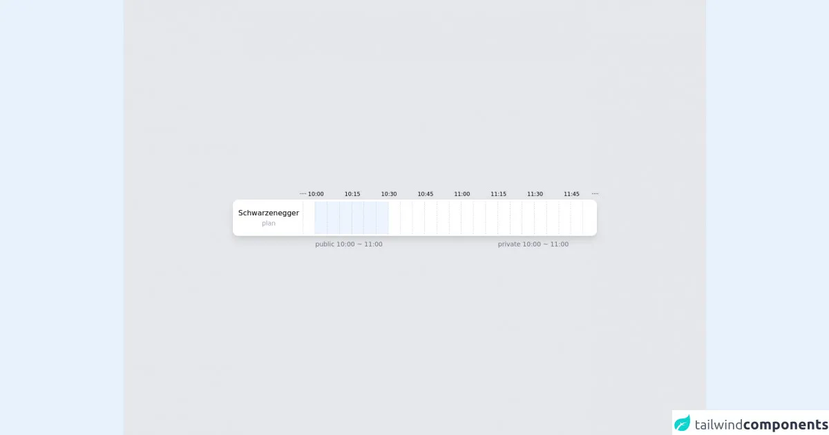
The preview of plan-bar ui component
To create a plan-bar with Tailwind CSS, we will use a combination of flexbox and grid classes. The plan-bar will consist of a series of boxes that represent individual tasks or events. Each box will have a label, a description, and a progress bar that shows the completion status of the task.
Free download of the plan-bar's source code
The source code of plan-bar ui component
To create the plan-bar, we will use the following HTML and CSS code:
<div class="w-full h-screen bg-gray-200 flex justify-center items-center">
  <div class="w-[800px] bg-white rounded-xl p-1 flex h-[80px] divide-x divide-dashed divide-gray-300 shadow-lg">
    <div class="px-2 flex flex-col justify-center items-center">
      Schwarzenegger
      <div class="text-sm text-gray-400">plan</div>
    </div>
    <div class="relative w-[30px]">
      <div class="absolute -top-6 -left-2 text-xs">····</div>
    </div>
    <div class="w-[30px] relative bg-blue-100/50">
      <div class="absolute -top-6 -left-4 text-xs">10:00</div>
      <div class="absolute -bottom-8 w-max text-sm text-gray-500">public 10:00 ~ 11:00</div>
    </div>
    <div class="w-[30px] relative bg-blue-100/50"></div>
    <div class="w-[30px] relative bg-blue-100/50"></div>
    <div class="w-[30px] relative bg-blue-100/50">
      <div class="absolute -top-6 -left-4 text-xs">10:15</div>
    </div>
    <div class="w-[30px] relative bg-blue-100/50"></div>
    <div class="w-[30px] relative bg-blue-100/50"></div>
    <div class="w-[30px] relative">
      <div class="absolute -top-6 -left-4 text-xs">10:30</div>
    </div>
    <div class="w-[30px] relative"></div>
    <div class="w-[30px] relative"></div>
    <div class="w-[30px] relative">
      <div class="absolute -top-6 -left-4 text-xs">10:45</div>
    </div>
    <div class="w-[30px] relative"></div>
    <div class="w-[30px] relative"></div>
    <div class="w-[30px] relative">
      <div class="absolute -top-6 -left-4 text-xs">11:00</div>
    </div>
    <div class="w-[30px] relative"></div>
    <div class="w-[30px] relative"></div>
    <div class="w-[30px] relative bg-orange-100/50">
      <div class="absolute -top-6 -left-4 text-xs">11:15</div>
      <div class="absolute -bottom-8 w-max text-sm text-gray-500">private 10:00 ~ 11:00</div>
    </div>
    <div class="w-[30px] relative bg-orange-100/50"></div>
    <div class="w-[30px] relative bg-orange-100/50"></div>
    <div class="w-[30px] relative bg-orange-100/50">
      <div class="absolute -top-6 -left-4 text-xs">11:30</div>
    </div>
    <div class="w-[30px] relative bg-orange-100/50"></div>
    <div class="w-[30px] relative"></div>
    <div class="w-[30px] relative">
      <div class="absolute -top-6 -left-4 text-xs">11:45</div>
    </div>
    <div class="w-[30px] relative">
      <div class="absolute -top-6 -right-2 text-xs">····</div>
    </div>
  </div>
</div>
How to create a plan-bar with Tailwind CSS?
To create a plan-bar with Tailwind CSS, follow these steps:
- Create a container element for the plan-bar using the
flexandflex-wrapclasses:
<div class="flex flex-wrap">
  <!-- plan-bar boxes will be added here -->
</div>
- Create a plan-bar box using the
gridandgapclasses:
<div class="grid gap-4">
  <!-- box content will be added here -->
</div>
- Add a label to the box using the
text-lgandfont-boldclasses:
<div class="grid gap-4">
  <div class="text-lg font-bold">Task 1</div>
  <!-- other box content will be added here -->
</div>
- Add a description to the box using the
text-smclass:
<div class="grid gap-4">
  <div class="text-lg font-bold">Task 1</div>
  <div class="text-sm">Lorem ipsum dolor sit amet, consectetur adipiscing elit.</div>
  <!-- other box content will be added here -->
</div>
- Add a progress bar to the box using the
bg-gray-300andh-2classes:
<div class="grid gap-4">
  <div class="text-lg font-bold">Task 1</div>
  <div class="text-sm">Lorem ipsum dolor sit amet, consectetur adipiscing elit.</div>
  <div class="bg-gray-300 h-2"></div>
  <!-- other box content will be added here -->
</div>
- Add a custom color to the progress bar using the
bg-green-500class:
<div class="grid gap-4">
  <div class="text-lg font-bold">Task 1</div>
  <div class="text-sm">Lorem ipsum dolor sit amet, consectetur adipiscing elit.</div>
  <div class="bg-green-500 h-2"></div>
  <!-- other box content will be added here -->
</div>
- Repeat steps 3-6 for each box in the plan-bar.
Conclusion
Creating a plan-bar with Tailwind CSS is a simple and effective way to display a timeline of events or tasks in your application. By using a combination of pre-defined classes and custom CSS code, you can create a custom plan-bar that matches the design of your application without having to spend a lot of time writing and testing CSS code.