- Published on
Create A Plan Pricing Table With Tailwind CSS Like A Pro With The Help Of These 6 Tips
- What is Tailwind CSS?
- The description of Plan pricing table ui component
- Why use Tailwind CSS to create a Plan pricing table ui component?
- The preview of Plan pricing table ui component
- The source code of Plan pricing table ui component
- How to create a Plan pricing table with Tailwind CSS?
- 1. Define the layout of the table
- 2. Choose the color scheme
- 3. Use typography effectively
- 4. Highlight the features of each plan
- 5. Add a call-to-action button
- 6. Make the table responsive
- Conclusion
What is Tailwind CSS?
Tailwind CSS is a utility-first CSS framework that helps you quickly build custom designs without writing any CSS code. It provides a set of pre-designed classes that you can use to style your HTML elements. It is highly customizable, and you can easily modify the design by changing the values of the classes.
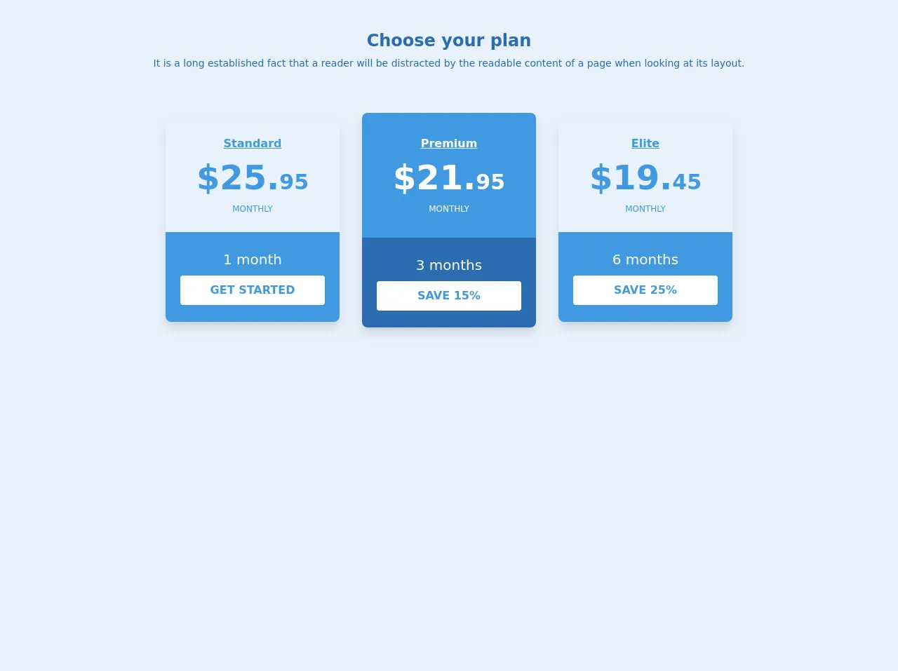
The description of Plan pricing table ui component
A Plan pricing table is a UI component that displays the pricing plans of a product or service. It typically includes the name of the plan, the price, the features included, and a call-to-action button to sign up for the plan. It is an essential component for any website that offers subscription-based products or services.
Why use Tailwind CSS to create a Plan pricing table ui component?
Tailwind CSS provides a set of pre-designed classes that you can use to create a Plan pricing table UI component quickly. It follows a utility-first approach, which means that you can customize the design by changing the values of the classes. This makes it easy to create a custom design that matches your brand's style.
The preview of Plan pricing table ui component
To create a Plan pricing table with Tailwind CSS, you can use the following classes:
bg-white: sets the background color of the table to white.border: adds a border to the table.rounded-lg: rounds the corners of the table.shadow-md: adds a shadow to the table.text-center: centers the text in the table cells.px-6: adds padding to the left and right of the table cells.py-4: adds padding to the top and bottom of the table cells.text-gray-700: sets the text color to gray.
Free download of the Plan pricing table's source code
The source code of Plan pricing table ui component
To create a Plan pricing table UI component with Tailwind CSS, you can use the following HTML code:
<div class="bg-white border rounded-lg shadow-md">
  <div class="px-6 py-4">
    <h3 class="text-lg font-medium text-gray-900">Basic</h3>
    <div class="mt-4">
      <div class="text-6xl font-semibold text-gray-900">$10</div>
      <span class="text-gray-600">/month</span>
    </div>
  </div>
  <div class="border-t border-gray-200 px-6 py-4">
    <ul class="text-sm text-gray-600">
      <li class="py-1"><i class="fas fa-check text-green-500 mr-2"></i>10GB Storage</li>
      <li class="py-1"><i class="fas fa-check text-green-500 mr-2"></i>100GB Bandwidth</li>
      <li class="py-1"><i class="fas fa-check text-green-500 mr-2"></i>5 Email Accounts</li>
      <li class="py-1"><i class="fas fa-check text-green-500 mr-2"></i>24/7 Support</li>
    </ul>
  </div>
  <div class="px-6 py-4">
    <a href="#" class="bg-blue-500 hover:bg-blue-700 text-white font-bold py-2 px-4 rounded">
      Sign up
    </a>
  </div>
</div>
<div class="container flex flex-wrap pt-4 pb-10 m-auto mt-6 md:mt-15 lg:px-12 xl:px-16">
    <div class="w-full px-0 lg:px-4">
      <h2 class="px-12 text-base font-bold text-center md:text-2xl text-blue-700">
        Choose your plan
      </h2>
      <p class="py-1 text-sm text-center text-blue-700 mb-10">
        It is a long established fact that a reader will be distracted by the readable content of a page when looking at its layout.
      </p>
      <div class="flex flex-wrap items-center justify-center py-4 pt-0">
        <div class="w-full p-4 md:w-1/2 lg:w-1/4 plan-card">
          <label class="flex flex-col rounded-lg shadow-lg group relative cursor-pointer hover:shadow-2xl">
            <div class="w-full px-4 py-6 rounded-t-lg card-section-1">
              <h3 class="mx-auto text-base font-semibold text-center underline text-blue-500 group-hover:text-white">
                Standard
              </h3>
              <p class="text-5xl font-bold text-center group-hover:text-white text-blue-500">
                $25.<span class="text-3xl">95</span>
              </p>
              <p class="text-xs text-center uppercase group-hover:text-white text-blue-500">
                monthly
              </p>
            </div>
            <div
              class="flex flex-col items-center justify-center w-full h-full py-6 rounded-b-lg bg-blue-500"
            >
              <p class="text-xl text-white">
                1 month
              </p>
              <button class="w-5/6 py-2 mt-2 font-semibold text-center uppercase bg-white border border-transparent rounded text-blue-500">
                Get Started
              </button>
            </div>
          </label>
        </div>

        <div class="w-full p-4 md:w-1/2 lg:w-1/4">
          <label class="flex flex-col rounded-lg shadow-lg relative cursor-pointer hover:shadow-2xl">
            <div class="w-full px-4 py-8 rounded-t-lg bg-blue-500">
              <h3 class="mx-auto text-base font-semibold text-center underline text-white group-hover:text-white">
                Premium
              </h3>
              <p class="text-5xl font-bold text-center text-white">
                $21.<span class="text-3xl">95</span>
              </p>
              <p class="text-xs text-center uppercase text-white">
                monthly
              </p>
            </div>
            <div
              class="flex flex-col items-center justify-center w-full h-full py-6 rounded-b-lg bg-blue-700"
            >
              <p class="text-xl text-white">
                3 months
              </p>
              <button class="w-5/6 py-2 mt-2 font-semibold text-center uppercase bg-white border border-transparent rounded text-blue-500">
                Save 15%
              </button>
            </div>
          </label>
        </div>

        <div class="w-full p-4 md:w-1/2 lg:w-1/4 plan-card">
          <label class="flex flex-col rounded-lg shadow-lg group card-group relative hover:bg-jblue-secondary cursor-pointer hover:shadow-2xl">
            <div class="w-full px-4 py-6 rounded-t-lg card-section-1">
              <h3 class="mx-auto text-base font-semibold text-center underline text-blue-500 group-hover:text-white">
                Elite
              </h3>
              <p class="text-5xl font-bold text-center group-hover:text-white text-blue-500">
                $19.<span class="text-3xl">45</span>
              </p>
              <p class="text-xs text-center uppercase group-hover:text-white text-blue-500">
                monthly
              </p>
            </div>
            <div
              class="flex flex-col items-center justify-center w-full h-full py-6 rounded-b-lg bg-blue-500"
            >
              <p class="text-xl text-white">
                6 months
              </p>
              <button class="w-5/6 py-2 mt-2 font-semibold text-center uppercase bg-white border border-transparent rounded text-blue-500">
                Save 25%
              </button>
            </div>
          </label>
        </div>

      </div>
    </div>
  </div>
How to create a Plan pricing table with Tailwind CSS?
Here are six tips to help you create a Plan pricing table with Tailwind CSS like a pro:
1. Define the layout of the table
Before you start styling the table, you need to define its layout. You can use HTML tags like div, ul, and li to create the structure of the table. You can also use CSS classes like flex and grid to create a responsive layout.
2. Choose the color scheme
The color scheme of the Plan pricing table should match your brand's style. You can use Tailwind CSS's built-in color classes or define your own custom colors. You can also use gradients or background images to add visual interest to the table.
3. Use typography effectively
The typography of the Plan pricing table should be easy to read and consistent with your brand's style. You can use Tailwind CSS's typography classes to set the font size, font weight, line height, and letter spacing of the text.
4. Highlight the features of each plan
The Plan pricing table should highlight the features of each plan. You can use icons, checkmarks, or other visual cues to make the features stand out. You can also use different colors or font weights to differentiate between the plans.
5. Add a call-to-action button
The Plan pricing table should include a call-to-action button that encourages users to sign up for a plan. You can use Tailwind CSS's button classes to style the button and make it stand out.
6. Make the table responsive
The Plan pricing table should be responsive and adapt to different screen sizes. You can use Tailwind CSS's responsive classes to adjust the layout and font size of the table based on the screen size.
Conclusion
Creating a Plan pricing table with Tailwind CSS is easy and straightforward. By following these six tips, you can create a professional-looking Plan pricing table that matches your brand's style. Tailwind CSS's utility-first approach makes it easy to customize the design and create a responsive layout.