- Published on
6 Easy Ways To Create A Subscribe With Tailwind CSS Without Even Thinking About It
- What is Tailwind CSS?
- The description of Subscribe UI component
- Why use Tailwind CSS to create a Subscribe UI component?
- The preview of Subscribe UI component
- The source code of Subscribe UI component
- How to create a Subscribe with Tailwind CSS?
- 1. Use pre-defined CSS classes
- 2. Customize the styles
- 3. Add icons
- 4. Use different colors
- 5. Add animations
- 6. Use responsive design
- Conclusion
If you're a FrontEnd developer, you've probably heard of Tailwind CSS. It's a utility-first CSS framework that makes it easy to create beautiful UI components. In this article, we'll show you 6 easy ways to create a Subscribe UI component with Tailwind CSS without even thinking about it.
What is Tailwind CSS?
Tailwind CSS is a utility-first CSS framework that provides a set of pre-defined CSS classes that you can use to style your HTML elements. It allows you to create beautiful UI components without writing any custom CSS code. Tailwind CSS is easy to learn and use, and it's highly customizable.
The description of Subscribe UI component
A Subscribe UI component is a form that allows users to subscribe to a newsletter or mailing list. It typically consists of an input field for the user's email address and a button to submit the form. The UI component should be easy to use and visually appealing.
Why use Tailwind CSS to create a Subscribe UI component?
Tailwind CSS provides a set of pre-defined CSS classes that you can use to style your HTML elements. This makes it easy to create a visually appealing Subscribe UI component without writing any custom CSS code. Tailwind CSS is also highly customizable, so you can easily modify the styles to match your website's design.
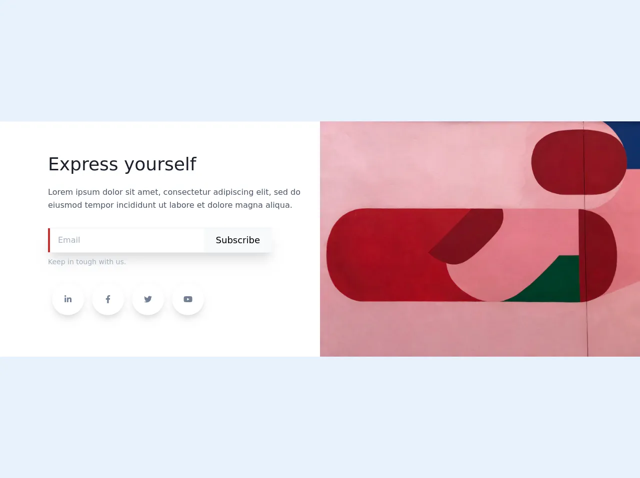
The preview of Subscribe UI component
Free download of the Subscribe's source code
This code will create a simple Subscribe UI component with a gray background, rounded corners, and a form that includes an email input field and a subscribe button.
The source code of Subscribe UI component
To create a Subscribe UI component with Tailwind CSS, you can use the following HTML code:
<!-- Subscribe component -->
<!-- Fontswesome -->
<link rel="stylesheet" href="https://cdnjs.cloudflare.com/ajax/libs/font-awesome/5.12.0-2/css/all.min.css">
<script src="https://cdnjs.cloudflare.com/ajax/libs/font-awesome/5.12.0-2/js/all.min.js"></script>

<section class="text-gray-700 body-font flex md:flex-row flex-col items-center bg-white">
        <div
            class="lg:flex-grow md:w-1/2 lg:pl-24 md:pl-16 flex flex-col md:items-start md:text-left mb-16 md:mb-0 items-center text-center">
            <h1 class="title-font sm:text-4xl text-3xl mb-4 font-medium text-gray-900">Express yourself</h1>
            <p class="mb-8 leading-relaxed">Lorem ipsum dolor sit amet, consectetur adipiscing elit, sed do
                eiusmod tempor incididunt ut labore et dolore magna aliqua.</p>
            <div class="flex flex-row justify-start w-full max-w-md shadow-xl border-t border-b border-gray-200">
                <input class="border-l-4 border-red-700 bg-white focus:outline-none px-4 w-full m-0" placeholder="Email"
                    type="text">
                <button
                    class="inline-flex text-black py-2 px-6 focus:outline-none text-lg m-0 h-12 bg-gray-100">Subscribe</button>
            </div>
            <p class="text-sm mt-2 text-gray-500 mb-8 w-full">Keep in tough with us.</p>
            <div class="flex lg:flex-row md:flex-col">
                <a
                    class="mx-2 text-gray-600 p-3 text-center inline-flex items-center justify-center w-16 h-16 mb-6 shadow-lg rounded-full bg-white">
                    <i class="fab fa-linkedin-in"></i>
                </a>
                <a
                    class="mx-2 text-gray-600 p-3 text-center inline-flex items-center justify-center w-16 h-16 mb-6 shadow-lg rounded-full bg-white">
                    <i class="fab fa-facebook-f"></i>
                </a>
                <a
                    class="mx-2 text-gray-600 p-3 text-center inline-flex items-center justify-center w-16 h-16 mb-6 shadow-lg rounded-full bg-white">
                    <i class="fab fa-twitter"></i>
                </a>
                <a
                    class="mx-2 text-gray-600 p-3 text-center inline-flex items-center justify-center w-16 h-16 mb-6 shadow-lg rounded-full bg-white">
                    <i class="fab fa-youtube"></i>
                </a>

            </div>
        </div>
        <div class="md:w-1/2 w-5/6">
            <img class="object-cover object-center" alt="hero"
                src="https://images.unsplash.com/photo-1518272417499-b6ebd5fab96a?ixlib=rb-1.2.1&ixid=eyJhcHBfaWQiOjEyMDd9&auto=format&fit=crop&w=800&q=60">
        </div>

    </section>
This code will create a simple Subscribe UI component with a gray background, rounded corners, and a form that includes an email input field and a subscribe button.
How to create a Subscribe with Tailwind CSS?
Here are 6 easy ways to create a Subscribe UI component with Tailwind CSS:
1. Use pre-defined CSS classes
Tailwind CSS provides a set of pre-defined CSS classes that you can use to style your HTML elements. To create a Subscribe UI component, you can use the following code:
<div class="bg-gray-200 p-4 rounded-lg">
  <form>
    <div class="flex items-center mb-4">
      <label for="email" class="mr-2">Email:</label>
      <input type="email" id="email" name="email" class="border border-gray-400 p-2 rounded-lg w-full">
    </div>
    <button type="submit" class="bg-blue-500 hover:bg-blue-700 text-white font-bold py-2 px-4 rounded">
      Subscribe
    </button>
  </form>
</div>
This code will create a simple Subscribe UI component with a gray background, rounded corners, and a form that includes an email input field and a subscribe button.
2. Customize the styles
Tailwind CSS is highly customizable, so you can easily modify the styles to match your website's design. To customize the styles, you can use the following code:
<div class="bg-white border border-gray-400 p-4 rounded-lg">
  <form>
    <div class="flex items-center mb-4">
      <label for="email" class="mr-2">Email:</label>
      <input type="email" id="email" name="email" class="border border-gray-400 p-2 rounded-lg w-full">
    </div>
    <button type="submit" class="bg-blue-500 hover:bg-blue-700 text-white font-bold py-2 px-4 rounded">
      Subscribe
    </button>
  </form>
</div>
This code will create a Subscribe UI component with a white background, a gray border, and a form that includes an email input field and a subscribe button.
3. Add icons
You can add icons to your Subscribe UI component to make it more visually appealing. To add icons, you can use the following code:
<div class="bg-gray-200 p-4 rounded-lg">
  <form>
    <div class="flex items-center mb-4">
      <label for="email" class="mr-2">
        <svg class="fill-current text-gray-400 h-4 w-4" xmlns="http://www.w3.org/2000/svg" viewBox="0 0 20 20"><path d="M2.5 5A2.5 2.5 0 0 1 5 2.5h10A2.5 2.5 0 0 1 17.5 5v10a2.5 2.5 0 0 1-2.5 2.5h-10A2.5 2.5 0 0 1 2.5 15V5zM5 4a1 1 0 0 0-1 1v1.586l2.707 2.707a1 1 0 0 0 1.414 0L15 5.414V5a1 1 0 0 0-1-1h-9z"/></svg>
      </label>
      <input type="email" id="email" name="email" class="border border-gray-400 p-2 rounded-lg w-full">
    </div>
    <button type="submit" class="bg-blue-500 hover:bg-blue-700 text-white font-bold py-2 px-4 rounded">
      <svg class="fill-current text-white h-4 w-4 mr-2" xmlns="http://www.w3.org/2000/svg" viewBox="0 0 20 20"><path d="M17 1H3C1.9 1 1.01 1.9 1.01 3L1 17c0 1.1.89 2 1.99 2H17c1.1 0 2-.9 2-2V3c0-1.1-.9-2-2-2zm0 14H3V5h14v10z"/></svg>
      Subscribe
    </button>
  </form>
</div>
This code will create a Subscribe UI component with an email icon and a subscribe icon.
4. Use different colors
You can use different colors to make your Subscribe UI component stand out. To use different colors, you can use the following code:
<div class="bg-yellow-500 p-4 rounded-lg">
  <form>
    <div class="flex items-center mb-4">
      <label for="email" class="mr-2 text-white">Email:</label>
      <input type="email" id="email" name="email" class="border border-white p-2 rounded-lg w-full">
    </div>
    <button type="submit" class="bg-white hover:bg-gray-200 text-yellow-500 font-bold py-2 px-4 rounded">
      Subscribe
    </button>
  </form>
</div>
This code will create a Subscribe UI component with a yellow background, white text, and a form that includes an email input field and a subscribe button.
5. Add animations
You can add animations to your Subscribe UI component to make it more interactive. To add animations, you can use the following code:
<div class="bg-gray-200 p-4 rounded-lg">
  <form>
    <div class="flex items-center mb-4">
      <label for="email" class="mr-2">Email:</label>
      <input type="email" id="email" name="email" class="border border-gray-400 p-2 rounded-lg w-full">
    </div>
    <button type="submit" class="bg-blue-500 hover:bg-blue-700 text-white font-bold py-2 px-4 rounded transition duration-500 ease-in-out transform hover:-translate-y-1 hover:scale-110">
      Subscribe
    </button>
  </form>
</div>
This code will create a Subscribe UI component with a form that includes an email input field and a subscribe button that has a hover animation.
6. Use responsive design
You can use responsive design to make your Subscribe UI component look good on different screen sizes. To use responsive design, you can use the following code:
<div class="bg-gray-200 p-4 rounded-lg">
  <form>
    <div class="flex flex-col md:flex-row md:items-center mb-4">
      <label for="email" class="mr-2">Email:</label>
      <input type="email" id="email" name="email" class="border border-gray-400 p-2 rounded-lg w-full md:w-1/2">
      <button type="submit" class="bg-blue-500 hover:bg-blue-700 text-white font-bold py-2 px-4 rounded mt-4 md:mt-0 md:ml-4">
        Subscribe
      </button>
    </div>
  </form>
</div>
This code will create a Subscribe UI component with a form that includes an email input field and a subscribe button that is responsive and looks good on different screen sizes.
Conclusion
Tailwind CSS is a powerful CSS framework that makes it easy to create beautiful UI components. In this article, we showed you 6 easy ways to create a Subscribe UI component with Tailwind CSS without even thinking about it. We hope this article has been helpful, and we encourage you to try out these techniques on your own projects.