- Published on
6 Tips To Make A Photo Gallery Card With Tailwind CSS
- What is Tailwind CSS?
- The description of Photo gallery card UI component
- Why use Tailwind CSS to create a Photo gallery card UI component?
- The preview of Photo gallery card UI component
- The source code of Photo gallery card UI component
- How to create a Photo gallery card with Tailwind CSS?
- 1. Set up the HTML structure
- 2. Style the card's elements
- 3. Add the card's image
- 4. Add the card's title and description
- 5. Add the card's images
- 6. Customize the card's appearance
- Conclusion
As a FrontEnd technology blogger, you might have heard of Tailwind CSS, a utility-first CSS framework. It is a popular choice among developers due to its flexibility and ease of use. In this article, we will explore how to create a photo gallery card using Tailwind CSS.
What is Tailwind CSS?
Tailwind CSS is a utility-first CSS framework that provides a set of pre-defined CSS classes. These classes can be used to style HTML elements without writing any custom CSS. It allows developers to create complex UI components quickly and efficiently.
The description of Photo gallery card UI component
A photo gallery card is a UI component that displays a set of images in a card-like structure. It is commonly used in websites and applications to showcase a collection of images. The photo gallery card usually includes a title, description, and a set of images.
Why use Tailwind CSS to create a Photo gallery card UI component?
Tailwind CSS provides a set of pre-defined CSS classes that can be used to create a photo gallery card quickly. It also allows developers to customize the card's appearance by modifying the CSS classes. Tailwind CSS saves time and reduces the amount of custom CSS required to create a photo gallery card.
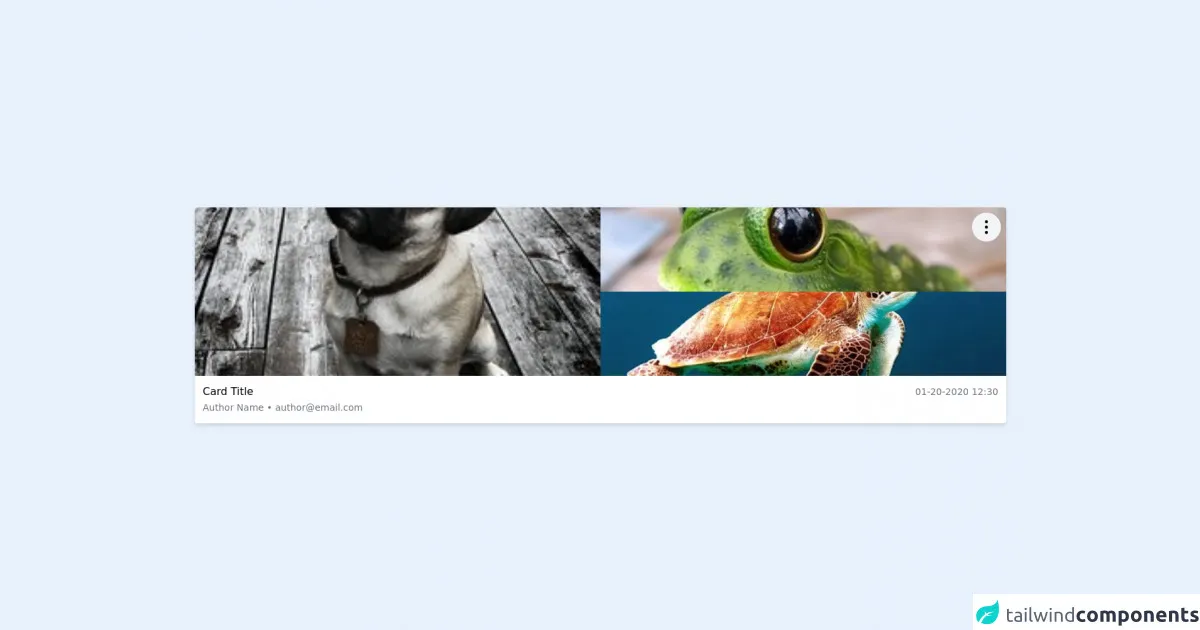
The preview of Photo gallery card UI component
To create a photo gallery card, we will use Tailwind CSS classes to style the card's elements. The card will include a title, description, and a set of images.
Free download of the Photo gallery card's source code
The source code of Photo gallery card UI component
The source code for the photo gallery card is straightforward and easy to understand. It uses Tailwind CSS classes to style the card's elements.
<!-- This is an example component -->
<script src="https://cdn.jsdelivr.net/gh/alpinejs/[email protected]/dist/alpine.min.js" defer></script>
<div class="w-full p-6 mx-auto">
<div class="shadow-md rounded bg-white overflow-hidden relative">
<div class="absolute top-2 right-2">
<div class="relative" x-data="{ isOpen: false }">
<button
@click="isOpen = !isOpen"
class="p-2 bg-gray-100 rounded-full hover:bg-gray-200 focus:outline-none focus:ring"
>
<svg xmlns="http://www.w3.org/2000/svg" class="h-7 w-7 cursor-pointer" fill="none" viewBox="0 0 24 24" stroke="currentColor">
<path stroke-linecap="round" stroke-linejoin="round" stroke-width="2" d="M12 5v.01M12 12v.01M12 19v.01M12 6a1 1 0 110-2 1 1 0 010 2zm0 7a1 1 0 110-2 1 1 0 010 2zm0 7a1 1 0 110-2 1 1 0 010 2z" />
</svg>
</button>
<!-- Dropdown card -->
<div
@click.away="isOpen = false"
x-show.transition.opacity="isOpen"
class="absolute w-48 max-w-md mt-3 transform bg-white rounded-md shadow-lg -translate-x-3/4 min-w-max overflow-hidden"
>
<div class="p-2 font-medium border-b">
<span class="text-gray-800">Actions</span>
</div>
<ul class="flex flex-col">
<li>
<a href="#" class="flex items-center px-2 py-1 transition hover:bg-gray-100">
<svg xmlns="http://www.w3.org/2000/svg" width="16" height="16" fill="currentColor" class="bi bi-eye-fill " viewBox="0 0 16 16">
<path d="M10.5 8a2.5 2.5 0 1 1-5 0 2.5 2.5 0 0 1 5 0z"></path>
<path d="M0 8s3-5.5 8-5.5S16 8 16 8s-3 5.5-8 5.5S0 8 0 8zm8 3.5a3.5 3.5 0 1 0 0-7 3.5 3.5 0 0 0 0 7z"></path>
</svg>
<span class="ml-2">View</span>
</a>
</li>
<li>
<a href="#" class="flex items-center px-2 py-1 transition hover:bg-gray-100 ">
<svg xmlns="http://www.w3.org/2000/svg" width="16" height="16" fill="currentColor" class="bi bi-pencil-square " viewBox="0 0 16 16">
<path d="M15.502 1.94a.5.5 0 0 1 0 .706L14.459 3.69l-2-2L13.502.646a.5.5 0 0 1 .707 0l1.293 1.293zm-1.75 2.456l-2-2L4.939 9.21a.5.5 0 0 0-.121.196l-.805 2.414a.25.25 0 0 0 .316.316l2.414-.805a.5.5 0 0 0 .196-.12l6.813-6.814z"></path>
<path fill-rule="evenodd" d="M1 13.5A1.5 1.5 0 0 0 2.5 15h11a1.5 1.5 0 0 0 1.5-1.5v-6a.5.5 0 0 0-1 0v6a.5.5 0 0 1-.5.5h-11a.5.5 0 0 1-.5-.5v-11a.5.5 0 0 1 .5-.5H9a.5.5 0 0 0 0-1H2.5A1.5 1.5 0 0 0 1 2.5v11z"></path>
</svg>
<span class="ml-2">Edit</span>
</a>
</li>
<li>
<a href="#" class="flex items-center px-2 py-1 transition hover:bg-gray-100">
<svg xmlns="http://www.w3.org/2000/svg" width="16" height="16" fill="currentColor" class="bi bi-trash-fill " viewBox="0 0 16 16">
<path d="M2.5 1a1 1 0 0 0-1 1v1a1 1 0 0 0 1 1H3v9a2 2 0 0 0 2 2h6a2 2 0 0 0 2-2V4h.5a1 1 0 0 0 1-1V2a1 1 0 0 0-1-1H10a1 1 0 0 0-1-1H7a1 1 0 0 0-1 1H2.5zm3 4a.5.5 0 0 1 .5.5v7a.5.5 0 0 1-1 0v-7a.5.5 0 0 1 .5-.5zM8 5a.5.5 0 0 1 .5.5v7a.5.5 0 0 1-1 0v-7A.5.5 0 0 1 8 5zm3 .5v7a.5.5 0 0 1-1 0v-7a.5.5 0 0 1 1 0z"></path>
</svg>
<span class="ml-2">Remove</span>
</a>
</li>
</ul>
</div>
</div>
</div>
<div class="grid grid-cols-2 h-64">
<div class="h-64 overflow-hidden">
<img class="object-cover h-64 w-full" src="https://images.freeimages.com/images/small-previews/20c/my-puppy-maggie-1362787.jpg">
</div>
<div class="h-64 overflow-hidden">
<img class="object-cover h-32 w-full" src="https://images.freeimages.com/images/small-previews/e71/frog-1371919.jpg">
<img class="object-cover h-32 w-full" src="https://cdn.pixabay.com/photo/2015/07/27/19/47/turtle-863336__340.jpg">
</div>
</div>
<div class="p-3">
<div class="block md:flex justify-between">
<div>
<h3 class="font-medium">Card Title</h3>
<span class="text-sm text-gray-500">Author Name • [email protected]</span>
</div>
<div class="">
<div>
<span class="text-sm text-gray-500">01-20-2020 12:30</span>
</div>
</div>
</div>
</div>
</div>
</div>
How to create a Photo gallery card with Tailwind CSS?
To create a photo gallery card with Tailwind CSS, follow these six tips:
1. Set up the HTML structure
The first step is to set up the HTML structure for the photo gallery card. The card will include a title, description, and a set of images. Use the following HTML code to create the card's structure:
<div class="max-w-sm rounded overflow-hidden shadow-lg">
  <img class="w-full" src="img/card-top.jpg" alt="Sunset in the mountains">
  <div class="px-6 py-4">
    <div class="font-bold text-xl mb-2">The Coldest Sunset</div>
    <p class="text-gray-700 text-base">
      Lorem ipsum dolor sit amet, consectetur adipisicing elit. Voluptatibus quia, nulla! Maiores et perferendis eaque, exercitationem praesentium nihil.
    </p>
  </div>
  <div class="px-6 pt-4 pb-2">
    <img class="w-10 h-10 rounded-full inline-block mr-2" src="img/avatar.jpg" alt="Avatar of Jonathan Reinink">
    <img class="w-10 h-10 rounded-full inline-block mr-2" src="img/avatar.jpg" alt="Avatar of Jonathan Reinink">
    <img class="w-10 h-10 rounded-full inline-block mr-2" src="img/avatar.jpg" alt="Avatar of Jonathan Reinink">
  </div>
</div>
2. Style the card's elements
Use Tailwind CSS classes to style the card's elements. For example, use the max-w-sm class to set the card's maximum width to 640 pixels. Use the rounded class to add rounded corners to the card. Use the overflow-hidden class to hide any content that overflows the card's boundaries. Use the shadow-lg class to add a box shadow to the card.
<div class="max-w-sm rounded overflow-hidden shadow-lg">
3. Add the card's image
Add the card's image using the img tag. Use the w-full class to set the image's width to 100%. Use the src attribute to specify the image's source.
<img class="w-full" src="img/card-top.jpg" alt="Sunset in the mountains">
4. Add the card's title and description
Add the card's title and description using the div and p tags. Use the px-6 and py-4 classes to add padding to the title and description. Use the font-bold and text-xl classes to make the title bold and increase its font size. Use the text-gray-700 and text-base classes to set the description's color to gray and its font size to the base size.
<div class="px-6 py-4">
  <div class="font-bold text-xl mb-2">The Coldest Sunset</div>
  <p class="text-gray-700 text-base">
    Lorem ipsum dolor sit amet, consectetur adipisicing elit. Voluptatibus quia, nulla! Maiores et perferendis eaque, exercitationem praesentium nihil.
  </p>
</div>
5. Add the card's images
Add the card's images using the img tag. Use the w-10 and h-10 classes to set the images' width and height to 40 pixels. Use the rounded-full class to make the images circular. Use the inline-block and mr-2 classes to align the images horizontally and add some margin between them.
<div class="px-6 pt-4 pb-2">
  <img class="w-10 h-10 rounded-full inline-block mr-2" src="img/avatar.jpg" alt="Avatar of Jonathan Reinink">
  <img class="w-10 h-10 rounded-full inline-block mr-2" src="img/avatar.jpg" alt="Avatar of Jonathan Reinink">
  <img class="w-10 h-10 rounded-full inline-block mr-2" src="img/avatar.jpg" alt="Avatar of Jonathan Reinink">
</div>
6. Customize the card's appearance
Customize the card's appearance by modifying the Tailwind CSS classes. For example, use the bg-gray-100 class to set the card's background color to gray. Use the text-teal-500 class to set the title's color to teal.
<div class="max-w-sm rounded overflow-hidden shadow-lg bg-gray-100">
  <img class="w-full" src="img/card-top.jpg" alt="Sunset in the mountains">
  <div class="px-6 py-4">
    <div class="font-bold text-xl mb-2 text-teal-500">The Coldest Sunset</div>
    <p class="text-gray-700 text-base">
      Lorem ipsum dolor sit amet, consectetur adipisicing elit. Voluptatibus quia, nulla! Maiores et perferendis eaque, exercitationem praesentium nihil.
    </p>
  </div>
  <div class="px-6 pt-4 pb-2">
    <img class="w-10 h-10 rounded-full inline-block mr-2" src="img/avatar.jpg" alt="Avatar of Jonathan Reinink">
    <img class="w-10 h-10 rounded-full inline-block mr-2" src="img/avatar.jpg" alt="Avatar of Jonathan Reinink">
    <img class="w-10 h-10 rounded-full inline-block mr-2" src="img/avatar.jpg" alt="Avatar of Jonathan Reinink">
  </div>
</div>
Conclusion
Creating a photo gallery card with Tailwind CSS is easy and efficient. By following these six tips, you can create a photo gallery card quickly and customize its appearance easily. Tailwind CSS provides a set of pre-defined CSS classes that save time and reduce the amount of custom CSS required. It is a popular choice among developers due to its flexibility and ease of use.