- Published on
Advanced Guide: Build A Opensea - Notable Drops With Tailwind CSS
- What is Tailwind CSS?
- The description of Opensea - Notable Drops ui component
- Why use Tailwind CSS to create a Opensea - Notable Drops ui component?
- The preview of Opensea - Notable Drops ui component.
- The source code of Opensea - Notable Drops ui component.
- How to create a Opensea - Notable Drops with Tailwind CSS?
- Conclusion
As a FrontEnd technology blogger, it's important to stay on top of the latest trends and tools in the industry. One such tool that has gained popularity in recent years is Tailwind CSS. Tailwind CSS is a utility-first CSS framework that makes it easy to create responsive and customizable UI components. In this article, we will explore how to use Tailwind CSS to create a Opensea - Notable Drops UI component.
What is Tailwind CSS?
Tailwind CSS is a utility-first CSS framework that provides a set of pre-defined CSS classes that can be used to style HTML elements. Unlike traditional CSS frameworks, Tailwind CSS does not provide pre-designed components. Instead, it provides a set of utility classes that can be used to create custom components. This approach gives developers more flexibility and control over the design of their UI components.
The description of Opensea - Notable Drops ui component
Opensea - Notable Drops is a UI component that displays a list of notable drops on the Opensea marketplace. The component displays the name of the drop, the date of the drop, and the number of items available for purchase. The component also includes a thumbnail image of the drop.
Why use Tailwind CSS to create a Opensea - Notable Drops ui component?
Tailwind CSS provides a set of utility classes that can be used to create custom UI components quickly and easily. The classes are designed to be composable, meaning they can be combined to create complex styles. This makes it easy to create a custom UI component like Opensea - Notable Drops without having to write a lot of custom CSS.
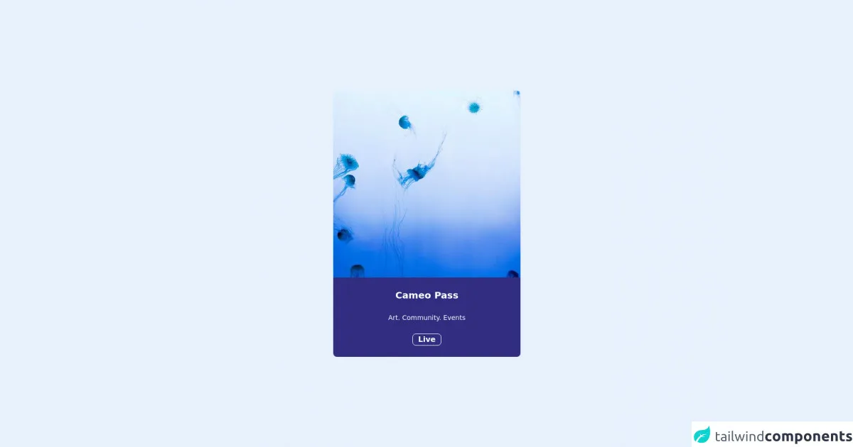
The preview of Opensea - Notable Drops ui component.
Free download of the Opensea - Notable Drops's source code
The source code of Opensea - Notable Drops ui component.
<div class="h-screen flex items-center justify-center">

  <card class="rounded-lg">

    <a href="#">
      <img src="https://picsum.photos/400/400" class="rounded-t-lg" />
    </a>

    <div class="bg-indigo-900 text-center rounded-b-lg">

      <p class="text-white text-xl font-bold pt-6">
        Cameo Pass
      </p>

       <p class="text-white text-sm font-light pt-6">
        Art. Community. Events
      </p>

      <button class="border border-white rounded-lg px-3 text-white font-semibold mt-6 mb-6">
        Live
      </button>

    </div>

  </card>

</div>
How to create a Opensea - Notable Drops with Tailwind CSS?
To create a Opensea - Notable Drops UI component with Tailwind CSS, we will need to follow these steps:
- Set up a new HTML file and include the Tailwind CSS stylesheet.
- Create a container element to hold the Opensea - Notable Drops component.
- Create a header element to display the title of the component.
- Create a list element to display the notable drops.
- Create a list item element for each notable drop.
- Add the necessary classes to style the component using Tailwind CSS.
- Add the necessary content to display the data for each notable drop.
Here's the HTML code for the Opensea - Notable Drops component:
<div class="container mx-auto py-8">
  <h2 class="text-2xl font-bold mb-4">Notable Drops</h2>
  <ul class="grid grid-cols-1 sm:grid-cols-2 md:grid-cols-3 gap-4">
    <li class="bg-white rounded-lg shadow-md">
      <img src="https://via.placeholder.com/150" alt="Notable Drop Thumbnail" class="w-full rounded-t-lg">
      <div class="p-4">
        <h3 class="text-lg font-bold mb-2">Notable Drop Name</h3>
        <p class="text-gray-600 mb-2">Date of Drop</p>
        <p class="text-gray-600">Number of Items Available</p>
      </div>
    </li>
    <!-- Repeat the list item for each notable drop -->
  </ul>
</div>
Let's break down the code:
- We start by creating a container element with a padding of 8 units on the y-axis and centering it horizontally using the
mx-autoclass. - Next, we create a header element with a font size of 2xl, bold font weight, and a margin bottom of 4 units.
- We then create a list element with a grid layout that displays one column on small screens, two columns on medium screens, and three columns on large screens. We also add a gap of 4 units between each grid item.
- Inside the list element, we create a list item element for each notable drop. Each list item has a white background, rounded corners, and a shadow. We also add an image element with a placeholder image and a width of 100%. The image has rounded corners on the top to match the rounded corners of the list item. Finally, we add a div element with padding of 4 units to display the name, date, and number of items available for each notable drop.
Conclusion
In this article, we explored how to use Tailwind CSS to create a Opensea - Notable Drops UI component. We learned that Tailwind CSS provides a set of utility classes that can be used to create custom UI components quickly and easily. We also learned how to create a Opensea - Notable Drops component using HTML and Tailwind CSS. With Tailwind CSS, creating custom UI components has never been easier.