- Published on
How To Make A Open/Close Multiple Model On Same Page With Tailwind CSS In 5 Easy Steps
- What is Tailwind CSS?
- The description of Open/Close Multiple Model on same page ui component
- Why use Tailwind CSS to create a Open/Close Multiple Model on same page ui component?
- The preview of Open/Close Multiple Model on same page ui component.
- The source code of Open/Close Multiple Model on same page ui component.
- How to create a Open/Close Multiple Model on same page with Tailwind CSS?
- Step 1: Create the HTML structure
- Step 2: Add the JavaScript
- Step 3: Add the Tailwind CSS classes
- Step 4: Add multiple modals
- Step 5: Test and refine
- Conclusion
What is Tailwind CSS?
Tailwind CSS is a utility-first CSS framework that allows developers to quickly and easily create custom user interfaces. It provides a set of pre-defined CSS classes that can be used to style HTML elements, making it easy to create consistent and responsive designs.
The description of Open/Close Multiple Model on same page ui component
An Open/Close Multiple Model on same page ui component is a user interface element that allows users to open and close multiple models on the same page. This component is useful for displaying information in a modal window without requiring the user to navigate away from the current page.
Why use Tailwind CSS to create a Open/Close Multiple Model on same page ui component?
Tailwind CSS provides a set of pre-defined CSS classes that can be used to quickly and easily create custom user interfaces. This makes it an ideal choice for creating an Open/Close Multiple Model on same page ui component, as it allows developers to focus on the functionality of the component rather than spending time on styling.
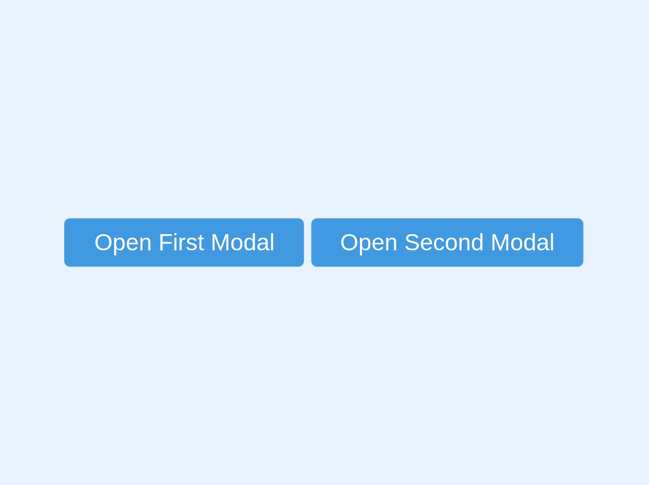
The preview of Open/Close Multiple Model on same page ui component.
To create an Open/Close Multiple Model on same page ui component with Tailwind CSS, we will use a combination of HTML and JavaScript. The final result will look something like this:
Free download of the Open/Close Multiple Model on same page's source code
The source code of Open/Close Multiple Model on same page ui component.
To create the Open/Close Multiple Model on same page ui component, we will need to use a combination of HTML, CSS, and JavaScript. Here is the source code for the component:
<div>
  <a class='bg-blue-500 py-2 px-5 text-white rounded modal-open' data-toggle="modal" data-target="firstModal">Open First Modal</a>
  <a class='bg-blue-500 py-2 px-5 text-white rounded modal-open' data-toggle="modal" data-target="secondModal">Open Second Modal</a>
</div>

<div class="modal opacity-0 pointer-events-none fixed w-full h-full top-0 left-0 flex items-center justify-center" id="firstModal">
    <div class="modal-overlay absolute w-full h-full bg-gray-900 opacity-50"></div>

    <div class="modal-container bg-white w-11/12 md:max-w-md mx-auto rounded shadow-lg z-50 overflow-y-auto">

    <div class="modal-close absolute top-0 right-0 cursor-pointer flex flex-col items-center mt-4 mr-4 text-white text-sm z-50">
        <svg class="fill-current text-white" xmlns="http://www.w3.org/2000/svg" width="18" height="18" viewBox="0 0 18 18">
        <path d="M14.53 4.53l-1.06-1.06L9 7.94 4.53 3.47 3.47 4.53 7.94 9l-4.47 4.47 1.06 1.06L9 10.06l4.47 4.47 1.06-1.06L10.06 9z"></path>
        </svg>
        <span class="text-sm">(Esc)</span>
    </div>

    <!-- Add margin if you want to see some of the overlay behind the modal-->
    <div class="modal-content py-4 text-left px-6">
        <!--Title-->
        <div class="flex justify-between items-center pb-3">
        <p class="text-2xl font-bold">First Modal</p>
        <div class="modal-close cursor-pointer z-50">
            <svg class="fill-current text-black" xmlns="http://www.w3.org/2000/svg" width="18" height="18" viewBox="0 0 18 18">
            <path d="M14.53 4.53l-1.06-1.06L9 7.94 4.53 3.47 3.47 4.53 7.94 9l-4.47 4.47 1.06 1.06L9 10.06l4.47 4.47 1.06-1.06L10.06 9z"></path>
            </svg>
        </div>
        </div>
    </div>
    </div>
</div>

<div class="modal opacity-0 pointer-events-none fixed w-full h-full top-0 left-0 flex items-center justify-center" id="secondModal">
    <div class="modal-overlay absolute w-full h-full bg-gray-900 opacity-50"></div>

    <div class="modal-container bg-white w-11/12 md:max-w-md mx-auto rounded shadow-lg z-50 overflow-y-auto">

    <div class="modal-close absolute top-0 right-0 cursor-pointer flex flex-col items-center mt-4 mr-4 text-white text-sm z-50">
        <svg class="fill-current text-white" xmlns="http://www.w3.org/2000/svg" width="18" height="18" viewBox="0 0 18 18">
        <path d="M14.53 4.53l-1.06-1.06L9 7.94 4.53 3.47 3.47 4.53 7.94 9l-4.47 4.47 1.06 1.06L9 10.06l4.47 4.47 1.06-1.06L10.06 9z"></path>
        </svg>
        <span class="text-sm">(Esc)</span>
    </div>

    <!-- Add margin if you want to see some of the overlay behind the modal-->
    <div class="modal-content py-4 text-left px-6">
        <!--Title-->
        <div class="flex justify-between items-center pb-3">
            <p class="text-2xl font-bold">Second Modal</p>
            <div class="modal-close cursor-pointer z-50">
                <svg class="fill-current text-black" xmlns="http://www.w3.org/2000/svg" width="18" height="18" viewBox="0 0 18 18">
                <path d="M14.53 4.53l-1.06-1.06L9 7.94 4.53 3.47 3.47 4.53 7.94 9l-4.47 4.47 1.06 1.06L9 10.06l4.47 4.47 1.06-1.06L10.06 9z"></path>
                </svg>
            </div>
            </div>
        </div>
    </div>
</div>

<script>
   var openmodal = document.querySelectorAll('.modal-open')
   let selectedModalTargetId = ''
   for (var i = 0; i < openmodal.length; i++) {
     openmodal[i].addEventListener('click', function(event){
       selectedModalTargetId = event.target.attributes.getNamedItem('data-target').value
       event.preventDefault()
       toggleModal()
     })
   }

  const overlay = document.querySelector('.modal-overlay')
  overlay.addEventListener('click', toggleModal)

  var closemodal = document.querySelectorAll('.modal-close')
  for (var i = 0; i < closemodal.length; i++) {
    closemodal[i].addEventListener('click', toggleModal)
  }

  document.onkeydown = function(evt) {
    evt = evt || window.event
    var isEscape = false
    if ("key" in evt) {
      isEscape = (evt.key === "Escape" || evt.key === "Esc")
    } else {
      isEscape = (evt.keyCode === 27)
    }
    if (isEscape && document.body.classList.contains('modal-active')) {
      toggleModal()
    }
  }

  function toggleModal () {
    if(!selectedModalTargetId) {
      return
    }
    const body = document.querySelector('body')
    const modal = document.getElementById(selectedModalTargetId)
    modal.classList.toggle('opacity-0')
    modal.classList.toggle('pointer-events-none')
    body.classList.toggle('modal-active')
  }
</script>
How to create a Open/Close Multiple Model on same page with Tailwind CSS?
To create an Open/Close Multiple Model on same page ui component with Tailwind CSS, follow these 5 easy steps:
Step 1: Create the HTML structure
The first step is to create the HTML structure for the component. This will include the modal window and the button that will be used to open and close the modal. Here is an example of the HTML structure:
<div class="relative">
  <button class="bg-blue-500 text-white font-bold py-2 px-4 rounded">
    Open Modal
  </button>

  <div class="absolute top-0 left-0 w-full h-full bg-gray-900 bg-opacity-50 flex items-center justify-center hidden">
    <div class="bg-white w-1/2 rounded-lg">
      <div class="flex justify-between items-center px-4 py-2">
        <h3 class="font-bold text-lg">Modal Title</h3>
        <button class="text-gray-500 hover:text-gray-700">
          <svg class="fill-current h-4 w-4" xmlns="http://www.w3.org/2000/svg" viewBox="0 0 20 20"><path d="M14.348 5.652a.5.5 0 0 1 0 .707L10.707 10l3.641 3.641a.5.5 0 0 1-.707.707L10 10.707l-3.641 3.641a.5.5 0 0 1-.707-.707L9.293 10 5.652 6.359a.5.5 0 0 1 .707-.707L10 9.293l3.641-3.641a.5.5 0 0 1 .707 0z"/></svg>
        </button>
      </div>
      <div class="p-4">
        <p>Modal content goes here.</p>
      </div>
    </div>
  </div>
</div>
In this example, we have created a button with the class bg-blue-500 to open the modal, and a div with the class absolute to contain the modal window. The modal window is hidden by default using the hidden class.
Step 2: Add the JavaScript
Next, we need to add the JavaScript to open and close the modal window. We will use the querySelector method to select the button and the modal window, and then add an event listener to the button to toggle the hidden class on the modal window. Here is an example of the JavaScript code:
const openModalButtons = document.querySelectorAll('[data-modal-target]')
const closeModalButtons = document.querySelectorAll('[data-close-button]')
const overlay = document.getElementById('overlay')

openModalButtons.forEach(button => {
  button.addEventListener('click', () => {
    const modal = document.querySelector(button.dataset.modalTarget)
    openModal(modal)
  })
})

overlay.addEventListener('click', () => {
  const modals = document.querySelectorAll('.modal.active')
  modals.forEach(modal => {
    closeModal(modal)
  })
})

closeModalButtons.forEach(button => {
  button.addEventListener('click', () => {
    const modal = button.closest('.modal')
    closeModal(modal)
  })
})

function openModal(modal) {
  if (modal == null) return
  modal.classList.add('active')
  overlay.classList.add('active')
}

function closeModal(modal) {
  if (modal == null) return
  modal.classList.remove('active')
  overlay.classList.remove('active')
}
In this example, we have created functions to open and close the modal window, and added event listeners to the button and overlay elements to trigger these functions.
Step 3: Add the Tailwind CSS classes
Next, we need to add the Tailwind CSS classes to style the modal window and button. Here is an example of the CSS code:
/* Modal */
.modal {
  transition: opacity 0.25s ease;
  background-color: #fff;
  border-radius: 0.5rem;
  padding: 1rem;
  position: fixed;
  top: 50%;
  left: 50%;
  transform: translate(-50%, -50%);
  z-index: 10;
  opacity: 0;
}

.modal.active {
  opacity: 1;
}

/* Overlay */
#overlay {
  transition: opacity 0.25s ease;
  background-color: rgba(0, 0, 0, 0.5);
  position: fixed;
  top: 0;
  left: 0;
  width: 100%;
  height: 100%;
  z-index: 5;
  opacity: 0;
}

#overlay.active {
  opacity: 1;
}

/* Button */
button {
  cursor: pointer;
}
In this example, we have added classes to style the modal window, overlay, and button. We have used the bg-blue-500 class to set the background color of the button to blue, and the rounded class to round the corners of the button.
Step 4: Add multiple modals
To add multiple modals to the page, we simply need to repeat the HTML structure for each modal, and update the data-modal-target attribute on the button to match the id of the corresponding modal window. Here is an example of the updated HTML structure:
<div class="relative">
<button class="bg-blue-500 text-white font-bold py-2 px-4 rounded" data-modal-target="#modal1">
Open Modal 1
</button>
<div class="modal" id="modal1">
<div class="modal-content">
<span class="close-button" data-close-button>×</span>
<p>Modal 1 content goes here.</p>
</div>
</div>
</div>
<div class="relative">
<button class="bg-blue-500 text-white font-bold py-2 px-4 rounded" data-modal-target="#modal2">
Open Modal 2
</button>
<div class="modal" id="modal2">
<div class="modal-content">
<span class="close-button" data-close-button>×</span>
<p>Modal 2 content goes here.</p>
</div>
</div>
</div>
In this example, we have added two modals to the page, each with its own unique id and data-modal-target attribute.
Step 5: Test and refine
Finally, we need to test the component and refine it as necessary. We can test the component by clicking on the button to open the modal window, and clicking on the overlay or close button to close the modal window. We can refine the component by adjusting the CSS classes to achieve the desired styling, and by updating the HTML and JavaScript to add additional functionality.
Conclusion
In this article, we have learned how to create an Open/Close Multiple Model on same page ui component with Tailwind CSS in 5 easy steps. By following these steps, we can quickly and easily create a custom user interface element that allows users to open and close multiple modals on the same page. With Tailwind CSS, we can focus on the functionality of the component rather than spending time on styling, making it an ideal choice for developers who want to create responsive and consistent user interfaces.