- Published on
6 Tips To Make A Notification Card With Tailwind CSS
- What is Tailwind CSS?
- The description of Notification Card ui component
- Why use Tailwind CSS to create a Notification Card ui component?
- The preview of Notification Card ui component
- The source code of Notification Card ui component
- How to create a Notification Card with Tailwind CSS?
- Conclusion
As a FrontEnd technology blogger, you are probably always looking for ways to improve your UI components. One such component is the Notification Card, which is a crucial part of any web application. In this article, we will discuss how to create a Notification Card using Tailwind CSS, a popular utility-first CSS framework.
What is Tailwind CSS?
Tailwind CSS is a utility-first CSS framework that provides pre-defined classes for commonly used CSS properties. It allows developers to create complex UI components with ease, without having to write custom CSS. Tailwind CSS provides a set of pre-defined classes that can be used to style HTML elements. It is highly customizable and can be configured to suit the specific needs of a project.
The description of Notification Card ui component
A Notification Card is a UI component that displays information to the user about an event or action. It is commonly used in web applications to notify users of updates, messages, or errors. A Notification Card typically contains a title, a message, and a close button.
Why use Tailwind CSS to create a Notification Card ui component?
Tailwind CSS provides a set of pre-defined classes that can be used to create a Notification Card with ease. It eliminates the need to write custom CSS and allows developers to focus on the functionality of the component. Tailwind CSS also provides responsive design classes, which makes it easy to create a Notification Card that looks great on any device.
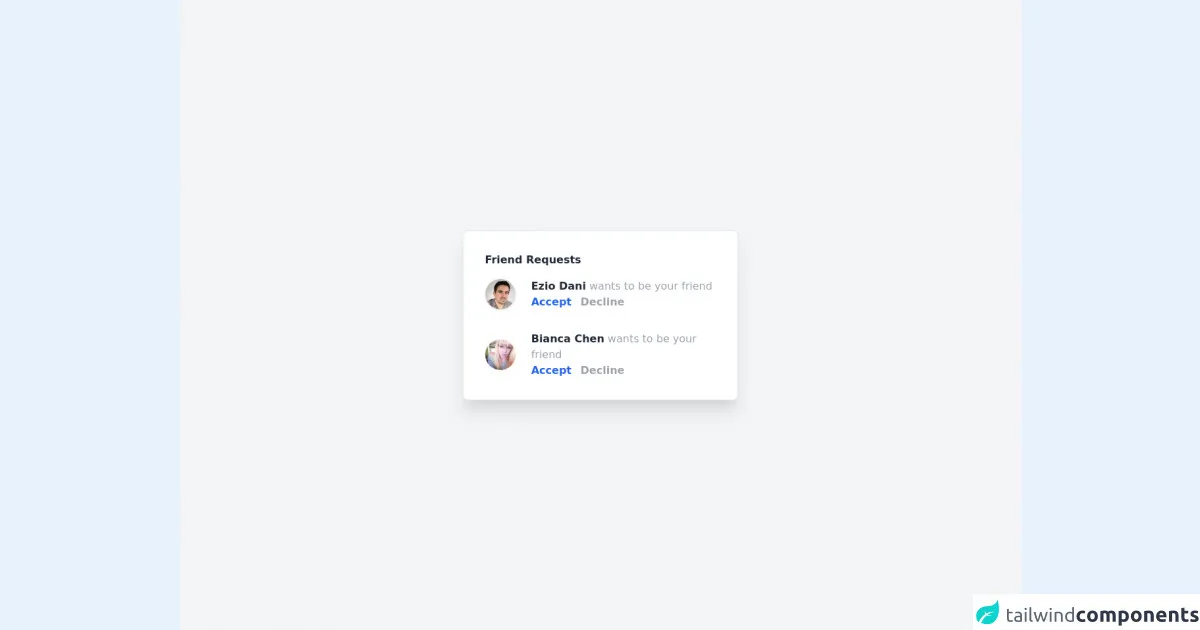
The preview of Notification Card ui component
To create a Notification Card with Tailwind CSS, we will use a combination of pre-defined classes to style the HTML elements. The Notification Card will have a title, a message, and a close button.
Free download of the Notification Card's source code
The source code of Notification Card ui component
To create a Notification Card with Tailwind CSS, we will use a combination of pre-defined classes to style the HTML elements. The Notification Card will have a title, a message, and a close button.
<div class="flex items-center justify-center h-screen bg-gray-100">
   <div class="bg-white rounded-lg shadow-xl border p-8 w-3xl">
     <div class="mb-4">
       <h1 class="font-semibold text-gray-800">Friend Requests</h1>
     </div>
     <div class="flex justify-center items-center mb-8">
       <div class="w-1/5">
         <img class="w-12 h-12 rounded-full border border-gray-100 shadow-sm" src="https://randomuser.me/api/portraits/men/20.jpg" alt="user image" />
       </div>
       <div class="w-4/5">
         <div>
           <span class="font-semibold text-gray-800">Ezio Dani</span>
           <span class="text-gray-400">wants to be your friend</span>
         </div>
         <div class="font-semibold">
           <a href="" class="text-blue-600 mr-2">Accept</a>
           <a href="" class="text-gray-400">Decline</a>
         </div>
       </div>
     </div>
     <div class="flex justify-center items-center">
       <div class="w-1/5">
         <img class="w-12 h-12 rounded-full border border-gray-100 shadow-sm" src="https://randomuser.me/api/portraits/women/20.jpg" alt="user image" />
       </div>
       <div class="w-4/5">
         <div>
           <span class="font-semibold text-gray-800">Bianca Chen</span>
           <span class="text-gray-400">wants to be your friend</span>
         </div>
         <div class="font-semibold">
           <a href="" class="text-blue-600 mr-2">Accept</a>
           <a href="" class="text-gray-400">Decline</a>
         </div>
       </div>
     </div>
   </div>
 </div>
How to create a Notification Card with Tailwind CSS?
Here are 6 tips to create a Notification Card with Tailwind CSS:
- Start with a container element
The first step is to create a container element for the Notification Card. We will use the div element and apply the bg-white and shadow-md classes to it.
<div class="bg-white shadow-md">
  <!-- Notification Card content goes here -->
</div>
- Add a title
Next, we will add a title to the Notification Card. We will use the h2 element and apply the text-lg and font-semibold classes to it.
<div class="bg-white shadow-md">
  <h2 class="text-lg font-semibold">Notification Title</h2>
  <!-- Notification Card content goes here -->
</div>
- Add a message
After adding the title, we will add a message to the Notification Card. We will use the p element and apply the text-sm and text-gray-600 classes to it.
<div class="bg-white shadow-md">
  <h2 class="text-lg font-semibold">Notification Title</h2>
  <p class="text-sm text-gray-600">Notification message goes here</p>
</div>
- Add a close button
Next, we will add a close button to the Notification Card. We will use the button element and apply the text-gray-600, hover:text-gray-800, and focus:outline-none classes to it.
<div class="bg-white shadow-md">
  <h2 class="text-lg font-semibold">Notification Title</h2>
  <p class="text-sm text-gray-600">Notification message goes here</p>
  <button class="text-gray-600 hover:text-gray-800 focus:outline-none">X</button>
</div>
- Style the Notification Card
Now that we have added the content to the Notification Card, we can style it using Tailwind CSS classes. We will use the p-4 class to add padding to the container element, and the border-l-4 and border-blue-500 classes to add a border to the left side of the container element.
<div class="bg-white shadow-md p-4 border-l-4 border-blue-500">
  <h2 class="text-lg font-semibold">Notification Title</h2>
  <p class="text-sm text-gray-600">Notification message goes here</p>
  <button class="text-gray-600 hover:text-gray-800 focus:outline-none">X</button>
</div>
- Make the Notification Card responsive
Finally, we will make the Notification Card responsive by using Tailwind CSS responsive design classes. We will use the sm and md classes to change the layout of the Notification Card on smaller screens.
<div class="bg-white shadow-md p-4 border-l-4 border-blue-500 sm:flex sm:items-center sm:justify-between">
  <h2 class="text-lg font-semibold">Notification Title</h2>
  <p class="text-sm text-gray-600">Notification message goes here</p>
  <button class="text-gray-600 hover:text-gray-800 focus:outline-none">X</button>
</div>
Conclusion
In conclusion, creating a Notification Card with Tailwind CSS is easy and straightforward. By following the 6 tips outlined in this article, you can create a Notification Card that looks great and is responsive on any device. Tailwind CSS provides a set of pre-defined classes that make it easy to style HTML elements, eliminating the need for custom CSS. So, go ahead and create your own Notification Card using Tailwind CSS today!