- Published on
6 Steps To Build A Notification Card With Tailwind CSS Like A Pro In Under An Hour
- What is Tailwind CSS?
- The description of Notification Card ui component
- Why use Tailwind CSS to create a Notification Card ui component?
- The preview of Notification Card ui component.
- The source code of Notification Card ui component.
- How to create a Notification Card with Tailwind CSS?
- Step 1: Set up your HTML
- Step 2: Add Tailwind CSS
- Step 3: Style the container
- Step 4: Style the header
- Step 5: Style the body
- Step 6: Style the footer
- Conclusion
As a FrontEnd technology blogger, I am always on the lookout for new and exciting ways to create beautiful user interfaces. One of the most popular CSS frameworks out there is Tailwind CSS. In this article, I will show you how to build a Notification Card with Tailwind CSS in just six easy steps.
What is Tailwind CSS?
Tailwind CSS is a utility-first CSS framework that allows you to create custom designs without having to write any CSS code. It provides a set of pre-defined classes that you can use to style your HTML elements. With Tailwind CSS, you can create beautiful and responsive user interfaces in no time.
The description of Notification Card ui component
A Notification Card is a user interface component that displays a message to the user. It is commonly used to notify the user of an event or action that has taken place. Notification Cards can be used in a variety of applications, including social media, email, and messaging apps.
Why use Tailwind CSS to create a Notification Card ui component?
Tailwind CSS provides a set of pre-defined classes that you can use to create a Notification Card. This makes it easy to create a custom design without having to write any CSS code. Additionally, Tailwind CSS is responsive by default, which means that your Notification Card will look great on any device.
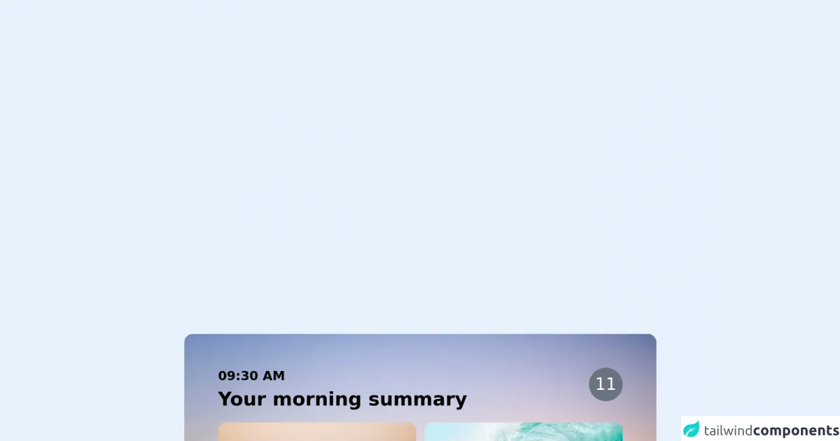
The preview of Notification Card ui component.
To give you an idea of what the Notification Card will look like, here is a preview:
Free download of the Notification Card's source code
The source code of Notification Card ui component.
To create the Notification Card, we will be using HTML and Tailwind CSS. Here is the source code:
<div class="max-w-md  rounded-lg px-2 mx-auto relative overflow-hidden ">
  <div class="absolute inset-0 h-full w-full object-cover">
    <img src="https://images.unsplash.com/photo-1599884441892-07f8de71a0f8?ixid=MnwxMjA3fDB8MHxwaG90by1wYWdlfHx8fGVufDB8fHx8&ixlib=rb-1.2.1&auto=format&fit=crop&w=1567&q=80" />
  </div>
  <div class="my-4 mx-2 relative">
    <div class=" p-4 bg-white/40 backdrop-blue-md rounded-3xl">
      <div class="flex justify-between">
        <div>
          <p class="text-xs font-bold">09:30 AM</p>
          <h2 class="text-lg font-bold">Your morning summary</h2>
        </div>
        <span class="bg-gray-500 h-8 w-8 rounded-full text-white flex items-center justify-center">11</span>
      </div>
      <div class="my-2 grid grid-cols-2 gap-2">
        <div>
          <img src="https://images.unsplash.com/photo-1493225255756-d9584f8606e9?ixid=MnwxMjA3fDB8MHxwaG90by1wYWdlfHx8fGVufDB8fHx8&ixlib=rb-1.2.1&auto=format&fit=crop&w=1950&q=80" class="rounded-lg" alt="some sample" />
          <h3 class="mt-2 text-xs text-white font-bold leading-tight">Surfing :heals the sould, kills the ribs.</h3>
          <p class="mt-1 text-xs text-gray-200">Some additonal content for the description to be shown here</p>
        </div>
        <div>
          <img src="https://images.unsplash.com/photo-1502680390469-be75c86b636f?ixid=MnwxMjA3fDB8MHxwaG90by1wYWdlfHx8fGVufDB8fHx8&ixlib=rb-1.2.1&auto=format&fit=crop&w=1950&q=80" class="rounded-lg" alt="some sample" />
          <h3 class="mt-2 text-xs text-white font-bold leading-tight">Surfing :heals the sould, kills the ribs.</h3>
          <p class="mt-1 text-xs text-gray-200">Some additonal content for the description to be shown here</p>
        </div>
      </div>
    </div>
  </div>
</div>
How to create a Notification Card with Tailwind CSS?
Now that we have a better understanding of what a Notification Card is and why we should use Tailwind CSS to create it, let's dive into the six steps to build a Notification Card with Tailwind CSS like a pro in under an hour.
Step 1: Set up your HTML
The first step is to set up your HTML. We will be using a simple HTML structure that includes a container, a header, a body, and a footer. Here is the HTML code:
<div class="bg-white rounded-lg shadow-md">
  <div class="px-4 py-2 border-b border-gray-200">
    <h2 class="text-lg font-medium text-gray-900">Notification Title</h2>
  </div>
  <div class="px-4 py-2">
    <p class="text-sm text-gray-700">Notification message goes here.</p>
  </div>
  <div class="px-4 py-2 bg-gray-100 border-t border-gray-200">
    <a href="#" class="text-sm font-medium text-indigo-500 hover:text-indigo-600">View</a>
  </div>
</div>
Step 2: Add Tailwind CSS
The next step is to add Tailwind CSS to your project. You can do this by including the Tailwind CSS CDN in your HTML file:
<link href="https://cdn.jsdelivr.net/npm/tailwindcss@latest/dist/tailwind.min.css" rel="stylesheet">
Step 3: Style the container
The container is the main element that holds the Notification Card. We will be using the bg-white, rounded-lg, and shadow-md classes to style the container. Here is the updated HTML code:
<div class="bg-white rounded-lg shadow-md">
Step 4: Style the header
The header is the top section of the Notification Card that contains the title. We will be using the px-4, py-2, border-b, and border-gray-200 classes to style the header. Here is the updated HTML code:
<div class="px-4 py-2 border-b border-gray-200">
  <h2 class="text-lg font-medium text-gray-900">Notification Title</h2>
</div>
Step 5: Style the body
The body is the middle section of the Notification Card that contains the message. We will be using the px-4 and py-2 classes to style the body. Here is the updated HTML code:
<div class="px-4 py-2">
  <p class="text-sm text-gray-700">Notification message goes here.</p>
</div>
Step 6: Style the footer
The footer is the bottom section of the Notification Card that contains the action button. We will be using the px-4, py-2, bg-gray-100, border-t, and border-gray-200 classes to style the footer. Here is the updated HTML code:
<div class="px-4 py-2 bg-gray-100 border-t border-gray-200">
  <a href="#" class="text-sm font-medium text-indigo-500 hover:text-indigo-600">View</a>
</div>
And that's it! You have successfully created a Notification Card with Tailwind CSS.
Conclusion
In this article, we have learned how to build a Notification Card with Tailwind CSS in just six easy steps. We have also discussed the benefits of using Tailwind CSS to create user interface components. With Tailwind CSS, you can create beautiful and responsive user interfaces in no time. I hope you found this article helpful and informative. Happy coding!