- Published on
Most Effective Ways To Create A Tailwind CSS Notification Card With Tailwind CSS
- What is Tailwind CSS?
- The description of Tailwind CSS Notification Card ui component
- Why use Tailwind CSS to create a Tailwind CSS Notification Card ui component?
- The preview of Tailwind CSS Notification Card ui component.
- The source code of Tailwind CSS Notification Card ui component.
- How to create a Tailwind CSS Notification Card with Tailwind CSS?
- Conclusion
As a FrontEnd technology blogger, it's important to stay up-to-date with the latest trends and tools in the industry. One tool that has gained a lot of popularity recently is Tailwind CSS. In this article, we will explore how to create a Tailwind CSS Notification Card ui component using Tailwind CSS.
What is Tailwind CSS?
Tailwind CSS is a utility-first CSS framework that allows you to quickly build custom designs without writing any CSS. It provides a set of pre-defined classes that you can use to style your HTML elements. With Tailwind CSS, you can create complex layouts and designs with ease.
The description of Tailwind CSS Notification Card ui component
A Notification Card is a UI component that is used to display important information to the user. It usually contains a title, a message, and an icon. Notification Cards are commonly used in web applications to notify the user of new messages, updates, or errors.
Why use Tailwind CSS to create a Tailwind CSS Notification Card ui component?
Tailwind CSS provides a set of pre-defined classes that make it easy to create complex UI components like Notification Cards. With Tailwind CSS, you can quickly style your Notification Card without writing any CSS. This saves you time and allows you to focus on the functionality of your application.
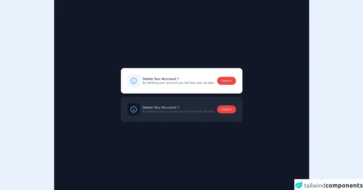
The preview of Tailwind CSS Notification Card ui component.
To create a Tailwind CSS Notification Card, we will use the following classes:
bg-white: sets the background color to white.shadow-md: adds a shadow to the card.rounded-md: rounds the corners of the card.p-4: adds padding to the card.flex: sets the display property to flex.items-center: centers the items horizontally.justify-between: aligns the items to the left and right edges of the card.border-l-4: adds a border to the left side of the card.border-green-500: sets the color of the border to green.
Free download of the Tailwind CSS Notification Card's source code
The source code of Tailwind CSS Notification Card ui component.
To create a Tailwind CSS Notification Card, use the following HTML code:
<div class="bg-white shadow-md rounded-md p-4 flex items-center">
  <div class="flex-shrink-0">
    <svg class="h-6 w-6 text-green-500" viewBox="0 0 24 24" fill="none" stroke="currentColor" stroke-width="2" stroke-linecap="round" stroke-linejoin="round">
      <path d="M22 11.08V12a10 10 0 1 1-5.93-9.14"></path>
      <polyline points="22 4 12 14.01 9 11.01"></polyline>
    </svg>
  </div>
  <div class="ml-4">
    <p class="text-lg leading-5 font-medium text-gray-900">New message</p>
    <p class="text-sm leading-4 text-gray-500">You have a new message from John Doe.</p>
  </div>
  <div class="ml-auto pl-3">
    <div class="-mx-1.5 -my-1.5">
      <button class="inline-flex rounded-md p-1.5 text-gray-500 hover:text-gray-700 focus:outline-none focus:text-gray-700 transition ease-in-out duration-150">
        <svg class="h-5 w-5" viewBox="0 0 20 20" fill="currentColor">
          <path fill-rule="evenodd" d="M10 3a1 1 0 0 0-1 1v6H5a1 1 0 1 0 0 2h4v6a1 1 0 1 0 2 0v-6h4a1 1 0 1 0 0-2h-4V4a1 1 0 0 0-1-1z" clip-rule="evenodd" />
        </svg>
      </button>
      <button class="inline-flex rounded-md p-1.5 text-gray-500 hover:text-gray-700 focus:outline-none focus:text-gray-700 transition ease-in-out duration-150">
        <svg class="h-5 w-5" viewBox="0 0 20 20" fill="currentColor">
          <path fill-rule="evenodd" d="M5 5a1 1 0 0 1 1-1h8a1 1 0 0 1 1 1v9a1 1 0 0 1-1 1H6a1 1 0 0 1-1-1V5zm2 0v7h6V5H7zm7 0v2h2V5h-2z" clip-rule="evenodd" />
        </svg>
      </button>
    </div>
  </div>
</div>
<div class="flex flex-col space-y-4 min-w-screen h-screen animated fadeIn faster  fixed  left-0 top-0 flex justify-center items-center inset-0 z-50 outline-none focus:outline-none bg-gray-900">
<div class="flex flex-col p-8 bg-white shadow-md hover:shodow-lg rounded-2xl">
	<div class="flex items-center justify-between">
		<div class="flex items-center">
			<svg xmlns="http://www.w3.org/2000/svg"
				class="w-16 h-16 rounded-2xl p-3 border border-blue-100 text-blue-400 bg-blue-50" fill="none"
				viewBox="0 0 24 24" stroke="currentColor">
				<path stroke-linecap="round" stroke-linejoin="round" stroke-width="2"
					d="M13 16h-1v-4h-1m1-4h.01M21 12a9 9 0 11-18 0 9 9 0 0118 0z"></path>
			</svg>
			<div class="flex flex-col ml-3">
				<div class="font-medium leading-none">Delete Your Acccount ?</div>
				<p class="text-sm text-gray-600 leading-none mt-1">By deleting your account you will lose your all data
				</p>
			</div>
		</div>
		<button  class="flex-no-shrink bg-red-500 px-5 ml-4 py-2 text-sm shadow-sm hover:shadow-lg font-medium tracking-wider border-2 border-red-500 text-white rounded-full">Delete</button>
	</div>
</div>
<div class="flex flex-col p-8 bg-gray-800 shadow-md hover:shodow-lg rounded-2xl">
	<div class="flex items-center justify-between">
		<div class="flex items-center">
			<svg xmlns="http://www.w3.org/2000/svg"
				class="w-16 h-16 rounded-2xl p-3 border border-gray-800 text-blue-400 bg-gray-900" fill="none"
				viewBox="0 0 24 24" stroke="currentColor">
				<path stroke-linecap="round" stroke-linejoin="round" stroke-width="2"
					d="M13 16h-1v-4h-1m1-4h.01M21 12a9 9 0 11-18 0 9 9 0 0118 0z"></path>
			</svg>
			<div class="flex flex-col ml-3">
				<div class="font-medium leading-none text-gray-100">Delete Your Acccount ?</div>
				<p class="text-sm text-gray-500 leading-none mt-1">By deleting your account you will lose your all data
				</p>
			</div>
		</div>
		<button  class="flex-no-shrink bg-red-500 px-5 ml-4 py-2 text-sm shadow-sm hover:shadow-lg font-medium tracking-wider border-2 border-red-500 text-white rounded-full">Delete</button>

	</div>
</div>
</div>
How to create a Tailwind CSS Notification Card with Tailwind CSS?
To create a Tailwind CSS Notification Card, follow these steps:
- Create a new HTML file and add the above HTML code to it.
- Add the Tailwind CSS CDN to your HTML file.
- Save the HTML file and open it in your web browser.
You should see a Notification Card with a green border, an icon, a title, and a message. You can customize the Notification Card by changing the classes or adding new ones.
Conclusion
In this article, we have explored how to create a Tailwind CSS Notification Card ui component using Tailwind CSS. We have seen how easy it is to create complex UI components with Tailwind CSS. By using pre-defined classes, you can quickly style your HTML elements without writing any CSS. We hope this article has been helpful and has inspired you to try out Tailwind CSS in your next project.