- Published on
How To Build A News Post Responsive With Tailwind CSS In 6 Easy Steps?
- What is Tailwind CSS?
- The description of News Post Responsive ui component
- Why use Tailwind CSS to create a News Post Responsive ui component?
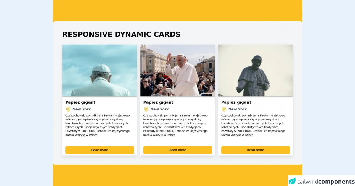
- The preview of News Post Responsive ui component.
- The source code of News Post Responsive ui component.
- How to create a News Post Responsive with Tailwind CSS?
- Conclusion
What is Tailwind CSS?
Tailwind CSS is a utility-first CSS framework that provides a set of pre-defined CSS classes to help you quickly build custom user interfaces. It is designed to be highly customizable and easy to use, making it a popular choice for front-end developers.
The description of News Post Responsive ui component
A News Post Responsive ui component is a user interface element that displays a news post in a responsive manner. It typically includes the title of the post, an image or video, a short summary, and a link to read more. The component should be designed to look good on all screen sizes, from mobile devices to desktop computers.
Why use Tailwind CSS to create a News Post Responsive ui component?
Tailwind CSS provides a set of pre-defined CSS classes that can be used to quickly build a responsive News Post component. This saves time and effort compared to writing custom CSS from scratch. Additionally, Tailwind CSS is highly customizable, so you can easily modify the styles to match your design requirements.
The preview of News Post Responsive ui component.
The News Post Responsive ui component typically includes the following elements:
- Title: The title of the news post.
- Image or video: A visual representation of the news post.
- Summary: A short summary of the news post.
- Read more link: A link to read the full news post.
Free download of the News Post Responsive's source code
The source code of News Post Responsive ui component.
To create a News Post Responsive ui component with Tailwind CSS, you can use the following HTML and CSS code:
<div class="max-w-sm rounded overflow-hidden shadow-lg">
  <img class="w-full" src="img/news-post.jpg" alt="News Post">
  <div class="px-6 py-4">
    <div class="font-bold text-xl mb-2">News Post Title</div>
    <p class="text-gray-700 text-base">Lorem ipsum dolor sit amet, consectetur adipiscing elit. Sed do eiusmod tempor incididunt ut labore et dolore magna aliqua.</p>
  </div>
  <div class="px-6 pt-4 pb-2">
    <a href="#" class="bg-blue-500 hover:bg-blue-700 text-white font-bold py-2 px-4 rounded-full">Read more</a>
  </div>
</div>
.max-w-sm {
  max-width: 20rem;
}

.rounded {
  border-radius: 0.25rem;
}

.overflow-hidden {
  overflow: hidden;
}

.shadow-lg {
  box-shadow: 0 10px 20px rgba(0, 0, 0, 0.19), 0 6px 6px rgba(0, 0, 0, 0.23);
}

.w-full {
  width: 100%;
}

.px-6 {
  padding-left: 1.5rem;
  padding-right: 1.5rem;
}

.py-4 {
  padding-top: 1rem;
  padding-bottom: 1rem;
}

.font-bold {
  font-weight: 700;
}

.text-xl {
  font-size: 1.25rem;
  line-height: 1.75rem;
}

.mb-2 {
  margin-bottom: 0.5rem;
}

.text-gray-700 {
  color: #4a5568;
}

.text-base {
  font-size: 1rem;
  line-height: 1.5rem;
}

.px-6 {
  padding-left: 1.5rem;
  padding-right: 1.5rem;
}

.pt-4 {
  padding-top: 1rem;
}

.pb-2 {
  padding-bottom: 0.5rem;
}

.bg-blue-500 {
  background-color: #4299e1;
}

.hover\:bg-blue-700:hover {
  background-color: #2b6cb0;
}

.text-white {
  color: #fff;
}

.font-bold {
  font-weight: 700;
}

.py-2 {
  padding-top: 0.5rem;
  padding-bottom: 0.5rem;
}

.px-4 {
  padding-left: 1rem;
  padding-right: 1rem;
}

.rounded-full {
  border-radius: 9999px;
}
<!-- Create By Joker Banny -->
<div class="min-h-screen bg-yellow-400 flex justify-center items-center py-20">
  <div class="container mx-auto p-12 bg-gray-100 rounded-xl">
    <h1 class="text-4xl uppercase font-bold from-current mb-8">Responsive dynamic cards</h1>
    <!-- Box-1 -->
    <div class="sm:grid sm:grid-cols-2 lg:grid-cols-3 gap-4 space-y-4 sm:space-y-0">
      <div class="bg-white">
        <div>
          <div class="shadow-lg hover:shadow-xl transform transition duration-500 hover:scale-105">
            <div>
              <img class="w-full" src="https://i.imgur.com/lmYYa2s.png" />
              <div class="px-4 py-2">
                <h1 class="text-xl font-gray-700 font-bold">Papież gigant</h1>
                <div class="flex space-x-2 mt-2">
                  <span>
                    <svg xmlns="http://www.w3.org/2000/svg" class="h-7 w-7 text-yellow-400" fill="none" viewBox="0 0 24 24" stroke="currentColor">
                      <path stroke-linecap="round" stroke-linejoin="round" stroke-width="2" d="M17.657 16.657L13.414 20.9a1.998 1.998 0 01-2.827 0l-4.244-4.243a8 8 0 1111.314 0z" />
                      <path stroke-linecap="round" stroke-linejoin="round" stroke-width="2" d="M15 11a3 3 0 11-6 0 3 3 0 016 0z" />
                    </svg>
                  </span>
                  <h3 class="text-lg text-gray-600 font-semibold mb-2">New York</h3>
                </div>
                <p class="text-sm tracking-normal">Częstochowski pomnik Jana Pawła II wyjątkowo interesująco wpisuje się w poprzemysłowy krajobraz tego miasta o mocnych lewicowych, robotniczych i socjalistycznych tradycjach. Powstały w 2013 roku, uchodzi za najwyższego Karola Wojtyłę w Polsce.</p>
                <button class="mt-12 w-full text-center bg-yellow-400 py-2 rounded-lg">Read more</button>
              </div>
            </div>
          </div>
        </div>
      </div>
      <!-- Box-2 -->
      <div class="bg-white">
        <div>
          <div class="shadow-lg hover:shadow-xl transform transition duration-500 hover:scale-105">
            <div>
              <img class="w-full" src="https://i.imgur.com/csPYilq.png" />
              <div class="px-4 py-2">
                <h1 class="text-xl font-gray-700 font-bold">Papież gigant</h1>
                <div class="flex space-x-2 mt-2">
                  <span>
                    <svg xmlns="http://www.w3.org/2000/svg" class="h-7 w-7 text-yellow-400" fill="none" viewBox="0 0 24 24" stroke="currentColor">
                      <path stroke-linecap="round" stroke-linejoin="round" stroke-width="2" d="M17.657 16.657L13.414 20.9a1.998 1.998 0 01-2.827 0l-4.244-4.243a8 8 0 1111.314 0z" />
                      <path stroke-linecap="round" stroke-linejoin="round" stroke-width="2" d="M15 11a3 3 0 11-6 0 3 3 0 016 0z" />
                    </svg>
                  </span>
                  <h3 class="text-lg text-gray-600 font-semibold mb-2">New York</h3>
                </div>
                <p class="text-sm tracking-normal">Częstochowski pomnik Jana Pawła II wyjątkowo interesująco wpisuje się w poprzemysłowy krajobraz tego miasta o mocnych lewicowych, robotniczych i socjalistycznych tradycjach. Powstały w 2013 roku, uchodzi za najwyższego Karola Wojtyłę w Polsce.</p>
                <button class="mt-12 w-full text-center bg-yellow-400 py-2 rounded-lg">Read more</button>
              </div>
            </div>
          </div>
        </div>
      </div>
      <!-- Box-3 -->
      <div class="bg-white">
        <div>
          <div class="shadow-lg hover:shadow-xl transform transition duration-500 hover:scale-105">
            <div>
              <img class="w-full" src="https://i.imgur.com/chvO4cX.png" />
              <div class="px-4 py-2">
                <h1 class="text-xl font-gray-700 font-bold">Papież gigant</h1>
                <div class="flex space-x-2 mt-2">
                  <span>
                    <svg xmlns="http://www.w3.org/2000/svg" class="h-7 w-7 text-yellow-400" fill="none" viewBox="0 0 24 24" stroke="currentColor">
                      <path stroke-linecap="round" stroke-linejoin="round" stroke-width="2" d="M17.657 16.657L13.414 20.9a1.998 1.998 0 01-2.827 0l-4.244-4.243a8 8 0 1111.314 0z" />
                      <path stroke-linecap="round" stroke-linejoin="round" stroke-width="2" d="M15 11a3 3 0 11-6 0 3 3 0 016 0z" />
                    </svg>
                  </span>
                  <h3 class="text-lg text-gray-600 font-semibold mb-2">New York</h3>
                </div>
                <p class="text-sm tracking-normal">Częstochowski pomnik Jana Pawła II wyjątkowo interesująco wpisuje się w poprzemysłowy krajobraz tego miasta o mocnych lewicowych, robotniczych i socjalistycznych tradycjach. Powstały w 2013 roku, uchodzi za najwyższego Karola Wojtyłę w Polsce.</p>
                <button class="mt-12 w-full text-center bg-yellow-400 py-2 rounded-lg">Read more</button>
              </div>
            </div>
          </div>
        </div>
      </div>
    </div>
  </div>
</div>
How to create a News Post Responsive with Tailwind CSS?
To create a News Post Responsive ui component with Tailwind CSS, follow these six easy steps:
- Create a new HTML file and add the necessary HTML markup for the News Post component.
<div class="max-w-sm rounded overflow-hidden shadow-lg">
  <img class="w-full" src="img/news-post.jpg" alt="News Post">
  <div class="px-6 py-4">
    <div class="font-bold text-xl mb-2">News Post Title</div>
    <p class="text-gray-700 text-base">Lorem ipsum dolor sit amet, consectetur adipiscing elit. Sed do eiusmod tempor incididunt ut labore et dolore magna aliqua.</p>
  </div>
  <div class="px-6 pt-4 pb-2">
    <a href="#" class="bg-blue-500 hover:bg-blue-700 text-white font-bold py-2 px-4 rounded-full">Read more</a>
  </div>
</div>
- Add the necessary CSS classes from Tailwind CSS to style the News Post component.
.max-w-sm {
  max-width: 20rem;
}

.rounded {
  border-radius: 0.25rem;
}

.overflow-hidden {
  overflow: hidden;
}

.shadow-lg {
  box-shadow: 0 10px 20px rgba(0, 0, 0, 0.19), 0 6px 6px rgba(0, 0, 0, 0.23);
}

.w-full {
  width: 100%;
}

.px-6 {
  padding-left: 1.5rem;
  padding-right: 1.5rem;
}

.py-4 {
  padding-top: 1rem;
  padding-bottom: 1rem;
}

.font-bold {
  font-weight: 700;
}

.text-xl {
  font-size: 1.25rem;
  line-height: 1.75rem;
}

.mb-2 {
  margin-bottom: 0.5rem;
}

.text-gray-700 {
  color: #4a5568;
}

.text-base {
  font-size: 1rem;
  line-height: 1.5rem;
}

.px-6 {
  padding-left: 1.5rem;
  padding-right: 1.5rem;
}

.pt-4 {
  padding-top: 1rem;
}

.pb-2 {
  padding-bottom: 0.5rem;
}

.bg-blue-500 {
  background-color: #4299e1;
}

.hover\:bg-blue-700:hover {
  background-color: #2b6cb0;
}

.text-white {
  color: #fff;
}

.font-bold {
  font-weight: 700;
}

.py-2 {
  padding-top: 0.5rem;
  padding-bottom: 0.5rem;
}

.px-4 {
  padding-left: 1rem;
  padding-right: 1rem;
}

.rounded-full {
  border-radius: 9999px;
}
Customize the HTML markup and CSS classes to match your design requirements.
Add the necessary images or videos to the News Post component.
Test the News Post component on different screen sizes to ensure it is responsive.
Publish the News Post component on your website.
Conclusion
In this article, we have discussed how to create a News Post Responsive ui component with Tailwind CSS in six easy steps. Tailwind CSS provides a set of pre-defined CSS classes that can be used to quickly build a responsive News Post component. By following the steps outlined in this article, you can easily create a News Post component that looks great on all screen sizes.