- Published on
How To Build A News With Tailwind CSS From Scratch
- What is Tailwind CSS?
- The description of News UI component
- Why use Tailwind CSS to create a News UI component?
- The preview of News UI component
- The source code of News UI component
- How to create a News with Tailwind CSS?
- Step 1: Set up the HTML structure
- Step 2: Style the HTML with Tailwind CSS classes
- Step 3: Add custom CSS to enhance the design
- Conclusion
What is Tailwind CSS?
Tailwind CSS is a utility-first CSS framework that allows developers to quickly and easily create custom designs without writing any CSS code. It provides a set of pre-defined classes that can be used to style HTML elements. Tailwind CSS is highly customizable and can be used to create any design style.
The description of News UI component
News UI component is a common feature in many websites and applications. It displays the latest news articles in a visually appealing way, making it easy for users to browse and read the news. The News UI component usually consists of a list of articles with a thumbnail image, title, description, and published date.
Why use Tailwind CSS to create a News UI component?
Tailwind CSS is a great choice for creating a News UI component because it provides a set of pre-defined classes that can be used to style the various elements of the component. This makes it easy to create a consistent and visually appealing design. Additionally, Tailwind CSS is highly customizable, so it is easy to modify the design to fit the specific needs of the project.
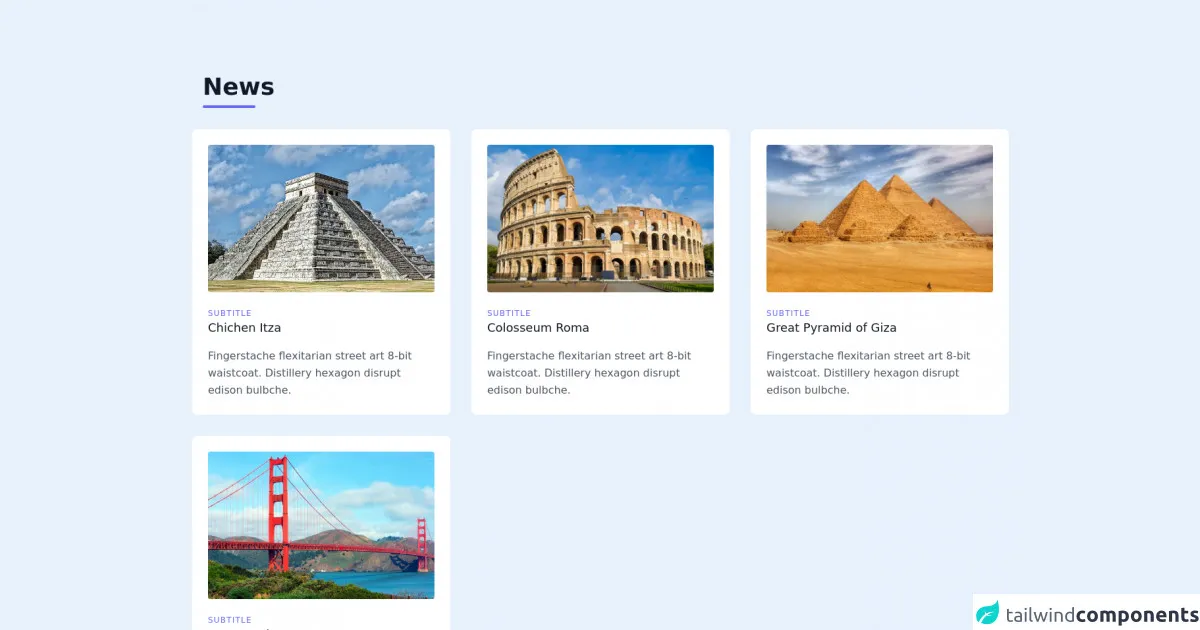
The preview of News UI component
To create a News UI component with Tailwind CSS, we will use a combination of HTML and CSS. The final result will be a visually appealing News UI component that displays the latest news articles.
Free download of the News's source code
The source code of News UI component
The source code for the News UI component is relatively simple and consists of HTML and CSS. We will use a combination of Tailwind CSS classes and custom CSS to create the design.
<section class="text-gray-600 body-font">
  <div class="container px-5 py-24 mx-auto max-w-7x1">
    <div class="flex flex-wrap w-full mb-4 p-4">
      <div class="w-full mb-6 lg:mb-0">
        <h1 class="sm:text-4xl text-5xl font-medium font-bold title-font mb-2 text-gray-900">News</h1>
        <div class="h-1 w-20 bg-indigo-500 rounded"></div>
      </div>
    </div>
    <div class="flex flex-wrap -m-4">
      <div class="xl:w-1/3 md:w-1/2 p-4">
        <div class="bg-white p-6 rounded-lg">
          <img class="lg:h-60 xl:h-56 md:h-64 sm:h-72 xs:h-72 h-72  rounded w-full object-cover object-center mb-6" src="https://kuyou.id/content/images/ctc_2020021605150668915.jpg" alt="Image Size 720x400">
          <h3 class="tracking-widest text-indigo-500 text-xs font-medium title-font">SUBTITLE</h3>
          <h2 class="text-lg text-gray-900 font-medium title-font mb-4">Chichen Itza</h2>
          <p class="leading-relaxed text-base">Fingerstache flexitarian street art 8-bit waistcoat. Distillery hexagon disrupt edison bulbche.</p>
        </div>
      </div>
      <div class="xl:w-1/3 md:w-1/2 p-4">
        <div class="bg-white p-6 rounded-lg">
          <img class="lg:h-60 xl:h-56 md:h-64 sm:h-72 xs:h-72 h-72 rounded w-full object-cover object-center mb-6" src="https://asset.kompas.com/crops/Pk_pN6vllxXy1RshYsEv74Q1BYA=/56x0:1553x998/750x500/data/photo/2021/06/16/60c8f9d68ff4a.jpg" alt="Image Size 720x400">
          <h3 class="tracking-widest text-indigo-500 text-xs font-medium title-font">SUBTITLE</h3>
          <h2 class="text-lg text-gray-900 font-medium title-font mb-4">Colosseum Roma</h2>
          <p class="leading-relaxed text-base">Fingerstache flexitarian street art 8-bit waistcoat. Distillery hexagon disrupt edison bulbche.</p>
        </div>
      </div>
      <div class="xl:w-1/3 md:w-1/2 p-4">
        <div class="bg-white p-6 rounded-lg">
          <img class="lg:h-60 xl:h-56 md:h-64 sm:h-72 xs:h-72 h-72 rounded w-full object-cover object-center mb-6" src="https://images.immediate.co.uk/production/volatile/sites/7/2019/07/33-GettyImages-154260931-216706f.jpg?quality=90&resize=768%2C574" alt="Image Size 720x400">
          <h3 class="tracking-widest text-indigo-500 text-xs font-medium title-font">SUBTITLE</h3>
          <h2 class="text-lg text-gray-900 font-medium title-font mb-4">Great Pyramid of Giza</h2>
          <p class="leading-relaxed text-base">Fingerstache flexitarian street art 8-bit waistcoat. Distillery hexagon disrupt edison bulbche.</p>
        </div>
      </div>
      <div class="xl:w-1/3 md:w-1/2 p-4">
        <div class="bg-white p-6 rounded-lg">
          <img class="lg:h-60 xl:h-56 md:h-64 sm:h-72 xs:h-72 h-72 rounded w-full object-cover object-center mb-6" src="https://wisatamuda.com/wp-content/uploads/2019/02/1-Golden-Gate-Bridge-Gambar-dan-Foto-Tempat-Wisata-Terbaik-di-San-Fransisco-USA.jpg" alt="Image Size 720x400">
          <h3 class="tracking-widest text-indigo-500 text-xs font-medium title-font">SUBTITLE</h3>
          <h2 class="text-lg text-gray-900 font-medium title-font mb-4">San Francisco</h2>
          <p class="leading-relaxed text-base">Fingerstache flexitarian street art 8-bit waistcoat. Distillery hexagon disrupt edison bulbche.</p>
        </div>
      </div>
    </div>
  </div>
</section>
How to create a News with Tailwind CSS?
To create a News UI component with Tailwind CSS, follow these steps:
Step 1: Set up the HTML structure
The first step is to set up the HTML structure for the News UI component. We will use an unordered list to display the articles. Each article will be contained within a list item element.
<ul class="grid grid-cols-1 md:grid-cols-2 lg:grid-cols-3 gap-4">
  <li class="bg-white rounded-lg shadow-md">
    <a href="#" class="block">
      <img src="https://via.placeholder.com/300x200" alt="Article Image" class="object-cover w-full h-48 rounded-t-lg">
      <div class="p-4">
        <h2 class="text-lg font-medium mb-2">Article Title</h2>
        <p class="text-gray-600 text-sm mb-2">Article Description</p>
        <p class="text-gray-400 text-sm">Published Date</p>
      </div>
    </a>
  </li>
  ...
</ul>
In the above code, we have set up an unordered list with a grid layout. The grid has one column on small screens, two columns on medium screens, and three columns on large screens. We have also set a gap of 4 between the grid items.
Each list item contains an anchor tag that wraps the article content. The anchor tag has a block display to fill the entire list item. Inside the anchor tag, we have an image, article title, description, and published date.
Step 2: Style the HTML with Tailwind CSS classes
Now that we have set up the HTML structure, we can start styling it using Tailwind CSS classes. We will use a combination of pre-defined classes and custom CSS to create the design.
/* Set the background color of the list item */
.bg-white {
  background-color: #fff;
}

/* Set the border radius of the list item */
.rounded-lg {
  border-radius: 0.5rem;
}

/* Add a shadow to the list item */
.shadow-md {
  box-shadow: 0px 4px 6px rgba(0, 0, 0, 0.1);
}

/* Set the object-fit of the image */
.object-cover {
  object-fit: cover;
}

/* Set the font size and color of the article title */
.text-lg {
  font-size: 1.125rem;
  color: #333;
}

/* Set the font size and color of the article description */
.text-sm {
  font-size: 0.875rem;
  color: #666;
}

/* Set the font size and color of the published date */
.text-gray-400 {
  font-size: 0.75rem;
  color: #999;
}
In the above code, we have used Tailwind CSS classes to style the various elements of the News UI component. We have set the background color, border radius, and shadow of the list item. We have also set the object-fit of the image and the font size and color of the article title, description, and published date.
Step 3: Add custom CSS to enhance the design
Finally, we can add custom CSS to enhance the design of the News UI component. We will add a hover effect to the list item and adjust the spacing of the elements.
/* Add a hover effect to the list item */
li:hover {
  transform: translateY(-0.25rem);
  transition: all 0.2s ease-in-out;
}

/* Adjust the spacing of the elements */
.block {
  margin: -1rem;
  padding: 1rem;
}

/* Adjust the spacing of the article title */
.mb-2 {
  margin-bottom: 0.5rem;
}
In the above code, we have added a hover effect to the list item that lifts it up slightly when hovered over. We have also adjusted the spacing of the elements to create a more visually appealing design.
Conclusion
In this article, we have learned how to create a News UI component with Tailwind CSS. We have seen how Tailwind CSS can be used to quickly and easily style HTML elements, and how it can be customized to fit the specific needs of the project. By following the steps outlined in this article, you can create a visually appealing News UI component for your website or application.