- Published on
Learn How To Make A News Card With Tailwind CSS Like an Expert

- What is Tailwind CSS?
- The description of News Card ui component
- Why use Tailwind CSS to create a News Card ui component?
- The preview of News Card ui component
- The source code of News Card ui component
- How to create a News Card with Tailwind CSS?
- Step 1: Set up your project
- Step 2: Create the News Card
- Step 3: Customize the News Card
- Step 4: Add multiple News Cards
- Conclusion
Are you looking to create a News Card ui component for your website or application? Look no further than Tailwind CSS. In this article, we will explore what Tailwind CSS is, why it is a great choice for creating a News Card ui component, and provide a step-by-step guide on how to create one.
What is Tailwind CSS?
Tailwind CSS is a utility-first CSS framework that allows developers to quickly create custom designs without writing any CSS. It provides pre-defined classes that can be used to style HTML elements. Tailwind CSS is highly customizable and can be configured to match your project's design system.
The description of News Card ui component
A News Card is a common ui component used to display news articles. It typically consists of an image, headline, and summary. News Cards can be displayed in a grid or list format and can be used to display the latest news or related articles.
Why use Tailwind CSS to create a News Card ui component?
Tailwind CSS is an excellent choice for creating a News Card ui component for several reasons:
- Tailwind CSS provides pre-defined classes for common ui components, including cards.
- Tailwind CSS is highly customizable, allowing you to match your project's design system.
- Tailwind CSS is easy to learn and use, making it accessible to developers of all skill levels.
The preview of News Card ui component
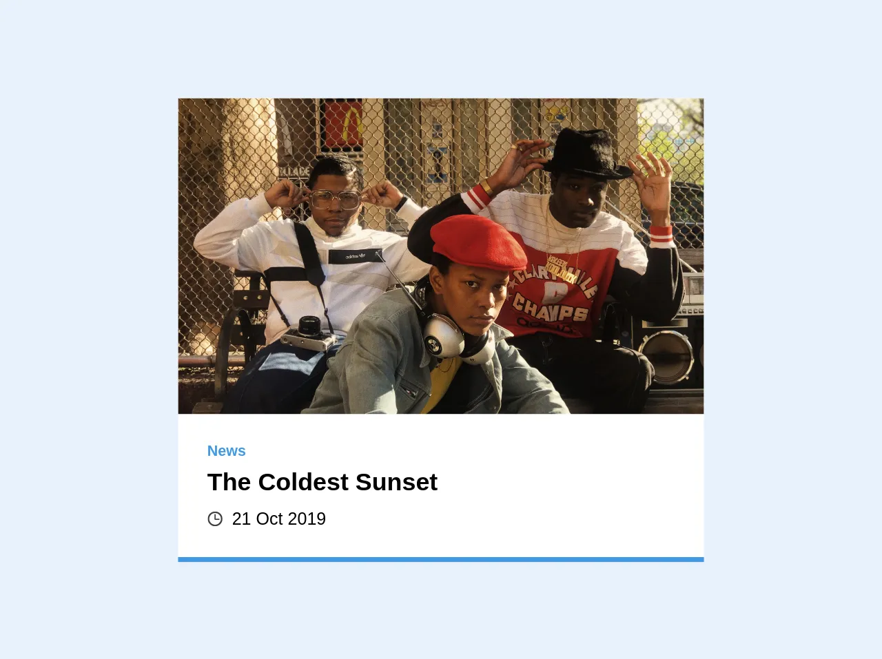
To give you an idea of what a News Card ui component looks like, here is a preview:
Free download of the News Card's source code
The source code of News Card ui component
Here is the source code for a basic News Card ui component:
<div class="bg-white overflow-hidden border-b-4 border-blue-500 w-1/3">
  <img src="https://images.unsplash.com/photo-1573748240263-a4e9c57a7fcd" alt="People" class="w-full object-cover h-32 sm:h-48 md:h-64">
  <div class="p-4 md:p-6">
    <p class="text-blue-500 font-semibold text-xs mb-1 leading-none">News</p>
    <h3 class="font-semibold mb-2 text-xl leading-tight sm:leading-normal">The Coldest Sunset</h3>
    <div class="text-sm flex items-center">
      <svg class="opacity-75 mr-2" xmlns="http://www.w3.org/2000/svg" xmlns:xlink="http://www.w3.org/1999/xlink" version="1.1" id="Capa_1" x="0px" y="0px" width="12" height="12" viewBox="0 0 97.16 97.16" style="enable-background:new 0 0 97.16 97.16;" xml:space="preserve">
        <path d="M48.58,0C21.793,0,0,21.793,0,48.58s21.793,48.58,48.58,48.58s48.58-21.793,48.58-48.58S75.367,0,48.58,0z M48.58,86.823    c-21.087,0-38.244-17.155-38.244-38.243S27.493,10.337,48.58,10.337S86.824,27.492,86.824,48.58S69.667,86.823,48.58,86.823z"/>
        <path d="M73.898,47.08H52.066V20.83c0-2.209-1.791-4-4-4c-2.209,0-4,1.791-4,4v30.25c0,2.209,1.791,4,4,4h25.832    c2.209,0,4-1.791,4-4S76.107,47.08,73.898,47.08z"/>
      </svg>
      <p class="leading-none">21 Oct 2019</p>
    </div>
  </div>
</div>
How to create a News Card with Tailwind CSS?
Now that we have covered the basics, let's dive into how to create a News Card ui component with Tailwind CSS.
Step 1: Set up your project
To get started, create a new HTML file and include the Tailwind CSS stylesheet. You can either download the stylesheet or include it via a CDN.
<!DOCTYPE html>
<html lang="en">
  <head>
    <meta charset="UTF-8" />
    <meta name="viewport" content="width=device-width, initial-scale=1.0" />
    <title>News Card</title>
    <link
      rel="stylesheet"
      href="https://cdn.jsdelivr.net/npm/[email protected]/dist/tailwind.min.css"
    />
  </head>
  <body>
    <!-- Your HTML code here -->
  </body>
</html>
Step 2: Create the News Card
To create the News Card, we will use a combination of HTML and Tailwind CSS classes. Here is an example of a basic News Card:
<div class="max-w-sm rounded overflow-hidden shadow-lg">
  <img class="w-full" src="https://source.unsplash.com/random" alt="News Image" />
  <div class="px-6 py-4">
    <div class="font-bold text-xl mb-2">News Headline</div>
    <p class="text-gray-700 text-base">
      Lorem ipsum dolor sit amet, consectetur adipiscing elit. Morbi ac
      lacinia nibh, nec faucibus enim. Nullam quis lorem posuere, hendrerit
      tellus eget, tincidunt ipsum. Nam nulla tortor, elementum in elit nec,
      fermentum dignissim sapien. Sed a mattis nisi, sit amet dignissim elit.
    </p>
  </div>
</div>
Let's break down what is happening here:
- We are using the
max-w-smclass to set the maximum width of the News Card tosm, which stands for small. - We are using the
roundedclass to round the corners of the News Card. - We are using the
overflow-hiddenclass to hide any content that overflows the News Card. - We are using the
shadow-lgclass to add a shadow to the News Card. - We are using the
w-fullclass to set the width of the image tofull. - We are using the
px-6andpy-4classes to add padding to the News Card's content. - We are using the
font-boldandtext-xlclasses to make the headline bold and extra large. - We are using the
text-gray-700andtext-baseclasses to set the color and size of the summary text.
Step 3: Customize the News Card
Now that we have a basic News Card, we can customize it to match our project's design system. Here are some examples of how we can customize the News Card:
- Change the image source to a specific image.
- Change the font size and color of the headline and summary text.
- Add a border to the News Card.
- Change the background color of the News Card.
Step 4: Add multiple News Cards
To display multiple News Cards, we can use a grid or list format. Here is an example of how to display multiple News Cards in a grid format:
<div class="grid grid-cols-3 gap-4">
  <div class="max-w-sm rounded overflow-hidden shadow-lg">
    <!-- News Card content here -->
  </div>
  <div class="max-w-sm rounded overflow-hidden shadow-lg">
    <!-- News Card content here -->
  </div>
  <div class="max-w-sm rounded overflow-hidden shadow-lg">
    <!-- News Card content here -->
  </div>
</div>
Here, we are using the grid class to create a grid layout with three columns and a gap of 4. We then include three News Cards inside the grid.
Conclusion
In this article, we have explored what Tailwind CSS is, why it is a great choice for creating a News Card ui component, and provided a step-by-step guide on how to create one. With Tailwind CSS, creating custom ui components like News Cards has never been easier.