- Published on
Ultimate Guide: Build A Payment Success With Tailwind CSS
- What is Tailwind CSS?
- The description of payment success UI component
- Why use Tailwind CSS to create a payment success UI component?
- The preview of payment success UI component.
- The source code of payment success UI component.
- How to create a payment success with Tailwind CSS?
- Step 1: Set up your project
- Step 2: Create the HTML structure
- Step 3: Style the UI component with Tailwind CSS
- Conclusion
As a FrontEnd technology blogger, I'm excited to share with you how to build a payment success UI component with Tailwind CSS. In this article, we will go through the following topics:
- What is Tailwind CSS?
- The description of payment success UI component
- Why use Tailwind CSS to create a payment success UI component?
- The preview of payment success UI component.
- The source code of payment success UI component.
- How to create a payment success with Tailwind CSS?
- Conclusion.
What is Tailwind CSS?
Tailwind CSS is a utility-first CSS framework that provides a set of pre-defined CSS classes to help you build custom designs quickly. It allows you to create complex UI components with minimal CSS code. With Tailwind CSS, you can focus on building your application's functionality instead of spending time on styling.
The description of payment success UI component
A payment success UI component is a part of the checkout process that appears after a successful payment. It provides feedback to the user that their payment was successful and displays relevant information such as the order number, payment amount, and date of purchase.
Why use Tailwind CSS to create a payment success UI component?
Tailwind CSS provides a set of pre-defined CSS classes that can be used to create responsive and customizable UI components quickly. It also allows you to customize the design of your UI components without writing any CSS code. This makes it an ideal choice for building a payment success UI component.
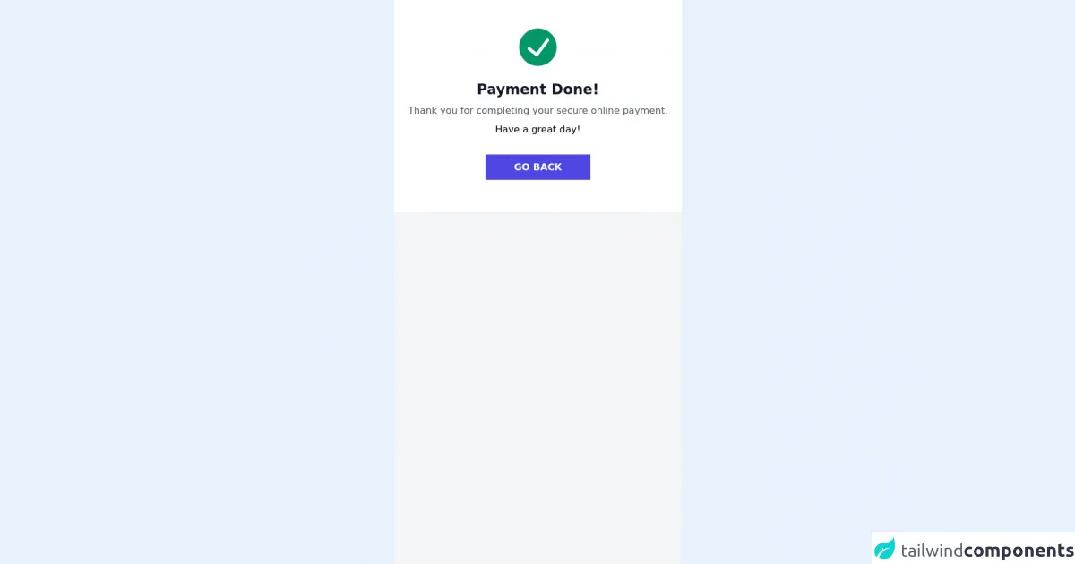
The preview of payment success UI component.
To give you an idea of what the payment success UI component looks like, here is a preview:
Free download of the payment success's source code
The source code of payment success UI component.
Here is the source code of the payment success UI component:
<div class="bg-gray-100 h-screen">
      <div class="bg-white p-6  md:mx-auto">
        <svg viewBox="0 0 24 24" class="text-green-600 w-16 h-16 mx-auto my-6">
            <path fill="currentColor"
                d="M12,0A12,12,0,1,0,24,12,12.014,12.014,0,0,0,12,0Zm6.927,8.2-6.845,9.289a1.011,1.011,0,0,1-1.43.188L5.764,13.769a1,1,0,1,1,1.25-1.562l4.076,3.261,6.227-8.451A1,1,0,1,1,18.927,8.2Z">
            </path>
        </svg>
        <div class="text-center">
            <h3 class="md:text-2xl text-base text-gray-900 font-semibold text-center">Payment Done!</h3>
            <p class="text-gray-600 my-2">Thank you for completing your secure online payment.</p>
            <p> Have a great day!  </p>
            <div class="py-10 text-center">
                <a href="#" class="px-12 bg-indigo-600 hover:bg-indigo-500 text-white font-semibold py-3">
                    GO BACK
               </a>
            </div>
        </div>
    </div>
  </div>
How to create a payment success with Tailwind CSS?
Now, let's dive into the steps to create a payment success UI component with Tailwind CSS.
Step 1: Set up your project
To get started, you need to set up a new project and install Tailwind CSS. You can do this by following the official Tailwind CSS documentation.
Step 2: Create the HTML structure
Next, you need to create the HTML structure for the payment success UI component. Here's an example:
<div class="bg-white p-6 rounded-lg shadow-md">
  <h2 class="text-lg font-medium mb-4">Payment successful</h2>
  <p class="text-gray-600 mb-2">Order number: <span class="font-medium">#123456</span></p>
  <p class="text-gray-600 mb-2">Payment amount: <span class="font-medium">$99.99</span></p>
  <p class="text-gray-600 mb-2">Date of purchase: <span class="font-medium">2022-01-01</span></p>
  <button class="bg-blue-500 hover:bg-blue-600 text-white font-medium py-2 px-4 rounded-lg mt-4">Continue shopping</button>
</div>
Step 3: Style the UI component with Tailwind CSS
Finally, you can style the payment success UI component with Tailwind CSS. Here's an example:
/* Set the font family */
body {
  font-family: 'Open Sans', sans-serif;
}

/* Center the UI component */
.container {
  display: flex;
  justify-content: center;
  align-items: center;
  height: 100vh;
}

/* Style the UI component */
.bg-white {
  width: 400px;
}

.font-medium {
  font-weight: 500;
}

.text-lg {
  font-size: 1.125rem;
}

.text-gray-600 {
  color: #718096;
}

.mb-2 {
  margin-bottom: 0.5rem;
}

.mb-4 {
  margin-bottom: 1rem;
}

.py-2 {
  padding-top: 0.5rem;
  padding-bottom: 0.5rem;
}

.px-4 {
  padding-left: 1rem;
  padding-right: 1rem;
}

.mt-4 {
  margin-top: 1rem;
}
With these steps, you have successfully created a payment success UI component with Tailwind CSS.
Conclusion
In this article, we have gone through the steps to build a payment success UI component with Tailwind CSS. We have discussed what Tailwind CSS is, why it is a good choice for building UI components, and provided a preview and source code for the payment success UI component. By following these steps, you can create custom UI components quickly and easily with Tailwind CSS.