- Published on
Imagine You Build A Header With Tailwind CSS Like An Expert. Follow These 6 Steps To Get There
- What is Tailwind CSS?
- The description of Header ui component
- Why use Tailwind CSS to create a Header ui component?
- The preview of Header ui component
- The source code of Header ui component
- How to create a Header with Tailwind CSS?
- Step 1: Create a container for your header
- Step 2: Add your logo
- Step 3: Add your navigation menu
- Step 4: Style your navigation menu
- Step 5: Add other elements
- Step 6: Make it responsive
- Conclusion
If you're a FrontEnd developer, you know how important it is to create a good user interface (UI) for your website. One of the most important components of a UI is the header. The header is the first thing that users see when they visit your website, so it's important to make it look good and be easy to use. In this article, we'll show you how to create a header with Tailwind CSS like an expert.
What is Tailwind CSS?
Tailwind CSS is a utility-first CSS framework that helps you create responsive and customizable UI components quickly and easily. It provides a set of pre-defined classes that you can use to style your HTML elements without writing any CSS code. With Tailwind CSS, you can create complex UI components with just a few lines of code.
The description of Header ui component
The header is the top section of a website that usually contains the logo, navigation menu, and other important information. It's the first thing that users see when they visit your website, so it's important to make it look good and be easy to use. A good header should be easy to navigate and provide users with the information they need to find what they're looking for.
Why use Tailwind CSS to create a Header ui component?
Tailwind CSS is a great choice for creating a header UI component because it provides a set of pre-defined classes that you can use to style your HTML elements quickly and easily. With Tailwind CSS, you don't have to write any CSS code, which saves you time and makes your code more maintainable. Additionally, Tailwind CSS provides a responsive design system that allows you to create a header that looks great on all devices.
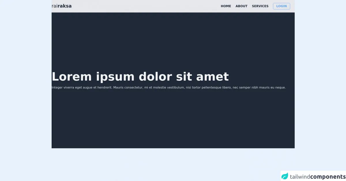
The preview of Header ui component
To create a header with Tailwind CSS, you'll need to follow a few steps. First, you'll need to create a container for your header. Inside the container, you'll add your logo and navigation menu. You can also add other elements, such as a search bar or social media icons. Here's a preview of what your header might look like:
Free download of the Header's source code
The source code of Header ui component
To create a header with Tailwind CSS, you'll need to write some HTML and add Tailwind CSS classes to style your elements. Here's an example of what your HTML might look like:
<div class="w-full h-screen">
    <!-- nav bar -->
    <nav class="sticky w-full h-auto bg-gray-200 px-8 sm:px-0">
        <div class="container flex justify-between py-4 mx-auto">
            <label class="text-2xl font-light text-gray-800">
                rai<span class="font-bold">raksa</span>
            </label>
            <ul class="flex text-gray-800 items-center">
                <li class="uppercase font-semibold mr-6">
                    <a href='#' class='hover:text-blue-600 transition'>
                        Home
                    </a>
                </li>
                <li class="uppercase font-semibold mr-6">
                    <a href='#' class='hover:text-blue-600 transition'>
                        About
                    </a>
                </li>
                <li class="uppercase font-semibold mr-6">
                    <a href='#' class='hover:text-blue-600 transition'>
                        Services
                    </a>
                </li>
                <li class="uppercase font-semibold mr-6 rounded-md border border-blue-400 text-blue-400 hover:text-gray-200 hover:bg-blue-400 transition">
                    <a href='#' class='block px-4 py-1'>
                        Login
                    </a>
                </li>
            </ul>
        </div>
    </nav>
    <section class="w-full h-3/4 bg-gray-800">
        <div class="container w-full h-full px-8 sm:px-0 mx-auto flex flex-col justify-center">
            <h1 class="text-6xl text-gray-100 font-bold">Lorem ipsum dolor sit amet</h1>
            <p class="text-gray-200 mt-4">Integer viverra eget augue et hendrerit. Mauris consectetur, mi et molestie vestibulum, nisi tortor pellentesque libero, nec semper nibh mauris eu neque.</p>
        </div>
    </section>
</div>
How to create a Header with Tailwind CSS?
Now that you know why Tailwind CSS is a great choice for creating a header UI component, let's look at how to create a header with Tailwind CSS. Follow these six steps to get there:
Step 1: Create a container for your header
The first step is to create a container for your header. You can use a div element with a class of "container" to create a container that's centered on the page. Here's what your HTML might look like:
<div class="container">
  <!-- Your header content goes here -->
</div>
Step 2: Add your logo
Next, you'll want to add your logo to the header. You can use an img element with a class of "h-10" to set the height of your logo to 10rem. Here's what your HTML might look like:
<div class="container">
  <img src="logo.png" alt="Logo" class="h-10">
  <!-- Your header content goes here -->
</div>
Step 3: Add your navigation menu
After you've added your logo, you'll want to add your navigation menu. You can use an unordered list element with a class of "flex" to create a horizontal navigation menu. Here's what your HTML might look like:
<div class="container">
  <img src="logo.png" alt="Logo" class="h-10">
  <ul class="flex">
    <li><a href="#">Home</a></li>
    <li><a href="#">About</a></li>
    <li><a href="#">Contact</a></li>
  </ul>
</div>
Step 4: Style your navigation menu
Now that you've added your navigation menu, you'll want to style it. You can use Tailwind CSS classes to style your navigation menu. For example, you can use the "text-white" class to set the text color to white, and the "px-4" class to add some padding to each menu item. Here's what your HTML might look like:
<div class="container">
  <img src="logo.png" alt="Logo" class="h-10">
  <ul class="flex">
    <li><a href="#" class="text-white px-4">Home</a></li>
    <li><a href="#" class="text-white px-4">About</a></li>
    <li><a href="#" class="text-white px-4">Contact</a></li>
  </ul>
</div>
Step 5: Add other elements
You can also add other elements to your header, such as a search bar or social media icons. You can use Tailwind CSS classes to style these elements. For example, you can use the "w-1/2" class to set the width of a search bar to half the width of the container. Here's what your HTML might look like:
<div class="container">
  <img src="logo.png" alt="Logo" class="h-10">
  <ul class="flex">
    <li><a href="#" class="text-white px-4">Home</a></li>
    <li><a href="#" class="text-white px-4">About</a></li>
    <li><a href="#" class="text-white px-4">Contact</a></li>
  </ul>
  <form class="w-1/2">
    <input type="text" placeholder="Search" class="bg-gray-200 rounded-full px-4 py-2 w-full">
  </form>
</div>
Step 6: Make it responsive
Finally, you'll want to make your header responsive. You can use Tailwind CSS classes to make your header look great on all devices. For example, you can use the "flex-col" class to stack your logo and navigation menu on top of each other on small screens. Here's what your HTML might look like:
<div class="container">
  <div class="flex flex-col md:flex-row md:items-center md:justify-between">
    <img src="logo.png" alt="Logo" class="h-10">
    <ul class="flex">
      <li><a href="#" class="text-white px-4">Home</a></li>
      <li><a href="#" class="text-white px-4">About</a></li>
      <li><a href="#" class="text-white px-4">Contact</a></li>
    </ul>
    <form class="w-full md:w-1/2">
      <input type="text" placeholder="Search" class="bg-gray-200 rounded-full px-4 py-2 w-full">
    </form>
  </div>
</div>
And that's it! With just a few lines of code, you've created a header with Tailwind CSS like an expert.
Conclusion
In this article, we've shown you how to create a header with Tailwind CSS like an expert. We've explained why Tailwind CSS is a great choice for creating a header UI component, and we've provided a step-by-step guide to help you get started. With Tailwind CSS, you can create complex UI components quickly and easily, without writing any CSS code. So why not give it a try? Your users will thank you for it.