- Published on
Advanced Guide: Make A Navigation Bar With Tailwind CSS
- What is Tailwind CSS?
- The description of navigation bar ui component
- Why use Tailwind CSS to create a navigation bar ui component?
- The preview of navigation bar ui component
- The source code of navigation bar ui component
- How to create a navigation bar with Tailwind CSS?
- Conclusion
What is Tailwind CSS?
Tailwind CSS is a utility-first CSS framework that provides a set of pre-defined CSS classes to help developers quickly build user interfaces. It is highly customizable and can be used with any JavaScript framework. With Tailwind CSS, you can easily create responsive designs and complex layouts without writing custom CSS.
The description of navigation bar ui component
The navigation bar is a common UI component that is used to provide easy access to the different sections of a website or application. It typically contains links to the most important pages, such as the home page, about page, and contact page. The navigation bar is usually located at the top of the page and is visible on all pages of the website or application.
Why use Tailwind CSS to create a navigation bar ui component?
Tailwind CSS provides a set of pre-defined CSS classes that can be used to create a navigation bar quickly and easily. With Tailwind CSS, you can customize the look and feel of the navigation bar without writing custom CSS. This saves time and makes it easier to maintain the code.
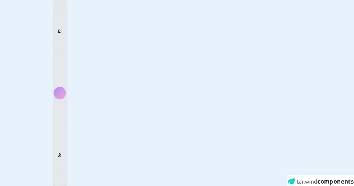
The preview of navigation bar ui component
To create a navigation bar with Tailwind CSS, we will use the following classes:
bg-gray-800: sets the background color of the navigation bar to gray.text-white: sets the text color of the navigation bar to white.flex: sets the display property of the navigation bar to flex.justify-between: aligns the items in the navigation bar to the left and right.py-4: adds padding to the top and bottom of the navigation bar.px-6: adds padding to the left and right of the navigation bar.
Free download of the navigation bar's source code
The source code of navigation bar ui component
To create a navigation bar with Tailwind CSS, we will use the following HTML code:
<nav class="bg-gray-800">
  <div class="max-w-7xl mx-auto px-2 sm:px-6 lg:px-8">
    <div class="relative flex items-center justify-between h-16">
      <div class="flex-1 flex items-center justify-center sm:items-stretch sm:justify-start">
        <div class="flex-shrink-0">
          <img class="h-8 w-8" src="https://tailwindui.com/img/logos/workflow-mark-indigo-500.svg" alt="Workflow">
        </div>
        <div class="hidden sm:block sm:ml-6">
          <div class="flex space-x-4">
            <a href="#" class="px-3 py-2 rounded-md text-sm font-medium text-white bg-gray-900">Dashboard</a>

            <a href="#" class="px-3 py-2 rounded-md text-sm font-medium text-white hover:text-gray-300 hover:bg-gray-700">Team</a>

            <a href="#" class="px-3 py-2 rounded-md text-sm font-medium text-white hover:text-gray-300 hover:bg-gray-700">Projects</a>

            <a href="#" class="px-3 py-2 rounded-md text-sm font-medium text-white hover:text-gray-300 hover:bg-gray-700">Calendar</a>
          </div>
        </div>
      </div>
      <div class="hidden sm:block">
        <div class="flex items-center">
          <button class="bg-gray-800 p-1 rounded-full text-gray-400 hover:text-white focus:outline-none focus:ring-2 focus:ring-offset-2 focus:ring-offset-gray-800 focus:ring-white">
            <span class="sr-only">View notifications</span>
            <!-- Heroicon name: bell -->
            <svg class="h-6 w-6" xmlns="http://www.w3.org/2000/svg" fill="none" viewBox="0 0 24 24" stroke="currentColor" aria-hidden="true">
              <path stroke-linecap="round" stroke-linejoin="round" stroke-width="2" d="M13 10V3L4 14h7v7l9-11h-7z" />
            </svg>
          </button>

          <div class="ml-3 relative">
            <div>
              <button class="max-w-xs bg-gray-800 rounded-full flex items-center text-sm focus:outline-none focus:ring-2 focus:ring-offset-2 focus:ring-offset-gray-800 focus:ring-white" id="user-menu" aria-haspopup="true">
                <span class="sr-only">Open user menu</span>
                <img class="h-8 w-8 rounded-full" src="https://avatars.githubusercontent.com/u/369274?v=4" alt="">
              </button>
            </div>

            <!--
              Profile dropdown panel, show/hide based on dropdown state.

              Entering: "transition ease-out duration-100"
                From: "transform opacity-0 scale-95"
                To: "transform opacity-100 scale-100"
              Leaving: "transition ease-in duration-75"
                From: "transform opacity-100 scale-100"
                To: "transform opacity-0 scale-95"
            -->
            <div class="origin-top-right absolute right-0 mt-2 w-48 rounded-md shadow-lg py-1 bg-white ring-1 ring-black ring-opacity-5" role="menu" aria-orientation="vertical" aria-labelledby="user-menu">
              <a href="#" class="block px-4 py-2 text-sm text-gray-700 hover:bg-gray-100" role="menuitem">Your Profile</a>

              <a href="#" class="block px-4 py-2 text-sm text-gray-700 hover:bg-gray-100" role="menuitem">Settings</a>

              <a href="#" class="block px-4 py-2 text-sm text-gray-700 hover:bg-gray-100" role="menuitem">Sign out</a>
            </div>
          </div>
        </div>
      </div>
      <div class="-mr-2 flex sm:hidden">
        <!-- Mobile menu button -->
        <button type="button" class="bg-gray-800 inline-flex items-center justify-center p-2 rounded-md text-gray-400 hover:text-white hover:bg-gray-700 focus:outline-none focus:ring-2 focus:ring-offset-2 focus:ring-offset-gray-800 focus:ring-white" aria-controls="mobile-menu" aria-expanded="false">
          <span class="sr-only">Open main menu</span>
          <!--
            Heroicon name: menu

            Menu open: "hidden", Menu closed: "block"
          -->
          <svg class="block h-6 w-6" xmlns="http://www.w3.org/2000/svg" fill="none" viewBox="0 0 24 24" stroke="currentColor" aria-hidden="true">
            <path stroke-linecap="round" stroke-linejoin="round" stroke-width="2" d="M4 6h16M4 12h16M4 18h16" />
          </svg>
          <!--
            Heroicon name: x

            Menu open: "block", Menu closed: "hidden"
          -->
          <svg class="hidden h-6 w-6" xmlns="http://www.w3.org/2000/svg" fill="none" viewBox="0 0 24 24" stroke="currentColor" aria-hidden="true">
            <path stroke-linecap="round" stroke-linejoin="round" stroke-width="2" d="M6 18L18 6M6 6l12 12" />
          </svg>
        </button>
      </div>
    </div>
  </div>

  <!-- Mobile menu, show/hide based on menu state. -->
  <div class="sm:hidden" id="mobile-menu">
    <div class="px-2 pt-2 pb-3 space-y-1">
      <a href="#" class="block px-3 py-2 rounded-md text-base font-medium text-white bg-gray-900">Dashboard</a>

      <a href="#" class="block px-3 py-2 rounded-md text-base font-medium text-white hover:text-gray-300 hover:bg-gray-700">Team</a>

      <a href="#" class="block px-3 py-2 rounded-md text-base font-medium text-white hover:text-gray-300 hover:bg-gray-700">Projects</a>

      <a href="#" class="block px-3 py-2 rounded-md text-base font-medium text-white hover:text-gray-300 hover:bg-gray-700">Calendar</a>
    </div>
  </div>
</nav>
<div class="bg-gray-200 static uppercase font-semibold rounded-lg flex md:flex-col md:ml-1 shadow-lg border-gray-600 justify-around md:h-screen md:w-16 fixed w-screen bottom-0">
    <div class="md:p-5 p-3 delay-75 duration-500 ease-in-out transform hover:scale-125 hover:-rotate-12">
        <svg xmlns="http://www.w3.org/2000/svg" class="text-black h-6 w-6" fill="none" viewBox="0 0 24 24" stroke="currentColor">
            <path strokeLinecap="round" strokeLinejoin="round" stroke-width="2" d="M3 12l2-2m0 0l7-7 7 7M5 10v10a1 1 0 001 1h3m10-11l2 2m-2-2v10a1 1 0 01-1 1h-3m-6 0a1 1 0 001-1v-4a1 1 0 011-1h2a1 1 0 011 1v4a1 1 0 001 1m-6 0h6" />
        </svg>
    </div>
    <div class="hover:shadow-md p-4 rounded-full duration-1000 ease-in-out transform hover:scale-125 delay-200 hover:rotate-180 text-3xl font-bold text-center bg-gradient-to-br from-purple-400 to-pink-300 md:p-5 ">
        <svg xmlns="http://www.w3.org/2000/svg" class="text-black h-6 w-6" fill="none" viewBox="0 0 24 24" stroke="currentColor">
            <path strokeLinecap="round" strokeLinejoin="round" stroke-width="2" d="M12 6v6m0 0v6m0-6h6m-6 0H6" />
        </svg>
    </div>
    <div class="md:p-5 p-3 delay-75 duration-500 ease-in-out transform hover:scale-125 hover:-rotate-12">
        <svg xmlns="http://www.w3.org/2000/svg" class="text-black h-6 w-6" fill="none" viewBox="0 0 24 24" stroke="currentColor">
           <path strokeLinecap="round" strokeLinejoin="round" stroke-width="2" d="M16 7a4 4 0 11-8 0 4 4 0 018 0zM12 14a7 7 0 00-7 7h14a7 7 0 00-7-7z" />
        </svg>
    </div>
</div>
How to create a navigation bar with Tailwind CSS?
To create a navigation bar with Tailwind CSS, follow these steps:
- Create a new HTML file and add the above HTML code.
- Add the Tailwind CSS CDN to the head of your HTML file:
<head>
  <link href="https://cdn.jsdelivr.net/npm/tailwindcss@latest/dist/tailwind.min.css" rel="stylesheet">
</head>
- Save the file and open it in your web browser.
You should now see a navigation bar at the top of your page.
Conclusion
In this article, we have learned how to create a navigation bar with Tailwind CSS. We have seen how Tailwind CSS provides pre-defined CSS classes that can be used to create complex UI components quickly and easily. With Tailwind CSS, you can customize the look and feel of your navigation bar without writing custom CSS. This saves time and makes it easier to maintain your code.