- Published on
6 Easy Ways To Build A NavBar With Tailwind CSS
- What is Tailwind CSS?
- The description of NavBar ui component
- Why use Tailwind CSS to create a NavBar ui component?
- The preview of NavBar ui component
- The source code of NavBar ui component
- How to create a NavBar with Tailwind CSS?
- Conclusion
As a FrontEnd technology blogger, you may have heard of Tailwind CSS. It is a utility-first CSS framework that helps you build custom designs quickly. In this article, we will show you how to build a NavBar using Tailwind CSS in six easy ways.
What is Tailwind CSS?
Tailwind CSS is a CSS framework that provides a set of pre-defined utility classes to help you build custom designs quickly. It is different from other CSS frameworks like Bootstrap and Foundation, which provide pre-built components. With Tailwind CSS, you can create any design you want by combining utility classes.
The description of NavBar ui component
The NavBar is a user interface component that is commonly used in web applications. It is a horizontal bar that contains links to different pages of the application. The NavBar is usually placed at the top of the page, and it helps users navigate the application easily.
Why use Tailwind CSS to create a NavBar ui component?
Tailwind CSS provides a set of pre-defined utility classes that make it easy to create a NavBar. You can use classes like bg-gray-900 for the background color, text-white for the text color, and px-4 for the padding. With Tailwind CSS, you can create a custom design for your NavBar quickly and easily.
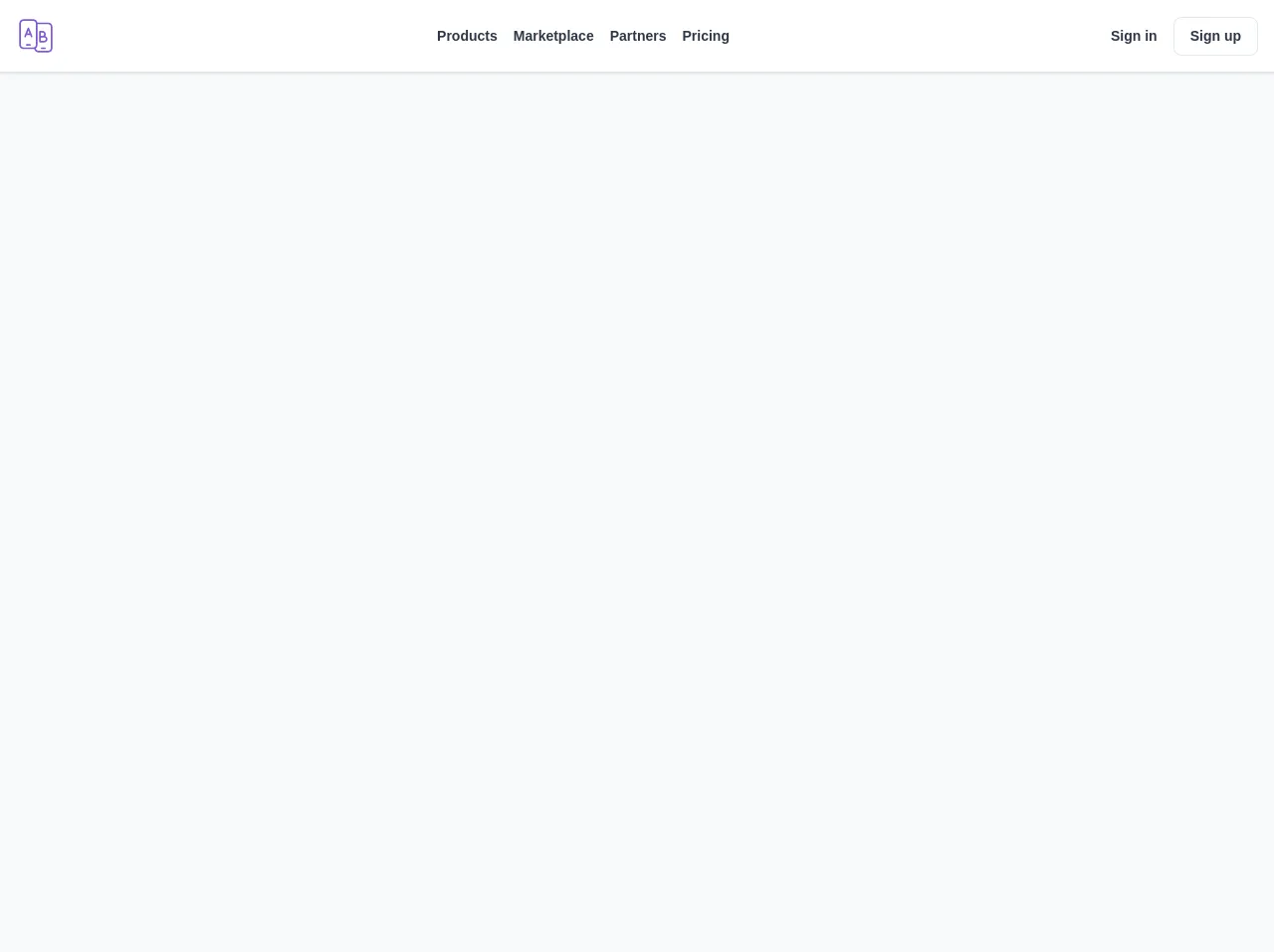
The preview of NavBar ui component
To create a NavBar with Tailwind CSS, you can use the following classes:
<nav class="bg-gray-900">
  <div class="max-w-7xl mx-auto px-4 sm:px-6 lg:px-8">
    <div class="flex items-center justify-between h-16">
      <div class="flex items-center">
        <div class="flex-shrink-0">
          <img class="h-8 w-8" src="/img/logo.svg" alt="Logo">
        </div>
        <div class="hidden md:block">
          <div class="ml-10 flex items-baseline">
            <a href="#" class="px-3 py-2 rounded-md text-sm font-medium text-white bg-gray-900 focus:outline-none focus:text-white focus:bg-gray-700">Home</a>

            <a href="#" class="ml-4 px-3 py-2 rounded-md text-sm font-medium text-gray-300 hover:text-white hover:bg-gray-700 focus:outline-none focus:text-white focus:bg-gray-700">About</a>

            <a href="#" class="ml-4 px-3 py-2 rounded-md text-sm font-medium text-gray-300 hover:text-white hover:bg-gray-700 focus:outline-none focus:text-white focus:bg-gray-700">Contact</a>
          </div>
        </div>
      </div>
      <div class="-mr-2 flex md:hidden">
        <button type="button" class="bg-gray-900 inline-flex items-center justify-center p-2 rounded-md text-gray-400 hover:text-white hover:bg-gray-700 focus:outline-none focus:bg-gray-700 focus:text-white" aria-controls="mobile-menu" aria-expanded="false">
          <span class="sr-only">Open main menu</span>
          <!-- Heroicon name: menu -->
          <svg class="block h-6 w-6" xmlns="http://www.w3.org/2000/svg" fill="none" viewBox="0 0 24 24" stroke="currentColor" aria-hidden="true">
            <path stroke-linecap="round" stroke-linejoin="round" stroke-width="2" d="M4 6h16M4 12h16M4 18h16"></path>
          </svg>
          <!-- Heroicon name: x -->
          <svg class="hidden h-6 w-6" xmlns="http://www.w3.org/2000/svg" fill="none" viewBox="0 0 24 24" stroke="currentColor" aria-hidden="true">
            <path stroke-linecap="round" stroke-linejoin="round" stroke-width="2" d="M6 18L18 6M6 6l12 12"></path>
          </svg>
        </button>
      </div>
    </div>
  </div>

  <div class="md:hidden" id="mobile-menu">
    <div class="px-2 pt-2 pb-3 space-y-1 sm:px-3">
      <a href="#" class="block px-3 py-2 rounded-md text-base font-medium text-white bg-gray-900 focus:outline-none focus:text-white focus:bg-gray-700">Home</a>

      <a href="#" class="block px-3 py-2 rounded-md text-base font-medium text-gray-300 hover:text-white hover:bg-gray-700 focus:outline-none focus:text-white focus:bg-gray-700">About</a>

      <a href="#" class="block px-3 py-2 rounded-md text-base font-medium text-gray-300 hover:text-white hover:bg-gray-700 focus:outline-none focus:text-white focus:bg-gray-700">Contact</a>
    </div>
  </div>
</nav>
Free download of the NavBar's source code
The source code of NavBar ui component
To create the NavBar, we used the following Tailwind CSS classes:
.bg-gray-900 {
  background-color: #1a202c;
}

.text-white {
  color: #fff;
}

.px-4 {
  padding-left: 1rem;
  padding-right: 1rem;
}

.flex {
  display: flex;
}

.items-center {
  align-items: center;
}

.justify-between {
  justify-content: space-between;
}

.h-16 {
  height: 4rem;
}

.flex-shrink-0 {
  flex-shrink: 0;
}

.hidden {
  display: none;
}

.md\:block {
  display: block;
}

.ml-10 {
  margin-left: 2.5rem;
}

.py-2 {
  padding-top: 0.5rem;
  padding-bottom: 0.5rem;
}

.rounded-md {
  border-radius: 0.375rem;
}

.text-sm {
  font-size: 0.875rem;
}

.font-medium {
  font-weight: 500;
}

.focus\:outline-none:focus {
  outline: 0;
}

.focus\:text-white:focus {
  --tw-text-opacity: 1;
  color: rgba(255, 255, 255, var(--tw-text-opacity));
}

.focus\:bg-gray-700:focus {
  --tw-bg-opacity: 1;
  background-color: rgba(55, 65, 81, var(--tw-bg-opacity));
}

.ml-4 {
  margin-left: 1rem;
}

.hover\:text-white:hover {
  --tw-text-opacity: 1;
  color: rgba(255, 255, 255, var(--tw-text-opacity));
}

.hover\:bg-gray-700:hover {
  --tw-bg-opacity: 1;
  background-color: rgba(55, 65, 81, var(--tw-bg-opacity));
}

.focus\:text-white:focus {
  --tw-text-opacity: 1;
  color: rgba(255, 255, 255, var(--tw-text-opacity));
}

.focus\:bg-gray-700:focus {
  --tw-bg-opacity: 1;
  background-color: rgba(55, 65, 81, var(--tw-bg-opacity));
}

.-mr-2 {
  margin-right: -0.5rem;
}

.inline-flex {
  display: inline-flex;
}

.aria-controls\:mobile-menu[aria-expanded="true"] ~ #mobile-menu {
  display: block;
}

.bg-gray-900 {
  background-color: #1a202c;
}

.items-baseline {
  align-items: baseline;
}

.sr-only {
  position: absolute;
  width: 1px;
  height: 1px;
  padding: 0;
  margin: -1px;
  overflow: hidden;
  clip: rect(0, 0, 0, 0);
  white-space: nowrap;
  border-width: 0;
}

.svg-inline--fa {
  display: inline-block;
  font-size: inherit;
  height: 1em;
  overflow: visible;
  vertical-align: -0.125em;
}

.svg-inline--fa.fa-w-16 {
  width: 1em;
}

.ml-2 {
  margin-left: 0.5rem;
}

.block {
  display: block;
}

.space-y-1 > :not([hidden]) ~ :not([hidden]) {
  --tw-space-y-reverse: 0;
  margin-top: calc(0.25rem * calc(1 - var(--tw-space-y-reverse)));
  margin-bottom: calc(0.25rem * var(--tw-space-y-reverse));
}
<div class="bg-gray-100 font-sans w-full min-h-screen m-0">
	<div class="bg-white shadow">
    <div class="container mx-auto px-4">
      <div class="flex items-center justify-between py-4">
        <div>
          <svg xmlns="http://www.w3.org/2000/svg" class="w-10 h-10 text-purple-600" viewBox="0 0 24 24">
            <path fill="currentColor" d="M14.5,16 C14.2238576,16 14,15.7761424 14,15.5 L14,9.5 C14,9.22385763 14.2238576,9 14.5,9 L16,9 C17.1045695,9 18,9.8954305 18,11 C18,11.4116588 17.8756286,11.7942691 17.6624114,12.1123052 C18.4414283,12.3856578 19,13.1275982 19,14 C19,15.1045695 18.1045695,16 17,16 L14.5,16 Z M15,15 L17,15 C17.5522847,15 18,14.5522847 18,14 C18,13.4477153 17.5522847,13 17,13 L15,13 L15,15 Z M15,12 L16,12 C16.5522847,12 17,11.5522847 17,11 C17,10.4477153 16.5522847,10 16,10 L15,10 L15,12 Z M12.9499909,4 L19.5,4 C20.8807119,4 22,5.11928813 22,6.5 L22,19.5 C22,20.8807119 20.8807119,22 19.5,22 L13.5,22 C12.2700325,22 11.2475211,21.1117749 11.0389093,19.9417682 C10.8653433,19.9799013 10.6850188,20 10.5,20 L4.5,20 C3.11928813,20 2,18.8807119 2,17.5 L2,4.5 C2,3.11928813 3.11928813,2 4.5,2 L10.5,2 C11.709479,2 12.7183558,2.85887984 12.9499909,4 Z M13,5 L13,17.5 C13,18.3179089 12.6072234,19.0440799 12,19.5001831 C12.0000989,20.3285261 12.6716339,21 13.5,21 L19.5,21 C20.3284271,21 21,20.3284271 21,19.5 L21,6.5 C21,5.67157288 20.3284271,5 19.5,5 L13,5 Z M8.56005566,11.4964303 C8.54036595,11.4987873 8.52032459,11.5 8.5,11.5 L6.5,11.5 C6.47967541,11.5 6.45963405,11.4987873 6.43994434,11.4964303 L5.96423835,12.6856953 C5.86168164,12.9420871 5.57069642,13.066795 5.31430466,12.9642383 C5.0579129,12.8616816 4.93320495,12.5706964 5.03576165,12.3143047 L7.03576165,7.31430466 C7.20339081,6.89523178 7.79660919,6.89523178 7.96423835,7.31430466 L9.96423835,12.3143047 C10.066795,12.5706964 9.9420871,12.8616816 9.68569534,12.9642383 C9.42930358,13.066795 9.13831836,12.9420871 9.03576165,12.6856953 L8.56005566,11.4964303 Z M8.16148352,10.5 L7.5,8.8462912 L6.83851648,10.5 L8.16148352,10.5 Z M10.5,3 L4.5,3 C3.67157288,3 3,3.67157288 3,4.5 L3,17.5 C3,18.3284271 3.67157288,19 4.5,19 L10.5,19 C11.3284271,19 12,18.3284271 12,17.5 L12,4.5 C12,3.67157288 11.3284271,3 10.5,3 Z M6.5,18 C6.22385763,18 6,17.7761424 6,17.5 C6,17.2238576 6.22385763,17 6.5,17 L8.5,17 C8.77614237,17 9,17.2238576 9,17.5 C9,17.7761424 8.77614237,18 8.5,18 L6.5,18 Z M15.5,20 C15.2238576,20 15,19.7761424 15,19.5 C15,19.2238576 15.2238576,19 15.5,19 L17.5,19 C17.7761424,19 18,19.2238576 18,19.5 C18,19.7761424 17.7761424,20 17.5,20 L15.5,20 Z"/>
          </svg>
        </div>

        <div class="hidden sm:flex sm:items-center">
          <a href="#" class="text-gray-800 text-sm font-semibold hover:text-purple-600 mr-4">Products</a>
          <a href="#" class="text-gray-800 text-sm font-semibold hover:text-purple-600 mr-4">Marketplace</a>
          <a href="#" class="text-gray-800 text-sm font-semibold hover:text-purple-600 mr-4">Partners</a>
          <a href="#" class="text-gray-800 text-sm font-semibold hover:text-purple-600">Pricing</a>
        </div>

        <div class="hidden sm:flex sm:items-center">
          <a href="#" class="text-gray-800 text-sm font-semibold hover:text-purple-600 mr-4">Sign in</a>
          <a href="#" class="text-gray-800 text-sm font-semibold border px-4 py-2 rounded-lg hover:text-purple-600 hover:border-purple-600">Sign up</a>
        </div>

        <div class="sm:hidden cursor-pointer">
          <svg xmlns="http://www.w3.org/2000/svg" class="w-6 h-6 text-purple-600" viewBox="0 0 24 24">
            <path fill="currentColor" d="M12.9499909,17 C12.7183558,18.1411202 11.709479,19 10.5,19 C9.29052104,19 8.28164422,18.1411202 8.05000906,17 L3.5,17 C3.22385763,17 3,16.7761424 3,16.5 C3,16.2238576 3.22385763,16 3.5,16 L8.05000906,16 C8.28164422,14.8588798 9.29052104,14 10.5,14 C11.709479,14 12.7183558,14.8588798 12.9499909,16 L20.5,16 C20.7761424,16 21,16.2238576 21,16.5 C21,16.7761424 20.7761424,17 20.5,17 L12.9499909,17 Z M18.9499909,12 C18.7183558,13.1411202 17.709479,14 16.5,14 C15.290521,14 14.2816442,13.1411202 14.0500091,12 L3.5,12 C3.22385763,12 3,11.7761424 3,11.5 C3,11.2238576 3.22385763,11 3.5,11 L14.0500091,11 C14.2816442,9.85887984 15.290521,9 16.5,9 C17.709479,9 18.7183558,9.85887984 18.9499909,11 L20.5,11 C20.7761424,11 21,11.2238576 21,11.5 C21,11.7761424 20.7761424,12 20.5,12 L18.9499909,12 Z M9.94999094,7 C9.71835578,8.14112016 8.70947896,9 7.5,9 C6.29052104,9 5.28164422,8.14112016 5.05000906,7 L3.5,7 C3.22385763,7 3,6.77614237 3,6.5 C3,6.22385763 3.22385763,6 3.5,6 L5.05000906,6 C5.28164422,4.85887984 6.29052104,4 7.5,4 C8.70947896,4 9.71835578,4.85887984 9.94999094,6 L20.5,6 C20.7761424,6 21,6.22385763 21,6.5 C21,6.77614237 20.7761424,7 20.5,7 L9.94999094,7 Z M7.5,8 C8.32842712,8 9,7.32842712 9,6.5 C9,5.67157288 8.32842712,5 7.5,5 C6.67157288,5 6,5.67157288 6,6.5 C6,7.32842712 6.67157288,8 7.5,8 Z M16.5,13 C17.3284271,13 18,12.3284271 18,11.5 C18,10.6715729 17.3284271,10 16.5,10 C15.6715729,10 15,10.6715729 15,11.5 C15,12.3284271 15.6715729,13 16.5,13 Z M10.5,18 C11.3284271,18 12,17.3284271 12,16.5 C12,15.6715729 11.3284271,15 10.5,15 C9.67157288,15 9,15.6715729 9,16.5 C9,17.3284271 9.67157288,18 10.5,18 Z"/>
          </svg>
        </div>
      </div>

      <div class="block sm:hidden bg-white border-t-2 py-2">
        <div class="flex flex-col">
          <a href="#" class="text-gray-800 text-sm font-semibold hover:text-purple-600 mb-1">Products</a>
          <a href="#" class="text-gray-800 text-sm font-semibold hover:text-purple-600 mb-1">Marketplace</a>
          <a href="#" class="text-gray-800 text-sm font-semibold hover:text-purple-600 mb-1">Partners</a>
          <a href="#" class="text-gray-800 text-sm font-semibold hover:text-purple-600 mb-1">Pricing</a>
          <div class="flex justify-between items-center border-t-2 pt-2">
            <a href="#" class="text-gray-800 text-sm font-semibold hover:text-purple-600 mr-4">Sign in</a>
            <a href="#" class="text-gray-800 text-sm font-semibold border px-4 py-1 rounded-lg hover:text-purple-600 hover:border-purple-600">Sign up</a>
          </div>
        </div>
      </div>
    </div>
  </div>
</div>
How to create a NavBar with Tailwind CSS?
- First, create a new HTML file and add the following code:
<nav class="bg-gray-900">
  <div class="max-w-7xl mx-auto px-4 sm:px-6 lg:px-8">
    <div class="flex items-center justify-between h-16">
      <div class="flex items-center">
        <div class="flex-shrink-0">
          <img class="h-8 w-8" src="/img/logo.svg" alt="Logo">
        </div>
        <div class="hidden md:block">
          <div class="ml-10 flex items-baseline">
            <a href="#" class="px-3 py-2 rounded-md text-sm font-medium text-white bg-gray-900 focus:outline-none focus:text-white focus:bg-gray-700">Home</a>

            <a href="#" class="ml-4 px-3 py-2 rounded-md text-sm font-medium text-gray-300 hover:text-white hover:bg-gray-700 focus:outline-none focus:text-white focus:bg-gray-700">About</a>

            <a href="#" class="ml-4 px-3 py-2 rounded-md text-sm font-medium text-gray-300 hover:text-white hover:bg-gray-700 focus:outline-none focus:text-white focus:bg-gray-700">Contact</a>
          </div>
        </div>
      </div>
      <div class="-mr-2 flex md:hidden">
        <button type="button" class="bg-gray-900 inline-flex items-center justify-center p-2 rounded-md text-gray-400 hover:text-white hover:bg-gray-700 focus:outline-none focus:bg-gray-700 focus:text-white" aria-controls="mobile-menu" aria-expanded="false">
          <span class="sr-only">Open main menu</span>
          <!-- Heroicon name: menu -->
          <svg class="block h-6 w-6" xmlns="http://www.w3.org/2000/svg" fill="none" viewBox="0 0 24 24" stroke="currentColor" aria-hidden="true">
            <path stroke-linecap="round" stroke-linejoin="round" stroke-width="2" d="M4 6h16M4 12h16M4 18h16"></path>
          </svg>
          <!-- Heroicon name: x -->
          <svg class="hidden h-6 w-6" xmlns="http://www.w3.org/2000/svg" fill="none" viewBox="0 0 24 24" stroke="currentColor" aria-hidden="true">
            <path stroke-linecap="round" stroke-linejoin="round" stroke-width="2" d="M6 18L18 6M6 6l12 12"></path>
          </svg>
        </button>
      </div>
    </div>
  </div>

  <div class="md:hidden" id="mobile-menu">
    <div class="px-2 pt-2 pb-3 space-y-1 sm:px-3">
      <a href="#" class="block px-3 py-2 rounded-md text-base font-medium text-white bg-gray-900 focus:outline-none focus:text-white focus:bg-gray-700">Home</a>

      <a href="#" class="block px-3 py-2 rounded-md text-base font-medium text-gray-300 hover:text-white hover:bg-gray-700 focus:outline-none focus:text-white focus:bg-gray-700">About</a>

      <a href="#" class="block px-3 py-2 rounded-md text-base font-medium text-gray-300 hover:text-white hover:bg-gray-700 focus:outline-none focus:text-white focus:bg-gray-700">Contact</a>
    </div>
  </div>
</nav>
- Add the Tailwind CSS stylesheet to your HTML file:
<link href="https://cdn.jsdelivr.net/npm/[email protected]/dist/tailwind.min.css" rel="stylesheet">
- Customize the NavBar by changing the classes and adding your own styles.
Conclusion
In this article, we have shown you how to build a NavBar using Tailwind CSS in six easy ways. We hope this article has helped you understand how to use Tailwind CSS to create custom designs quickly. If you have any questions or feedback, please leave a comment below.