- Published on
How To Make A Navbar With Tagline With Tailwind CSS From Scratch
- What is Tailwind CSS?
- The description of Navbar with Tagline ui component
- Why use Tailwind CSS to create a Navbar with Tagline ui component?
- The preview of Navbar with Tagline ui component
- The source code of Navbar with Tagline ui component
- How to create a Navbar with Tagline with Tailwind CSS?
- Conclusion
What is Tailwind CSS?
Tailwind CSS is a utility-first CSS framework that allows developers to quickly create custom designs without having to write any CSS from scratch. It provides a set of pre-built CSS classes that can be easily applied to HTML elements to style them.
The description of Navbar with Tagline ui component
A navbar with tagline is a common UI component used in web development. It consists of a navigation menu and a tagline that describes the purpose of the website. The navigation menu typically contains links to various pages on the website, while the tagline provides a brief summary of what the website is about.
Why use Tailwind CSS to create a Navbar with Tagline ui component?
Tailwind CSS makes it easy to create a navbar with tagline UI component from scratch. It provides a set of pre-built CSS classes that can be used to style the various elements of the navbar, such as the menu items and the tagline. This saves developers time and effort, as they don't have to write any CSS from scratch.
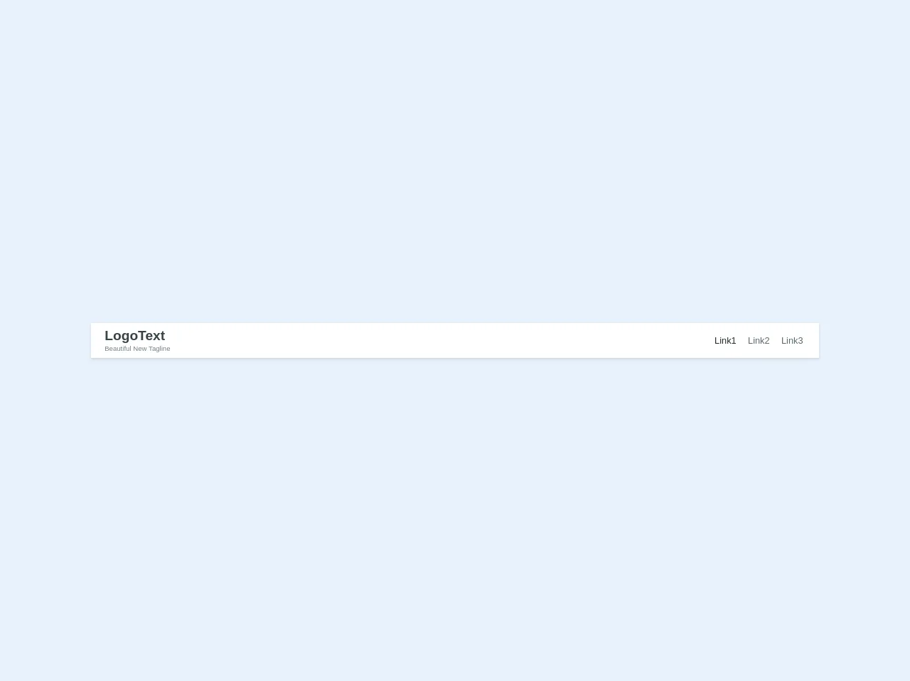
The preview of Navbar with Tagline ui component
To create a navbar with tagline UI component using Tailwind CSS, we will use the following HTML structure:
<nav class="bg-gray-800">
  <div class="max-w-7xl mx-auto px-2 sm:px-6 lg:px-8">
    <div class="relative flex items-center justify-between h-16">
      <div class="absolute inset-y-0 left-0 flex items-center sm:hidden">
        <!-- Mobile menu button -->
        <button type="button" class="inline-flex items-center justify-center p-2 rounded-md text-gray-400 hover:text-white hover:bg-gray-700 focus:outline-none focus:ring-2 focus:ring-inset focus:ring-white" aria-controls="mobile-menu" aria-expanded="false">
          <span class="sr-only">Open main menu</span>
          <!-- Icon when menu is closed. -->
          <!--
            Heroicon name: menu

            Menu open: "hidden", Menu closed: "block"
          -->
          <svg class="block h-6 w-6" xmlns="http://www.w3.org/2000/svg" fill="none" viewBox="0 0 24 24" stroke="currentColor" aria-hidden="true">
            <path stroke-linecap="round" stroke-linejoin="round" stroke-width="2" d="M4 6h16M4 12h16M4 18h16" />
          </svg>
          <!-- Icon when menu is open. -->
          <!--
            Heroicon name: x

            Menu open: "block", Menu closed: "hidden"
          -->
          <svg class="hidden h-6 w-6" xmlns="http://www.w3.org/2000/svg" fill="none" viewBox="0 0 24 24" stroke="currentColor" aria-hidden="true">
            <path stroke-linecap="round" stroke-linejoin="round" stroke-width="2" d="M6 18L18 6M6 6l12 12" />
          </svg>
        </button>
      </div>
      <div class="flex-1 flex items-center justify-center sm:items-stretch sm:justify-start">
        <div class="flex-shrink-0">
          <img class="block lg:hidden h-8 w-auto" src="https://tailwindui.com/img/logos/workflow-mark-indigo-500.svg" alt="Workflow">
          <img class="hidden lg:block h-8 w-auto" src="https://tailwindui.com/img/logos/workflow-logo-indigo-500-mark-white-text.svg" alt="Workflow">
        </div>
        <div class="hidden sm:block sm:ml-6">
          <div class="flex space-x-4">
            <!-- Current: "bg-gray-900 text-white", Default: "text-gray-300 hover:bg-gray-700 hover:text-white" -->
            <a href="#" class="bg-gray-900 text-white px-3 py-2 rounded-md text-sm font-medium">Dashboard</a>

            <a href="#" class="text-gray-300 hover:bg-gray-700 hover:text-white px-3 py-2 rounded-md text-sm font-medium">Team</a>

            <a href="#" class="text-gray-300 hover:bg-gray-700 hover:text-white px-3 py-2 rounded-md text-sm font-medium">Projects</a>

            <a href="#" class="text-gray-300 hover:bg-gray-700 hover:text-white px-3 py-2 rounded-md text-sm font-medium">Calendar</a>
          </div>
        </div>
      </div>
      <div class="absolute inset-y-0 right-0 flex items-center pr-2 sm:static sm:inset-auto sm:ml-6 sm:pr-0">
        <button class="bg-gray-800 p-1 rounded-full text-gray-400 hover:text-white focus:outline-none focus:ring-2 focus:ring-offset-2 focus:ring-offset-gray-800 focus:ring-white">
          <span class="sr-only">View notifications</span>
          <!-- Heroicon name: bell -->
          <svg class="h-6 w-6" xmlns="http://www.w3.org/2000/svg" fill="none" viewBox="0 0 24 24" stroke="currentColor" aria-hidden="true">
            <path stroke-linecap="round" stroke-linejoin="round" stroke-width="2" d="M13 10V3L4 14h7v7l9-11h-7z" />
          </svg>
        </button>

        <!-- Profile dropdown -->
        <div class="ml-3 relative">
          <div>
            <button type="button" class="bg-gray-800 flex text-sm rounded-full focus:outline-none focus:ring-2 focus:ring-offset-2 focus:ring-offset-gray-800 focus:ring-white" id="user-menu" aria-expanded="false" aria-haspopup="true">
              <span class="sr-only">Open user menu</span>
              <img class="h-8 w-8 rounded-full" src="https://images.unsplash.com/photo-1625148341785-6a7a7b5d6f8e" alt="">
            </button>
          </div>
          <!--
            Profile dropdown panel, show/hide based on dropdown state.

            Entering: "transition ease-out duration-100"
              From: "transform opacity-0 scale-95"
              To: "transform opacity-100 scale-100"
            Leaving: "transition ease-in duration-75"
              From: "transform opacity-100 scale-100"
              To: "transform opacity-0 scale-95"
          -->
          <div class="hidden origin-top-right absolute right-0 mt-2 w-48 rounded-md shadow-lg py-1 bg-white ring-1 ring-black ring-opacity-5" role="menu" aria-orientation="vertical" aria-labelledby="user-menu">
            <a href="#" class="block px-4 py-2 text-sm text-gray-700 hover:bg-gray-100" role="menuitem">Your Profile</a>

            <a href="#" class="block px-4 py-2 text-sm text-gray-700 hover:bg-gray-100" role="menuitem">Settings</a>

            <a href="#" class="block px-4 py-2 text-sm text-gray-700 hover:bg-gray-100" role="menuitem">Sign out</a>
          </div>
        </div>
      </div>
    </div>
  </div>

  <!-- Mobile menu, show/hide based on menu state. -->
  <div class="sm:hidden" id="mobile-menu">
    <div class="px-2 pt-2 pb-3 space-y-1">
      <!-- Current: "bg-gray-900 text-white", Default: "text-gray-300 hover:bg-gray-700 hover:text-white" -->
      <a href="#" class="bg-gray-900 text-white block px-3 py-2 rounded-md text-base font-medium">Dashboard</a>

      <a href="#" class="text-gray-300 hover:bg-gray-700 hover:text-white block px-3 py-2 rounded-md text-base font-medium">Team</a>

      <a href="#" class="text-gray-300 hover:bg-gray-700 hover:text-white block px-3 py-2 rounded-md text-base font-medium">Projects</a>

      <a href="#" class="text-gray-300 hover:bg-gray-700 hover:text-white block px-3 py-2 rounded-md text-base font-medium">Calendar</a>
    </div>
  </div>
</nav>
Free download of the Navbar with Tagline's source code
The source code of Navbar with Tagline ui component
To create the navbar with tagline UI component using Tailwind CSS, we will use the following HTML and CSS code:
<nav class="font-sans flex flex-col text-center content-center sm:flex-row sm:text-left sm:justify-between py-2 px-6 bg-white shadow sm:items-baseline w-full">
  <div class="mb-2 sm:mb-0 inner">

    <a href="/home" class="text-2xl no-underline text-grey-darkest hover:text-blue-dark font-sans font-bold">LogoText</a><br>
    <span class="text-xs text-grey-dark">Beautiful New Tagline</span>

  </div>

  <div class="sm:mb-0 self-center">
    <!-- <div class="h-10" style="display: table-cell, vertical-align: middle;"> -->
    <a href="#" class="text-md no-underline text-black hover:text-blue-dark ml-2 px-1">Link1</a>
    <a href="#" class="text-md no-underline text-grey-darker hover:text-blue-dark ml-2 px-1">Link2</a>
    <!-- <a href="/two" class="text-lg no-underline text-grey-darkest hover:text-blue-dark ml-2">About Us</a> -->
    <a href="#" class="text-md no-underline text-grey-darker hover:text-blue-dark ml-2 px-1">Link3</a>
    <!-- </div> -->

  </div>
</nav>
How to create a Navbar with Tagline with Tailwind CSS?
To create a Navbar with Tagline using Tailwind CSS, follow these steps:
- Create a new HTML file and add the above HTML code to it.
- Add the Tailwind CSS CDN to the head section of the HTML file.
- Customize the navbar by changing the colors, fonts, and other properties using the pre-built Tailwind CSS classes.
- Save the HTML file and open it in a web browser to see the Navbar with Tagline UI component.
Conclusion
In this article, we learned how to create a Navbar with Tagline UI component using Tailwind CSS. We saw how Tailwind CSS makes it easy to create custom designs without having to write any CSS from scratch. We also saw how to customize the navbar using the pre-built Tailwind CSS classes. With this knowledge, you can now create your own custom Navbar with Tagline UI component using Tailwind CSS.