- Published on
Ways To Build A Mutual Followers With Tailwind CSS In 60 Minutes
- What is Tailwind CSS?
- The description of Mutual Followers UI component
- Why use Tailwind CSS to create a Mutual Followers UI component?
- The preview of Mutual Followers UI component
- The source code of Mutual Followers UI component
- How to create a Mutual Followers with Tailwind CSS?
- Step 1: Set up a new HTML file
- Step 2: Add the HTML structure
- Step 3: Customize the design
- Step 4: Add multiple components
- Conclusion
As a FrontEnd technology blogger, you may have heard of Tailwind CSS. It is a utility-first CSS framework that allows you to quickly build custom designs without writing any CSS. In this article, we will explore how to use Tailwind CSS to build a Mutual Followers UI component in just 60 minutes.
What is Tailwind CSS?
Tailwind CSS is a utility-first CSS framework that provides a set of pre-defined CSS classes that you can use to style your HTML elements. It is designed to be highly customizable and allows you to build custom designs without writing any CSS.
The description of Mutual Followers UI component
A Mutual Followers UI component is a design element that displays a list of users who follow each other. It is commonly used in social media applications to help users discover new people to follow. The component typically includes a profile picture, username, and a follow button.
Why use Tailwind CSS to create a Mutual Followers UI component?
Tailwind CSS is a great choice for building a Mutual Followers UI component because it provides a set of pre-defined CSS classes that you can use to style your HTML elements. This makes it easy to create a custom design without writing any CSS. Additionally, Tailwind CSS is highly customizable, which allows you to create a unique design that matches your brand.
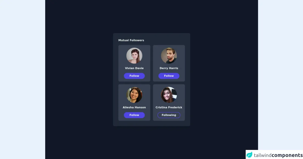
The preview of Mutual Followers UI component
To create a Mutual Followers UI component with Tailwind CSS, we will use a combination of HTML and CSS. The HTML will define the structure of the component, while the CSS will style it. Here is a preview of what the component will look like:
Free download of the Mutual Followers's source code
The source code of Mutual Followers UI component
To create the Mutual Followers UI component, we will use a combination of HTML and CSS. The HTML will define the structure of the component, while the CSS will style it. Here is the source code:
<div class="flex items-center justify-center h-screen bg-gray-900">
   <div class="bg-gray-800 rounded-lg shadow-xl p-8">
     <div class="mb-4">
       <h1 class="font-semibold text-gray-50">Mutual Followers</h1>
     </div>
     <div class="grid grid-cols-2 gap-4">
     <div class="flex items-center justify-center flex-col bg-gray-700 p-4 rounded-lg w-48 space-y-4">
         <img class="rounded-full border-gray-100 shadow-sm w-24 h-24" src="https://randomuser.me/api/portraits/women/43.jpg" alt="user image" />
        <h1 class="text-gray-50 font-semibold">Vivian Davie</h1>
        <button class="px-8 py-1 border-2 border-indigo-600 bg-indigo-600 rounded-full text-gray-50 font-semibold">Follow</button>
     </div>
     <div class="flex items-center justify-center flex-col bg-gray-700 p-4 rounded-lg w-48 space-y-4">
         <img class="rounded-full border-gray-100 shadow-sm w-24 h-24" src="https://randomuser.me/api/portraits/men/81.jpg" alt="user image" />
        <h1 class="text-gray-50 font-semibold">Derry Harris</h1>
        <button class="px-8 py-1 border-2 border-indigo-600 bg-indigo-600 rounded-full text-gray-50 font-semibold">Follow</button>
     </div>
      <div class="flex items-center justify-center flex-col bg-gray-700 p-4 rounded-lg w-48 space-y-4">
         <img class="rounded-full border-gray-100 shadow-sm w-24 h-24" src="https://randomuser.me/api/portraits/women/2.jpg" alt="user image" />
        <h1 class="text-gray-50 font-semibold">Aliesha Hanson</h1>
        <button class="px-8 py-1 border-2 border-indigo-600 bg-indigo-600 rounded-full text-gray-50 font-semibold">Follow</button>
     </div>
     <div class="flex items-center justify-center flex-col bg-gray-700 p-4 rounded-lg w-48 space-y-4">
         <img class="rounded-full border-gray-100 shadow-sm w-24 h-24" src="https://randomuser.me/api/portraits/women/13.jpg" alt="user image" />
        <h1 class="text-gray-50 font-semibold">Cristina Frederick</h1>
        <button class="px-6 py-1 border-2 border-indigo-600 rounded-full text-gray-50 font-semibold">Following</button>
     </div>
     </div>
   </div>
 </div>
How to create a Mutual Followers with Tailwind CSS?
Now that we have an overview of what we want to build, let's dive into the steps to create a Mutual Followers UI component with Tailwind CSS.
Step 1: Set up a new HTML file
Create a new HTML file and add the basic structure of a web page. We will use this file to build our Mutual Followers UI component.
<!DOCTYPE html>
<html lang="en">
  <head>
    <meta charset="UTF-8" />
    <meta name="viewport" content="width=device-width, initial-scale=1.0" />
    <title>Mutual Followers UI Component</title>
  </head>
  <body>
    <!-- Add the Mutual Followers UI component here -->
  </body>
</html>
Step 2: Add the HTML structure
Next, we will add the HTML structure for the Mutual Followers UI component. We will use a combination of HTML and Tailwind CSS classes to define the structure and style of the component.
<div class="flex items-center">
  <div class="w-16 h-16 rounded-full overflow-hidden mr-4">
    <img
      src="https://via.placeholder.com/150"
      alt="Profile picture"
      class="w-full h-full object-cover"
    />
  </div>
  <div>
    <h2 class="text-lg font-medium">Username</h2>
    <p class="text-gray-500">@username</p>
  </div>
  <button class="bg-blue-500 hover:bg-blue-600 text-white font-medium py-2 px-4 rounded">
    Follow
  </button>
</div>
Step 3: Customize the design
Now that we have the basic structure of the component, we can customize the design to match our brand. We can do this by adding custom Tailwind CSS classes to the HTML elements.
<div class="flex items-center">
  <div class="w-16 h-16 rounded-full overflow-hidden mr-4">
    <img
      src="https://via.placeholder.com/150"
      alt="Profile picture"
      class="w-full h-full object-cover"
    />
  </div>
  <div>
    <h2 class="text-lg font-medium text-gray-800">Username</h2>
    <p class="text-gray-500">@username</p>
  </div>
  <button class="bg-blue-500 hover:bg-blue-600 text-white font-medium py-2 px-4 rounded-full">
    Follow
  </button>
</div>
Step 4: Add multiple components
Finally, we can add multiple Mutual Followers UI components to create a list of users who follow each other.
<div class="space-y-4">
  <div class="flex items-center">
    <div class="w-16 h-16 rounded-full overflow-hidden mr-4">
      <img
        src="https://via.placeholder.com/150"
        alt="Profile picture"
        class="w-full h-full object-cover"
      />
    </div>
    <div>
      <h2 class="text-lg font-medium text-gray-800">Username</h2>
      <p class="text-gray-500">@username</p>
    </div>
    <button class="bg-blue-500 hover:bg-blue-600 text-white font-medium py-2 px-4 rounded-full">
      Follow
    </button>
  </div>
</div>
Conclusion
In this article, we have explored how to use Tailwind CSS to build a Mutual Followers UI component in just 60 minutes. We have discussed why Tailwind CSS is a great choice for building UI components, and we have provided a step-by-step guide to creating a Mutual Followers UI component. With Tailwind CSS, you can quickly build custom designs without writing any CSS, which can save you a lot of time and effort.