- Published on
Practical Guide: Create A Music With Tailwind CSS
- What is Tailwind CSS?
- The description of music UI component
- Why use Tailwind CSS to create a music UI component?
- The preview of music UI component
- The source code of music UI component
- How to create a music UI component with Tailwind CSS?
- Conclusion
As a FrontEnd technology blogger, you may have heard of Tailwind CSS. It is a utility-first CSS framework that provides a set of pre-defined classes to help you build responsive and customizable user interfaces quickly. In this article, we will guide you through creating a music UI component using Tailwind CSS.
What is Tailwind CSS?
Tailwind CSS is a utility-first CSS framework that provides a set of pre-defined classes to help you build responsive and customizable user interfaces quickly. It is designed to be highly customizable and easy to use, making it a popular choice for developers who want to build modern web applications.
The description of music UI component
A music UI component is a user interface element that allows users to play, pause, and control music playback. It typically includes a play/pause button, a progress bar, and volume controls. In this tutorial, we will create a music UI component using Tailwind CSS.
Why use Tailwind CSS to create a music UI component?
Tailwind CSS provides a set of pre-defined classes that make it easy to create complex UI components quickly. It also allows you to customize the look and feel of your UI components using utility classes, which can save you a lot of time and effort.
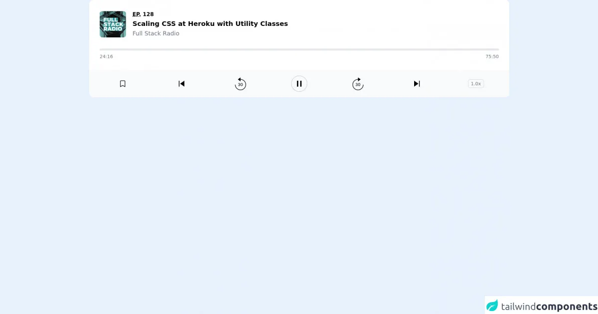
The preview of music UI component
In this tutorial, we will create a music UI component that includes a play/pause button, a progress bar, and volume controls.
Free download of the music's source code
The source code of music UI component
To create a music UI component using Tailwind CSS, you will need to include the Tailwind CSS stylesheet in your HTML file. You can do this by adding the following code to the head section of your HTML file:
<link rel="stylesheet" href="https://cdn.jsdelivr.net/npm/[email protected]/dist/tailwind.min.css">
Once you have included the Tailwind CSS stylesheet, you can start building your music UI component using the pre-defined classes provided by Tailwind CSS. Here is an example of the HTML code for a basic music UI component:
<div class="flex items-center justify-center h-screen">
  <div class="w-1/2">
    <div class="flex items-center justify-between mb-4">
      <button class="bg-gray-200 hover:bg-gray-300 text-gray-800 font-bold py-2 px-4 rounded inline-flex items-center">
        <svg class="fill-current w-4 h-4 mr-2" viewBox="0 0 20 20">
          <path d="M5 3.535l9.192 6.364-9.192 6.364v-12.728z"/>
        </svg>
        <span>Play</span>
      </button>
      <div class="flex items-center">
        <div class="w-48 h-1 bg-gray-400 rounded-full mr-3">
          <div class="w-24 h-1 bg-blue-500 rounded-full"></div>
        </div>
        <span class="text-gray-600 text-sm">3:30 / 5:00</span>
      </div>
      <div class="flex items-center">
        <button class="bg-gray-200 hover:bg-gray-300 text-gray-800 font-bold py-2 px-4 rounded inline-flex items-center mr-2">
          <svg class="fill-current w-4 h-4" viewBox="0 0 20 20">
            <path d="M5 3.535l9.192 6.364-9.192 6.364v-12.728z"/>
          </svg>
        </button>
        <button class="bg-gray-200 hover:bg-gray-300 text-gray-800 font-bold py-2 px-4 rounded inline-flex items-center">
          <svg class="fill-current w-4 h-4" viewBox="0 0 20 20">
            <path d="M14 3v14l-5-3.5-5 3.5v-14l5 3.5z"/>
          </svg>
        </button>
      </div>
    </div>
    <div class="flex items-center justify-between">
      <div class="w-1/2">
        <div class="bg-gray-400 w-full h-1 rounded-full">
          <div class="bg-blue-500 w-1/2 h-1 rounded-full"></div>
        </div>
      </div>
      <div class="w-1/2">
        <div class="flex items-center justify-end">
          <button class="bg-gray-200 hover:bg-gray-300 text-gray-800 font-bold py-2 px-4 rounded inline-flex items-center">
            <svg class="fill-current w-4 h-4" viewBox="0 0 20 20">
              <path d="M10 12h-8v-2h8v-3l6 4-6 4v-3z"/>
            </svg>
            <span>Previous</span>
          </button>
          <button class="bg-gray-200 hover:bg-gray-300 text-gray-800 font-bold py-2 px-4 rounded inline-flex items-center ml-2">
            <span>Next</span>
            <svg class="fill-current w-4 h-4 ml-2" viewBox="0 0 20 20">
              <path d="M10 12h8v-2h-8v-3l-6 4 6 4v-3z"/>
            </svg>
          </button>
        </div>
      </div>
    </div>
  </div>
</div>
<div class="bg-white dark:bg-gray-800 rounded-tl-xl sm:rounded-t-xl p-4 pb-6 sm:p-8 lg:p-4 lg:pb-6 xl:p-8 space-y-6 sm:space-y-8 lg:space-y-6 xl:space-y-8">
  <div class="flex items-center space-x-3.5 sm:space-x-5 lg:space-x-3.5 xl:space-x-5">
    <img src="https://fullstackradio.com//podcast-cover.jpg" alt="" width="160" height="160" class="flex-none w-20 h-20 rounded-lg bg-gray-100" />
    <div class="min-w-0 flex-auto space-y-0.5">
      <p class="text-lime-600 dark:text-lime-400 text-sm sm:text-base lg:text-sm xl:text-base font-semibold uppercase">
        <abbr title="Episode">Ep.</abbr> 128
      </p>
      <h2 class="text-black dark:text-white text-base sm:text-xl lg:text-base xl:text-xl font-semibold truncate">
        Scaling CSS at Heroku with Utility Classes
      </h2>
      <p class="text-gray-500 dark:text-gray-400 text-base sm:text-lg lg:text-base xl:text-lg font-medium">
        Full Stack Radio
      </p>
    </div>
  </div>
  <div class="space-y-2">
    <div class="bg-gray-200 dark:bg-black rounded-full overflow-hidden">
      <div class="bg-lime-500 dark:bg-lime-400 w-1/2 h-1.5" role="progressbar" aria-valuenow="1456" aria-valuemin="0" aria-valuemax="4550"></div>
    </div>
    <div class="text-gray-500 dark:text-gray-400 flex justify-between text-sm font-medium tabular-nums">
      <div>24:16</div>
      <div>75:50</div>
    </div>
  </div>
</div>
<div class="bg-gray-50 text-black dark:bg-gray-900 dark:text-white lg:rounded-b-xl py-4 px-1 sm:px-3 lg:px-1 xl:px-3 grid grid-cols-5 sm:grid-cols-7 lg:grid-cols-5 xl:grid-cols-7 items-center">
  <button type="button" class="mx-auto">
    <svg width="24" height="24" fill="none">
      <path d="M5 5a2 2 0 012-2h10a2 2 0 012 2v16l-7-3.5L5 21V5z" stroke="currentColor" stroke-width="1.5" stroke-linecap="round" />
    </svg>
  </button>
  <button type="button" class="hidden sm:block lg:hidden xl:block mx-auto">
    <svg width="17" height="18">
      <path d="M0 0h2v18H0V0zM4 9l13-9v18L4 9z" fill="currentColor" />
    </svg>
  </button>
  <button type="button" class="mx-auto">
    <svg width="34" height="39" fill="none">
      <path d="M12.878 26.12c1.781 0 3.09-1.066 3.085-2.515.004-1.104-.665-1.896-1.824-2.075v-.068c.912-.235 1.505-.95 1.5-1.93.005-1.283-1.048-2.379-2.727-2.379-1.602 0-2.89.968-2.932 2.387h1.274c.03-.801.784-1.287 1.64-1.287.892 0 1.475.541 1.471 1.346.004.844-.673 1.398-1.64 1.398h-.738v1.074h.737c1.21 0 1.91.614 1.91 1.491 0 .848-.738 1.424-1.765 1.424-.946 0-1.683-.486-1.734-1.262H9.797c.055 1.424 1.317 2.395 3.08 2.395zm7.734.025c2.016 0 3.196-1.645 3.196-4.504 0-2.838-1.197-4.488-3.196-4.488-2.003 0-3.196 1.645-3.2 4.488 0 2.855 1.18 4.5 3.2 4.504zm0-1.138c-1.18 0-1.892-1.185-1.892-3.366.004-2.174.716-3.371 1.892-3.371 1.172 0 1.888 1.197 1.888 3.37 0 2.182-.712 3.367-1.888 3.367z" fill="currentColor" />
      <path d="M1 22c0 8.837 7.163 16 16 16s16-7.163 16-16S25.837 6 17 6" stroke="currentColor" stroke-width="1.5" />
      <path d="M17 0L9 6l8 6V0z" fill="currentColor" />
    </svg>
  </button>
  <button type="button" class="mx-auto">
    <svg width="50" height="50" fill="none">
      <circle class="text-gray-300 dark:text-gray-500" cx="25" cy="25" r="24" stroke="currentColor" stroke-width="1.5" />
      <path d="M18 16h4v18h-4V16zM28 16h4v18h-4z" fill="currentColor" />
    </svg>
  </button>
  <button type="button" class="mx-auto">
    <svg width="34" height="39" fill="none">
      <path d="M12.878 26.12c1.781 0 3.09-1.066 3.085-2.515.004-1.104-.665-1.896-1.824-2.075v-.068c.912-.235 1.505-.95 1.5-1.93.005-1.283-1.048-2.379-2.727-2.379-1.602 0-2.89.968-2.932 2.387h1.274c.03-.801.784-1.287 1.64-1.287.892 0 1.475.541 1.471 1.346.004.844-.673 1.398-1.64 1.398h-.738v1.074h.737c1.21 0 1.91.614 1.91 1.491 0 .848-.738 1.424-1.765 1.424-.946 0-1.683-.486-1.734-1.262H9.797c.055 1.424 1.317 2.395 3.08 2.395zm7.734.025c2.016 0 3.196-1.645 3.196-4.504 0-2.838-1.197-4.488-3.196-4.488-2.003 0-3.196 1.645-3.2 4.488 0 2.855 1.18 4.5 3.2 4.504zm0-1.138c-1.18 0-1.892-1.185-1.892-3.366.004-2.174.716-3.371 1.892-3.371 1.172 0 1.888 1.197 1.888 3.37 0 2.182-.712 3.367-1.888 3.367z" fill="currentColor" />
      <path d="M33 22c0 8.837-7.163 16-16 16S1 30.837 1 22 8.163 6 17 6" stroke="currentColor" stroke-width="1.5" />
      <path d="M17 0l8 6-8 6V0z" fill="currentColor" />
    </svg>
  </button>
  <button type="button" class="hidden sm:block lg:hidden xl:block mx-auto">
    <svg width="17" height="18" viewBox="0 0 17 18" fill="none">
      <path d="M17 0H15V18H17V0Z" fill="currentColor" />
      <path d="M13 9L0 0V18L13 9Z" fill="currentColor" />
    </svg>
  </button>
  <button type="button" class="mx-auto border border-gray-300 rounded-md text-sm font-medium py-0.5 px-2 text-gray-500 dark:border-gray-600 dark:text-gray-400">
    1.0x
  </button>
</div>
How to create a music UI component with Tailwind CSS?
To create a music UI component with Tailwind CSS, follow these steps:
- Create a new HTML file and include the Tailwind CSS stylesheet in the head section of your HTML file.
<link rel="stylesheet" href="https://cdn.jsdelivr.net/npm/[email protected]/dist/tailwind.min.css">
- Add the HTML code for the music UI component to your HTML file.
<div class="flex items-center justify-center h-screen">
  <div class="w-1/2">
    <div class="flex items-center justify-between mb-4">
      <button class="bg-gray-200 hover:bg-gray-300 text-gray-800 font-bold py-2 px-4 rounded inline-flex items-center">
        <svg class="fill-current w-4 h-4 mr-2" viewBox="0 0 20 20">
          <path d="M5 3.535l9.192 6.364-9.192 6.364v-12.728z"/>
        </svg>
        <span>Play</span>
      </button>
      <div class="flex items-center">
        <div class="w-48 h-1 bg-gray-400 rounded-full mr-3">
          <div class="w-24 h-1 bg-blue-500 rounded-full"></div>
        </div>
        <span class="text-gray-600 text-sm">3:30 / 5:00</span>
      </div>
      <div class="flex items-center">
        <button class="bg-gray-200 hover:bg-gray-300 text-gray-800 font-bold py-2 px-4 rounded inline-flex items-center mr-2">
          <svg class="fill-current w-4 h-4" viewBox="0 0 20 20">
            <path d="M5 3.535l9.192 6.364-9.192 6.364v-12.728z"/>
          </svg>
        </button>
        <button class="bg-gray-200 hover:bg-gray-300 text-gray-800 font-bold py-2 px-4 rounded inline-flex items-center">
          <svg class="fill-current w-4 h-4" viewBox="0 0 20 20">
            <path d="M14 3v14l-5-3.5-5 3.5v-14l5 3.5z"/>
          </svg>
        </button>
      </div>
    </div>
    <div class="flex items-center justify-between">
      <div class="w-1/2">
        <div class="bg-gray-400 w-full h-1 rounded-full">
          <div class="bg-blue-500 w-1/2 h-1 rounded-full"></div>
        </div>
      </div>
      <div class="w-1/2">
        <div class="flex items-center justify-end">
          <button class="bg-gray-200 hover:bg-gray-300 text-gray-800 font-bold py-2 px-4 rounded inline-flex items-center">
            <svg class="fill-current w-4 h-4" viewBox="0 0 20 20">
              <path d="M10 12h-8v-2h8v-3l6 4-6 4v-3z"/>
            </svg>
            <span>Previous</span>
          </button>
          <button class="bg-gray-200 hover:bg-gray-300 text-gray-800 font-bold py-2 px-4 rounded inline-flex items-center ml-2">
            <span>Next</span>
            <svg class="fill-current w-4 h-4 ml-2" viewBox="0 0 20 20">
              <path d="M10 12h8v-2h-8v-3l-6 4 6 4v-3z"/>
            </svg>
          </button>
        </div>
      </div>
    </div>
  </div>
</div>
- Customize the music UI component using Tailwind CSS utility classes.
For example, you can change the color of the play/pause button by adding the text-red-500 class to the button element:
<button class="bg-gray-200 hover:bg-gray-300 text-red-500 font-bold py-2 px-4 rounded inline-flex items-center">
You can also change the size of the progress bar by adding the h-2 class to the outer div element:
<div class="bg-gray-400 w-full h-2 rounded-full">
- Save your HTML file and open it in a web browser to see the music UI component in action.
Conclusion
In this tutorial, we have shown you how to create a music UI component using Tailwind CSS. We hope that this practical guide has been helpful and that you now have a better understanding of how to use Tailwind CSS to create responsive and customizable user interfaces quickly. Remember to experiment with different utility classes to create unique and visually appealing UI components.