- Published on
Learn How To Make A Music Player Cards With Tailwind CSS from the Pros
- What is Tailwind CSS?
- The description of Music player cards UI component
- Why use Tailwind CSS to create a Music player cards UI component?
- The preview of Music player cards UI component
- The source code of Music player cards UI component
- How to create a Music player cards with Tailwind CSS?
- Step 1: Define the HTML structure
- Step 2: Apply the appropriate Tailwind CSS classes
- Step 3: Customize the design
- Conclusion
As a FrontEnd technology blogger, it is important to stay up-to-date with the latest trends and tools in the industry. One such tool that has gained popularity in recent years is Tailwind CSS. In this article, we will learn how to create a Music player cards UI component using Tailwind CSS.
What is Tailwind CSS?
Tailwind CSS is a utility-first CSS framework that provides a set of pre-defined CSS classes to help you quickly build custom designs. It is built on top of PostCSS and provides a low-level utility class system that allows you to easily style your HTML without writing custom CSS.
The description of Music player cards UI component
A music player cards UI component is a design element that is commonly used in music streaming applications. It typically consists of an image of the album cover, the name of the artist and the song, and controls to play, pause, and skip tracks.
Why use Tailwind CSS to create a Music player cards UI component?
Tailwind CSS provides a set of pre-defined CSS classes that can be used to quickly build custom designs. This makes it an ideal choice for creating UI components like the music player cards. Additionally, Tailwind CSS is highly customizable, which allows you to easily modify the design to match your specific needs.
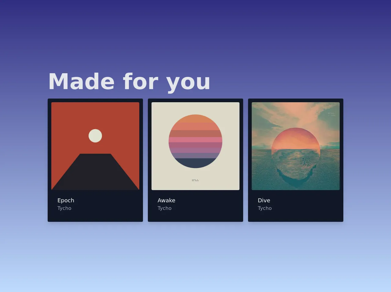
The preview of Music player cards UI component
To create a music player cards UI component using Tailwind CSS, we will start by defining the HTML structure and then apply the appropriate CSS classes to style the component.
Free download of the Music player cards's source code
The source code of Music player cards UI component
To create a music player cards UI component using Tailwind CSS, we will need to define the HTML structure and apply the appropriate CSS classes to style the component.
<main class="grid place-items-center min-h-screen bg-gradient-to-t from-blue-200 to-indigo-900 p-5">
  <div>
    <h1 class="text-4xl sm:text-5xl md:text-7xl font-bold text-gray-200 mb-5">Made for you</h1>
    <section class="grid grid-cols-1 sm:grid-cols-3 gap-4">
      <!-- CARD 1 -->
      <div class="bg-gray-900 shadow-lg rounded p-3">
        <div class="group relative">
          <img class="w-full md:w-72 block rounded" src="https://upload.wikimedia.org/wikipedia/en/f/f1/Tycho_-_Epoch.jpg" alt="" />
          <div class="absolute bg-black rounded bg-opacity-0 group-hover:bg-opacity-60 w-full h-full top-0 flex items-center group-hover:opacity-100 transition justify-evenly">
            <button class="hover:scale-110 text-white opacity-0 transform translate-y-3 group-hover:translate-y-0 group-hover:opacity-100 transition">
              <svg xmlns="http://www.w3.org/2000/svg" width="20" height="20" fill="currentColor" class="bi bi-heart" viewBox="0 0 16 16">
                <path d="M8 2.748l-.717-.737C5.6.281 2.514.878 1.4 3.053c-.523 1.023-.641 2.5.314 4.385.92 1.815 2.834 3.989 6.286 6.357 3.452-2.368 5.365-4.542 6.286-6.357.955-1.886.838-3.362.314-4.385C13.486.878 10.4.28 8.717 2.01L8 2.748zM8 15C-7.333 4.868 3.279-3.04 7.824 1.143c.06.055.119.112.176.171a3.12 3.12 0 0 1 .176-.17C12.72-3.042 23.333 4.867 8 15z" />
              </svg>
            </button>

            <button class="hover:scale-110 text-white opacity-0 transform translate-y-3 group-hover:translate-y-0 group-hover:opacity-100 transition">
              <svg xmlns="http://www.w3.org/2000/svg" width="40" height="40" fill="currentColor" class="bi bi-play-circle-fill" viewBox="0 0 16 16">
                <path d="M16 8A8 8 0 1 1 0 8a8 8 0 0 1 16 0zM6.79 5.093A.5.5 0 0 0 6 5.5v5a.5.5 0 0 0 .79.407l3.5-2.5a.5.5 0 0 0 0-.814l-3.5-2.5z" />
              </svg>
            </button>

            <button class="hover:scale-110 text-white opacity-0 transform translate-y-3 group-hover:translate-y-0 group-hover:opacity-100 transition">
              <svg xmlns="http://www.w3.org/2000/svg" width="20" height="20" fill="currentColor" class="bi bi-three-dots" viewBox="0 0 16 16">
                <path d="M3 9.5a1.5 1.5 0 1 1 0-3 1.5 1.5 0 0 1 0 3zm5 0a1.5 1.5 0 1 1 0-3 1.5 1.5 0 0 1 0 3zm5 0a1.5 1.5 0 1 1 0-3 1.5 1.5 0 0 1 0 3z" />
              </svg>
            </button>
          </div>
        </div>
        <div class="p-5">
          <h3 class="text-white text-lg">Epoch</h3>
          <p class="text-gray-400">Tycho</p>
        </div>
      </div>
      <!-- END OF CARD 1 -->

      <!-- CARD 2 -->
      <div class="bg-gray-900 shadow-lg rounded p-3">
        <div class="group relative">
          <img class="w-full md:w-72 block rounded" src="https://upload.wikimedia.org/wikipedia/en/c/ca/Tycho_-_Awake.png" alt="" />
          <div class="absolute bg-black rounded bg-opacity-0 group-hover:bg-opacity-60 w-full h-full top-0 flex items-center group-hover:opacity-100 transition justify-evenly">
            <button class="hover:scale-110 text-white opacity-0 transform translate-y-3 group-hover:translate-y-0 group-hover:opacity-100 transition">
              <svg xmlns="http://www.w3.org/2000/svg" width="20" height="20" fill="currentColor" class="bi bi-heart" viewBox="0 0 16 16">
                <path d="M8 2.748l-.717-.737C5.6.281 2.514.878 1.4 3.053c-.523 1.023-.641 2.5.314 4.385.92 1.815 2.834 3.989 6.286 6.357 3.452-2.368 5.365-4.542 6.286-6.357.955-1.886.838-3.362.314-4.385C13.486.878 10.4.28 8.717 2.01L8 2.748zM8 15C-7.333 4.868 3.279-3.04 7.824 1.143c.06.055.119.112.176.171a3.12 3.12 0 0 1 .176-.17C12.72-3.042 23.333 4.867 8 15z" />
              </svg>
            </button>

            <button class="hover:scale-110 text-white opacity-0 transform translate-y-3 group-hover:translate-y-0 group-hover:opacity-100 transition">
              <svg xmlns="http://www.w3.org/2000/svg" width="40" height="40" fill="currentColor" class="bi bi-play-circle-fill" viewBox="0 0 16 16">
                <path d="M16 8A8 8 0 1 1 0 8a8 8 0 0 1 16 0zM6.79 5.093A.5.5 0 0 0 6 5.5v5a.5.5 0 0 0 .79.407l3.5-2.5a.5.5 0 0 0 0-.814l-3.5-2.5z" />
              </svg>
            </button>

            <button class="hover:scale-110 text-white opacity-0 transform translate-y-3 group-hover:translate-y-0 group-hover:opacity-100 transition">
              <svg xmlns="http://www.w3.org/2000/svg" width="20" height="20" fill="currentColor" class="bi bi-three-dots" viewBox="0 0 16 16">
                <path d="M3 9.5a1.5 1.5 0 1 1 0-3 1.5 1.5 0 0 1 0 3zm5 0a1.5 1.5 0 1 1 0-3 1.5 1.5 0 0 1 0 3zm5 0a1.5 1.5 0 1 1 0-3 1.5 1.5 0 0 1 0 3z" />
              </svg>
            </button>
          </div>
        </div>
        <div class="p-5">
          <h3 class="text-white text-lg">Awake</h3>
          <p class="text-gray-400">Tycho</p>
        </div>
      </div>
      <!-- END OF CARD 2 -->

      <!-- CARD 3 -->
      <div class="bg-gray-900 shadow-lg rounded p-3">
        <div class="group relative">
          <img class="w-full md:w-72 block rounded" src="https://upload.wikimedia.org/wikipedia/en/1/11/Dive_tycho_album.jpg" alt="" />
          <div class="absolute bg-black rounded bg-opacity-0 group-hover:bg-opacity-60 w-full h-full top-0 flex items-center group-hover:opacity-100 transition justify-evenly">
            <button class="hover:scale-110 text-white opacity-0 transform translate-y-3 group-hover:translate-y-0 group-hover:opacity-100 transition">
              <svg xmlns="http://www.w3.org/2000/svg" width="20" height="20" fill="currentColor" class="bi bi-heart" viewBox="0 0 16 16">
                <path d="M8 2.748l-.717-.737C5.6.281 2.514.878 1.4 3.053c-.523 1.023-.641 2.5.314 4.385.92 1.815 2.834 3.989 6.286 6.357 3.452-2.368 5.365-4.542 6.286-6.357.955-1.886.838-3.362.314-4.385C13.486.878 10.4.28 8.717 2.01L8 2.748zM8 15C-7.333 4.868 3.279-3.04 7.824 1.143c.06.055.119.112.176.171a3.12 3.12 0 0 1 .176-.17C12.72-3.042 23.333 4.867 8 15z" />
              </svg>
            </button>

            <button class="hover:scale-110 text-white opacity-0 transform translate-y-3 group-hover:translate-y-0 group-hover:opacity-100 transition">
              <svg xmlns="http://www.w3.org/2000/svg" width="40" height="40" fill="currentColor" class="bi bi-play-circle-fill" viewBox="0 0 16 16">
                <path d="M16 8A8 8 0 1 1 0 8a8 8 0 0 1 16 0zM6.79 5.093A.5.5 0 0 0 6 5.5v5a.5.5 0 0 0 .79.407l3.5-2.5a.5.5 0 0 0 0-.814l-3.5-2.5z" />
              </svg>
            </button>

            <button class="hover:scale-110 text-white opacity-0 transform translate-y-3 group-hover:translate-y-0 group-hover:opacity-100 transition">
              <svg xmlns="http://www.w3.org/2000/svg" width="20" height="20" fill="currentColor" class="bi bi-three-dots" viewBox="0 0 16 16">
                <path d="M3 9.5a1.5 1.5 0 1 1 0-3 1.5 1.5 0 0 1 0 3zm5 0a1.5 1.5 0 1 1 0-3 1.5 1.5 0 0 1 0 3zm5 0a1.5 1.5 0 1 1 0-3 1.5 1.5 0 0 1 0 3z" />
              </svg>
            </button>
          </div>
        </div>
        <div class="p-5">
          <h3 class="text-white text-lg">Dive</h3>
          <p class="text-gray-400">Tycho</p>
        </div>
      </div>
      <!-- END OF CARD 3 -->
    </section>
  </div>
</main>
How to create a Music player cards with Tailwind CSS?
To create a music player cards UI component using Tailwind CSS, we will need to follow these steps:
- Define the HTML structure for the music player cards UI component.
- Apply the appropriate Tailwind CSS classes to style the component.
- Customize the design to match your specific needs.
Let's walk through each of these steps in more detail.
Step 1: Define the HTML structure
The first step in creating a music player cards UI component is to define the HTML structure. Here is an example of what the HTML structure might look like:
<div class="card">
  <img src="album-cover.jpg" alt="Album Cover">
  <div class="details">
    <h2 class="title">Song Title</h2>
    <h3 class="artist">Artist Name</h3>
    <div class="controls">
      <button class="play">Play</button>
      <button class="pause">Pause</button>
      <button class="skip">Skip</button>
    </div>
  </div>
</div>
Step 2: Apply the appropriate Tailwind CSS classes
Once we have defined the HTML structure, we can apply the appropriate Tailwind CSS classes to style the component. Here is an example of what the CSS might look like:
.card {
  display: flex;
  align-items: center;
  padding: 1rem;
  background-color: #fff;
  box-shadow: 0 1px 2px rgba(0, 0, 0, 0.1);
}

.card img {
  width: 100px;
  height: 100px;
  object-fit: cover;
  margin-right: 1rem;
}

.card .details {
  flex: 1;
}

.card .title {
  font-size: 1.25rem;
  font-weight: bold;
  margin-bottom: 0.5rem;
}

.card .artist {
  font-size: 1rem;
  color: #666;
  margin-bottom: 1rem;
}

.card .controls button {
  background-color: #4caf50;
  color: #fff;
  border: none;
  border-radius: 4px;
  padding: 0.5rem 1rem;
  margin-right: 1rem;
  cursor: pointer;
}

.card .controls button:hover {
  background-color: #3e8e41;
}
Step 3: Customize the design
Finally, we can customize the design to match our specific needs. This might involve changing the colors, font sizes, or layout of the component.
Conclusion
In this article, we learned how to create a music player cards UI component using Tailwind CSS. We saw how Tailwind CSS provides a set of pre-defined CSS classes that can be used to quickly build custom designs, and how it is highly customizable to match your specific needs. By following the steps outlined in this article, you should now be able to create your own music player cards UI component using Tailwind CSS.