- Published on
Imagine You Create A Music Player With Tailwind CSS Like An Expert. Follow These 6 Steps To Get There
- What is Tailwind CSS?
- The description of Music Player UI component
- Why use Tailwind CSS to create a Music Player UI component?
- The preview of Music Player UI component
- The source code of Music Player UI component
- How to create a Music Player with Tailwind CSS?
- Step 1: Set up your project
- Step 2: Create the HTML structure
- Step 3: Style the music player with Tailwind CSS
- Step 4: Add JavaScript functionality
- Step 5: Test and debug
- Step 6: Deploy and enjoy!
- Conclusion
Are you looking to create a sleek and modern music player for your website or application? Look no further than Tailwind CSS. In this article, we'll walk you through the steps to create a music player UI component using Tailwind CSS.
What is Tailwind CSS?
Tailwind CSS is a utility-first CSS framework that allows developers to quickly and easily create custom user interfaces. Instead of relying on pre-built components, Tailwind CSS provides a set of utility classes that can be combined to create unique designs.
The description of Music Player UI component
A music player UI component is a user interface element that allows users to play, pause, skip, and control the volume of audio files. It typically includes a progress bar to show how much of the audio has been played and how much is remaining.
Why use Tailwind CSS to create a Music Player UI component?
Tailwind CSS is the perfect choice for creating a music player UI component because it allows you to easily customize every aspect of the design. With Tailwind CSS, you can quickly create a responsive and visually appealing music player that matches the style of your website or application.
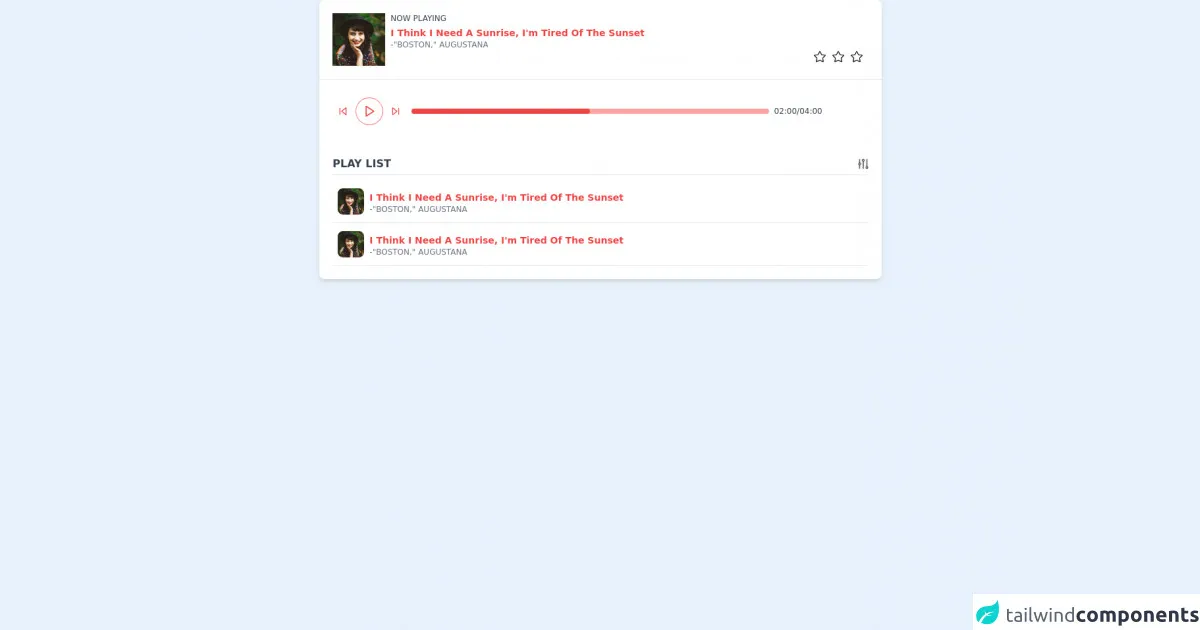
The preview of Music Player UI component
Creating a music player UI component with Tailwind CSS is easy and straightforward. Here's a preview of what the final product will look like:
Free download of the Music Player's source code
The source code of Music Player UI component
To create the music player UI component, we'll be using HTML, CSS, and JavaScript. Here's the source code:
<!-- This is an example component -->
<div class="w-full">
    <div class='flex w-8/12  bg-white shadow-md rounded-lg overflow-hidden mx-auto'>
        <div class="flex flex-col w-full">
            <div class="flex p-5 border-b">
                <img class='w-20 h-20 object-cover' alt='User avatar' src='https://images.unsplash.com/photo-1477118476589-bff2c5c4cfbb?ixlib=rb-1.2.1&ixid=eyJhcHBfaWQiOjEyMDd9&auto=format&fit=crop&w=200&q=200'>
                <div class="flex flex-col px-2 w-full">
                    <span class="text-xs text-gray-700 uppercase font-medium ">
                        now playing
                    </span>
                    <span class="text-sm text-red-500 capitalize font-semibold pt-1">
                       I think I need a sunrise, I'm tired of the sunset
                    </span>
                    <span class="text-xs text-gray-500 uppercase font-medium ">
                        -"Boston," Augustana
                    </span>
                    <div class="flex justify-end">
                        <img class="w-5 cursor-pointer" src="https://www.iconpacks.net/icons/2/free-favourite-icon-2765-thumb.png" />
                        <img class="w-5 cursor-pointer mx-2" src="https://www.iconpacks.net/icons/2/free-favourite-icon-2765-thumb.png" />
                        <img class="w-5 cursor-pointer" src="https://www.iconpacks.net/icons/2/free-favourite-icon-2765-thumb.png" />
                    </div>
                </div>
            </div>

            <div class="flex flex-col sm:flex-row items-center p-5">
                <div class="flex items-center">
                    <div class="flex space-x-3 p-2">
        <button class="focus:outline-none">
          <svg class="w-4 h-4" viewBox="0 0 24 24" fill="none" stroke="#ef4444" stroke-width="2" stroke-linecap="round" stroke-linejoin="round"><polygon points="19 20 9 12 19 4 19 20"></polygon><line x1="5" y1="19" x2="5" y2="5"></line></svg>
        </button>
        <button class="rounded-full w-10 h-10 flex items-center justify-center pl-0.5 ring-1 ring-red-400 focus:outline-none">
          <svg class="w-5 h-5" viewBox="0 0 24 24" fill="none" stroke="#ef4444" stroke-width="2" stroke-linecap="round" stroke-linejoin="round"><polygon points="5 3 19 12 5 21 5 3"></polygon></svg>
        </button>
        <button class="focus:outline-none">
          <svg class="w-4 h-4" viewBox="0 0 24 24" fill="none" stroke="#ef4444" stroke-width="2" stroke-linecap="round" stroke-linejoin="round"><polygon points="5 4 15 12 5 20 5 4"></polygon><line x1="19" y1="5" x2="19" y2="19"></line></svg>
        </button>
      </div>
                </div>
                <div class="relative w-full sm:w-1/2 md:w-7/12 lg:w-4/6 ml-2">
                    <div class="bg-red-300 h-2 w-full rounded-lg"></div>
                     <div class="bg-red-500 h-2 w-1/2 rounded-lg absolute top-0"></div>

                </div>
                <div class="flex justify-end w-full sm:w-auto pt-1 sm:pt-0">
<span class="text-xs text-gray-700 uppercase font-medium pl-2">
                    02:00/04:00
                </span>
                </div>

            </div>

            <div class="flex flex-col p-5">
                <div class="border-b pb-1 flex justify-between items-center mb-2">
                    <span class=" text-base font-semibold uppercase text-gray-700"> play list</span>
                    <img class="w-4 cursor-pointer" src="https://p.kindpng.com/picc/s/152-1529312_filter-ios-filter-icon-png-transparent-png.png" />
                </div>

                <div class="flex border-b py-3 cursor-pointer hover:shadow-md px-2 ">
                    <img class='w-10 h-10 object-cover rounded-lg' alt='User avatar' src='https://images.unsplash.com/photo-1477118476589-bff2c5c4cfbb?ixlib=rb-1.2.1&ixid=eyJhcHBfaWQiOjEyMDd9&auto=format&fit=crop&w=200&q=200'>
                    <div class="flex flex-col px-2 w-full">

                        <span class="text-sm text-red-500 capitalize font-semibold pt-1">
                        I think I need a sunrise, I'm tired of the sunset
                        </span>
                        <span class="text-xs text-gray-500 uppercase font-medium ">
                            -"Boston," Augustana
                        </span>
                    </div>
                </div>
                 <div class="flex border-b py-3 cursor-pointer hover:shadow-md px-2 ">
                    <img class='w-10 h-10 object-cover rounded-lg' alt='User avatar' src='https://images.unsplash.com/photo-1477118476589-bff2c5c4cfbb?ixlib=rb-1.2.1&ixid=eyJhcHBfaWQiOjEyMDd9&auto=format&fit=crop&w=200&q=200'>
                    <div class="flex flex-col px-2 w-full">

                        <span class="text-sm text-red-500 capitalize font-semibold pt-1">
                        I think I need a sunrise, I'm tired of the sunset
                        </span>
                        <span class="text-xs text-gray-500 uppercase font-medium ">
                            -"Boston," Augustana
                        </span>
                    </div>
                </div>
            </div>
        </div>
    </div>
</div>
How to create a Music Player with Tailwind CSS?
Now that we've covered the basics, let's dive into the steps to create a music player UI component using Tailwind CSS.
Step 1: Set up your project
The first step is to set up your project. Create a new HTML file and add the necessary CSS and JavaScript files. You can either download Tailwind CSS or use a CDN.
Step 2: Create the HTML structure
Next, create the HTML structure for the music player. This will include a container for the player, buttons for play/pause and skip, a progress bar, and a volume control.
Step 3: Style the music player with Tailwind CSS
Once you have the HTML structure in place, it's time to style the music player using Tailwind CSS. You can use utility classes to customize the size, color, and position of each element.
Step 4: Add JavaScript functionality
Now that the music player is styled, it's time to add JavaScript functionality. This will include event listeners for the play/pause and skip buttons, as well as the progress bar and volume control.
Step 5: Test and debug
Once you have the JavaScript functionality in place, it's time to test and debug the music player. Make sure that all buttons and controls are working properly and that the progress bar accurately reflects the audio file's progress.
Step 6: Deploy and enjoy!
Finally, deploy your music player and enjoy the fruits of your labor. Your users will appreciate the sleek and modern design of your new music player UI component.
Conclusion
Creating a music player UI component with Tailwind CSS is a straightforward process that can be completed in just a few steps. By using Tailwind CSS, you can create a visually appealing and responsive music player that matches the style of your website or application. So what are you waiting for? Give it a try today!