- Published on
How To Build A Music Player With Tailwind CSS From Scratch
- What is Tailwind CSS?
- The description of Music player ui component
- Why use Tailwind CSS to create a Music player ui component?
- The preview of Music player ui component
- The source code of Music player ui component
- How to create a Music player with Tailwind CSS?
- Step 1: Set up the HTML structure
- Step 2: Style the music player with Tailwind CSS
- Step 3: Add JavaScript functionality
- Conclusion
What is Tailwind CSS?
Tailwind CSS is a utility-first CSS framework that provides a set of pre-defined CSS classes to help developers quickly create custom user interfaces. It is a popular choice for building responsive and modern web applications because it allows developers to easily customize the look and feel of their UI components without having to write custom CSS from scratch.
The description of Music player ui component
A music player UI component is a user interface element that allows users to play, pause, skip, and control the volume of audio files. It is a common feature in many music streaming applications and websites.
Why use Tailwind CSS to create a Music player ui component?
Tailwind CSS provides a set of pre-defined CSS classes that can be used to quickly create custom UI components. This makes it an ideal choice for building a music player UI component because it allows developers to easily customize the look and feel of the component without having to write custom CSS from scratch.
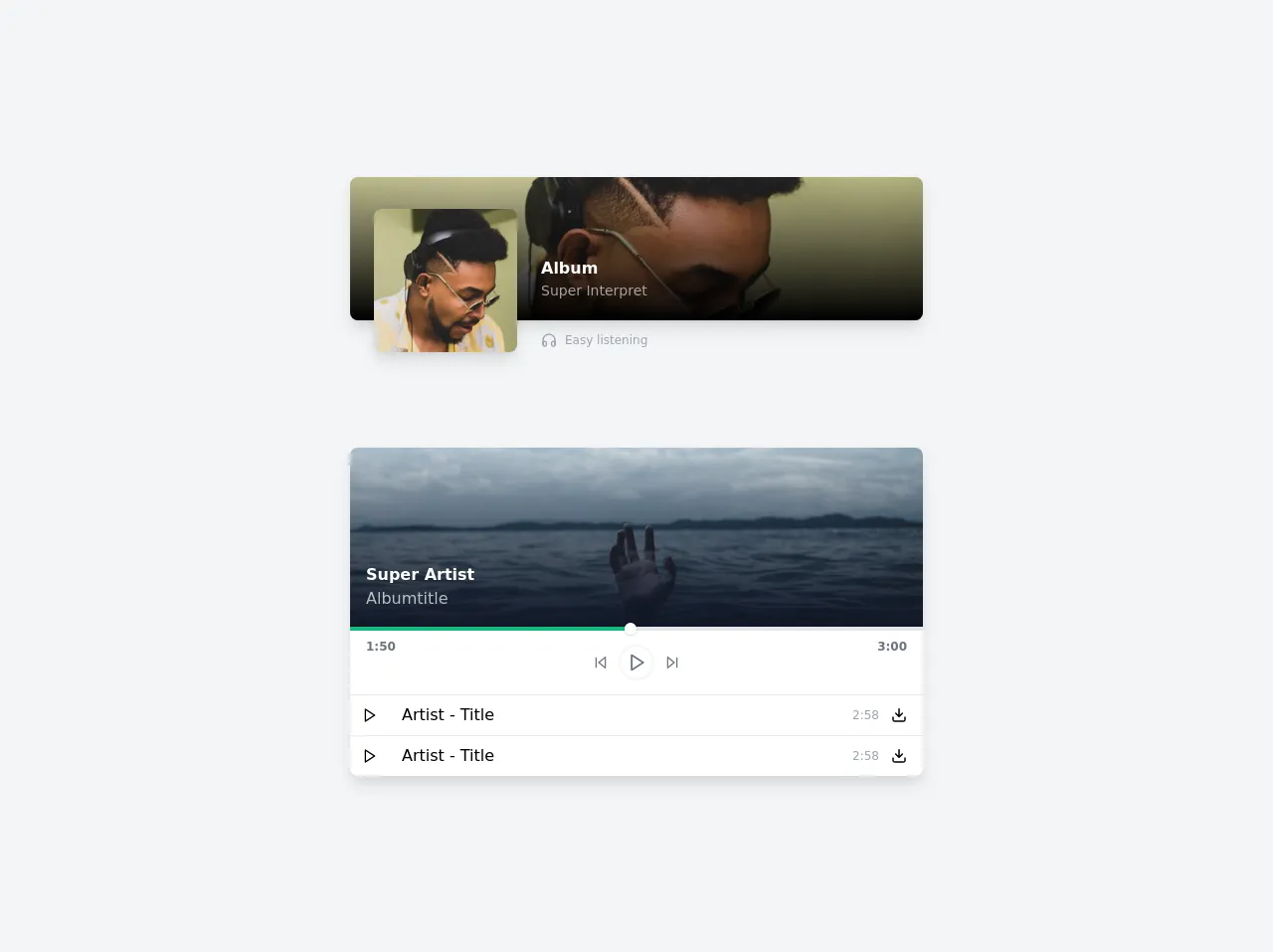
The preview of Music player ui component
To create a music player UI component with Tailwind CSS, we will use a combination of HTML, CSS, and JavaScript. The final result will be a sleek and modern-looking music player that is fully responsive and easy to use.
Free download of the Music player's source code
The source code of Music player ui component
The source code for our music player UI component can be found below.
<div class="min-h-screen bg-gray-100 flex flex-col items-center justify-center">

  <div class="relative max-w-xl w-full h-36 bg-white rounded-lg shadow-lg overflow-hidde mb-32">
    <div class="absolute inset-0 rounded-lg overflow-hidden bg-red-200">
      <img src="https://images.unsplash.com/photo-1543794327-59a91fb815d1?ixid=MXwxMjA3fDB8MHxwaG90by1wYWdlfHx8fGVufDB8fHw%3D&ixlib=rb-1.2.1&auto=format&fit=crop&w=800&h=200&q=80" alt="">
      <div class="absolute inset-0 backdrop backdrop-blur-10 bg-gradient-to-b from-transparent to-black">

      </div>
    </div>
    <div class="absolute flex space-x-6 transform translate-x-6 translate-y-8">
      <div class="w-36 h-36 rounded-lg shadow-lg overflow-hidden">
        <img src="https://images.unsplash.com/photo-1543794327-59a91fb815d1?ixid=MXwxMjA3fDB8MHxwaG90by1wYWdlfHx8fGVufDB8fHw%3D&ixlib=rb-1.2.1&auto=format&fit=crop&w=200&h=200&q=80" alt="">
      </div>
      <div class="text-white pt-12">
        <h3 class="font-bold">Album</h3>
        <div class="text-sm opacity-60">Super Interpret</div>
        <div class="mt-8 text-gray-400">
          <div class="flex items-center space-x-2 text-xs">
            <svg class="w-4 h-4" viewBox="0 0 24 24" fill="none" stroke="currentColor" stroke-width="2" stroke-linecap="round" stroke-linejoin="round"><path d="M3 18v-6a9 9 0 0 1 18 0v6"></path><path d="M21 19a2 2 0 0 1-2 2h-1a2 2 0 0 1-2-2v-3a2 2 0 0 1 2-2h3zM3 19a2 2 0 0 0 2 2h1a2 2 0 0 0 2-2v-3a2 2 0 0 0-2-2H3z"></path></svg>
            <span>Easy listening</span>
          </div>
        </div>
      </div>
    </div>
  </div>

  <div class="max-w-xl bg-white rounded-lg shadow-lg overflow-hidden">
    <div class="relative">
      <img
        src="https://images.unsplash.com/photo-1500099817043-86d46000d58f?ixlib=rb-1.2.1&ixid=MXwxMjA3fDB8MHxwaG90by1wYWdlfHx8fGVufDB8fHw%3D&auto=format&fit=crop&w=800&h=250&q=80"
        class="object-cover">
      <div class="absolute p-4 inset-0 flex flex-col justify-end bg-gradient-to-b from-transparent to-gray-900 backdrop backdrop-blur-5 text-white">
        <h3 class="font-bold">Super Artist</h3>
        <span class="opacity-70">Albumtitle</span>
      </div>
    </div>
    <div>
      <div class="relative h-1 bg-gray-200">
        <div class="absolute h-full w-1/2 bg-green-500 flex items-center justify-end">
          <div class="rounded-full w-3 h-3 bg-white shadow"></div>
        </div>
      </div>
    </div>
    <div class="flex justify-between text-xs font-semibold text-gray-500 px-4 py-2">
      <div>
        1:50
      </div>
      <div class="flex space-x-3 p-2">
        <button class="focus:outline-none">
          <svg class="w-4 h-4" viewBox="0 0 24 24" fill="none" stroke="currentColor" stroke-width="2" stroke-linecap="round" stroke-linejoin="round"><polygon points="19 20 9 12 19 4 19 20"></polygon><line x1="5" y1="19" x2="5" y2="5"></line></svg>
        </button>
        <button class="rounded-full w-8 h-8 flex items-center justify-center pl-0.5 ring-2 ring-gray-100 focus:outline-none">
          <svg class="w-5 h-5" viewBox="0 0 24 24" fill="none" stroke="currentColor" stroke-width="2" stroke-linecap="round" stroke-linejoin="round"><polygon points="5 3 19 12 5 21 5 3"></polygon></svg>
        </button>
        <button class="focus:outline-none">
          <svg class="w-4 h-4" viewBox="0 0 24 24" fill="none" stroke="currentColor" stroke-width="2" stroke-linecap="round" stroke-linejoin="round"><polygon points="5 4 15 12 5 20 5 4"></polygon><line x1="19" y1="5" x2="19" y2="19"></line></svg>
        </button>
      </div>
      <div>
        3:00
      </div>
    </div>
    <ul class="text-xs sm:text-base divide-y border-t cursor-default">
      <li class="flex items-center space-x-3 hover:bg-gray-100">
        <button class="p-3 hover:bg-green-500 group focus:outline-none">
          <svg class="w-4 h-4 group-hover:text-white" viewBox="0 0 24 24" fill="none" stroke="currentColor" stroke-width="2" stroke-linecap="round" stroke-linejoin="round"><polygon points="5 3 19 12 5 21 5 3"></polygon></svg>
        </button>
        <div class="flex-1">
          Artist - Title
        </div>
        <div class="text-xs text-gray-400">
          2:58
        </div>
        <button class="focus:outline-none pr-4 group">
          <svg class="w-4 h-4 group-hover:text-green-600" viewBox="0 0 24 24" fill="none" stroke="currentColor" stroke-width="2" stroke-linecap="round" stroke-linejoin="round"><path d="M3 15v4c0 1.1.9 2 2 2h14a2 2 0 0 0 2-2v-4M17 9l-5 5-5-5M12 12.8V2.5"/></svg>
        </button>
      </li>
    </ul>
  </div>
</div>
How to create a Music player with Tailwind CSS?
To create a music player UI component with Tailwind CSS, follow these steps:
Step 1: Set up the HTML structure
The first step is to set up the HTML structure for our music player. We will use a combination of divs, buttons, and icons to create the player controls. Here's an example HTML structure:
<div class="music-player">
  <div class="music-player__controls">
    <button class="music-player__button music-player__play">
      <i class="fas fa-play"></i>
    </button>
    <button class="music-player__button music-player__pause">
      <i class="fas fa-pause"></i>
    </button>
    <button class="music-player__button music-player__skip-back">
      <i class="fas fa-backward"></i>
    </button>
    <button class="music-player__button music-player__skip-forward">
      <i class="fas fa-forward"></i>
    </button>
    <input type="range" class="music-player__volume">
  </div>
</div>
Step 2: Style the music player with Tailwind CSS
Next, we will use Tailwind CSS to style the music player. We can do this by adding pre-defined CSS classes to our HTML elements. Here's an example CSS code:
.music-player {
  background-color: #f7fafc;
  border: 1px solid #edf2f7;
  border-radius: 0.25rem;
  padding: 1rem;
}

.music-player__controls {
  display: flex;
  align-items: center;
  justify-content: center;
}

.music-player__button {
  background-color: #fff;
  border: 1px solid #e2e8f0;
  border-radius: 0.25rem;
  color: #4a5568;
  cursor: pointer;
  font-size: 1rem;
  margin-right: 0.5rem;
  padding: 0.5rem;
  transition: all 0.2s ease-in-out;
}

.music-player__button:hover {
  background-color: #e2e8f0;
}

.music-player__button:active {
  transform: scale(0.95);
}

.music-player__play {
  display: none;
}

.music-player__pause {
  display: block;
}

.music-player__skip-back,
.music-player__skip-forward {
  margin-right: 1rem;
}

.music-player__volume {
  width: 100%;
  margin-left: 1rem;
}
Step 3: Add JavaScript functionality
Finally, we will add JavaScript functionality to our music player. This will allow us to control the playback of audio files and update the UI accordingly. Here's an example JavaScript code:
const musicPlayer = document.querySelector('.music-player');
const playButton = musicPlayer.querySelector('.music-player__play');
const pauseButton = musicPlayer.querySelector('.music-player__pause');
const skipBackButton = musicPlayer.querySelector('.music-player__skip-back');
const skipForwardButton = musicPlayer.querySelector('.music-player__skip-forward');
const volumeSlider = musicPlayer.querySelector('.music-player__volume');

let isPlaying = false;
let audio = new Audio('path/to/audio/file.mp3');

playButton.addEventListener('click', () => {
  audio.play();
  isPlaying = true;
  playButton.style.display = 'none';
  pauseButton.style.display = 'block';
});

pauseButton.addEventListener('click', () => {
  audio.pause();
  isPlaying = false;
  pauseButton.style.display = 'none';
  playButton.style.display = 'block';
});

skipBackButton.addEventListener('click', () => {
  audio.currentTime -= 10;
});

skipForwardButton.addEventListener('click', () => {
  audio.currentTime += 10;
});

volumeSlider.addEventListener('input', () => {
  audio.volume = volumeSlider.value / 100;
});
Conclusion
In this article, we have learned how to build a music player UI component with Tailwind CSS from scratch. By following the steps outlined in this article, you can easily create a sleek and modern-looking music player that is fully responsive and easy to use. With Tailwind CSS, you can customize the look and feel of your UI components without having to write custom CSS from scratch, making it an ideal choice for building responsive and modern web applications.