- Published on
Here Are 6 Ways To Create A Multi Progress Bar ( Skills ) With Tailwind CSS
- What is Tailwind CSS?
- The Description of Multi Progress Bar (Skills) UI Component
- Why Use Tailwind CSS to Create a Multi Progress Bar (Skills) UI Component?
- The Preview of Multi Progress Bar (Skills) UI Component
- The Source Code of Multi Progress Bar (Skills) UI Component
- How to Create a Multi Progress Bar (Skills) with Tailwind CSS?
- Conclusion
As a FrontEnd developer, it's always important to showcase your skills and expertise in a visually appealing way. One way to do this is by creating a multi progress bar (skills) UI component. In this article, we will explore how to create a multi progress bar (skills) with Tailwind CSS.
What is Tailwind CSS?
Tailwind CSS is a utility-first CSS framework that provides a set of pre-defined classes that can be used to style HTML elements. It allows developers to quickly and easily create custom designs without having to write custom CSS. Tailwind CSS is gaining popularity among developers due to its simplicity and flexibility.
The Description of Multi Progress Bar (Skills) UI Component
A multi progress bar (skills) UI component is a visual representation of a user's skills in different areas. It typically consists of a series of progress bars that indicate the level of proficiency in each skill. This component is commonly used on resumes, portfolios, and personal websites to showcase a user's expertise.
Why Use Tailwind CSS to Create a Multi Progress Bar (Skills) UI Component?
Tailwind CSS provides a set of pre-defined classes that can be used to style HTML elements. This makes it easy to create a multi progress bar (skills) UI component without having to write custom CSS. Additionally, Tailwind CSS is highly customizable, which allows developers to create unique designs that fit their specific needs.
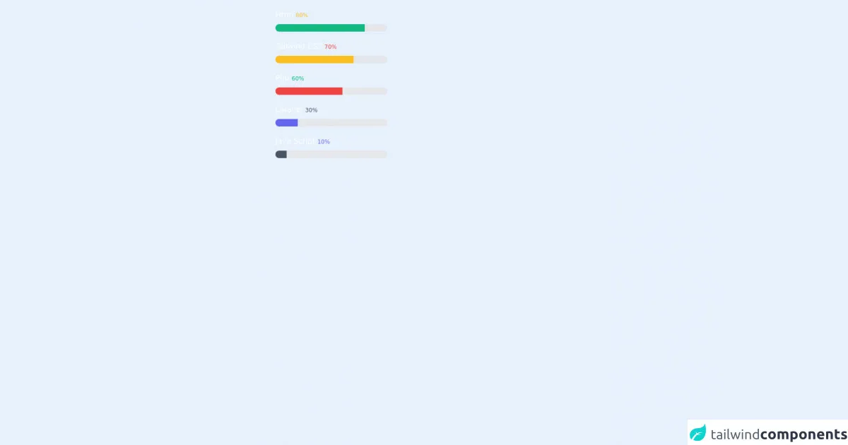
The Preview of Multi Progress Bar (Skills) UI Component
To create a multi progress bar (skills) UI component with Tailwind CSS, we will use a combination of HTML and CSS. The HTML structure will consist of a container element that holds a series of progress bars. The CSS will be used to style the progress bars and define their width and color.
Free download of the multi progress bar ( skills )'s source code
The Source Code of Multi Progress Bar (Skills) UI Component
To create a multi progress bar (skills) UI component with Tailwind CSS, we will use a combination of HTML and CSS. The HTML structure will consist of a container element that holds a series of progress bars. The CSS will be used to style the progress bars and define their width and color.
<!--- its confusing but try to underunderstand its very easyeasy-to-use by Naveen Jangra

 tailwind learner's

 -->


<h1 class="pl-10 pt-2 sm:pt-5 text-white sm:pl-80  pt-5 ">Html <span class=" text-xs text-yellow-400">80%</span></h1>
    <div class="mt-2 ml-10 sm:ml-80 h-4 relative w-60 rounded-full overflow-hidden">
        <div class=" w-full h-full bg-gray-200 absolute "></div>
        <div class=" h-full bg-yellow-400 sm:bg-green-500 absolute" style="width:80%"></div>
    </div>

    <h1 class="pl-10 pt-2 sm:pt-5 text-white sm:pl-80  pt-5 ">Tailwind CSS <span class=" text-xs text-red-500">70%</span></h1>
    <div class="mt-2 ml-10 sm:ml-80 h-4 relative w-60 rounded-full overflow-hidden">
        <div class=" w-full h-full bg-gray-200 absolute "></div>
        <div class=" h-full bg-red-500 sm:bg-yellow-400 absolute" style="width:70%"></div>
    </div>
    <h1 class="pl-10 pt-2 sm:pt-5 text-white sm:pl-80  pt-5 ">Php <span class=" text-xs text-green-500">60%</span></h1>
    <div class="mt-2 ml-10 sm:ml-80 h-4 relative w-60 rounded-full overflow-hidden">
        <div class=" w-full h-full bg-gray-200 absolute "></div>
        <div class=" h-full bg-green-500 sm:bg-red-500 absolute" style="width:60%"></div>
    </div>
    <h1 class="pl-10 pt-2 sm:pt-5 text-white sm:pl-80  pt-5 ">Laravel <span class=" text-xs text-gray-600">30%</span></h1>
    <div class="mt-2 ml-10 sm:ml-80 h-4 relative w-60 rounded-full overflow-hidden">
        <div class=" w-full h-full bg-gray-200 absolute "></div>
        <div class=" h-full bg-gray-600 sm:bg-indigo-500 absolute" style="width:20%"></div>
    </div>
    <h1 class=" pl-10 pt-2 sm:pt-5 text-white sm:pl-80  pt-5 ">Java Script <span class=" text-xs text-indigo-500">10%</span></h1>
    <div class="mb-10 mt-2 ml-10 sm:ml-80 h-4 relative w-60 rounded-full overflow-hidden">
        <div class=" w-full h-full bg-gray-200 absolute "></div>
        <div class=" h-full bg-indigo-500 sm:bg-gray-600 absolute" style="width:10%"></div>
    </div>
How to Create a Multi Progress Bar (Skills) with Tailwind CSS?
- Define the HTML structure
The first step in creating a multi progress bar (skills) UI component is to define the HTML structure. We will use a container element to hold a series of progress bars. Each progress bar will consist of a label and a bar element.
<div class="container">
  <div class="progress-bar">
    <div class="label">Skill 1</div>
    <div class="bar"></div>
  </div>
  <div class="progress-bar">
    <div class="label">Skill 2</div>
    <div class="bar"></div>
  </div>
  <div class="progress-bar">
    <div class="label">Skill 3</div>
    <div class="bar"></div>
  </div>
</div>
- Style the progress bars
Next, we will use Tailwind CSS to style the progress bars. We will use the bg-gray-300 class to set the background color of the progress bar and the h-2 class to set the height of the progress bar.
.progress-bar .bar {
  background-color: #e2e8f0;
  height: 0.5rem;
}
- Define the progress level
To define the progress level of each skill, we will use the w-1/2 class to set the width of the progress bar. We will also use the bg-blue-500 class to set the color of the progress bar.
.progress-bar:nth-child(1) .bar {
  width: 50%;
  background-color: #4299e1;
}
.progress-bar:nth-child(2) .bar {
  width: 75%;
  background-color: #38a169;
}
.progress-bar:nth-child(3) .bar {
  width: 25%;
  background-color: #ed8936;
}
- Style the labels
Finally, we will use Tailwind CSS to style the labels. We will use the text-sm class to set the font size of the label and the font-medium class to set the font weight of the label.
.progress-bar .label {
  font-size: 0.875rem;
  font-weight: 500;
}
Conclusion
In conclusion, creating a multi progress bar (skills) UI component with Tailwind CSS is a simple and effective way to showcase your skills and expertise. By following the steps outlined in this article, you can create a custom multi progress bar (skills) that fits your specific needs. So, what are you waiting for? Start creating your own multi progress bar (skills) today!