- Published on
6 Steps To Build A Multi Range Slider With Alpine.js With Tailwind CSS Like A Pro In Under An Hour
- What is Tailwind CSS?
- The description of Multi Range Slider with Alpine.js ui component
- Why use Tailwind CSS to create a Multi Range Slider with Alpine.js ui component?
- The preview of Multi Range Slider with Alpine.js ui component.
- The source code of Multi Range Slider with Alpine.js ui component.
- How to create a Multi Range Slider with Alpine.js with Tailwind CSS?
- Step 1: Set up your HTML
- Step 2: Add Alpine.js
- Step 3: Add the Alpine.js script
- Step 4: Add the Alpine.js bindings
- Step 5: Style the multi-range slider with Tailwind CSS
- Step 6: Test your multi-range slider
- Conclusion
Are you looking to build a multi-range slider for your website or application? Look no further than Alpine.js and Tailwind CSS! In this tutorial, we'll walk you through the steps to create a multi-range slider with Alpine.js and Tailwind CSS. By the end of this tutorial, you'll have a fully functional multi-range slider that you can use on your website or application.
What is Tailwind CSS?
Tailwind CSS is a utility-first CSS framework that allows you to quickly and easily create custom designs for your website or application. With Tailwind CSS, you can write less CSS and create more consistent designs.
The description of Multi Range Slider with Alpine.js ui component
A multi-range slider is a UI component that allows users to select multiple values within a range. This is useful for applications that require users to select a range of values, such as price ranges or date ranges.
Alpine.js is a lightweight JavaScript framework that allows you to add interactivity to your website or application without the need for a larger framework like React or Vue. With Alpine.js, you can easily add functionality to your website or application without adding a lot of extra code.
Why use Tailwind CSS to create a Multi Range Slider with Alpine.js ui component?
Tailwind CSS makes it easy to create custom designs for your website or application without writing a lot of CSS. With Tailwind CSS, you can quickly and easily create a multi-range slider that matches the design of your website or application.
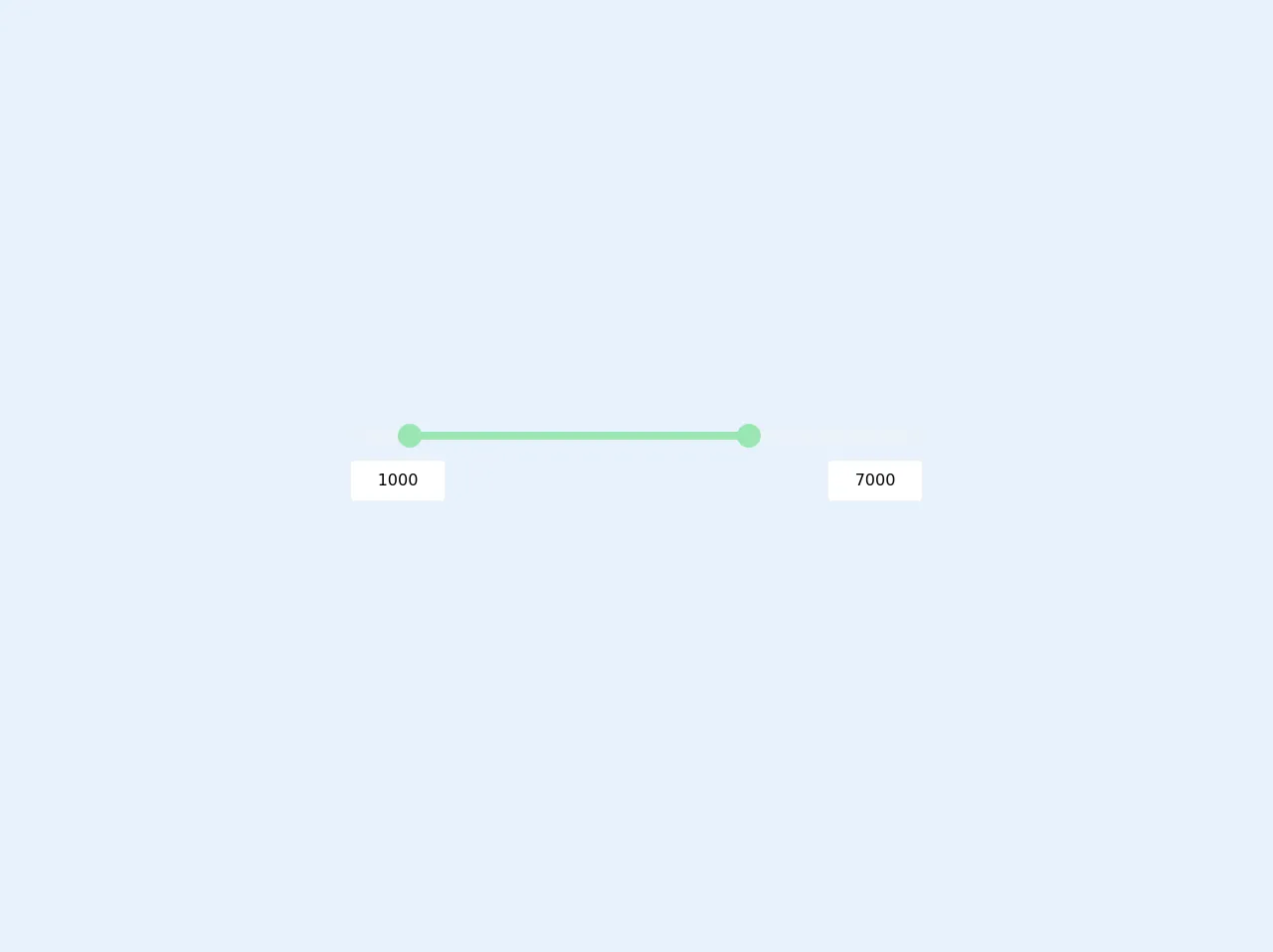
The preview of Multi Range Slider with Alpine.js ui component.
To give you an idea of what we'll be creating, here's a preview of the multi-range slider we'll be building:
Free download of the Multi Range Slider with Alpine.js's source code
The source code of Multi Range Slider with Alpine.js ui component.
Here's the source code for the multi-range slider we'll be building:
<script src="https://cdn.jsdelivr.net/gh/alpinejs/[email protected]/dist/alpine.min.js" defer></script>
<style>
  input[type=range]::-webkit-slider-thumb {
	pointer-events: all;
	width: 24px;
	height: 24px;
	-webkit-appearance: none;
  /* @apply w-6 h-6 appearance-none pointer-events-auto; */
  }
</style>
<div class="h-screen flex justify-center items-center">
  <div x-data="range()" x-init="mintrigger(); maxtrigger()" class="relative max-w-xl w-full">
    <div>
      <input type="range"
             step="100"
             x-bind:min="min" x-bind:max="max"
             x-on:input="mintrigger"
             x-model="minprice"
             class="absolute pointer-events-none appearance-none z-20 h-2 w-full opacity-0 cursor-pointer">

      <input type="range"
             step="100"
             x-bind:min="min" x-bind:max="max"
             x-on:input="maxtrigger"
             x-model="maxprice"
             class="absolute pointer-events-none appearance-none z-20 h-2 w-full opacity-0 cursor-pointer">

      <div class="relative z-10 h-2">

        <div class="absolute z-10 left-0 right-0 bottom-0 top-0 rounded-md bg-gray-200"></div>

        <div class="absolute z-20 top-0 bottom-0 rounded-md bg-green-300" x-bind:style="'right:'+maxthumb+'%; left:'+minthumb+'%'"></div>

        <div class="absolute z-30 w-6 h-6 top-0 left-0 bg-green-300 rounded-full -mt-2 -ml-1" x-bind:style="'left: '+minthumb+'%'"></div>

        <div class="absolute z-30 w-6 h-6 top-0 right-0 bg-green-300 rounded-full -mt-2 -mr-3" x-bind:style="'right: '+maxthumb+'%'"></div>

      </div>

    </div>

    <div class="flex justify-between items-center py-5">
      <div>
        <input type="text" maxlength="5" x-on:input="mintrigger" x-model="minprice" class="px-3 py-2 border border-gray-200 rounded w-24 text-center">
      </div>
      <div>
        <input type="text" maxlength="5" x-on:input="maxtrigger" x-model="maxprice" class="px-3 py-2 border border-gray-200 rounded w-24 text-center">
      </div>
    </div>

  </div>

<script>
    function range() {
        return {
          minprice: 1000,
          maxprice: 7000,
          min: 100,
          max: 10000,
          minthumb: 0,
          maxthumb: 0,

          mintrigger() {
            this.minprice = Math.min(this.minprice, this.maxprice - 500);
            this.minthumb = ((this.minprice - this.min) / (this.max - this.min)) * 100;
          },

          maxtrigger() {
            this.maxprice = Math.max(this.maxprice, this.minprice + 500);
            this.maxthumb = 100 - (((this.maxprice - this.min) / (this.max - this.min)) * 100);
          },
        }
    }
</script>
</div>
How to create a Multi Range Slider with Alpine.js with Tailwind CSS?
Now that you understand what we'll be building and why we'll be using Alpine.js and Tailwind CSS, let's get started!
Step 1: Set up your HTML
The first thing we need to do is set up our HTML. We'll create a div with a class of "slider" and two range inputs inside the div. We'll also add a span element to display the selected range.
<div class="slider">
  <input type="range" min="0" max="100" value="25">
  <input type="range" min="0" max="100" value="75">
  <span></span>
</div>
Step 2: Add Alpine.js
Next, we need to add Alpine.js to our project. You can add Alpine.js to your project by including the following script tag in your HTML:
<script src="https://cdn.jsdelivr.net/npm/[email protected]"></script>
Step 3: Add the Alpine.js script
Now that we have Alpine.js added to our project, we need to add the script that will handle the functionality of our multi-range slider. We'll create a script tag at the bottom of our HTML and add the following code:
<script>
  const slider = () => ({
    min: 0,
    max: 100,
    values: [25, 75],
    updateValues(values) {
      this.values = values;
    },
    getRange() {
      return `${this.values[0]} - ${this.values[1]}`;
    }
  });
</script>
This script defines a function called "slider" that returns an object with the properties "min", "max", "values", "updateValues", and "getRange". The "min" and "max" properties define the minimum and maximum values of our range inputs, and the "values" property defines the initial values of our range inputs.
The "updateValues" method allows us to update the values of our range inputs, and the "getRange" method returns a string that displays the selected range.
Step 4: Add the Alpine.js bindings
Now that we have our script defined, we need to add the Alpine.js bindings to our HTML. We'll add the "x-data" attribute to our div and set it to the "slider" function we defined earlier. We'll also add the "x-init" attribute to our span element and set it to the "getRange" method.
<div class="slider" x-data="slider()">
  <input type="range" min="0" max="100" x-model="values[0]" x-on:input="updateValues(values)">
  <input type="range" min="0" max="100" x-model="values[1]" x-on:input="updateValues(values)">
  <span x-init="getRange()"></span>
</div>
The "x-model" attribute binds the value of our range inputs to the "values" property of our "slider" function, and the "x-on:input" attribute updates the values of our range inputs when they are changed.
The "x-init" attribute sets the initial value of our span element to the result of the "getRange" method.
Step 5: Style the multi-range slider with Tailwind CSS
Now that we have our multi-range slider working, we need to style it with Tailwind CSS. We'll add the following classes to our HTML to style our multi-range slider:
<div class="slider bg-gray-200 rounded-lg p-4" x-data="slider()">
  <input type="range" class="w-full h-4 bg-blue-500 rounded-lg" min="0" max="100" x-model="values[0]" x-on:input="updateValues(values)">
  <input type="range" class="w-full h-4 bg-blue-500 rounded-lg" min="0" max="100" x-model="values[1]" x-on:input="updateValues(values)">
  <span class="text-center block mt-2 font-bold" x-init="getRange()"></span>
</div>
The "bg-gray-200" class sets the background color of our multi-range slider, and the "rounded-lg" class rounds the corners of our multi-range slider.
The "p-4" class adds padding to our multi-range slider, and the "w-full" class sets the width of our range inputs to 100%.
The "h-4" class sets the height of our range inputs to 4 pixels, and the "bg-blue-500" class sets the background color of our range inputs to blue.
The "text-center" class centers the text in our span element, and the "block" class sets our span element to display as a block element.
The "mt-2" class adds margin to the top of our span element, and the "font-bold" class sets the font weight of our span element to bold.
Step 6: Test your multi-range slider
Now that we have our multi-range slider working and styled, we need to test it to make sure it works as expected. Try dragging the range inputs and see if the selected range updates in the span element.
Congratulations! You've successfully created a multi-range slider with Alpine.js and Tailwind CSS.
Conclusion
In this tutorial, we walked you through the steps to create a multi-range slider with Alpine.js and Tailwind CSS. By following these steps, you can create a fully functional multi-range slider that matches the design of your website or application. With Alpine.js and Tailwind CSS, you can create custom UI components quickly and easily.