- Published on
6 Ideas To Help You Make A Multi-Level Dropdown With Tailwind CSS Like A Pro
- What is Tailwind CSS?
- The description of Multi-Level Dropdown ui component
- Why use Tailwind CSS to create a Multi-Level Dropdown ui component?
- The preview of Multi-Level Dropdown ui component
- The source code of Multi-Level Dropdown ui component
- How to create a Multi-Level Dropdown with Tailwind CSS?
- 1. Define the HTML structure of the dropdown.
- 2. Use Tailwind CSS utility classes to style the dropdown.
- 3. Add JavaScript to handle the dropdown's behavior.
- Conclusion
In this article, we will explore how to create a multi-level dropdown with Tailwind CSS. We will discuss what Tailwind CSS is, the benefits of using it to create a multi-level dropdown, and provide a preview and source code for the component.
What is Tailwind CSS?
Tailwind CSS is a utility-first CSS framework that allows developers to quickly and easily create custom user interfaces. It provides a set of pre-defined utility classes that can be used to style HTML elements, making it easy to create responsive designs without the need for custom CSS.
The description of Multi-Level Dropdown ui component
A multi-level dropdown is a user interface component that allows users to navigate through a hierarchical menu structure. It typically consists of a top-level menu item that, when clicked, reveals a sub-menu containing additional menu items.
Why use Tailwind CSS to create a Multi-Level Dropdown ui component?
Tailwind CSS is an excellent choice for creating a multi-level dropdown because it provides a set of utility classes that can be used to style the component quickly and easily. Additionally, Tailwind CSS's responsive design capabilities make it easy to create a dropdown that works well on both desktop and mobile devices.
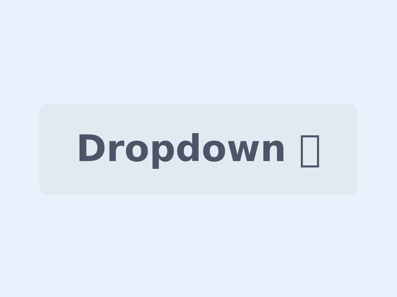
The preview of Multi-Level Dropdown ui component
To create a multi-level dropdown with Tailwind CSS, we will use a combination of HTML and CSS. The HTML will define the structure of the dropdown, while the CSS will be used to style it.
Free download of the Multi-Level Dropdown's source code
The source code of Multi-Level Dropdown ui component
To create a multi-level dropdown with Tailwind CSS, we will need to use a combination of HTML and CSS. The HTML will define the structure of the dropdown, while the CSS will be used to style it.
<style>
.dropdown:hover > .dropdown-content {
	display: block;
}
</style>

<div class="dropdown inline-block relative">
	<button class="bg-gray-300 text-gray-700 font-semibold py-2 px-4 rounded inline-flex items-center">
		<span>Dropdown 🠋</span>
	</button>
	<ul class="dropdown-content absolute hidden text-gray-700 pt-1">
		<li><a class="rounded-t bg-gray-200 hover:bg-gray-400 py-2 px-4 block whitespace-no-wrap" href="#">Option 1</a></li>
		<li><a class="bg-gray-200 hover:bg-gray-400 py-2 px-4 block whitespace-no-wrap" href="#">Option 2</a></li>
      	<li class="dropdown">
          <a class="bg-gray-200 hover:bg-gray-400 py-2 px-4 block whitespace-no-wrap" href="#">Option 3 🠞</a>
          	<ul class="dropdown-content absolute hidden text-gray-700 pl-5 ml-24 -mt-10">
          		<li><a class="bg-gray-200 hover:bg-gray-400 py-2 px-4 block whitespace-no-wrap" href="#">Option 3-1</a>
              	<li><a class="bg-gray-200 hover:bg-gray-400 py-2 px-4 block whitespace-no-wrap" href="#">Option 3-2</a>
            </ul>
      	</li>
		<li><a class="rounded-b bg-gray-200 hover:bg-gray-400 py-2 px-4 block whitespace-no-wrap" href="#">Option 4</a></li>
	</ul>
</div>
How to create a Multi-Level Dropdown with Tailwind CSS?
To create a multi-level dropdown with Tailwind CSS, we will need to follow these steps:
- Define the HTML structure of the dropdown.
- Use Tailwind CSS utility classes to style the dropdown.
- Add JavaScript to handle the dropdown's behavior.
1. Define the HTML structure of the dropdown.
The first step in creating a multi-level dropdown is to define the HTML structure of the dropdown. We will use a combination of nested unordered lists and anchor tags to create the dropdown's hierarchical structure.
<nav class="flex flex-wrap items-center justify-between p-6 bg-gray-800">
  <div class="flex items-center flex-shrink-0 mr-6 text-white">
    <span class="font-semibold text-xl tracking-tight">Multi-Level Dropdown</span>
  </div>
  <div class="block lg:hidden">
    <button class="flex items-center px-3 py-2 border rounded text-gray-500 border-gray-600 hover:text-white hover:border-white">
      <svg class="fill-current h-3 w-3" viewBox="0 0 20 20" xmlns="http://www.w3.org/2000/svg"><title>Menu</title><path d="M0 3h20v2H0V3zm0 6h20v2H0V9zm0 6h20v2H0v-2z"/></svg>
    </button>
  </div>
  <div class="w-full block flex-grow lg:flex lg:items-center lg:w-auto">
    <div class="text-sm lg:flex-grow">
      <ul class="flex flex-col lg:flex-row list-none lg:ml-auto">
        <li class="nav-item">
          <a class="px-3 py-2 flex items-center text-xs uppercase font-bold leading-snug text-white hover:opacity-75" href="#pablo">
            Home
          </a>
        </li>
        <li class="nav-item dropdown">
          <a class="px-3 py-2 flex items-center text-xs uppercase font-bold leading-snug text-white hover:opacity-75" href="#pablo">
            Dropdown
            <svg class="fill-current h-4 w-4 ml-2" viewBox="0 0 20 20" xmlns="http://www.w3.org/2000/svg"><path d="M10 12l-6-6h12l-6 6z"/></svg>
          </a>
          <ul class="dropdown-menu absolute hidden text-gray-700 pt-1">
            <li class="">
              <a class="rounded-t bg-gray-200 hover:bg-gray-400 py-2 px-4 block whitespace-no-wrap" href="#">
                One
              </a>
            </li>
            <li class="">
              <a class="bg-gray-200 hover:bg-gray-400 py-2 px-4 block whitespace-no-wrap" href="#">
                Two
              </a>
            </li>
            <li class="">
              <a class="rounded-b bg-gray-200 hover:bg-gray-400 py-2 px-4 block whitespace-no-wrap" href="#">
                Three
              </a>
            </li>
          </ul>
        </li>
      </ul>
    </div>
  </div>
</nav>
2. Use Tailwind CSS utility classes to style the dropdown.
Once we have defined the HTML structure of the dropdown, we can use Tailwind CSS utility classes to style it. We will use a combination of padding, margin, background color, text color, and hover effects to create a visually appealing dropdown.
/* Dropdown Styles */
.dropdown:hover .dropdown-menu {
  display: block;
}

.dropdown-menu {
  z-index: 20;
  min-width: 10rem;
  padding: 0.5rem 0;
  margin: 0.125rem 0 0;
  font-size: 1rem;
  color: #212529;
  text-align: left;
  list-style: none;
  background-color: #fff;
  background-clip: padding-box;
  border: 1px solid rgba(0, 0, 0, 0.15);
  border-radius: 0.25rem;
}

.dropdown-item {
  display: block;
  width: 100%;
  padding: 0.25rem 1.5rem;
  clear: both;
  font-weight: 400;
  color: #212529;
  text-align: inherit;
  white-space: nowrap;
  background-color: transparent;
  border: 0;
}

.dropdown-item:hover,
.dropdown-item:focus {
  color: #16181b;
  text-decoration: none;
  background-color: #f8f9fa;
}

.dropdown-item.active,
.dropdown-item:active {
  color: #fff;
  text-decoration: none;
  background-color: #007bff;
}
3. Add JavaScript to handle the dropdown's behavior.
Finally, we will need to add JavaScript to handle the dropdown's behavior. We will use JavaScript to toggle the visibility of the dropdown's sub-menu when the user clicks on the dropdown's top-level menu item.
/* Dropdown JS */
(function () {
  var dropdown = document.querySelectorAll('.dropdown');
  var dropdownArray = Array.prototype.slice.call(dropdown, 0);
  dropdownArray.forEach(function (el) {
    var button = el.querySelector('a[data-toggle="dropdown"]');
    var menu = el.querySelector('.dropdown-menu');
    var arrow = button.querySelector('svg');

    button.onclick = function (event) {
      if (!menu.classList.contains('show')) {
        menu.classList.add('show');
        menu.classList.remove('hide');
        arrow.classList.add('open');
        arrow.classList.remove('closed');
        event.preventDefault();
      } else {
        menu.classList.remove('show');
        menu.classList.add('hide');
        arrow.classList.remove('open');
        arrow.classList.add('closed');
        event.preventDefault();
      }
    };
  });

  Element.prototype.hasClass = function (className) {
    return this.className && new RegExp('(^|\\s)' + className + '(\\s|$)').test(this.className);
  };
})();
Conclusion
In conclusion, creating a multi-level dropdown with Tailwind CSS is a straightforward process that can be accomplished with a combination of HTML, CSS, and JavaScript. By using Tailwind CSS's utility classes, we can quickly and easily style the dropdown, making it both visually appealing and responsive.