- Published on
How To Build A Love Hit With Tailwind CSS In 6 Easy Steps?
- What is Tailwind CSS?
- The description of Love hit ui component
- Why use Tailwind CSS to create a Love hit ui component?
- The preview of Love hit ui component.
- The source code of Love hit ui component.
- How to create a Love hit with Tailwind CSS?
- Step 1: Create a button element
- Step 2: Add Tailwind CSS classes to the button element
- Step 3: Style the heart icon
- Step 4: Add JavaScript code to handle the Love hit action
- Step 5: Add CSS code to style the Love hit
- Step 6: Test the Love hit UI component
- Conclusion
What is Tailwind CSS?
Tailwind CSS is a utility-first CSS framework that allows you to quickly build custom user interfaces. It provides a set of pre-defined CSS classes that you can use to style your HTML elements. With Tailwind CSS, you can create complex layouts and designs without writing custom CSS code.
The description of Love hit ui component
A Love hit is a UI component that is commonly used in social media applications. It allows users to express their appreciation for a post or a comment by clicking on a heart-shaped button. When the button is clicked, the heart icon changes color to indicate that the post has been liked.
Why use Tailwind CSS to create a Love hit ui component?
Tailwind CSS is an excellent choice for creating a Love hit UI component because it provides pre-defined classes for common UI elements, including buttons and icons. This means that you can create a Love hit with just a few lines of HTML and CSS code.
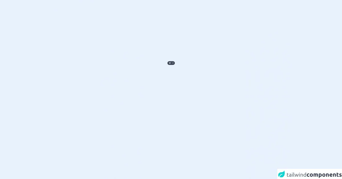
The preview of Love hit ui component.
To create a Love hit UI component, we will use Tailwind CSS classes to style a button and an icon. The result will be a button with a heart icon that changes color when clicked.
Free download of the Love hit's source code
The source code of Love hit ui component.
To create a Love hit UI component, we will use the following HTML and CSS code:
<div class="flex items-center h-screen px-6">
  <div class="cursor-pointer">
    <span class="flex h-min w-min space-x-1 items-center rounded-full text-gray-400 hover:text-rose-600 bg-gray-700 hover:bg-rose-50 py-1 px-2 text-xs font-medium">
      <svg xmlns="http://www.w3.org/2000/svg" class="h-5 w-5 fill-current hover:text-red-400" fill="none" viewBox="0 0 24 24" stroke="currentColor">
        <path stroke-linecap="round" stroke-linejoin="round" stroke-width="2" d="M4.318 6.318a4.5 4.5 0 000 6.364L12 20.364l7.682-7.682a4.5 4.5 0 00-6.364-6.364L12 7.636l-1.318-1.318a4.5 4.5 0 00-6.364 0z" />
      </svg>
      <p class="font-semibold text-xs">10</p>
    </span>
  </div>
</div>
How to create a Love hit with Tailwind CSS?
Here are the six easy steps to create a Love hit with Tailwind CSS:
Step 1: Create a button element
The first step is to create a button element in your HTML code. This button will be used to trigger the Love hit action.
<button class="bg-transparent border border-gray-300 rounded-full p-2">
  <svg class="text-gray-500 hover:text-red-500" fill="none" stroke="currentColor" viewBox="0 0 24 24" xmlns="http://www.w3.org/2000/svg">
    <path stroke-linecap="round" stroke-linejoin="round" stroke-width="2" d="M12 4c-3.18 0-6 2.5-6 5.5 0 3.86 4.42 8.74 5.5 9.75 1.08-1.01 5.5-5.89 5.5-9.75C18 6.5 15.18 4 12 4z"></path>
  </svg>
</button>
In this code, we have created a button element with a border and a rounded shape. We have also added a heart icon to the button using an SVG element.
Step 2: Add Tailwind CSS classes to the button element
Next, we will add Tailwind CSS classes to the button element to style it. We will use the bg-transparent class to make the button background transparent, the border class to add a border to the button, and the rounded-full class to make the button round.
<button class="bg-transparent border border-gray-300 rounded-full p-2">
  <svg class="text-gray-500 hover:text-red-500" fill="none" stroke="currentColor" viewBox="0 0 24 24" xmlns="http://www.w3.org/2000/svg">
    <path stroke-linecap="round" stroke-linejoin="round" stroke-width="2" d="M12 4c-3.18 0-6 2.5-6 5.5 0 3.86 4.42 8.74 5.5 9.75 1.08-1.01 5.5-5.89 5.5-9.75C18 6.5 15.18 4 12 4z"></path>
  </svg>
</button>
Step 3: Style the heart icon
Now, we will style the heart icon using Tailwind CSS classes. We will use the text-gray-500 class to set the heart icon color to gray and the hover:text-red-500 class to change the heart icon color to red when the button is hovered over.
<button class="bg-transparent border border-gray-300 rounded-full p-2">
  <svg class="text-gray-500 hover:text-red-500" fill="none" stroke="currentColor" viewBox="0 0 24 24" xmlns="http://www.w3.org/2000/svg">
    <path stroke-linecap="round" stroke-linejoin="round" stroke-width="2" d="M12 4c-3.18 0-6 2.5-6 5.5 0 3.86 4.42 8.74 5.5 9.75 1.08-1.01 5.5-5.89 5.5-9.75C18 6.5 15.18 4 12 4z"></path>
  </svg>
</button>
Step 4: Add JavaScript code to handle the Love hit action
To handle the Love hit action, we will add some JavaScript code to our HTML file. This code will listen for a click event on the button element and toggle the heart icon color.
<button class="bg-transparent border border-gray-300 rounded-full p-2" onclick="toggleLoveHit()">
  <svg class="text-gray-500 hover:text-red-500" fill="none" stroke="currentColor" viewBox="0 0 24 24" xmlns="http://www.w3.org/2000/svg">
    <path stroke-linecap="round" stroke-linejoin="round" stroke-width="2" d="M12 4c-3.18 0-6 2.5-6 5.5 0 3.86 4.42 8.74 5.5 9.75 1.08-1.01 5.5-5.89 5.5-9.75C18 6.5 15.18 4 12 4z"></path>
  </svg>
</button>

<script>
  function toggleLoveHit() {
    const heartIcon = document.querySelector('svg');
    heartIcon.classList.toggle('text-red-500');
  }
</script>
In this code, we have added an onclick attribute to the button element that calls the toggleLoveHit() function when clicked. This function uses the querySelector() method to select the heart icon and toggles the text-red-500 class to change the heart icon color.
Step 5: Add CSS code to style the Love hit
To style the Love hit UI component, we will add some CSS code to our HTML file. This code will set the button size and position and adjust the heart icon size.
<style>
  button {
    width: 40px;
    height: 40px;
    position: relative;
  }

  svg {
    width: 20px;
    height: 20px;
    position: absolute;
    top: 50%;
    left: 50%;
    transform: translate(-50%, -50%);
  }
</style>
In this code, we have set the button width and height to 40 pixels and positioned it relative to its parent element. We have also set the heart icon width and height to 20 pixels and positioned it in the center of the button using absolute positioning and the transform property.
Step 6: Test the Love hit UI component
Finally, we can test our Love hit UI component by clicking on the button. When clicked, the heart icon color should change from gray to red and back again.
Conclusion
In this article, we have learned how to create a Love hit UI component using Tailwind CSS. With just a few lines of HTML and CSS code, we were able to create a button with a heart icon that changes color when clicked. Tailwind CSS is an excellent choice for creating custom UI components because it provides pre-defined classes for common UI elements, making it easy to create complex layouts and designs.