- Published on
6 Steps To Create A Login Page With Tailwind CSS Like A Pro In Under An Hour
- What is Tailwind CSS?
- The description of Login page ui component
- Why use Tailwind CSS to create a Login page ui component?
- The preview of Login page ui component
- The source code of Login page ui component
- How to create a Login page with Tailwind CSS?
- Step 1: Set up a new HTML file
- Step 2: Add the Login form
- Step 3: Style the Login form
- Step 4: Add responsive design
- Step 5: Add custom styles
- Step 6: Add JavaScript functionality
- Conclusion
As a FrontEnd technology blogger, you must have heard of Tailwind CSS. It is a utility-first CSS framework that helps you quickly build custom designs. In this article, we will show you how to create a Login page with Tailwind CSS like a pro in under an hour.
What is Tailwind CSS?
Tailwind CSS is a CSS framework that provides a set of pre-defined classes that you can use to style your HTML elements. It is a utility-first framework, which means that it focuses on providing utility classes rather than pre-built components. This approach gives you more flexibility and control over your designs.
The description of Login page ui component
A Login page is an essential component of any web application. It is the first point of contact for users to access the application. A well-designed Login page should be simple, intuitive, and easy to use. It should also be visually appealing and consistent with the overall design of the application.
Why use Tailwind CSS to create a Login page ui component?
Tailwind CSS provides a set of pre-defined utility classes that you can use to quickly style your Login page. This approach saves you time and effort, as you don't have to write custom CSS from scratch. Tailwind CSS also provides a responsive design system that allows you to create a Login page that looks great on any device.
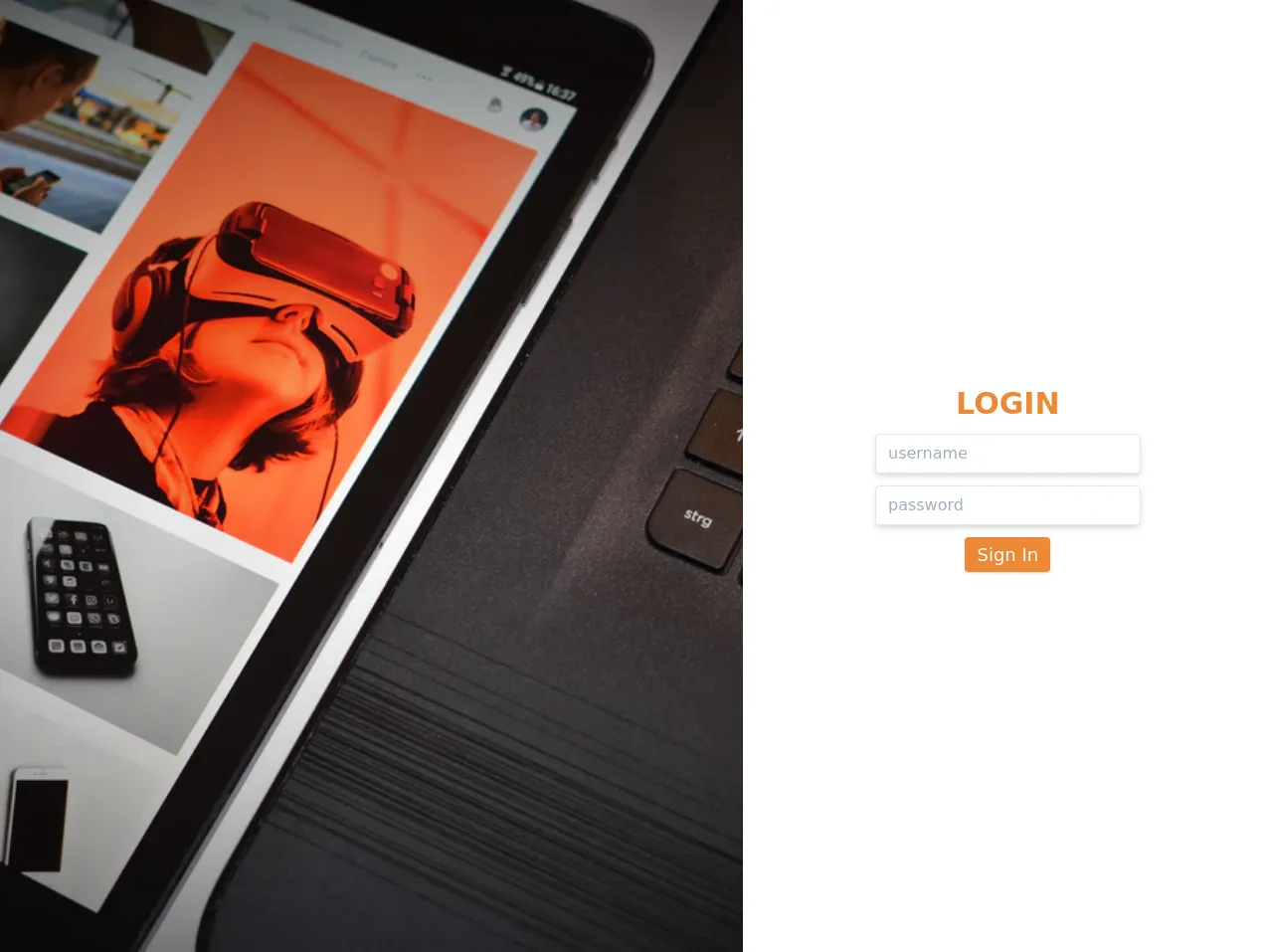
The preview of Login page ui component
To create a Login page with Tailwind CSS, we will use a simple design that includes a login form with two input fields for username and password, a remember me checkbox, and a login button.
Free download of the Login page's source code
The source code of Login page ui component
To create the Login page, we will use HTML and Tailwind CSS classes. The HTML code will define the structure of the Login page, while the Tailwind CSS classes will provide the styling.
<div class="w-full h-screen flex">
    <img src="https://images.unsplash.com/photo-1540569876033-6e5d046a1d77?ixlib=rb-1.2.1&ixid=eyJhcHBfaWQiOjEyMDd9&auto=format&fit=crop&w=1050&q=80" alt="background" class="object-cover object-center h-screen w-7/12">
    <div class="bg-white flex flex-col justify-center items-center w-5/12 shadow-lg">
      <h1 class="text-3xl font-bold text-orange-500 mb-2">LOGIN</h1>
      <div class="w-1/2 text-center">
        <input type="text" name="username" placeholder="username" autocomplete="off"
            class="shadow-md border w-full h-10 px-3 py-2 text-orange-500 focus:outline-none focus:border-orange-500 mb-3 rounded">
        <input type="password" name="password" placeholder="password" autocomplete="off"
            class="shadow-md border w-full h-10 px-3 py-2 text-orange-500 focus:outline-none focus:border-orange-500 mb-3 rounded">
        <button class="bg-orange-500 hover:bg-orange-600 text-white px-3 py-1 rounded text-lg focus:outline-none shadow">Sign In</button>
      </div>
    </div>
  </div>
How to create a Login page with Tailwind CSS?
Now that we have a basic understanding of Tailwind CSS and the Login page component let's dive into the steps to create a Login page with Tailwind CSS.
Step 1: Set up a new HTML file
Create a new HTML file and add the basic HTML structure. Add a title to the page and link the Tailwind CSS stylesheet.
<!DOCTYPE html>
<html lang="en">
<head>
  <meta charset="UTF-8">
  <title>Login Page</title>
  <link rel="stylesheet" href="https://cdn.jsdelivr.net/npm/[email protected]/dist/tailwind.min.css">
</head>
<body>

</body>
</html>
Step 2: Add the Login form
Add the HTML code for the Login form. The form should have two input fields for the username and password, a remember me checkbox, and a login button.
<div class="flex justify-center items-center h-screen">
  <form class="w-full max-w-md">
    <div class="mb-4">
      <label class="block text-gray-700 font-bold mb-2" for="username">
        Username
      </label>
      <input class="shadow appearance-none border rounded w-full py-2 px-3 text-gray-700 leading-tight focus:outline-none focus:shadow-outline" id="username" type="text" placeholder="Username">
    </div>
    <div class="mb-6">
      <label class="block text-gray-700 font-bold mb-2" for="password">
        Password
      </label>
      <input class="shadow appearance-none border rounded w-full py-2 px-3 text-gray-700 leading-tight focus:outline-none focus:shadow-outline" id="password" type="password" placeholder="********">
    </div>
    <div class="mb-6">
      <label class="inline-flex items-center">
        <input type="checkbox" class="form-checkbox h-5 w-5 text-gray-600" checked><span class="ml-2 text-gray-700 font-bold">Remember me</span>
      </label>
    </div>
    <div class="flex items-center justify-between">
      <button class="bg-blue-500 hover:bg-blue-700 text-white font-bold py-2 px-4 rounded focus:outline-none focus:shadow-outline" type="button">
        Sign In
      </button>
    </div>
  </form>
</div>
Step 3: Style the Login form
Add Tailwind CSS classes to style the Login form. Use the flexbox utility classes to center the Login form vertically and horizontally. Use the form utility classes to style the input fields, checkbox, and button.
<div class="flex justify-center items-center h-screen">
  <form class="w-full max-w-md bg-white rounded-lg shadow-md p-8">
    <div class="mb-4">
      <label class="block text-gray-700 font-bold mb-2" for="username">
        Username
      </label>
      <input class="shadow appearance-none border rounded w-full py-2 px-3 text-gray-700 leading-tight focus:outline-none focus:shadow-outline" id="username" type="text" placeholder="Username">
    </div>
    <div class="mb-6">
      <label class="block text-gray-700 font-bold mb-2" for="password">
        Password
      </label>
      <input class="shadow appearance-none border rounded w-full py-2 px-3 text-gray-700 leading-tight focus:outline-none focus:shadow-outline" id="password" type="password" placeholder="********">
    </div>
    <div class="mb-6">
      <label class="inline-flex items-center">
        <input type="checkbox" class="form-checkbox h-5 w-5 text-gray-600" checked><span class="ml-2 text-gray-700 font-bold">Remember me</span>
      </label>
    </div>
    <div class="flex items-center justify-between">
      <button class="bg-blue-500 hover:bg-blue-700 text-white font-bold py-2 px-4 rounded focus:outline-none focus:shadow-outline" type="button">
        Sign In
      </button>
    </div>
  </form>
</div>
Step 4: Add responsive design
Tailwind CSS provides a responsive design system that allows you to create a Login page that looks great on any device. Use the responsive utility classes to adjust the layout of the Login form on different screen sizes.
<div class="flex justify-center items-center h-screen">
  <form class="w-full max-w-md bg-white rounded-lg shadow-md p-8">
    <div class="mb-4">
      <label class="block text-gray-700 font-bold mb-2" for="username">
        Username
      </label>
      <input class="shadow appearance-none border rounded w-full py-2 px-3 text-gray-700 leading-tight focus:outline-none focus:shadow-outline" id="username" type="text" placeholder="Username">
    </div>
    <div class="mb-6">
      <label class="block text-gray-700 font-bold mb-2" for="password">
        Password
      </label>
      <input class="shadow appearance-none border rounded w-full py-2 px-3 text-gray-700 leading-tight focus:outline-none focus:shadow-outline" id="password" type="password" placeholder="********">
    </div>
    <div class="mb-6">
      <label class="inline-flex items-center">
        <input type="checkbox" class="form-checkbox h-5 w-5 text-gray-600" checked><span class="ml-2 text-gray-700 font-bold">Remember me</span>
      </label>
    </div>
    <div class="flex items-center justify-between">
      <button class="bg-blue-500 hover:bg-blue-700 text-white font-bold py-2 px-4 rounded focus:outline-none focus:shadow-outline" type="button">
        Sign In
      </button>
    </div>
  </form>
</div>
Step 5: Add custom styles
Tailwind CSS provides a set of pre-defined utility classes that you can use to style your Login page. However, you can also add custom styles if needed. For example, you can add a custom background color to the Login form.
<div class="flex justify-center items-center h-screen bg-gray-100">
  <form class="w-full max-w-md bg-white rounded-lg shadow-md p-8">
    <div class="mb-4">
      <label class="block text-gray-700 font-bold mb-2" for="username">
        Username
      </label>
      <input class="shadow appearance-none border rounded w-full py-2 px-3 text-gray-700 leading-tight focus:outline-none focus:shadow-outline" id="username" type="text" placeholder="Username">
    </div>
    <div class="mb-6">
      <label class="block text-gray-700 font-bold mb-2" for="password">
        Password
      </label>
      <input class="shadow appearance-none border rounded w-full py-2 px-3 text-gray-700 leading-tight focus:outline-none focus:shadow-outline" id="password" type="password" placeholder="********">
    </div>
    <div class="mb-6">
      <label class="inline-flex items-center">
        <input type="checkbox" class="form-checkbox h-5 w-5 text-gray-600" checked><span class="ml-2 text-gray-700 font-bold">Remember me</span>
      </label>
    </div>
    <div class="flex items-center justify-between">
      <button class="bg-blue-500 hover:bg-blue-700 text-white font-bold py-2 px-4 rounded focus:outline-none focus:shadow-outline" type="button">
        Sign In
      </button>
    </div>
  </form>
</div>
Step 6: Add JavaScript functionality
Finally, you can add JavaScript functionality to the Login form. For example, you can add a click event listener to the login button that validates the input fields and logs the user in if the credentials are correct.
<div class="flex justify-center items-center h-screen bg-gray-100">
  <form class="w-full max-w-md bg-white rounded-lg shadow-md p-8">
    <div class="mb-4">
      <label class="block text-gray-700 font-bold mb-2" for="username">
        Username
      </label>
      <input class="shadow appearance-none border rounded w-full py-2 px-3 text-gray-700 leading-tight focus:outline-none focus:shadow-outline" id="username" type="text" placeholder="Username">
    </div>
    <div class="mb-6">
      <label class="block text-gray-700 font-bold mb-2" for="password">
        Password
      </label>
      <input class="shadow appearance-none border rounded w-full py-2 px-3 text-gray-700 leading-tight focus:outline-none focus:shadow-outline" id="password" type="password" placeholder="********">
    </div>
    <div class="mb-6">
      <label class="inline-flex items-center">
        <input type="checkbox" class="form-checkbox h-5 w-5 text-gray-600" checked><span class="ml-2 text-gray-700 font-bold">Remember me</span>
      </label>
    </div>
    <div class="flex items-center justify-between">
      <button id="login-btn" class="bg-blue-500 hover:bg-blue-700 text-white font-bold py-2 px-4 rounded focus:outline-none focus:shadow-outline" type="button">
        Sign In
      </button>
    </div>
  </form>
</div>

<script>
  const loginBtn = document.getElementById('login-btn');
  loginBtn.addEventListener('click', () => {
    const username = document.getElementById('username').value;
    const password = document.getElementById('password').value;
    // Validate credentials and log user in
  });
</script>
Conclusion
In this article, we have shown you how to create a Login page with Tailwind CSS like a pro in under an hour. We have covered the basic steps to create a Login form, style it with Tailwind CSS classes, add responsive design, add custom styles, and add JavaScript functionality. With Tailwind CSS, you can quickly create custom designs that look great on any device. Happy coding!