- Published on
6 Critical Skills To Create A Login Page With Tailwind CSS Remarkably Well
- What is Tailwind CSS?
- The description of login page UI component
- Why use Tailwind CSS to create a login page UI component?
- The preview of login page UI component
- The source code of login page UI component
- How to create a login page with Tailwind CSS?
- Conclusion
As a FrontEnd technology blogger, you must have heard of Tailwind CSS. It is a utility-first CSS framework that helps you create responsive and customizable designs with ease. In this article, we will discuss 6 critical skills that you need to create a login page with Tailwind CSS remarkably well.
What is Tailwind CSS?
Tailwind CSS is a utility-first CSS framework that provides you with a set of pre-defined classes that you can use to style your HTML elements. It is designed to help you create responsive and customizable designs quickly and efficiently. With Tailwind CSS, you don't have to write custom CSS code for every design element, which saves you a lot of time and effort.
The description of login page UI component
A login page is a crucial component of any website or application that requires user authentication. It is the first point of contact between the user and the system, and it should be designed to be user-friendly and secure. A typical login page UI component consists of a form with two input fields for the username and password, and a submit button to log in.
Why use Tailwind CSS to create a login page UI component?
Tailwind CSS provides you with a set of pre-defined classes that you can use to style your login page UI component quickly and efficiently. It also provides you with responsive design utilities, which means that your login page will look great on any device, regardless of its screen size.
The preview of login page UI component
To create a login page UI component with Tailwind CSS, you need to have a basic understanding of HTML and CSS. Here is a preview of what your login page UI component could look like:
<div class="bg-gray-100 min-h-screen flex flex-col justify-center py-12 sm:px-6 lg:px-8">
  <div class="sm:mx-auto sm:w-full sm:max-w-md">
    <h2 class="mt-6 text-center text-3xl font-extrabold text-gray-900">
      Sign in to your account
    </h2>
    <p class="mt-2 text-center text-sm text-gray-600">
      Or
      <a href="#" class="font-medium text-indigo-600 hover:text-indigo-500">
        start your free trial
      </a>
    </p>
  </div>

  <div class="mt-8 sm:mx-auto sm:w-full sm:max-w-md">
    <div class="bg-white py-8 px-4 shadow sm:rounded-lg sm:px-10">
      <form class="space-y-6" action="#" method="POST">
        <div>
          <label for="email" class="block text-sm font-medium text-gray-700">
            Email address
          </label>
          <div class="mt-1">
            <input id="email" name="email" type="email" autocomplete="email" required class="appearance-none block w-full px-3 py-2 border border-gray-300 rounded-md shadow-sm placeholder-gray-400 focus:outline-none focus:ring-indigo-500 focus:border-indigo-500 sm:text-sm">
          </div>
        </div>

        <div>
          <label for="password" class="block text-sm font-medium text-gray-700">
            Password
          </label>
          <div class="mt-1">
            <input id="password" name="password" type="password" autocomplete="current-password" required class="appearance-none block w-full px-3 py-2 border border-gray-300 rounded-md shadow-sm placeholder-gray-400 focus:outline-none focus:ring-indigo-500 focus:border-indigo-500 sm:text-sm">
          </div>
        </div>

        <div class="flex items-center justify-between">
          <div class="flex items-center">
            <input id="remember_me" name="remember_me" type="checkbox" class="h-4 w-4 text-indigo-600 focus:ring-indigo-500 border-gray-300 rounded">
            <label for="remember_me" class="ml-2 block text-sm text-gray-900">
              Remember me
            </label>
          </div>

          <div class="text-sm">
            <a href="#" class="font-medium text-indigo-600 hover:text-indigo-500">
              Forgot your password?
            </a>
          </div>
        </div>

        <div>
          <button type="submit" class="group relative w-full flex justify-center py-2 px-4 border border-transparent text-sm font-medium rounded-md text-white bg-indigo-600 hover:bg-indigo-700 focus:outline-none focus:ring-2 focus:ring-offset-2 focus:ring-indigo-500">
            <span class="absolute left-0 inset-y-0 flex items-center pl-3">
              <!-- Heroicon name: solid/lock-closed -->
              <svg class="h-5 w-5 text-indigo-500 group-hover:text-indigo-400" xmlns="http://www.w3.org/2000/svg" viewBox="0 0 20 20" fill="currentColor" aria-hidden="true">
                <path fill-rule="evenodd" d="M10 2a3 3 0 00-3 3v2H4a2 2 0 00-2 2v9a2 2 0 002 2h12a2 2 0 002-2v-9a2 2 0 00-2-2h-3V5a3 3 0 00-3-3zm-3 5h6v2a1 1 0 01-1 1H8a1 1 0 01-1-1V7z" clip-rule="evenodd" />
              </svg>
            </span>
            Sign in
          </button>
        </div>
      </form>

      <div class="mt-6">
        <div class="relative">
          <div class="absolute inset-0 flex items-center">
            <div class="w-full border-t border-gray-300"></div>
          </div>
          <div class="relative flex justify-center text-sm">
            <span class="px-2 bg-white text-gray-500">
              Or continue with
            </span>
          </div>
        </div>

        <div class="mt-6 grid grid-cols-3 gap-3">
          <div>
            <a href="#" class="w-full inline-flex justify-center py-2 px-4 border border-gray-300 rounded-md shadow-sm bg-white text-sm font-medium text-gray-500 hover:bg-gray-50">
              <span class="sr-only">Sign in with Facebook</span>
              <svg class="w-5 h-5" fill="currentColor" viewBox="0 0 20 20" aria-hidden="true">
                <path fill-rule="evenodd" d="M16 3a1 1 0 011 1v12a1 1 0 01-1 1H9.83a.5.5 0 00-.5.5v2a.5.5 0 00.5.5H12a1 1 0 01-1 1H8a1 1 0 01-1-1V4a1 1 0 011-1h8zm-5.54 5.47h1.4l.21-1.62h-1.61v-1.04c0-.47.13-.79.81-.79h.87V2.2A12.11 12.11 0 0013.14 2c-1.35 0-2.28.82-2.28 2.33v1.14H9.5v1.62h1.36v4.14h1.68v-4.14zm-3.83-.47h1.4v-1.62H7.63v1.62zm0 2.47h1.4v-1.62H7.63v1.62z" clip-rule="evenodd" />
              </svg>
            </a>
          </div>

          <div>
            <a href="#" class="w-full inline-flex justify-center py-2 px-4 border border-gray-300 rounded-md shadow-sm bg-white text-sm font-medium text-gray-500 hover:bg-gray-50">
              <span class="sr-only">Sign in with Twitter</span>
              <svg class="w-5 h-5" fill="currentColor" viewBox="0 0 20 20" aria-hidden="true">
                <path fill-rule="evenodd" d="M17.94 5.06a.75.75 0 00-1.06 0 6.47 6.47 0 01-4.6 1.9 3.24 3.24 0 001.51-1.78 6.5 6.5 0 01-2.08.79 3.25 3.25 0 00-5.53 2.97c0 .25 0 .5.02.75A9.26 9.26 0 012.2 5.6a3.25 3.25 0 001 4.34 3.24 3.24 0 01-1.47-.4v.04a3.25 3.25 0 002.6 3.18 3.27 3.27 0 01-.9.12c-.22 0-.44-.02-.64-.08a3.25 3.25 0 003.04 2.25A6.5 6.5 0 012 14.5a9.18 9.18 0 005.02 1.47c6.04 0 9.34-5 9.34-9.34 0-.14 0-.28-.01-.42a6.67 6.67 0 001.64-1.7z" clip-rule="evenodd" />
              </svg>
            </a>
          </div>

          <div>
            <a href="#" class="w-full inline-flex justify-center py-2 px-4 border border-gray-300 rounded-md shadow-sm bg-white text-sm font-medium text-gray-500 hover:bg-gray-50">
              <span class="sr-only">Sign in with GitHub</span>
              <svg class="w-5 h-5" fill="currentColor" viewBox="0 0 20 20" aria-hidden="true">
                <path fill-rule="evenodd" d="M10 0C4.48 0 0 4.48 0 10c0 4.41 2.87 8.14 6.84 9.46.5.09.68-.22.68-.48v-1.67c-2.79.6-3.37-1.34-3.37-1.34-.46-1.17-1.12-1.48-1.12-1.48-.91-.62.07-.61.07-.61 1 .07 1.53 1.02 1.53 1.02.89 1.52 2.34 1.08 2.91.83.09-.64.35-1.08.63-1.33-2.22-.25-4.56-1.11-4.56-4.94 0-1.09.39-1.98 1.03-2.68-.1-.25-.45-1.27.1-2.64 0 0 .84-.27 2.75 1.02.8-.22 1.65-.33 2.5-.33s1.7.11 2.5.33c1.91-1.29 2.75-1.02 2.75-1.02.55 1.37.2 2.39.1 2.64.64.7 1.03 1.59 1.03 2.68 0 3.84-2.34 4.69-4.57 4.93.36.31.68.92.68 1.86v2.76c0 .27.18.58.69.48C17.13 18.14 20 14.41 20 10c0-5.52-4.48-10-10-10z" clip-rule="evenodd" />
              </svg>
            </a>
          </div>
        </div>
      </div>
    </div>
  </div>
</div>
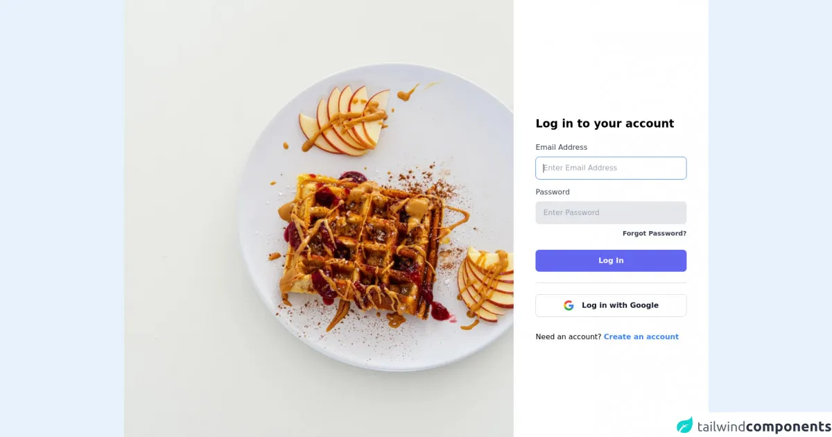
Free download of the login page's source code
The source code of login page UI component
To create a login page UI component with Tailwind CSS, you need to have a basic understanding of HTML and CSS. Here is the source code of the login page UI component:
<section class="flex flex-col md:flex-row h-screen items-center">

  <div class="bg-indigo-600 hidden lg:block w-full md:w-1/2 xl:w-2/3 h-screen">
    <img src="https://source.unsplash.com/random" alt="" class="w-full h-full object-cover">
  </div>

  <div class="bg-white w-full md:max-w-md lg:max-w-full md:mx-auto md:mx-0 md:w-1/2 xl:w-1/3 h-screen px-6 lg:px-16 xl:px-12
        flex items-center justify-center">

    <div class="w-full h-100">


      <h1 class="text-xl md:text-2xl font-bold leading-tight mt-12">Log in to your account</h1>

      <form class="mt-6" action="#" method="POST">
        <div>
          <label class="block text-gray-700">Email Address</label>
          <input type="email" name="" id="" placeholder="Enter Email Address" class="w-full px-4 py-3 rounded-lg bg-gray-200 mt-2 border focus:border-blue-500 focus:bg-white focus:outline-none" autofocus autocomplete required>
        </div>

        <div class="mt-4">
          <label class="block text-gray-700">Password</label>
          <input type="password" name="" id="" placeholder="Enter Password" minlength="6" class="w-full px-4 py-3 rounded-lg bg-gray-200 mt-2 border focus:border-blue-500
                focus:bg-white focus:outline-none" required>
        </div>

        <div class="text-right mt-2">
          <a href="#" class="text-sm font-semibold text-gray-700 hover:text-blue-700 focus:text-blue-700">Forgot Password?</a>
        </div>

        <button type="submit" class="w-full block bg-indigo-500 hover:bg-indigo-400 focus:bg-indigo-400 text-white font-semibold rounded-lg
              px-4 py-3 mt-6">Log In</button>
      </form>

      <hr class="my-6 border-gray-300 w-full">

      <button type="button" class="w-full block bg-white hover:bg-gray-100 focus:bg-gray-100 text-gray-900 font-semibold rounded-lg px-4 py-3 border border-gray-300">
            <div class="flex items-center justify-center">
            <svg xmlns="http://www.w3.org/2000/svg" xmlns:xlink="http://www.w3.org/1999/xlink" class="w-6 h-6" viewBox="0 0 48 48"><defs><path id="a" d="M44.5 20H24v8.5h11.8C34.7 33.9 30.1 37 24 37c-7.2 0-13-5.8-13-13s5.8-13 13-13c3.1 0 5.9 1.1 8.1 2.9l6.4-6.4C34.6 4.1 29.6 2 24 2 11.8 2 2 11.8 2 24s9.8 22 22 22c11 0 21-8 21-22 0-1.3-.2-2.7-.5-4z"/></defs><clipPath id="b"><use xlink:href="#a" overflow="visible"/></clipPath><path clip-path="url(#b)" fill="#FBBC05" d="M0 37V11l17 13z"/><path clip-path="url(#b)" fill="#EA4335" d="M0 11l17 13 7-6.1L48 14V0H0z"/><path clip-path="url(#b)" fill="#34A853" d="M0 37l30-23 7.9 1L48 0v48H0z"/><path clip-path="url(#b)" fill="#4285F4" d="M48 48L17 24l-4-3 35-10z"/></svg>
            <span class="ml-4">
            Log in
            with
            Google</span>
            </div>
          </button>

      <p class="mt-8">Need an account? <a href="#" class="text-blue-500 hover:text-blue-700 font-semibold">Create an
              account</a></p>


    </div>
  </div>

</section>
How to create a login page with Tailwind CSS?
To create a login page with Tailwind CSS, you need to follow these 6 critical skills:
Use the responsive design utilities: Tailwind CSS provides you with responsive design utilities that allow you to create a login page that looks great on any device. You can use the
sm,md,lg, andxlclasses to adjust the layout of your login page based on the screen size.Use the pre-defined classes: Tailwind CSS provides you with a set of pre-defined classes that you can use to style your login page UI component quickly and efficiently. You can use the
bg-gray-100,text-gray-900,text-indigo-600, andbg-indigo-600classes to set the background color, text color, and button color of your login page.Use the spacing utilities: Tailwind CSS provides you with spacing utilities that allow you to add padding and margin to your login page UI component. You can use the
py-12,mt-6,mt-2,mt-8, andmy-4classes to add padding and margin to your login page.Use the form elements: Tailwind CSS provides you with pre-defined classes that you can use to style your form elements. You can use the
appearance-none,border,rounded-md,shadow-sm,placeholder-gray-400,focus:outline-none,focus:ring-indigo-500, andfocus:border-indigo-500classes to style your input fields.Use the flexbox utilities: Tailwind CSS provides you with flexbox utilities that allow you to create flexible and responsive layouts. You can use the
flex,flex-col,justify-center,items-center,items-start,flex-wrap, andjustify-betweenclasses to create a flexible and responsive layout for your login page.Use the button utilities: Tailwind CSS provides you with button utilities that allow you to create custom buttons with ease. You can use the
group,relative,w-full,flex,justify-center,py-2,px-4,border,text-sm,font-medium,rounded-md,text-white,bg-indigo-600,hover:bg-indigo-700,focus:outline-none,focus:ring-2,focus:ring-offset-2,focus:ring-indigo-500, andabsoluteclasses to create a custom button for your login page.
Conclusion
Creating a login page with Tailwind CSS is easy and efficient. With the pre-defined classes and responsive design utilities provided by Tailwind CSS, you can create a login page that looks great on any device. By following the 6 critical skills discussed in this article, you can create a login page with Tailwind CSS remarkably well.