- Published on
Learn How To Make A Login Page With Tailwind CSS from the Pros
- What is Tailwind CSS?
- The description of Login page ui component
- Why use Tailwind CSS to create a Login page ui component?
- The preview of Login page ui component
- The source code of Login page ui component
- How to create a Login page with Tailwind CSS?
- Conclusion
As a FrontEnd technology blogger, it's important to stay up-to-date with the latest trends and tools in the industry. One tool that has been gaining popularity among developers is Tailwind CSS. Tailwind CSS is a utility-first CSS framework that allows you to quickly build custom user interfaces. In this article, we will walk you through how to make a Login page with Tailwind CSS.
What is Tailwind CSS?
Tailwind CSS is a utility-first CSS framework that provides a set of pre-defined classes that you can use to style your HTML elements. It's designed to be highly customizable and easy to use. With Tailwind CSS, you can create custom user interfaces without writing any CSS code.
The description of Login page ui component
A Login page is a common UI component that allows users to log in to a website or application. It typically consists of a form with two input fields for the user's email address and password, and a button to submit the form.
Why use Tailwind CSS to create a Login page ui component?
Tailwind CSS provides a set of pre-defined classes that you can use to quickly style your Login page. This saves you time and allows you to focus on the functionality of your page rather than the design. Additionally, Tailwind CSS is highly customizable, so you can easily modify the styles to match your brand or project requirements.
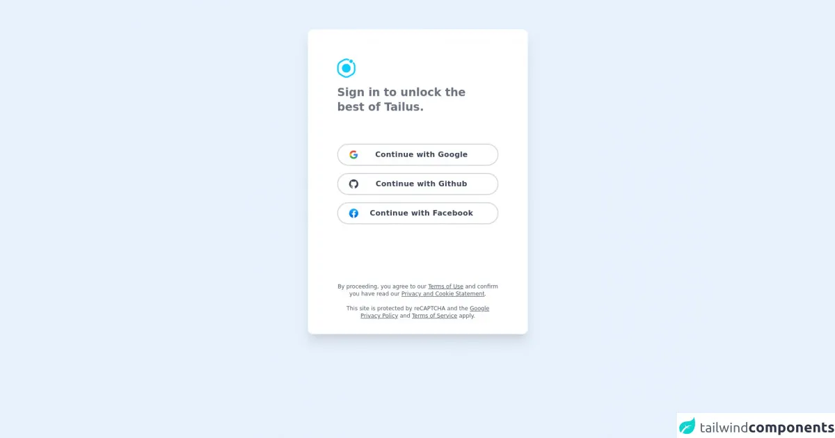
The preview of Login page ui component
To create a Login page with Tailwind CSS, we'll start by creating a basic HTML structure. We'll use the following HTML code:
<div class="bg-gray-100 min-h-screen flex flex-col justify-center py-12 sm:px-6 lg:px-8">
  <div class="sm:mx-auto sm:w-full sm:max-w-md">
    <h2 class="mt-6 text-center text-3xl font-extrabold text-gray-900">
      Sign in to your account
    </h2>
  </div>

  <div class="mt-8 sm:mx-auto sm:w-full sm:max-w-md">
    <div class="bg-white py-8 px-4 shadow sm:rounded-lg sm:px-10">
      <!-- Login form goes here -->
    </div>
  </div>
</div>
Free download of the Login page's source code
The source code of Login page ui component
To create the Login form, we'll add the following HTML code inside the bg-white div:
<form class="space-y-6" action="#" method="POST">
  <div>
    <label for="email" class="block text-sm font-medium text-gray-700">
      Email address
    </label>
    <div class="mt-1">
      <input id="email" name="email" type="email" autocomplete="email" required class="appearance-none block w-full px-3 py-2 border border-gray-300 rounded-md shadow-sm placeholder-gray-400 focus:outline-none focus:ring-blue-500 focus:border-blue-500 sm:text-sm">
    </div>
  </div>

  <div>
    <label for="password" class="block text-sm font-medium text-gray-700">
      Password
    </label>
    <div class="mt-1">
      <input id="password" name="password" type="password" autocomplete="current-password" required class="appearance-none block w-full px-3 py-2 border border-gray-300 rounded-md shadow-sm placeholder-gray-400 focus:outline-none focus:ring-blue-500 focus:border-blue-500 sm:text-sm">
    </div>
  </div>

  <div class="flex items-center justify-between">
    <div class="flex items-center">
      <input id="remember_me" name="remember_me" type="checkbox" class="h-4 w-4 text-blue-600 focus:ring-blue-500 border-gray-300 rounded">
      <label for="remember_me" class="ml-2 block text-sm text-gray-900">
        Remember me
      </label>
    </div>

    <div class="text-sm">
      <a href="#" class="font-medium text-blue-600 hover:text-blue-500">
        Forgot your password?
      </a>
    </div>
  </div>

  <div>
    <button type="submit" class="group relative w-full flex justify-center py-2 px-4 border border-transparent text-sm font-medium rounded-md text-white bg-blue-600 hover:bg-blue-700 focus:outline-none focus:ring-2 focus:ring-offset-2 focus:ring-blue-500">
      <span class="absolute left-0 inset-y-0 flex items-center pl-3">
        <!-- Heroicon name: solid/lock-closed -->
        <svg class="h-5 w-5 text-blue-500 group-hover:text-blue-400" xmlns="http://www.w3.org/2000/svg" viewBox="0 0 20 20" fill="currentColor" aria-hidden="true">
          <path fill-rule="evenodd" d="M10 2a3 3 0 00-3 3v2H4a2 2 0 00-2 2v7a2 2 0 002 2h12a2 2 0 002-2v-7a2 2 0 00-2-2h-3V5a3 3 0 00-3-3zm-3 5v2h6V7a1 1 0 00-2 0v1h-2V7a1 1 0 00-2 0z" clip-rule="evenodd" />
        </svg>
      </span>
      Sign in
    </button>
  </div>
</form>
<div class="relative py-16 bg-gradient-to-br from-sky-50 to-gray-200">
    <div class="relative container m-auto px-6 text-gray-500 md:px-12 xl:px-40">
        <div class="m-auto md:w-8/12 lg:w-6/12 xl:w-6/12">
            <div class="rounded-xl bg-white shadow-xl">
                <div class="p-6 sm:p-16">
                    <div class="space-y-4">
                        <img src="https://tailus.io/sources/blocks/social/preview/images/icon.svg" loading="lazy" class="w-10" alt="tailus logo">
                        <h2 class="mb-8 text-2xl text-cyan-900 font-bold">Sign in to unlock the <br> best of Tailus.</h2>
                    </div>
                    <div class="mt-16 grid space-y-4">
                        <button class="group h-12 px-6 border-2 border-gray-300 rounded-full transition duration-300
 hover:border-blue-400 focus:bg-blue-50 active:bg-blue-100">
                            <div class="relative flex items-center space-x-4 justify-center">
                                <img src="https://tailus.io/sources/blocks/social/preview/images/google.svg" class="absolute left-0 w-5" alt="google logo">
                                <span class="block w-max font-semibold tracking-wide text-gray-700 text-sm transition duration-300 group-hover:text-blue-600 sm:text-base">Continue with Google</span>
                            </div>
                        </button>
                        <button class="group h-12 px-6 border-2 border-gray-300 rounded-full transition duration-300
 hover:border-blue-400 focus:bg-blue-50 active:bg-blue-100">
                            <div class="relative flex items-center space-x-4 justify-center">
                                <svg xmlns="http://www.w3.org/2000/svg" fill="currentColor" class="absolute left-0 w-5 text-gray-700" viewBox="0 0 16 16">
<path d="M8 0C3.58 0 0 3.58 0 8c0 3.54 2.29 6.53 5.47 7.59.4.07.55-.17.55-.38 0-.19-.01-.82-.01-1.49-2.01.37-2.53-.49-2.69-.94-.09-.23-.48-.94-.82-1.13-.28-.15-.68-.52-.01-.53.63-.01 1.08.58 1.23.82.72 1.21 1.87.87 2.33.66.07-.52.28-.87.51-1.07-1.78-.2-3.64-.89-3.64-3.95 0-.87.31-1.59.82-2.15-.08-.2-.36-1.02.08-2.12 0 0 .67-.21 2.2.82.64-.18 1.32-.27 2-.27.68 0 1.36.09 2 .27 1.53-1.04 2.2-.82 2.2-.82.44 1.1.16 1.92.08 2.12.51.56.82 1.27.82 2.15 0 3.07-1.87 3.75-3.65 3.95.29.25.54.73.54 1.48 0 1.07-.01 1.93-.01 2.2 0 .21.15.46.55.38A8.012 8.012 0 0 0 16 8c0-4.42-3.58-8-8-8z"/>
                                </svg>
                                <span class="block w-max font-semibold tracking-wide text-gray-700 text-sm transition duration-300 group-hover:text-blue-600 sm:text-base">Continue with Github</span>
                            </div>
                        </button>
                        <button class="group h-12 px-6 border-2 border-gray-300 rounded-full transition duration-300
                                     hover:border-blue-400 focus:bg-blue-50 active:bg-blue-100">
                            <div class="relative flex items-center space-x-4 justify-center">
                                 <img src="https://upload.wikimedia.org/wikipedia/en/0/04/Facebook_f_logo_%282021%29.svg" class="absolute left-0 w-5" alt="Facebook logo">
                                <span class="block w-max font-semibold tracking-wide text-gray-700 text-sm transition duration-300 group-hover:text-blue-600 sm:text-base">Continue with Facebook</span>
                            </div>
                        </button>
                    </div>

                    <div class="mt-32 space-y-4 text-gray-600 text-center sm:-mb-8">
                        <p class="text-xs">By proceeding, you agree to our <a href="#" class="underline">Terms of Use</a> and confirm you have read our <a href="#" class="underline">Privacy and Cookie Statement</a>.</p>
                        <p class="text-xs">This site is protected by reCAPTCHA and the <a href="#" class="underline">Google Privacy Policy</a> and <a href="#" class="underline">Terms of Service</a> apply.</p>
                    </div>
                </div>
            </div>
        </div>
    </div>
</div>
How to create a Login page with Tailwind CSS?
Now that we have our HTML structure and form elements in place, we can start styling our Login page with Tailwind CSS. We'll use the following classes to style our Login page:
bg-gray-100- sets the background color of the page to graymin-h-screen- sets the minimum height of the page to the height of the viewportflex- sets the display property of the page to flexflex-col- sets the flex direction of the page to columnjustify-center- centers the content verticallypy-12- adds padding to the top and bottom of the pagesm:px-6- adds padding to the left and right of the page on small screenslg:px-8- adds padding to the left and right of the page on large screenssm:mx-auto- centers the content horizontally on small screenssm:w-full- sets the width of the content to full width on small screenssm:max-w-md- sets the maximum width of the content to medium on small screensmt-6- adds margin to the top of the contenttext-center- centers the text horizontallytext-3xl- sets the font size of the text to 3xlfont-extrabold- sets the font weight of the text to extraboldtext-gray-900- sets the text color to graymt-8- adds margin to the top of the contentbg-white- sets the background color of the form to whitepy-8- adds padding to the top and bottom of the formpx-4- adds padding to the left and right of the formshadow- adds a shadow to the formsm:rounded-lg- rounds the corners of the form on small screenssm:px-10- adds padding to the left and right of the form on small screensspace-y-6- adds spacing between the form elementsblock- sets the display property of the label to blocktext-sm- sets the font size of the label to smfont-medium- sets the font weight of the label to mediumtext-gray-700- sets the text color of the label to graymt-1- adds margin to the top of the input fieldappearance-none- removes the default appearance of the input fieldw-full- sets the width of the input field to full widthpx-3- adds padding to the left and right of the input fieldpy-2- adds padding to the top and bottom of the input fieldborder- adds a border to the input fieldborder-gray-300- sets the color of the border to grayrounded-md- rounds the corners of the input fieldshadow-sm- adds a shadow to the input fieldplaceholder-gray-400- sets the color of the placeholder text to grayfocus:outline-none- removes the outline when the input field is focusedfocus:ring-blue-500- adds a blue ring when the input field is focusedfocus:border-blue-500- sets the color of the border to blue when the input field is focusedsm:text-sm- sets the font size of the input field to sm on small screensflex- sets the display property of the checkbox and label to flexitems-center- centers the content vertically and horizontallyjustify-between- evenly distributes the content horizontallyh-4- sets the height of the checkbox to 4w-4- sets the width of the checkbox to 4text-blue-600- sets the text color of the checkbox to bluefocus:ring-blue-500- adds a blue ring when the checkbox is focusedborder-gray-300- sets the color of the border to grayrounded- rounds the corners of the checkboxml-2- adds margin to the left of the labeltext-gray-900- sets the text color of the label to graytext-sm- sets the font size of the text to smfont-medium- sets the font weight of the text to mediumhover:text-blue-500- sets the text color of the text to blue when hoveredgroup- sets the display property of the button to grouprelative- sets the position property of the button to relativew-full- sets the width of the button to full widthflex- sets the display property of the button content to flexjustify-center- centers the content horizontallypy-2- adds padding to the top and bottom of the buttonpx-4- adds padding to the left and right of the buttonborder- adds a border to the buttonborder-transparent- sets the color of the border to transparenttext-sm- sets the font size of the button text to smfont-medium- sets the font weight of the button text to mediumrounded-md- rounds the corners of the buttontext-white- sets the text color of the button to whitebg-blue-600- sets the background color of the button to bluehover:bg-blue-700- sets the background color of the button to blue when hoveredfocus:outline-none- removes the outline when the button is focusedfocus:ring-2- adds a ring when the button is focusedfocus:ring-offset-2- adds an offset to the ring when the button is focusedfocus:ring-blue-500- sets the color of the ring to blue when the button is focused
Conclusion
In this article, we walked you through how to make a Login page with Tailwind CSS. We started by creating a basic HTML structure and form elements, and then we used Tailwind CSS classes to style the page. Tailwind CSS is a powerful tool that allows you to quickly create custom user interfaces without writing any CSS code. We hope this article has been helpful in showing you how to use Tailwind CSS to create a Login page.