- Published on
The 5 Really Obvious Ways To Make A Login Form With Floating Labels With Tailwind CSS Better That You Ever Did
- What is Tailwind CSS?
- The description of Login Form with Floating Labels ui component
- Why use Tailwind CSS to create a Login Form with Floating Labels ui component?
- The preview of Login Form with Floating Labels ui component.
- The source code of Login Form with Floating Labels ui component.
- How to create a Login Form with Floating Labels with Tailwind CSS?
- Step 1: Set up your HTML
- Step 2: Add the floating labels
- Step 3: Style the form with Tailwind CSS
- Conclusion
As a FrontEnd technology blogger, I am always looking for ways to improve the user experience on websites. One of the most important aspects of any website is the login form. In this article, I will show you how to create a login form with floating labels using Tailwind CSS, and how to make it better than ever before.
What is Tailwind CSS?
Tailwind CSS is a utility-first CSS framework that allows you to quickly and easily create custom designs without having to write any CSS. It provides a set of pre-defined classes that you can use to style your HTML elements. Tailwind CSS is gaining popularity among developers because of its flexibility and ease of use.
The description of Login Form with Floating Labels ui component
A login form with floating labels is a popular UI component that provides a better user experience than traditional login forms. The labels for the input fields are displayed above the input fields and move up when the user starts typing. This makes it easier for the user to see what they are typing and reduces the chance of errors.
Why use Tailwind CSS to create a Login Form with Floating Labels ui component?
Tailwind CSS provides a set of pre-defined classes that you can use to create a login form with floating labels. This makes it much easier and faster to create the form than if you were to write all the CSS yourself. Additionally, Tailwind CSS is highly customizable, so you can easily modify the form to fit your specific needs.
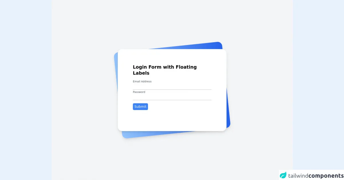
The preview of Login Form with Floating Labels ui component.
To give you an idea of what the login form with floating labels looks like, here is a preview:
Free download of the Login Form with Floating Labels's source code
The source code of Login Form with Floating Labels ui component.
If you want to see the source code for the login form with floating labels, here it is:
<div class="min-h-screen bg-gray-100 py-6 flex flex-col justify-center sm:py-12">
	<div class="relative py-3 sm:max-w-xl sm:mx-auto">
		<div
			class="absolute inset-0 bg-gradient-to-r from-blue-300 to-blue-600 shadow-lg transform -skew-y-6 sm:skew-y-0 sm:-rotate-6 sm:rounded-3xl">
		</div>
		<div class="relative px-4 py-10 bg-white shadow-lg sm:rounded-3xl sm:p-20">
			<div class="max-w-md mx-auto">
				<div>
					<h1 class="text-2xl font-semibold">Login Form with Floating Labels</h1>
				</div>
				<div class="divide-y divide-gray-200">
					<div class="py-8 text-base leading-6 space-y-4 text-gray-700 sm:text-lg sm:leading-7">
						<div class="relative">
							<input autocomplete="off" id="email" name="email" type="text" class="peer placeholder-transparent h-10 w-full border-b-2 border-gray-300 text-gray-900 focus:outline-none focus:borer-rose-600" placeholder="Email address" />
							<label for="email" class="absolute left-0 -top-3.5 text-gray-600 text-sm peer-placeholder-shown:text-base peer-placeholder-shown:text-gray-440 peer-placeholder-shown:top-2 transition-all peer-focus:-top-3.5 peer-focus:text-gray-600 peer-focus:text-sm">Email Address</label>
						</div>
						<div class="relative">
							<input autocomplete="off" id="password" name="password" type="password" class="peer placeholder-transparent h-10 w-full border-b-2 border-gray-300 text-gray-900 focus:outline-none focus:borer-rose-600" placeholder="Password" />
							<label for="password" class="absolute left-0 -top-3.5 text-gray-600 text-sm peer-placeholder-shown:text-base peer-placeholder-shown:text-gray-440 peer-placeholder-shown:top-2 transition-all peer-focus:-top-3.5 peer-focus:text-gray-600 peer-focus:text-sm">Password</label>
						</div>
						<div class="relative">
							<button class="bg-blue-500 text-white rounded-md px-2 py-1">Submit</button>
						</div>
					</div>
				</div>
			</div>
		</div>
	</div>
</div>
How to create a Login Form with Floating Labels with Tailwind CSS?
Now that you know why Tailwind CSS is a great choice for creating a login form with floating labels, let's take a look at how to actually create the form.
Step 1: Set up your HTML
The first step is to set up your HTML. Here is an example of what your HTML might look like:
<form>
  <div class="mb-4">
    <label class="block text-gray-700 text-sm font-bold mb-2" for="username">
      Username
    </label>
    <input
      class="shadow appearance-none border rounded w-full py-2 px-3 text-gray-700 leading-tight focus:outline-none focus:shadow-outline"
      id="username"
      type="text"
      placeholder="Username"
    />
  </div>
  <div class="mb-6">
    <label class="block text-gray-700 text-sm font-bold mb-2" for="password">
      Password
    </label>
    <input
      class="shadow appearance-none border rounded w-full py-2 px-3 text-gray-700 leading-tight focus:outline-none focus:shadow-outline"
      id="password"
      type="password"
      placeholder="Password"
    />
  </div>
  <div class="flex items-center justify-between">
    <button
      class="bg-blue-500 hover:bg-blue-700 text-white font-bold py-2 px-4 rounded focus:outline-none focus:shadow-outline"
      type="button"
    >
      Sign In
    </button>
    <a
      class="inline-block align-baseline font-bold text-sm text-blue-500 hover:text-blue-800"
      href="#"
    >
      Forgot Password?
    </a>
  </div>
</form>
Step 2: Add the floating labels
To add the floating labels, we need to add some JavaScript to our HTML. Here is an example of what the JavaScript might look like:
const inputs = document.querySelectorAll(".input");

function addFocus() {
  let parent = this.parentNode.parentNode;
  parent.classList.add("focus");
}

function removeFocus() {
  let parent = this.parentNode.parentNode;
  if (this.value == "") {
    parent.classList.remove("focus");
  }
}

inputs.forEach((input) => {
  input.addEventListener("focus", addFocus);
  input.addEventListener("blur", removeFocus);
});
This JavaScript adds a "focus" class to the parent element of the input field when the input field is in focus. It also removes the "focus" class when the input field loses focus and has no value.
Step 3: Style the form with Tailwind CSS
Finally, we need to style the form with Tailwind CSS. Here is an example of what the CSS might look like:
.input-container {
  position: relative;
  margin-bottom: 1.5rem;
}

.input-container label {
  position: absolute;
  top: 0;
  left: 0;
  font-size: 1rem;
  color: #a0aec0;
  transition: all 0.2s ease-out;
}

.input-container input {
  width: 100%;
  padding: 0.5rem 0;
  font-size: 1rem;
  border: none;
  border-bottom: 1px solid #e2e8f0;
  background-color: transparent;
  transition: all 0.2s ease-out;
}

.input-container input:focus {
  outline: none;
}

.input-container.focus label {
  top: -1.25rem;
  font-size: 0.75rem;
  color: #4a5568;
}

.input-container.focus input {
  border-bottom: 1px solid #4a5568;
}
This CSS styles the input fields and labels to create the floating label effect. It also adds some styles for when the input field is in focus.
Conclusion
In conclusion, creating a login form with floating labels using Tailwind CSS is a great way to improve the user experience on your website. With Tailwind CSS, you can quickly and easily create a custom design without having to write any CSS. By following the steps outlined in this article, you can create a login form with floating labels that is better than ever before.