- Published on
The Ultimate Guide To Help You Make A List With Tailwind CSS
- What is Tailwind CSS?
- The description of List ui component
- Why use Tailwind CSS to create a List ui component?
- The preview of List ui component.
- The source code of List ui component.
- How to create a List with Tailwind CSS?
- Conclusion
Are you looking for a way to create a list with Tailwind CSS? Look no further! In this article, we will guide you through the process of creating a list with Tailwind CSS, from understanding what Tailwind CSS is to creating the list and providing you with the source code.
What is Tailwind CSS?
Tailwind CSS is a utility-first CSS framework that allows you to create custom designs quickly and efficiently. It provides a set of pre-defined classes that you can use to style your HTML elements. With Tailwind CSS, you can create beautiful designs without having to write custom CSS.
The description of List ui component
A list is a common UI component that displays a collection of items in a vertical or horizontal layout. Lists are used in many applications, including e-commerce websites, social media platforms, and news websites.
Why use Tailwind CSS to create a List ui component?
Tailwind CSS provides a set of pre-defined classes that you can use to style your list quickly and easily. With Tailwind CSS, you don't have to write custom CSS, which saves you time and effort. Additionally, Tailwind CSS is highly customizable, allowing you to create a list that matches your brand's style.
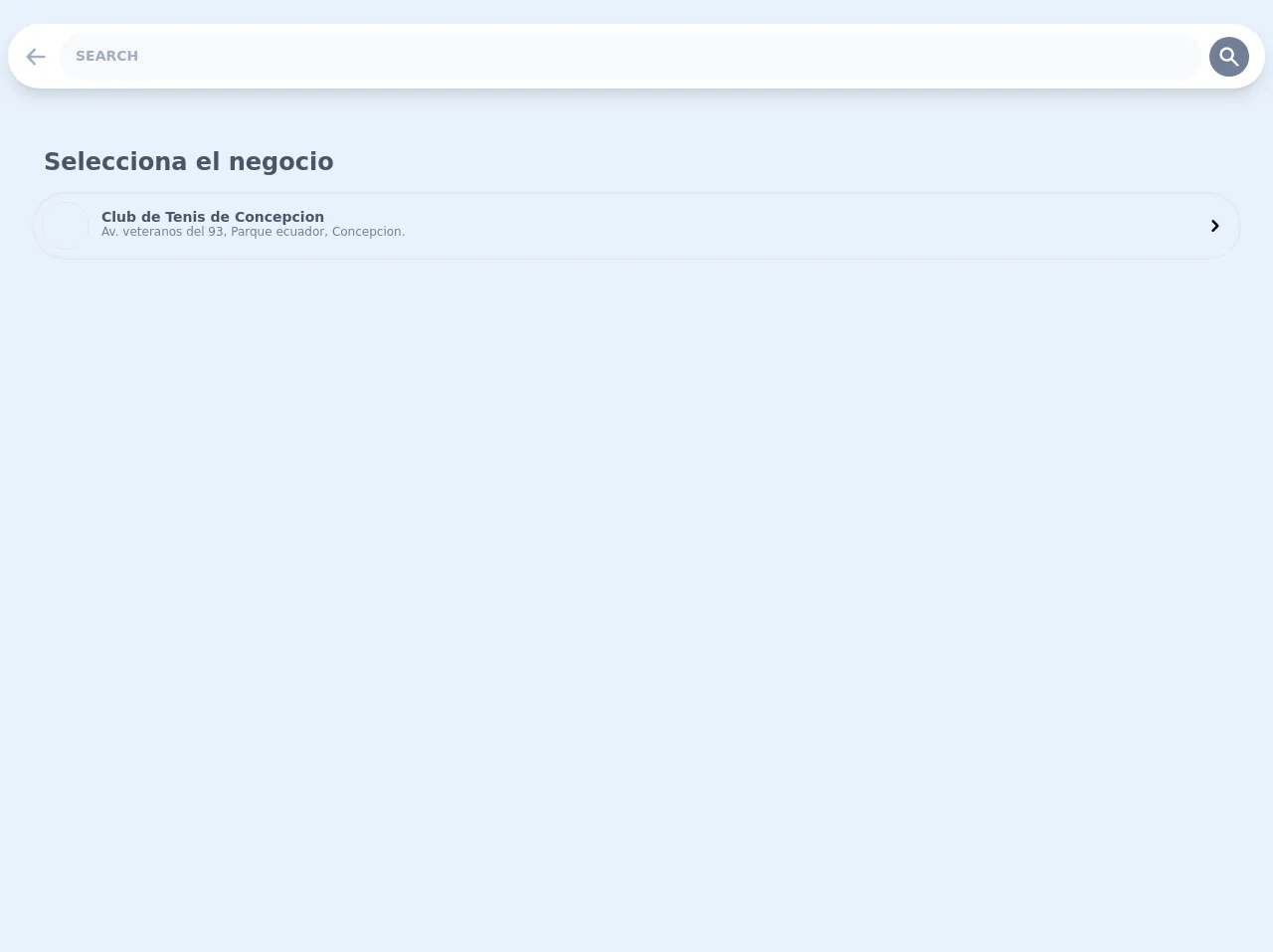
The preview of List ui component.
Lists can be displayed in many different ways, including unordered lists, ordered lists, and definition lists. With Tailwind CSS, you can customize the appearance of your list by changing the font size, font color, background color, and more.
Free download of the List's source code
The source code of List ui component.
To create a list with Tailwind CSS, you need to use HTML and CSS. The HTML code defines the structure of the list, while the CSS code applies the styles to the list.
<div>

      <div class="flex flex-col p-2 py-6 m-h-screen">

        <div class="bg-white items-center justify-between w-full flex rounded-full shadow-lg p-2 mb-5 sticky" style="top: 5px">

            <div>

                <div class="p-2 mr-1 rounded-full hover:bg-gray-100 cursor-pointer">

                    <svg class="h-6 w-6 text-gray-500" xmlns="http://www.w3.org/2000/svg" viewBox="0 0 20 20" fill="currentColor">
                    <path fill-rule="evenodd" d="M9.707 16.707a1 1 0 01-1.414 0l-6-6a1 1 0 010-1.414l6-6a1 1 0 011.414 1.414L5.414 9H17a1 1 0 110 2H5.414l4.293 4.293a1 1 0 010 1.414z" clip-rule="evenodd" />
                    </svg>

                </div>

            </div>

            <input class="font-bold uppercase rounded-full w-full py-4 pl-4 text-gray-700 bg-gray-100 leading-tight focus:outline-none focus:shadow-outline lg:text-sm text-xs" type="text" placeholder="Search">

                <div class="bg-gray-600 p-2 hover:bg-blue-400 cursor-pointer mx-2 rounded-full">

                    <svg class="w-6 h-6 text-white" xmlns="http://www.w3.org/2000/svg" viewBox="0 0 20 20" fill="currentColor">
                    <path fill-rule="evenodd" d="M8 4a4 4 0 100 8 4 4 0 000-8zM2 8a6 6 0 1110.89 3.476l4.817 4.817a1 1 0 01-1.414 1.414l-4.816-4.816A6 6 0 012 8z" clip-rule="evenodd" />
                    </svg>

                </div>

        </div>


        <div class="flex flex-col gap-4 lg:p-4 p-2  rounde-lg m-2">

            <div class="lg:text-2xl md:text-xl text-lg lg:p-3 p-1 font-black text-gray-700">Selecciona el negocio</div>

            <div class="flex items-center justify-between w-full p-2 lg:rounded-full md:rounded-full hover:bg-gray-100 cursor-pointer border-2 rounded-lg">

                <div class="lg:flex md:flex items-center">
                <div class="h-12 w-12 mb-2 lg:mb-0 border md:mb-0 rounded-full mr-3"></div>

                <div class="flex flex-col">

                    <div class="text-sm leading-3 text-gray-700 font-bold w-full">Club de Tenis de Concepcion</div>

                    <div class="text-xs text-gray-600 w-full">Av. veteranos del 93, Parque ecuador, Concepcion.</div>

                </div>

                </div>

                <svg class="h-6 w-6 mr-1 invisible md:visible lg:visible xl:visible" xmlns="http://www.w3.org/2000/svg" viewBox="0 0 20 20" fill="currentColor">
                <path fill-rule="evenodd" d="M7.293 14.707a1 1 0 010-1.414L10.586 10 7.293 6.707a1 1 0 011.414-1.414l4 4a1 1 0 010 1.414l-4 4a1 1 0 01-1.414 0z" clip-rule="evenodd" />
                </svg>

            </div>

        </div>

      </div>

  </div>
How to create a List with Tailwind CSS?
To create a list with Tailwind CSS, follow these steps:
- Create an HTML element for the list. You can use an unordered list (
<ul>) or an ordered list (<ol>). - Add list items to the list using the
<li>element. - Apply Tailwind CSS classes to the list and list items to style them.
Here's an example of how to create an unordered list with Tailwind CSS:
<ul class="list-disc">
  <li class="text-red-500">Item 1</li>
  <li class="text-green-500">Item 2</li>
  <li class="text-blue-500">Item 3</li>
</ul>
In this example, we've used the list-disc class to display a bullet point next to each list item. We've also used the text-red-500, text-green-500, and text-blue-500 classes to change the font color of each list item.
You can customize the appearance of your list further by using other Tailwind CSS classes, such as bg-gray-100 to change the background color of the list and text-lg to change the font size of the list items.
Conclusion
Creating a list with Tailwind CSS is easy and efficient. With Tailwind CSS, you can create a list that matches your brand's style without having to write custom CSS. We hope this guide has been helpful in showing you how to create a list with Tailwind CSS. Happy coding!