- Published on
Advanced Guide: Create A Input Field With Float Label With Tailwind CSS
- What is Tailwind CSS?
- The description of Input field with float label ui component
- Why use Tailwind CSS to create a Input field with float label ui component?
- The preview of Input field with float label ui component
- The source code of Input field with float label ui component
- How to create a Input field with float label with Tailwind CSS?
- Conclusion
As a FrontEnd developer, you may have heard of Tailwind CSS, a utility-first CSS framework that allows you to rapidly build custom user interfaces. In this article, we will walk through how to create an input field with a float label using Tailwind CSS.
What is Tailwind CSS?
Tailwind CSS is a utility-first CSS framework that allows you to rapidly build custom user interfaces. It provides a set of pre-defined CSS classes that you can use to style your HTML elements. Unlike other CSS frameworks, Tailwind CSS doesn't come with pre-built components. Instead, it provides you with a set of low-level utility classes that you can use to build your own components.
The description of Input field with float label ui component
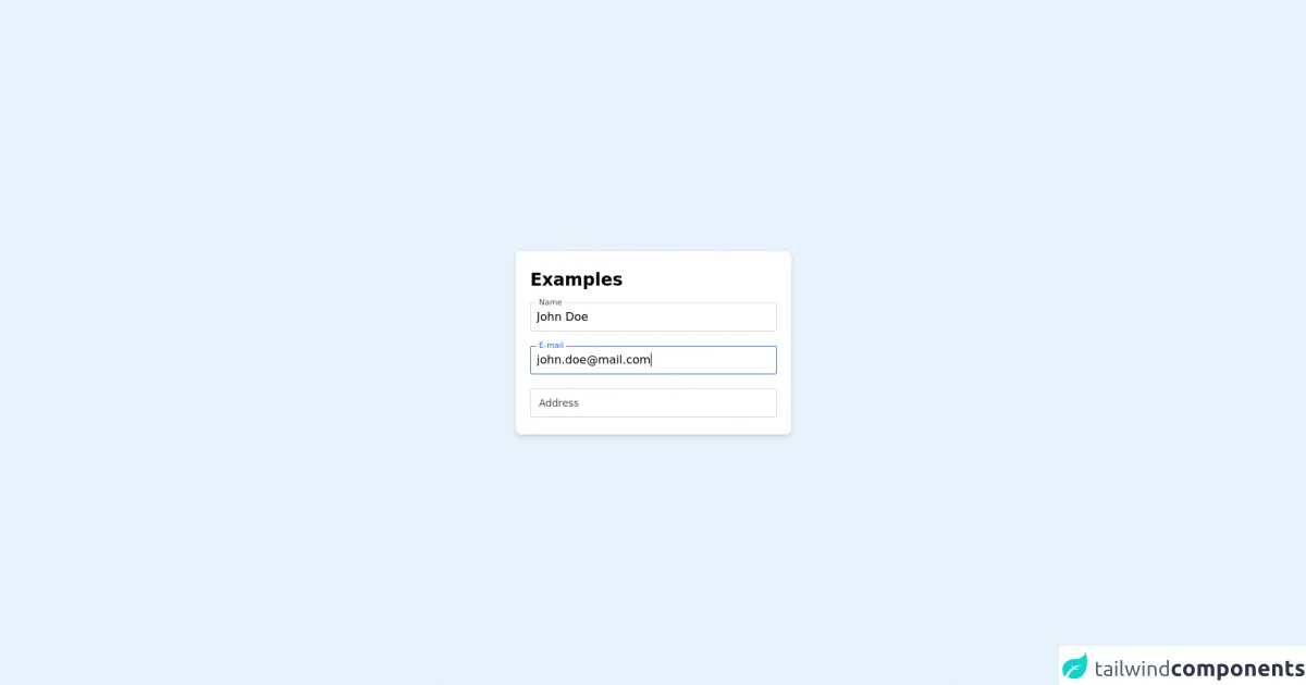
An input field with a float label is a UI component that is commonly used in forms. When a user enters text into the input field, the label "floats" above the input field, providing a better user experience. This UI component is commonly used in modern web applications and is easy to implement using Tailwind CSS.
Why use Tailwind CSS to create a Input field with float label ui component?
Tailwind CSS provides a set of pre-defined utility classes that allow you to rapidly build custom user interfaces. By using Tailwind CSS, you can save time and effort in building UI components. Additionally, Tailwind CSS provides a consistent design system that makes it easy to maintain and update your UI components.
The preview of Input field with float label ui component
To create an input field with a float label using Tailwind CSS, we will use the following HTML code:
<div class="form-group">
  <label for="name" class="label">Name</label>
  <input type="text" id="name" class="input" placeholder="Enter your name">
</div>
Free download of the Input field with float label's source code
The source code of Input field with float label ui component
To create an input field with a float label using Tailwind CSS, we will use the following CSS code:
.form-group {
  position: relative;
  margin-bottom: 1.5rem;
}

.label {
  position: absolute;
  top: 0;
  left: 0;
  font-size: 1rem;
  color: #a0aec0;
  transition: all 0.2s ease-out;
}

.input {
  width: 100%;
  padding: 0.5rem;
  font-size: 1rem;
  border: 2px solid #e2e8f0;
  border-radius: 0.25rem;
  transition: all 0.2s ease-out;
}

.input:focus {
  border-color: #cbd5e0;
  outline: none;
  box-shadow: 0 0 0 3px rgba(66, 153, 225, 0.5);
}

.input:focus + .label,
.input:not(:placeholder-shown) + .label {
  transform: translate(0, -1.5rem) scale(0.75);
  color: #4a5568;
}
<div class="flex justify-center h-screen items-center">
    <div class='flex max-w-sm w-full h-64 justify-center bg-white shadow-md rounded-lg overflow-hidden mx-auto flex flex-col p-5'>
        <h3 class="text-2xl font-bold mb-4">Examples</h3>
    <!-- This is the input component -->
    <div class="relative h-10 input-component mb-5">
      <input
        id="name"
        type="text"
        name="name"
        class="h-full w-full border-gray-300 px-2 transition-all border-blue rounded-sm"
      />
      <label for="name" class="absolute left-2 transition-all bg-white px-1">
        Name
      </label>
    </div>
    <!-- This is the input component -->
    <div class="relative h-10 input-component mb-5">
      <input
        id="email"
        type="text"
        name="email"
        class="h-full w-full border-gray-300 px-2 transition-all border-blue rounded-sm"
      />
      <label for="email" class="absolute left-2 transition-all bg-white px-1">
        E-mail
      </label>
    </div>
    <!-- This is the input component -->
    <div class="relative h-10 input-component empty">
      <input
        id="address"
        type="text"
        name="address"
        class="h-full w-full border-gray-300 px-2 transition-all border-blue rounded-sm"
      />
      <label for="address" class="absolute left-2 transition-all bg-white px-1">
        Address
      </label>
    </div>

    </div>
</div>

<style>
label {
  top: 0%;
  transform: translateY(-50%);
  font-size: 11px;
  color: rgba(37, 99, 235, 1);
}
.empty input:not(:focus) + label {
  top: 50%;
  transform: translateY(-50%);
  font-size: 14px;
}
input:not(:focus) + label {
  color: rgba(70, 70, 70, 1);
}
input {
  border-width: 1px;
}
input:focus {
  outline: none;
  border-color: rgba(37, 99, 235, 1);
}
</style>
<script>
    document.getElementById('name').value = 'John Doe'
    document.getElementById('email').value = '[email protected]'
    document.getElementById('email').focus()
    const allInputs = document.querySelectorAll('input');
    for(const input of allInputs) {
        input.addEventListener('input', () => {
            const val = input.value
            if(!val) {
                input.parentElement.classList.add('empty')
            } else {
                input.parentElement.classList.remove('empty')
            }
        })
    }
</script>
How to create a Input field with float label with Tailwind CSS?
To create an input field with a float label using Tailwind CSS, follow these steps:
- Create a form group container using the
form-groupclass.
<div class="form-group">
  <!-- Input field and label will go here -->
</div>
- Add a label element with the
labelclass and aforattribute that matches theidof the input field.
<div class="form-group">
  <label for="name" class="label">Name</label>
  <!-- Input field will go here -->
</div>
- Add an input element with the
inputclass and anidattribute that matches theforattribute of the label.
<div class="form-group">
  <label for="name" class="label">Name</label>
  <input type="text" id="name" class="input" placeholder="Enter your name">
</div>
- Add CSS styles to position the label above the input field and animate it when the input field is focused or has a value.
.form-group {
  position: relative;
  margin-bottom: 1.5rem;
}

.label {
  position: absolute;
  top: 0;
  left: 0;
  font-size: 1rem;
  color: #a0aec0;
  transition: all 0.2s ease-out;
}

.input {
  width: 100%;
  padding: 0.5rem;
  font-size: 1rem;
  border: 2px solid #e2e8f0;
  border-radius: 0.25rem;
  transition: all 0.2s ease-out;
}

.input:focus {
  border-color: #cbd5e0;
  outline: none;
  box-shadow: 0 0 0 3px rgba(66, 153, 225, 0.5);
}

.input:focus + .label,
.input:not(:placeholder-shown) + .label {
  transform: translate(0, -1.5rem) scale(0.75);
  color: #4a5568;
}
Conclusion
In this article, we have learned how to create an input field with a float label using Tailwind CSS. By using Tailwind CSS, we can rapidly build custom user interfaces and maintain a consistent design system. This UI component is commonly used in modern web applications and can improve the user experience.