- Published on
3 Things You Must Know To Build A Login With Tailwind CSS
- What is Tailwind CSS?
- The description of Login UI component
- Why use Tailwind CSS to create a Login UI component?
- The preview of Login UI component
- The source code of Login UI component
- How to create a Login with Tailwind CSS?
- Conclusion
What is Tailwind CSS?
Tailwind CSS is a utility-first CSS framework that provides a set of pre-defined classes to create a responsive and modern UI with less effort. It allows you to design your website or application by composing classes instead of writing custom CSS code. Tailwind CSS has gained a lot of popularity among developers because of its flexibility, ease of use, and customization options.
The description of Login UI component
A login UI component is an essential part of any application that requires user authentication. It typically consists of a form that collects user credentials such as username and password. The login form should be easy to use, responsive, and visually appealing.
Why use Tailwind CSS to create a Login UI component?
Tailwind CSS provides a set of pre-defined classes that can be used to create a login UI component quickly. Instead of writing custom CSS code, you can use Tailwind classes to style your login form. This saves time and effort and allows you to focus on the functionality of your application.
Tailwind CSS also provides responsive design classes that allow you to create a login form that is optimized for different screen sizes. This means that your login form will look great on desktop, tablet, and mobile devices.
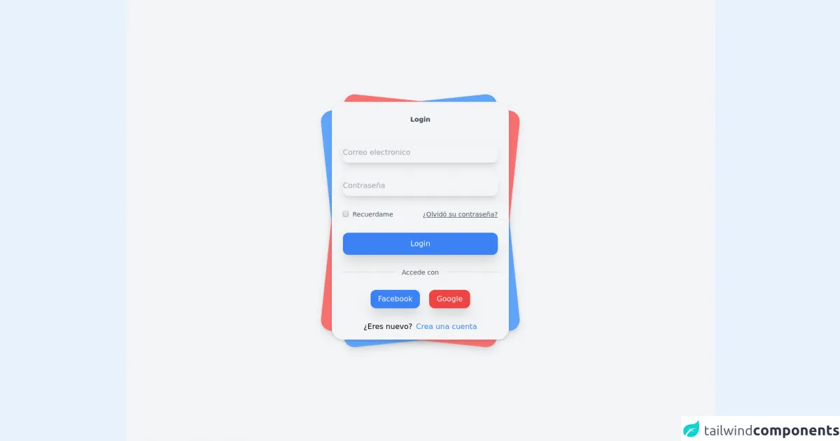
The preview of Login UI component
To create a login UI component with Tailwind CSS, we will use the following classes:
bg-white: sets the background color of the form to white.shadow-md: adds a shadow effect to the form.rounded-md: rounds the corners of the form.px-4: adds padding to the left and right sides of the form.py-6: adds padding to the top and bottom of the form.w-full: sets the width of the form to 100%.mb-4: adds margin to the bottom of the input fields.border: adds a border to the input fields.rounded-md: rounds the corners of the input fields.py-2: adds padding to the top and bottom of the input fields.px-3: adds padding to the left and right sides of the input fields.w-full: sets the width of the input fields to 100%.text-gray-700: sets the text color of the input fields to gray.focus:outline-none: removes the outline when the input fields are in focus.focus:ring-2: adds a ring effect when the input fields are in focus.focus:ring-blue-500: sets the color of the ring effect to blue.
Free download of the Login's source code
The source code of Login UI component
To create a login UI component with Tailwind CSS, you can use the following HTML code:
<form class="bg-white shadow-md rounded-md px-4 py-6 w-full">
  <div class="mb-4">
    <label class="block text-gray-700 font-bold mb-2" for="username">
      Username
    </label>
    <input
      class="border rounded-md py-2 px-3 w-full text-gray-700 focus:outline-none focus:ring-2 focus:ring-blue-500"
      id="username"
      type="text"
      placeholder="Enter your username"
    />
  </div>
  <div class="mb-4">
    <label class="block text-gray-700 font-bold mb-2" for="password">
      Password
    </label>
    <input
      class="border rounded-md py-2 px-3 w-full text-gray-700 focus:outline-none focus:ring-2 focus:ring-blue-500"
      id="password"
      type="password"
      placeholder="Enter your password"
    />
  </div>
  <button
    class="bg-blue-500 hover:bg-blue-700 text-white font-bold py-2 px-4 rounded focus:outline-none focus:shadow-outline"
    type="button"
  >
    Sign In
  </button>
</form>
This code creates a login form with two input fields for username and password and a sign-in button. You can customize the form by adding or removing classes as needed.
<!-- This is an example component -->
 <div class="font-sans">
            <div class="relative min-h-screen flex flex-col sm:justify-center items-center bg-gray-100 ">
                <div class="relative sm:max-w-sm w-full">
                    <div class="card bg-blue-400 shadow-lg  w-full h-full rounded-3xl absolute  transform -rotate-6"></div>
                    <div class="card bg-red-400 shadow-lg  w-full h-full rounded-3xl absolute  transform rotate-6"></div>
                    <div class="relative w-full rounded-3xl  px-6 py-4 bg-gray-100 shadow-md">
                        <label for="" class="block mt-3 text-sm text-gray-700 text-center font-semibold">
                            Login
                        </label>
                        <form method="#" action="#" class="mt-10">

                            <div>
                                <input type="email" placeholder="Correo electronico" class="mt-1 block w-full border-none bg-gray-100 h-11 rounded-xl shadow-lg hover:bg-blue-100 focus:bg-blue-100 focus:ring-0">
                            </div>

                            <div class="mt-7">
                                <input type="password" placeholder="Contraseña" class="mt-1 block w-full border-none bg-gray-100 h-11 rounded-xl shadow-lg hover:bg-blue-100 focus:bg-blue-100 focus:ring-0">
                            </div>

                            <div class="mt-7 flex">
                                <label for="remember_me" class="inline-flex items-center w-full cursor-pointer">
                                    <input id="remember_me" type="checkbox" class="rounded border-gray-300 text-indigo-600 shadow-sm focus:border-indigo-300 focus:ring focus:ring-indigo-200 focus:ring-opacity-50" name="remember">
                                    <span class="ml-2 text-sm text-gray-600">
                                        Recuerdame
                                    </span>
                                </label>

                               <div class="w-full text-right">
                                    <a class="underline text-sm text-gray-600 hover:text-gray-900" href="#">
                                        ¿Olvidó su contraseña?
                                    </a>
                               </div>
                            </div>

                            <div class="mt-7">
                                <button class="bg-blue-500 w-full py-3 rounded-xl text-white shadow-xl hover:shadow-inner focus:outline-none transition duration-500 ease-in-out  transform hover:-translate-x hover:scale-105">
                                    Login
                                </button>
                            </div>

                            <div class="flex mt-7 items-center text-center">
                                <hr class="border-gray-300 border-1 w-full rounded-md">
                                <label class="block font-medium text-sm text-gray-600 w-full">
                                    Accede con
                                </label>
                                <hr class="border-gray-300 border-1 w-full rounded-md">
                            </div>

                            <div class="flex mt-7 justify-center w-full">
                                <button class="mr-5 bg-blue-500 border-none px-4 py-2 rounded-xl cursor-pointer text-white shadow-xl hover:shadow-inner transition duration-500 ease-in-out  transform hover:-translate-x hover:scale-105">

                                    Facebook
                                </button>

                                <button class="bg-red-500 border-none px-4 py-2 rounded-xl cursor-pointer text-white shadow-xl hover:shadow-inner transition duration-500 ease-in-out  transform hover:-translate-x hover:scale-105">

                                    Google
                                </button>
                            </div>

                             <div class="mt-7">
                                <div class="flex justify-center items-center">
                                    <label class="mr-2" >¿Eres nuevo?</label>
                                    <a href="#" class=" text-blue-500 transition duration-500 ease-in-out  transform hover:-translate-x hover:scale-105">
                                        Crea una cuenta
                                    </a>
                                </div>
                            </div>
                        </form>
                    </div>
                </div>
            </div>

        </div>
How to create a Login with Tailwind CSS?
To create a login UI component with Tailwind CSS, follow these steps:
- Create a new HTML file and add the above HTML code to it.
- Link the Tailwind CSS stylesheet to your HTML file by adding the following line to the head section of your HTML file:
<link href="https://cdn.jsdelivr.net/npm/tailwindcss@latest/dist/tailwind.min.css" rel="stylesheet">
- Open the HTML file in your browser to see the login form.
You can customize the form by adding or removing classes as needed. For example, you can change the background color of the form by using the bg- prefix classes, such as bg-gray-100 or bg-blue-500.
Conclusion
In this article, we have discussed how to create a login UI component with Tailwind CSS. We have seen that Tailwind CSS provides a set of pre-defined classes that can be used to create a responsive and visually appealing login form. By using Tailwind CSS, you can save time and effort and focus on the functionality of your application. With the help of this article, you can create a login form that looks great on desktop, tablet, and mobile devices.