- Published on
The Ultimate Guide To Help You Build A Mobile Navigation Bar With Tailwind CSS
- What is Tailwind CSS?
- The description of Mobile Navigation Bar ui component
- Why use Tailwind CSS to create a Mobile Navigation Bar ui component?
- The preview of Mobile Navigation Bar ui component.
- The source code of Mobile Navigation Bar ui component.
- How to create a Mobile Navigation Bar with Tailwind CSS?
- Conclusion
As a FrontEnd technology blogger, it's important to stay up-to-date with the latest trends and tools in the industry. One such tool that has gained popularity in recent years is Tailwind CSS. Tailwind CSS is a utility-first CSS framework that allows developers to quickly and easily create responsive and customizable user interfaces. In this article, we'll explore how to use Tailwind CSS to build a mobile navigation bar.
What is Tailwind CSS?
Tailwind CSS is a utility-first CSS framework that provides a set of pre-defined CSS classes that can be used to style HTML elements. The framework is designed to be highly customizable, allowing developers to create unique and responsive user interfaces without having to write custom CSS.
The description of Mobile Navigation Bar ui component
A mobile navigation bar is a user interface component that is typically used in mobile applications to provide users with easy access to different sections of the app. The navigation bar is usually located at the top of the screen and contains a menu button, which when clicked, reveals a list of links to different sections of the app.
Why use Tailwind CSS to create a Mobile Navigation Bar ui component?
Tailwind CSS provides a set of pre-defined CSS classes that can be used to style a mobile navigation bar. This makes it easy to create a responsive and customizable navigation bar without having to write custom CSS. Additionally, Tailwind CSS provides a mobile-first approach to styling, which means that the navigation bar will be optimized for mobile devices.
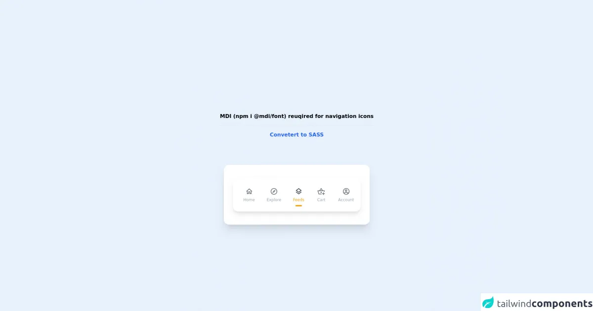
The preview of Mobile Navigation Bar ui component.
To create a mobile navigation bar with Tailwind CSS, we'll use a combination of HTML and CSS. The navigation bar will be responsive and will collapse into a menu button on smaller screens.
Free download of the Mobile Navigation Bar's source code
The source code of Mobile Navigation Bar ui component.
To create the mobile navigation bar, we'll start by creating a basic HTML structure. We'll use an unordered list to create the links and a button to toggle the menu on smaller screens.
<!-- MDI Icons -->
<link rel="stylesheet" href="https://cdn.materialdesignicons.com/6.5.95/css/materialdesignicons.min.css">

<!-- Container -->
<div class="flex items-center justify-center min-h-screen">
	<div class="flex flex-col">
		<span class="text-center font-bold my-20">
			MDI (npm i @mdi/font) reuqired for navigation icons

			<hr class="my-4">

			<a href="https://egoistdeveloper.github.io/twcss-to-sass-playground/" target="_blank" class="text-blue-600">
				Convetert to SASS
			</a>
		</span>

		<div class="w-full max-w-md px-7 py-10 mx-auto bg-white rounded-2xl shadow-xl">
			<!-- Navigation Bar -->
			<div class="px-5 pt-3 bg-white shadow-lg rounded-2xl">
				<div class="flex flex-row space-x-3">
					<!-- Item #1 -->
					<div class="flex group">
						<a href="#" class="p-3 text-gray-400 hover:text-yellow-500">
							<span class="flex flex-col items-center">
								<!-- Icon -->
								<i class="mdi mdi-home-outline mdi-24px mx-1 text-gray-500 group-hover:text-gray-700
									transition-color duration-200"></i>

								<!-- Text -->
								<span class="text-xs mb-2 transition-all duration-200">
									Home
								</span>

								<!-- Focus Dot -->
								<span class="h-2 w-2 rounded-full group-hover:bg-yellow-500
									transition-all duration-150 delay-100"></span>
							</span>
						</a>
					</div>

					<!-- Item #2 -->
					<div class="flex group">
						<a href="#" class="p-3 text-gray-400 hover:text-yellow-500">
							<span class="flex flex-col items-center">
								<!-- Icon -->
								<i class="mdi mdi-compass-outline mdi-24px mx-1 text-gray-500 group-hover:text-gray-700
									transition-color duration-200"></i>

								<!-- Text -->
								<span class="text-xs mb-2 transition-all duration-200">
									Explore
								</span>

								<!-- Focus Dot -->
								<span class="h-2 w-2 rounded-full group-hover:bg-yellow-500
									transition-all duration-150 delay-100"></span>
							</span>
						</a>
					</div>

					<!-- Item #3 Active -->
					<div class="flex group">
						<a href="#" class="p-3 text-yellow-500 hover:text-yellow-500">
							<span class="flex flex-col items-center">
								<!-- Icon -->
								<i class="mdi mdi-layers-outline mdi-24px mx-1 text-gray-700 group-hover:text-gray-700
									transition-color duration-200"></i>

								<!-- Text -->
								<span class="text-xs mb-2 transition-all duration-200">
									Feeds
								</span>

								<!-- Focus Dot -->
								<span class="h-1 w-5 rounded-full bg-yellow-500 group-hover:bg-yellow-500
									hover:h-3 hover:w-3 transition-all duration-150 delay-100"></span>
							</span>
						</a>
					</div>

					<!-- Item #4 -->
					<div class="flex group">
						<a href="#" class="p-3 text-gray-400 hover:text-yellow-500">
							<span class="flex flex-col items-center">
								<!-- Icon -->
								<i class="mdi mdi-basket-plus-outline mdi-24px mx-1 text-gray-500 group-hover:text-gray-700
									transition-color duration-200"></i>

								<!-- Text -->
								<span class="text-xs mb-2 transition-all duration-200">
									Cart
								</span>

								<!-- Focus Dot -->
								<span class="h-2 w-2 rounded-full group-hover:bg-yellow-500
									transition-all duration-150 delay-100"></span>
							</span>
						</a>
					</div>

					<!-- Item #5 -->
					<div class="flex group">
						<a href="#" class="p-3 text-gray-400 hover:text-yellow-500">
							<span class="flex flex-col items-center">
								<!-- Icon -->
								<i class="mdi mdi-account-circle-outline mdi-24px mx-1 text-gray-500 group-hover:text-gray-700
									transition-color duration-200"></i>

								<!-- Text -->
								<span class="text-xs mb-2 transition-all duration-200">
									Account
								</span>

								<!-- Focus Dot -->
								<span class="h-2 w-2 rounded-full group-hover:bg-yellow-500
									transition-all duration-150 delay-100"></span>
							</span>
						</a>
					</div>
				</div>
			</div>
		</div>
	</div>
</div>
How to create a Mobile Navigation Bar with Tailwind CSS?
- First, we'll create the basic HTML structure for the navigation bar. We'll use an unordered list to create the links and a button to toggle the menu on smaller screens.
<nav class="bg-gray-800">
  <div class="max-w-7xl mx-auto px-2 sm:px-6 lg:px-8">
    <div class="relative flex items-center justify-between h-16">
      <div class="absolute inset-y-0 left-0 flex items-center sm:hidden">
        <button type="button" class="inline-flex items-center justify-center p-2 rounded-md text-gray-400 hover:text-white hover:bg-gray-700 focus:outline-none focus:ring-2 focus:ring-inset focus:ring-white" aria-controls="mobile-menu" aria-expanded="false">
          <span class="sr-only">Open main menu</span>
          <!-- Icon when menu is closed. -->
          <!--
            Heroicon name: menu

            Menu open: "hidden", Menu closed: "block"
          -->
          <svg class="block h-6 w-6" xmlns="http://www.w3.org/2000/svg" fill="none" viewBox="0 0 24 24" stroke="currentColor" aria-hidden="true">
            <path stroke-linecap="round" stroke-linejoin="round" stroke-width="2" d="M4 6h16M4 12h16M4 18h16" />
          </svg>
          <!-- Icon when menu is open. -->
          <!--
            Heroicon name: x

            Menu open: "block", Menu closed: "hidden"
          -->
          <svg class="hidden h-6 w-6" xmlns="http://www.w3.org/2000/svg" fill="none" viewBox="0 0 24 24" stroke="currentColor" aria-hidden="true">
            <path stroke-linecap="round" stroke-linejoin="round" stroke-width="2" d="M6 18L18 6M6 6l12 12" />
          </svg>
        </button>
      </div>
      <div class="flex-1 flex items-center justify-center sm:items-stretch sm:justify-start">
        <div class="flex-shrink-0 flex items-center">
          <img class="block lg:hidden h-8 w-auto" src="https://tailwindui.com/img/logos/workflow-mark-indigo-500.svg" alt="Workflow">
          <img class="hidden lg:block h-8 w-auto" src="https://tailwindui.com/img/logos/workflow-logo-indigo-500-mark-white-text.svg" alt="Workflow">
        </div>
        <div class="hidden sm:block sm:ml-6">
          <div class="flex space-x-4">
            <a href="#" class="bg-gray-900 text-white px-3 py-2 rounded-md text-sm font-medium">Dashboard</a>

            <a href="#" class="text-gray-300 hover:bg-gray-700 hover:text-white px-3 py-2 rounded-md text-sm font-medium">Team</a>

            <a href="#" class="text-gray-300 hover:bg-gray-700 hover:text-white px-3 py-2 rounded-md text-sm font-medium">Projects</a>

            <a href="#" class="text-gray-300 hover:bg-gray-700 hover:text-white px-3 py-2 rounded-md text-sm font-medium">Calendar</a>
          </div>
        </div>
      </div>
    </div>
  </div>

  <!-- Mobile menu, show/hide based on menu state. -->
  <div class="sm:hidden" id="mobile-menu">
    <div class="px-2 pt-2 pb-3 space-y-1">
      <a href="#" class="bg-gray-900 text-white block px-3 py-2 rounded-md text-base font-medium">Dashboard</a>

      <a href="#" class="text-gray-300 hover:bg-gray-700 hover:text-white block px-3 py-2 rounded-md text-base font-medium">Team</a>

      <a href="#" class="text-gray-300 hover:bg-gray-700 hover:text-white block px-3 py-2 rounded-md text-base font-medium">Projects</a>

      <a href="#" class="text-gray-300 hover:bg-gray-700 hover:text-white block px-3 py-2 rounded-md text-base font-medium">Calendar</a>
    </div>
  </div>
</nav>
- Next, we'll add some custom CSS to style the navigation bar. We'll use Tailwind CSS classes to style the different elements of the navigation bar.
/* Style the navigation bar */
nav {
  height: 3.5rem;
}

/* Style the logo */
nav img {
  height: 1.75rem;
}

/* Style the links */
nav a {
  color: #fff;
  text-decoration: none;
}

/* Style the menu button */
nav button {
  display: none;
}

/* Style the menu when it's open */
#mobile-menu {
  display: none;
}

/* Show the menu button on smaller screens */
@media (max-width: 640px) {
  nav button {
    display: block;
  }

  /* Hide the links when the menu is open */
  #mobile-menu {
    display: block;
  }

  /* Hide the logo on smaller screens */
  nav img {
    display: none;
  }
}
- Finally, we'll add some JavaScript to toggle the menu on smaller screens.
// Get the menu button
const menuButton = document.querySelector('nav button');

// Get the mobile menu
const mobileMenu = document.querySelector('#mobile-menu');

// Add a click event listener to the menu button
menuButton.addEventListener('click', () => {
  // Toggle the aria-expanded attribute
  menuButton.setAttribute('aria-expanded', menuButton.getAttribute('aria-expanded') === 'false' ? 'true' : 'false');

  // Toggle the menu
  mobileMenu.style.display = mobileMenu.style.display === 'none' ? 'block' : 'none';
});
Conclusion
In this article, we've explored how to use Tailwind CSS to create a mobile navigation bar. We've seen how Tailwind CSS provides a set of pre-defined CSS classes that can be used to style the navigation bar, and how it provides a mobile-first approach to styling. By following the steps outlined in this article, you should be able to create a responsive and customizable mobile navigation bar for your next project.