- Published on
Imagine You Create A List Group With Tailwind CSS Like An Expert. Follow These 6 Steps To Get There
- What is Tailwind CSS?
- The description of List Group UI component
- Why use Tailwind CSS to create a List Group UI component?
- The preview of List Group UI component
- The source code of List Group UI component
- How to create a List Group with Tailwind CSS?
- Conclusion
What is Tailwind CSS?
Tailwind CSS is a utility-first CSS framework that allows you to rapidly build custom user interfaces. It provides a set of pre-defined CSS classes that you can use to style your HTML elements. With Tailwind CSS, you can create complex layouts and designs without writing any custom CSS code.
The description of List Group UI component
A list group is a UI component that displays a list of items in a structured way. It is commonly used to display a collection of related items, such as a list of products, blog posts, or user profiles. A list group typically consists of a container element that holds a series of list items, each of which contains some content.
Why use Tailwind CSS to create a List Group UI component?
Tailwind CSS makes it easy to create a list group UI component that is both visually appealing and functional. With its pre-defined CSS classes, you can quickly style your list group to match your design requirements. Additionally, Tailwind CSS provides responsive design classes that allow you to create a list group that looks great on any device.
The preview of List Group UI component
To create a list group with Tailwind CSS, you can use the following HTML structure:
<div class="bg-gray-100 p-4">
  <ul class="divide-y divide-gray-200">
    <li class="py-4">
      <div class="flex space-x-3">
        <img class="h-8 w-8 rounded-full" src="{{__placeholder1__}}" alt="">
        <div class="flex-1 space-y-1">
          <div class="flex items-center justify-between">
            <h3 class="text-sm font-medium">List item title</h3>
            <p class="text-sm text-gray-500">11/10/2021</p>
          </div>
          <p class="text-sm text-gray-500">List item description</p>
        </div>
      </div>
    </li>
  </ul>
</div>
This HTML structure creates a list group with two list items. Each list item contains an image, a title, a date, and a description. The list items are separated by a horizontal line, which is created using the divide-y and divide-gray-200 classes.
Free download of the List Group's source code
The source code of List Group UI component
To create a list group with Tailwind CSS, you can use the following CSS classes:
.bg-gray-100 {
  background-color: #f7fafc;
}

.p-4 {
  padding: 1rem;
}

.divide-y > :not(:last-child) {
  margin-bottom: 0.5rem;
}

.divide-gray-200 > :not(:last-child) {
  border-bottom-width: 1px;
  border-color: #e2e8f0;
}

.py-4 {
  padding-top: 1rem;
  padding-bottom: 1rem;
}

.flex {
  display: flex;
}

.space-x-3 {
  margin-right: 0.75rem;
  margin-left: 0.75rem;
}

.h-8 {
  height: 2rem;
}

.w-8 {
  width: 2rem;
}

.rounded-full {
  border-radius: 9999px;
}

.flex-1 {
  flex: 1;
}

.space-y-1 {
  margin-top: 0.25rem;
  margin-bottom: 0.25rem;
}

.items-center {
  align-items: center;
}

.justify-between {
  justify-content: space-between;
}

.text-sm {
  font-size: 0.875rem;
}

.font-medium {
  font-weight: 500;
}

.text-gray-500 {
  color: #718096;
}
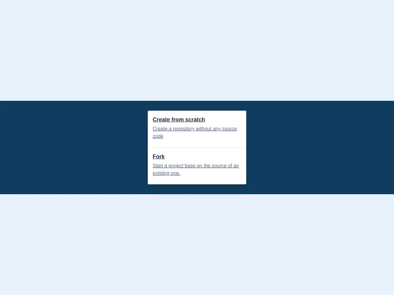
<div class="font-sans flex items-center justify-center bg-blue-darker w-full py-8">
                <div class="overflow-hidden bg-white rounded max-w-xs w-full shadow-lg  leading-normal">
                    <a href="#" class="block group hover:bg-blue p-4 border-b">
                        <p class="font-bold text-lg mb-1 text-black group-hover:text-white">Create from scratch</p>
                        <p class="text-grey-darker mb-2 group-hover:text-white">Create a repository without any source code</p>
                    </a>
                    <a href="#" class="block group hover:bg-blue p-4">
                        <p class="font-bold text-lg mb-1 text-black group-hover:text-white">Fork</p>
                        <p class="text-grey-darker mb-2 group-hover:text-white">Start a project base on the source of an existing one.</p>
                    </a>
                </div>
            </div>
How to create a List Group with Tailwind CSS?
To create a list group with Tailwind CSS, follow these steps:
Create a container element for the list group. You can use a
divelement with thebg-gray-100andp-4classes to create a container with a light gray background and some padding.Create a
ulelement to hold the list items. Use thedivide-yanddivide-gray-200classes to create a horizontal line between each list item.Create a
lielement for each list item. Use thepy-4class to add some vertical padding to each list item.Create a
divelement inside eachlielement. Use theflexandspace-x-3classes to create a horizontal layout for the image and the content.Add an
imgelement inside thedivelement to display an image for each list item. Use theh-8,w-8, androunded-fullclasses to create a circular image with a height and width of 2rem.Add a
divelement inside thedivelement to display the title, date, and description for each list item. Use theflex-1andspace-y-1classes to create a vertical layout for the content. Use theitems-centerandjustify-betweenclasses to align the title and date on the same line.
Conclusion
Creating a list group with Tailwind CSS is a simple and straightforward process. With its pre-defined CSS classes, you can quickly create a visually appealing and functional list group that matches your design requirements. By following the six steps outlined in this article, you can create a list group like an expert and take your UI design skills to the next level.