- Published on
How To Make A Layout With Header Sidebar And Rightbar With Tailwind CSS From Scratch
- What is Tailwind CSS?
- The description of Layout With Header Sidebar And Rightbar ui component
- Why use Tailwind CSS to create a Layout With Header Sidebar And Rightbar ui component?
- The preview of Layout With Header Sidebar And Rightbar ui component.
- The source code of Layout With Header Sidebar And Rightbar ui component.
- How to create a Layout With Header Sidebar And Rightbar with Tailwind CSS?
- Step 1: Set up the HTML structure
- Step 2: Style the header
- Step 3: Style the sidebar
- Step 4: Style the main content
- Step 5: Style the right bar
- Step 6: Add responsive classes
- Conclusion
What is Tailwind CSS?
Tailwind CSS is a utility-first CSS framework that provides a set of pre-defined CSS classes to help you quickly build custom user interfaces. It allows you to create complex layouts and designs without writing any custom CSS code. Tailwind CSS is highly customizable and can be used with any front-end framework or library.
The description of Layout With Header Sidebar And Rightbar ui component
A layout with a header, sidebar, and right bar is a common user interface component used in many web applications. The header typically contains the logo and navigation links, the sidebar contains the main menu, and the right bar contains additional information or widgets.
Why use Tailwind CSS to create a Layout With Header Sidebar And Rightbar ui component?
Tailwind CSS provides a set of pre-defined CSS classes that can be used to create a layout with a header, sidebar, and right bar quickly. Using Tailwind CSS can save you a lot of time and effort in writing custom CSS code. Additionally, Tailwind CSS is highly customizable, so you can easily modify the layout to fit your specific needs.
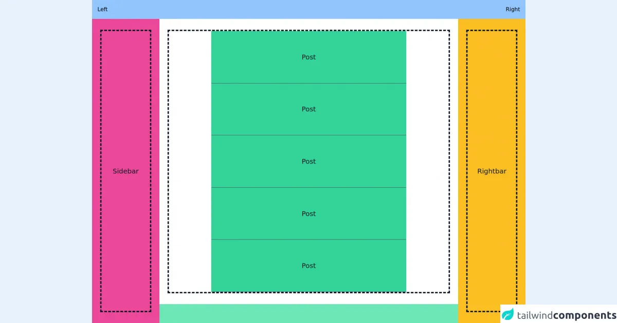
The preview of Layout With Header Sidebar And Rightbar ui component.
To create a layout with a header, sidebar, and right bar, we will use Tailwind CSS. The layout will be responsive and will adapt to different screen sizes.
Free download of the Layout With Header Sidebar And Rightbar's source code
The source code of Layout With Header Sidebar And Rightbar ui component.
The source code for the layout with a header, sidebar, and right bar can be found below.
<div class="flex h-screen bg-green-300">
  <div class="flex-1 flex flex-col overflow-hidden">
    <header class="flex justify-between items-center bg-blue-300 p-4">
      <div class="flex">Left</div>
      <div class="flex">Right</div>
    </header>
    <div class="flex h-full">
      <nav class="flex w-72 h-full bg-pink-500">
        <div class="w-full flex mx-auto px-6 py-8">
          <div class="w-full h-full flex items-center justify-center text-gray-900 text-xl border-4 border-gray-900 border-dashed">Sidebar</div>
        </div>
      </nav>
      <main class="flex flex-col w-full bg-white overflow-x-hidden overflow-y-auto mb-14">
        <div class="flex w-full mx-auto px-6 py-8">
          <div class="flex flex-col w-full h-full text-gray-900 text-xl border-4 border-gray-900 border-dashed">
            <div class="flex w-full max-w-xl h-60 items-center justify-center mx-auto bg-green-400 border-b border-gray-600">Post</div>
            <div class="flex w-full max-w-xl h-60 items-center justify-center mx-auto bg-green-400 border-b border-gray-600">Post</div>
            <div class="flex w-full max-w-xl h-60 items-center justify-center mx-auto bg-green-400 border-b border-gray-600">Post</div>
            <div class="flex w-full max-w-xl h-60 items-center justify-center mx-auto bg-green-400 border-b border-gray-600">Post</div>
            <div class="flex w-full max-w-xl h-60 items-center justify-center mx-auto bg-green-400 border-b border-gray-600">Post</div>
          </div>
        </div>
      </main>
      <nav class="flex w-72 h-full bg-yellow-400">
        <div class="w-full flex mx-auto px-6 py-8">
          <div class="w-full h-full flex items-center justify-center text-gray-900 text-xl border-4 border-gray-900 border-dashed">Rightbar</div>
        </div>
      </nav>
    </div>
  </div>
</div>

<style>
::-webkit-scrollbar {
  width: 5px;
  height: 5px;
}
::-webkit-scrollbar-thumb {
  background: linear-gradient(13deg, #7bcfeb 14%, #e685d3 64%);
  border-radius: 10px;
}
::-webkit-scrollbar-thumb:hover {
  background: linear-gradient(13deg, #c7ceff 14%, #f9d4ff 64%);
}
::-webkit-scrollbar-track {
  background: #ffffff;
  border-radius: 10px;
  box-shadow: inset 7px 10px 12px #f0f0f0;
}
</style>
How to create a Layout With Header Sidebar And Rightbar with Tailwind CSS?
To create a layout with a header, sidebar, and right bar with Tailwind CSS, follow the steps below:
Step 1: Set up the HTML structure
The first step is to set up the HTML structure for the layout. We will use a div element to contain the entire layout and three div elements to represent the header, sidebar, and right bar.
<div class="flex flex-col min-h-screen">
  <div class="bg-gray-800 text-white flex justify-between items-center px-4 py-3">
    <!-- Header content goes here -->
  </div>
  <div class="flex flex-col md:flex-row flex-1">
    <div class="bg-gray-200 md:w-64 px-4 py-6">
      <!-- Sidebar content goes here -->
    </div>
    <div class="bg-gray-100 flex-1 px-4 py-6">
      <!-- Main content goes here -->
    </div>
    <div class="bg-gray-200 md:w-64 px-4 py-6">
      <!-- Right bar content goes here -->
    </div>
  </div>
</div>
Step 2: Style the header
Next, we will style the header using Tailwind CSS classes. We will use the bg-gray-800 class to set the background color to dark gray, the text-white class to set the text color to white, and the px-4 and py-3 classes to add padding to the header.
<div class="bg-gray-800 text-white flex justify-between items-center px-4 py-3">
  <div>
    <img src="logo.png" alt="Logo" class="h-8">
  </div>
  <div>
    <a href="#" class="text-gray-300 hover:text-white px-3 py-2">Home</a>
    <a href="#" class="text-gray-300 hover:text-white px-3 py-2">About</a>
    <a href="#" class="text-gray-300 hover:text-white px-3 py-2">Contact</a>
  </div>
</div>
Step 3: Style the sidebar
Next, we will style the sidebar using Tailwind CSS classes. We will use the bg-gray-200 class to set the background color to light gray, the md:w-64 class to set the width of the sidebar to 64 pixels on medium and larger screens, and the px-4 and py-6 classes to add padding to the sidebar.
<div class="bg-gray-200 md:w-64 px-4 py-6">
  <ul class="list-disc list-inside">
    <li><a href="#" class="text-gray-700 hover:text-gray-900">Link 1</a></li>
    <li><a href="#" class="text-gray-700 hover:text-gray-900">Link 2</a></li>
    <li><a href="#" class="text-gray-700 hover:text-gray-900">Link 3</a></li>
  </ul>
</div>
Step 4: Style the main content
Next, we will style the main content using Tailwind CSS classes. We will use the bg-gray-100 class to set the background color to light gray, the flex-1 class to make the main content fill the remaining space, and the px-4 and py-6 classes to add padding to the main content.
<div class="bg-gray-100 flex-1 px-4 py-6">
  <h1 class="text-2xl font-bold mb-4">Main Content</h1>
  <p>Lorem ipsum dolor sit amet, consectetur adipiscing elit. Sed vel nisi euismod, aliquet magna in, ultricies nunc. Sed euismod, massa ac ullamcorper sagittis, lectus velit tincidunt sapien, vel sodales nunc sapien vel orci. Sed nec odio ac purus bibendum dapibus. Sed euismod, massa ac ullamcorper sagittis, lectus velit tincidunt sapien, vel sodales nunc sapien vel orci.</p>
</div>
Step 5: Style the right bar
Finally, we will style the right bar using Tailwind CSS classes. We will use the bg-gray-200 class to set the background color to light gray, the md:w-64 class to set the width of the right bar to 64 pixels on medium and larger screens, and the px-4 and py-6 classes to add padding to the right bar.
<div class="bg-gray-200 md:w-64 px-4 py-6">
  <h2 class="text-lg font-bold mb-4">Right Bar</h2>
  <ul class="list-disc list-inside">
    <li>Item 1</li>
    <li>Item 2</li>
    <li>Item 3</li>
  </ul>
</div>
Step 6: Add responsive classes
To make the layout responsive, we will add some responsive classes to the HTML. We will use the flex-col class to make the layout a column on small screens and the md:flex-row class to make the layout a row on medium and larger screens.
<div class="flex flex-col min-h-screen">
  <div class="bg-gray-800 text-white flex justify-between items-center px-4 py-3">
    <!-- Header content goes here -->
  </div>
  <div class="flex flex-col md:flex-row flex-1">
    <div class="bg-gray-200 md:w-64 px-4 py-6">
      <!-- Sidebar content goes here -->
    </div>
    <div class="bg-gray-100 flex-1 px-4 py-6">
      <!-- Main content goes here -->
    </div>
    <div class="bg-gray-200 md:w-64 px-4 py-6">
      <!-- Right bar content goes here -->
    </div>
  </div>
</div>
Conclusion
In this article, we have learned how to create a layout with a header, sidebar, and right bar using Tailwind CSS. We have seen how Tailwind CSS can save us time and effort in writing custom CSS code and how it can be customized to fit our specific needs. With the steps outlined above, you can easily create a layout with a header, sidebar, and right bar for your next web application.