- Published on
3 Things You Must Know To Build A Leading Pages With Tailwind CSS
- What is Tailwind CSS?
- The description of Leading pages UI component
- Why use Tailwind CSS to create a Leading pages UI component?
- The preview of Leading pages UI component
- The source code of Leading pages UI component
- How to create a Leading pages with Tailwind CSS?
- Conclusion
If you are looking to create a leading pages UI component, then you are in the right place. In this article, we will discuss what Tailwind CSS is and how it can help you create a leading pages UI component. We will also provide a preview of the UI component and the source code. So, let's get started.
What is Tailwind CSS?
Tailwind CSS is a utility-first CSS framework that provides a set of pre-defined classes that you can use to style your HTML elements. It is different from other CSS frameworks like Bootstrap and Foundation, which provide a set of pre-defined components that you can use to build your UI.
With Tailwind CSS, you can create your own custom components by using the pre-defined classes. This gives you more control over the design of your UI and makes it easier to maintain your code.
The description of Leading pages UI component
A leading pages UI component is a set of UI elements that are used to create a landing page. It includes elements like headers, footers, buttons, forms, and images. The goal of a leading pages UI component is to create a visually appealing and user-friendly landing page that encourages users to take action.
Why use Tailwind CSS to create a Leading pages UI component?
Tailwind CSS provides a set of pre-defined classes that you can use to create a leading pages UI component. This makes it easier to create a consistent and visually appealing design across all the elements of your landing page.
Tailwind CSS also provides a responsive design system that makes it easy to create a landing page that looks great on all devices. You can use the pre-defined classes to create different layouts for different screen sizes.
Finally, Tailwind CSS is easy to learn and use. You don't need to be an expert in CSS to create a leading pages UI component with Tailwind CSS. You can simply use the pre-defined classes to style your HTML elements.
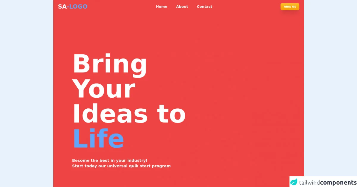
The preview of Leading pages UI component
To create a leading pages UI component with Tailwind CSS, you can use the pre-defined classes to style your HTML elements. Here is a preview of what the UI component might look like:
Free download of the Leading pages's source code
The source code of Leading pages UI component
To create a leading pages UI component with Tailwind CSS, you can use the pre-defined classes to style your HTML elements. Here is an example of the source code:
<!DOCTYPE html>
<html>

<head>
    <link rel="stylesheet" href="https://cdnjs.cloudflare.com/ajax/libs/font-awesome/4.7.0/css/font-awesome.min.css">
</head>

<body>
    <div class="bg-red-500 w-full">
        <header>
            <div class="flex justify-between items-center py-4 px-6">
                <div>
                    <h1 class="font-bold text-white text-3xl">SA<span class="text-blue-400">-LOGO</span></h1>
                </div>
                <div class="flex justify-center space-x-10 hidden sm:block">
                    <a href="#" class="text-white font-semibold text-lg hover:text-yellow-400">Home</a>
                    <a href="#" class="text-white font-semibold text-lg hover:text-yellow-400">About</a>
                    <a href="#" class="text-white font-semibold text-lg hover:text-yellow-400">Contact</a>
                </div>
                <div class="flex space-x-2 space-x-10 hidden sm:block">
                    <button
                        class="bg-gradient-to-b from-yellow-400 to-yellow-500  text-white font-bold py-2 px-4 rounded-lg uppercase text-sm  shadow-xl">
                        HIRE US
                    </button>
                </div>
                <div class="flex space-x-2 space-x-10 block sm:hidden">
                    <a href="#"
                        class="flex items-center bg-gradient-to-b from-yellow-400 to-yellow-500  text-white font-bold py-2 px-4 rounded-full uppercase text-sm  shadow-xl">
                        <svg xmlns="http://www.w3.org/2000/svg" class="h-6 w-6" fill="none" viewBox="0 0 24 24" stroke="currentColor">
                            <path stroke-linecap="round" stroke-linejoin="round" stroke-width="2" d="M4 6h16M4 12h8m-8 6h16" />
                        </svg>
                    </a>
                </div>
            </div>
        </header>
        <!-- Title -->
        <section class="h-screen px-12 sm:px-24 flex items-center relative">
            <div class="grid grid-cols-12 gap-6 ">
                <div class="col-span-12 sm:col-span-12 md:col-span-12 lg:col-span-8 xxl:col-span-12">
                    <div class="w-full">
                        <h1 class="text-7xl sm:text-8xl lg:text-8xl xl:text-9xl text-white font-bold my-8">Bring Your<br>
                            Ideas to <span class="text-blue-400">Life</span></h1>
                        <p class="text-xl text-white font-semibold ">Become the best in your industry!<br> Start today
                            our universal quik start program</p>
                    </div>
                </div>
                <div class="absolute bottom-0 left-0 py-6 px-6">
                    <div class="flex space-x-2">
                        <svg xmlns="http://www.w3.org/2000/svg" class="h-7 w-7 text-yellow-400" fill="none"
                            viewBox="0 0 24 24" stroke="currentColor">
                            <path stroke-linecap="round" stroke-linejoin="round" stroke-width="2"
                                d="M13 9l3 3m0 0l-3 3m3-3H8m13 0a9 9 0 11-18 0 9 9 0 0118 0z" />
                        </svg>
                        <p class="text-white font-semibold">Explore</p>
                    </div>
                </div>
                <div class="absolute bottom-0 py-6 px-6 right-0">
                    <div class="flex space-x-6">
                        <i class="fa fa-dribbble text-white fa-lg"></i>
                        <i class="fa fa-twitter text-white fa-lg"></i>
                        <i class="fa fa-facebook text-white fa-lg"></i>
                        <i class="fa fa-instagram text-white fa-lg"></i>
                    </div>

                </div>
            </div>
        </section>
        <!-- WE CREATE -->
        <section class="h-full bg-yellow-300">
            <div class="relative  px-8 py-8">
                <div>
                    <h1 class="text-white text-white text-6xl font-bold">
                        <span class="bg-blue-400 py-4 px-4 rounded-full text-5xl">WE</span>CREATE
                    </h1>
                </div>
            </div>
            <div class="grid grid-cols-12 gap-6 px-8 py-8">
                <div class="col-span-12 sm:col-span-12 md:col-span-5 lg:col-span-5 xxl:col-span-5">
                    <div class="py-4">
                        <p class="text-lg font-semibold text-blue-900"><span class="text-red-400 font-bold">01-</span>
                            OPTIMIZED <span class="font-bold">USER EXPERIENCES</span></p>
                        <p class="text-blue-900 text-sm pl-8">Lorem Ipsum is simply dummy text of the printing and
                            typesetting industry. Lorem Ipsum has been the industry's standard dummy text ever since
                            the 1500s, when an unknown printer took a galley of type and scrambled it to make a
                            type specimen book.
                        </p>
                    </div>
                    <div class="py-4">
                        <p class="text-lg font-semibold text-blue-900"><span class="text-red-400 font-bold">02-</span>
                            ELEGENT <span class="font-bold">USER INTERFACES</span></p>
                    </div>
                    <div class="py-4">
                        <p class="text-lg font-semibold text-blue-900"><span class="text-red-400 font-bold">03-</span>
                            BEAUTIFUL <span class="font-bold">GRAPHIC DESIGNS</span></p>
                    </div>
                    <div class="py-4">
                        <p class="text-lg font-semibold text-blue-900"><span class="text-red-400 font-bold">04-</span>
                            TACTICAL <span class="font-bold">DIGITAL MARKETING</span></p>
                    </div>
                </div>
                <div class="col-span-12 sm:col-span-12 md:col-span-7 lg:col-span-7 xxl:col-span-7 flex justify-center">
                    <img src="https://cdn3d.iconscout.com/3d/premium/thumb/male-employee-looking-at-customer-review-2937682-2426381.png"
                        class="w-auto" />
                </div>
            </div>
        </section>
        <!-- Grow With Us -->
        <section class="h-full bg-yellow-300">
            <div class="grid grid-cols-12 gap-0">
                <div
                    class="col-span-12 sm:col-span-12 md:col-span-6 lg:col-span-6 xxl:col-span-6 bg-red-500 h-full px-16 py-6">
                    <div>
                        <img src="https://ouch-cdn2.icons8.com/c_sJhjs8JZ9WhtxfMnw0Eh2FpwIsj4VukdWjkjOiJqw/rs:fit:784:784/czM6Ly9pY29uczgu/b3VjaC1wcm9kLmFz/c2V0cy9wbmcvMjEx/LzZkY2MyYWU2LWU5/MDYtNDJjNC05Yzk3/LTBiYjliMDgxOGMz/MC5wbmc.png" class="w-52 -ml-4" />
                        <h1 class="text-white font-semibold text-7xl">Grow With Us</h1>
                        <button
                            class="my-6 bg-gradient-to-b from-yellow-400 to-yellow-500  text-white font-bold py-2 px-4 rounded-lg uppercase text-sm  shadow-xl">
                            Hire Us
                        </button>
                    </div>
                </div>
                <div
                    class="col-span-12 sm:col-span-12 md:col-span-6 lg:col-span-6 xxl:col-span-6 bg-blue-400 h-full px-16 py-6">
                    <div>
                        <img src="https://assets.materialup.com/uploads/641e0e0f-eddf-4d2c-b0ee-c6f55300bb1b/preview.png"
                            class="w-52 -ml-10" />
                        <h1 class="text-white font-semibold text-7xl">Say Hello</h1>
                        <button
                            class="my-6 bg-gradient-to-b from-red-400 to-red-500  text-white font-bold py-2 px-4 rounded-lg uppercase text-sm  shadow-xl">
                            [email protected]
                        </button>
                    </div>
                </div>
            </div>
        </section>

        <!-- footer -->
        <section class="h-full bg-gray-800">
            <div class="py-6 px-16 flex justify-between">
                <div>
                    <h1 class="font-bold text-white text-xl">SA<span class="text-blue-400">-LOGO</span></h1>
                </div>

                <div class="flex space-x-6 mt-2">
                    <i class="fa fa-dribbble text-white fa-lg"></i>
                    <i class="fa fa-twitter text-white fa-lg"></i>
                    <i class="fa fa-facebook text-white fa-lg"></i>
                    <i class="fa fa-instagram text-white fa-lg"></i>
                </div>
            </div>

            <div class="border-t-2 mx-10 border-gray-500"></div>

            <div class="py-4 py-6 px-16 flex justify-between">
                <div>
                    <h1 class="font-semibold text-white text-sm">Copyrigth @ 2021</h1>
                </div>

                <div>
                    <a href="#" class="flex space-x-2 text-white hover:text-yellow-400">
                        <p class="font-semibold  text-sm">GO TOP</p>
                        <svg xmlns="http://www.w3.org/2000/svg" class="h-6 w-6  -mt-1" fill="none" viewBox="0 0 24 24"
                            stroke="currentColor">
                            <path stroke-linecap="round" stroke-linejoin="round" stroke-width="2"
                                d="M8 7l4-4m0 0l4 4m-4-4v18" />
                        </svg>
                    </a>
                </div>
            </div>
        </section>
    </div>
</body>
</html>
How to create a Leading pages with Tailwind CSS?
To create a leading pages UI component with Tailwind CSS, follow these steps:
- Create a new HTML file and add the necessary HTML elements for your landing page.
- Add the Tailwind CSS CDN to your HTML file.
- Use the pre-defined classes to style your HTML elements.
- Add any custom CSS that you need to achieve your desired design.
Here is an example of how you might use Tailwind CSS to create a header for your landing page:
<header class="bg-gray-800 text-white">
  <div class="container mx-auto py-4 px-6 flex justify-between items-center">
    <h1 class="text-2xl font-bold">My Landing Page</h1>
    <nav>
      <a href="#" class="text-white hover:text-gray-400 px-3 py-2">Home</a>
      <a href="#" class="text-white hover:text-gray-400 px-3 py-2">About</a>
      <a href="#" class="text-white hover:text-gray-400 px-3 py-2">Contact</a>
    </nav>
  </div>
</header>
In this example, we have used the bg-gray-800 class to set the background color of the header to gray, the text-white class to set the text color to white, and the container, mx-auto, py-4, and px-6 classes to center the content of the header and add padding.
We have also used the text-2xl and font-bold classes to set the font size and weight of the heading, and the text-white, hover:text-gray-400, px-3, and py-2 classes to style the links in the navigation menu.
You can use similar classes to style the other elements of your landing page, such as forms, buttons, and images.
Conclusion
In conclusion, Tailwind CSS is a powerful tool for creating a leading pages UI component. It provides a set of pre-defined classes that you can use to style your HTML elements, making it easy to create a consistent and visually appealing design across all the elements of your landing page.
By using Tailwind CSS, you can also create a responsive design that looks great on all devices, and you don't need to be an expert in CSS to use it.
So, if you are looking to create a leading pages UI component, give Tailwind CSS a try. It might just be the tool you need to create a visually appealing and user-friendly landing page.