- Published on
6 Steps To Make A Landing Page Example With Tailwind CSS Like A Pro In Under An Hour
- What is Tailwind CSS?
- The description of Landing page example ui component
- Why use Tailwind CSS to create a Landing page example ui component?
- The preview of Landing page example ui component
- The source code of Landing page example ui component
- How to create a Landing page example with Tailwind CSS?
- Step 1: Set up your project
- Step 2: Create the header section
- Step 3: Add a hero section
- Step 4: Add a features section
- Step 5: Add a testimonials section
- Step 6: Add a footer section
- Conclusion
Are you looking to create a landing page example with Tailwind CSS? Look no further! In this article, we'll guide you through the process of creating a landing page example with Tailwind CSS in just six easy steps.
What is Tailwind CSS?
Tailwind CSS is a utility-first CSS framework that allows you to quickly and easily create custom designs without writing any CSS. It provides a set of pre-defined CSS classes that you can use to style your HTML elements.
The description of Landing page example ui component
A landing page is a web page that serves as the entry point for a website or a particular section of a website. It's designed to convert visitors into leads or customers by providing them with a clear and compelling call-to-action. A landing page example UI component is a pre-designed user interface element that you can use to create a landing page quickly and easily.
Why use Tailwind CSS to create a Landing page example ui component?
Tailwind CSS is an excellent choice for creating landing page example UI components because it provides a wide range of pre-defined CSS classes that you can use to style your elements. It's also highly customizable, which means you can easily modify the styles to fit your specific needs.
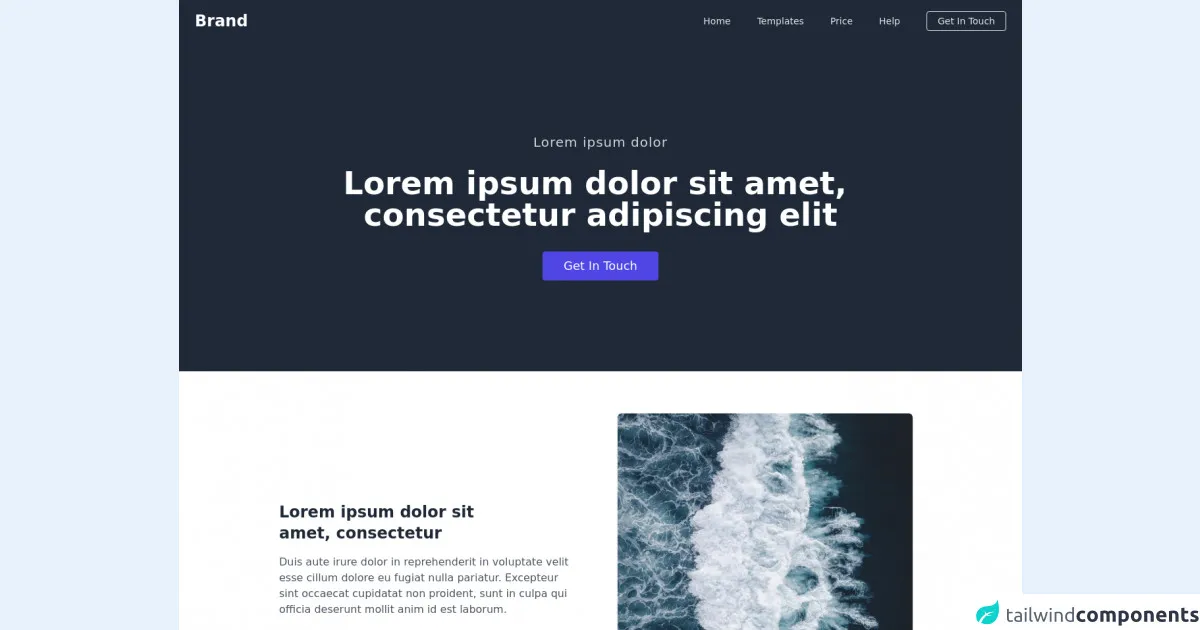
The preview of Landing page example ui component
To give you an idea of what a landing page example UI component might look like, here's a preview:
Free download of the Landing page example's source code
The source code of Landing page example ui component
Here's the source code for the landing page example UI component:
<script src="https://cdn.jsdelivr.net/gh/alpinejs/[email protected]/dist/alpine.min.js" defer></script>

<div>
    <header class="bg-gray-800" x-data="{ isOpen: false }">
        <nav class="container px-6 py-4 mx-auto md:flex md:justify-between md:items-center">
            <div class="flex items-center justify-between">
                <a class="text-xl font-bold text-white transition-colors duration-300 transform md:text-2xl hover:text-indigo-400"
                    href="#">Brand</a>

                <!-- Mobile menu button -->
                <div @click="isOpen = !isOpen" class="flex md:hidden">
                    <button type="button" class="text-gray-200 hover:text-gray-400 focus:outline-none focus:text-gray-400"
                        aria-label="toggle menu">
                        <svg viewBox="0 0 24 24" class="w-6 h-6 fill-current">
                            <path fill-rule="evenodd"
                                d="M4 5h16a1 1 0 0 1 0 2H4a1 1 0 1 1 0-2zm0 6h16a1 1 0 0 1 0 2H4a1 1 0 0 1 0-2zm0 6h16a1 1 0 0 1 0 2H4a1 1 0 0 1 0-2z">
                            </path>
                        </svg>
                    </button>
                </div>
            </div>

            <!-- Mobile Menu open: "block", Menu closed: "hidden" -->
            <div :class="isOpen ? 'flex' : 'hidden'"
                class="flex-col mt-2 space-y-4 md:flex md:space-y-0 md:flex-row md:items-center md:space-x-10 md:mt-0">
                <a class="text-sm font-medium text-gray-200 transition-colors duration-300 transform hover:text-indigo-400"
                    href="#">Home</a>
                <a class="text-sm font-medium text-gray-200 transition-colors duration-300 transform hover:text-indigo-400"
                    href="#">Templates</a>
                <a class="text-sm font-medium text-gray-200 transition-colors duration-300 transform hover:text-indigo-400"
                    href="#">Price</a>
                <a class="text-sm font-medium text-gray-200 transition-colors duration-300 transform hover:text-indigo-400"
                    href="#">Help</a>
                <a class="px-4 py-1 text-sm font-medium text-center text-gray-200 transition-colors duration-300 transform border rounded hover:bg-indigo-400"
                    href="#">Get In Touch</a>
            </div>
        </nav>

        <section class="flex items-center justify-center" style="height: 500px;">
            <div class="text-center">
                <p class="text-xl font-medium tracking-wider text-gray-300">Lorem ipsum dolor</p>
                <h2 class="mt-6 text-3xl font-bold text-white md:text-5xl">Lorem ipsum dolor sit amet, <br> consectetur
                    adipiscing elit</h2>

                <div class="flex justify-center mt-8">
                    <a class="px-8 py-2 text-lg font-medium text-white transition-colors duration-300 transform bg-indigo-600 rounded hover:bg-indigo-500"
                        href="#">Get In Touch</a>
                </div>
            </div>
        </section>
    </header>


    <section class="bg-white">
        <div class="max-w-5xl px-6 py-16 mx-auto">
            <div class="items-center md:flex md:space-x-6">
                <div class="md:w-1/2">
                    <h3 class="text-2xl font-semibold text-gray-800">Lorem ipsum dolor sit <br> amet, consectetur</h3>
                    <p class="max-w-md mt-4 text-gray-600">Duis aute irure dolor in reprehenderit in voluptate velit esse
                        cillum dolore eu fugiat nulla pariatur. Excepteur sint occaecat cupidatat non proident, sunt in
                        culpa qui officia deserunt mollit anim id est laborum.</p>
                    <a href="#" class="block mt-8 text-indigo-700 underline">Experienced team</a>
                </div>

                <div class="mt-8 md:mt-0 md:w-1/2">
                    <div class="flex items-center justify-center">
                        <div class="max-w-md">
                            <img class="object-cover object-center w-full rounded-md shadow" style="height: 500px;"
                                src="https://images.unsplash.com/photo-1618346136472-090de27fe8b4?ixid=MnwxMjA3fDB8MHxwaG90by1wYWdlfHx8fGVufDB8fHx8&ixlib=rb-1.2.1&auto=format&fit=crop&w=673&q=80">
                        </div>
                    </div>
                </div>
            </div>
        </div>
    </section>

    <section class="bg-white">
        <div class="max-w-5xl px-6 py-16 mx-auto">
            <div class="items-center md:flex md:space-x-6">
                <div class="md:w-1/2">
                    <div class="flex items-center justify-center">
                        <div class="max-w-md">
                            <img class="object-cover object-center w-full rounded-md shadow" style="height: 500px;"
                                src="https://images.unsplash.com/photo-1616874535244-73aea5daadb9?ixid=MnwxMjA3fDB8MHxwaG90by1wYWdlfHx8fGVufDB8fHx8&ixlib=rb-1.2.1&auto=format&fit=crop&w=634&q=80">
                        </div>
                    </div>
                </div>

                <div class="mt-8 md:mt-0 md:w-1/2">
                    <h3 class="text-2xl font-semibold text-gray-800">Lorem ipsum dolor sit <br> amet, consectetur</h3>
                    <p class="max-w-md mt-4 text-gray-600">Duis aute irure dolor in reprehenderit in voluptate velit esse
                        cillum dolore eu fugiat nulla pariatur. Excepteur sint occaecat cupidatat non proident, sunt in
                        culpa qui officia deserunt mollit anim id est laborum.</p>
                    <a href="#" class="block mt-8 text-indigo-700 underline">Experienced team</a>
                </div>
            </div>
        </div>
    </section>

    <section class="bg-white">
        <div class="max-w-5xl px-6 py-16 mx-auto">
            <h2 class="text-3xl font-semibold text-gray-800">Lorem ipsum dolor sit amet, <br> consectetur adipiscing</h2>
            <p class="max-w-lg mt-4 text-gray-600">Duis aute irure dolor in reprehenderit in voluptate velit esse cillum
                dolore eu fugiat nulla pariatur. Excepteur sint occaecat cupidatat non proident, sunt in culpa qui officia
                deserunt mollit anim id est laborum.</p>
            <div class="grid gap-8 mt-10 md:mt-20 md:grid-cols-2">
                <div class="flex space-x-4">
                    <svg class="w-6 h-6 text-gray-500" viewBox="0 0 50 50" fill="none" xmlns="http://www.w3.org/2000/svg">
                        <path
                            d="M47.6268 23.7062C48.2466 24.4484 48.2466 25.5277 47.6268 26.2699L44.4812 30.0372C43.803 30.8493 43.4742 31.8971 43.5669 32.9512L44.0044 37.9287C44.0912 38.9165 43.4411 39.8188 42.4765 40.0491L38.0619 41.1031C36.9808 41.3612 36.0559 42.0575 35.5089 43.025L33.2053 47.099C32.6961 47.9995 31.5844 48.3631 30.6415 47.9375L26.6498 46.1358C25.6003 45.6621 24.3976 45.6636 23.3493 46.14L19.3597 47.9531C18.4161 48.3819 17.3014 48.0189 16.7912 47.1168L14.4911 43.0489C13.9441 42.0814 13.0192 41.3851 11.9381 41.127L7.52286 40.0728C6.55849 39.8426 5.90838 38.9406 5.99496 37.9529L6.43346 32.9505C6.52583 31.8968 6.19706 30.8494 5.5191 30.0375L2.37029 26.2665C1.75138 25.5253 1.75043 24.4477 2.36803 23.7054L5.52362 19.9127C6.1988 19.1012 6.52582 18.0557 6.43339 17.0041L5.99624 12.0308C5.90922 11.0408 6.56225 10.1372 7.52946 9.90904L11.9298 8.87123C13.0153 8.61522 13.9446 7.91765 14.4935 6.94684L16.7947 2.87709C17.3039 1.97664 18.4156 1.61302 19.3585 2.03858L23.3544 3.8422C24.4007 4.31444 25.5993 4.31444 26.6456 3.8422L30.6415 2.03858C31.5844 1.61301 32.6961 1.97663 33.2053 2.87709L35.5089 6.95112C36.0559 7.9186 36.9808 8.61486 38.0619 8.87297L42.4765 9.92701C43.4411 10.1573 44.0912 11.0596 44.0044 12.0474L43.5669 17.0249C43.4742 18.079 43.803 19.1268 44.4812 19.939L47.6268 23.7062ZM25 37.9326C26.8075 37.9326 28.2727 36.4674 28.2727 34.6599V34.4275C28.2727 32.6201 26.8075 31.1548 25 31.1548C23.1925 31.1548 21.7273 32.6201 21.7273 34.4275V34.6599C21.7273 36.4674 23.1925 37.9326 25 37.9326ZM25 28.377C26.8075 28.377 28.2727 26.9117 28.2727 25.1042V15.3162C28.2727 13.5087 26.8075 12.0435 25 12.0435C23.1925 12.0435 21.7273 13.5087 21.7273 15.3162V25.1042C21.7273 26.9117 23.1925 28.377 25 28.377Z"
                            stroke="currentColor" stroke-width="2" />
                    </svg>

                    <div>
                        <h4 class="text-xl font-medium text-gray-800">Design concept</h4>
                        <p class="max-w-lg mt-4 text-gray-600">Vitae nulla nunc euismod vel nunc euismod velpretium tellus
                            accumsan nulla nunc euismod ve semper.</p>
                    </div>
                </div>

                <div class="flex space-x-4">
                    <svg class="w-6 h-6 text-gray-500" viewBox="0 0 50 50" fill="none" xmlns="http://www.w3.org/2000/svg">
                        <path
                            d="M1 25C1 11.8023 11.8023 1 25 1C38.1977 1 49 11.8023 49 25C49 38.1977 38.1977 49 25 49C11.8023 49 1 38.1977 1 25ZM33.36 35.3573C34.7228 36.1959 36.5074 35.771 37.346 34.4082C38.1913 33.0346 37.7522 31.2351 36.3692 30.4053L28.221 25.5164C27.6186 25.155 27.25 24.504 27.25 23.8014V14.375C27.25 12.7872 25.9628 11.5 24.375 11.5C22.7872 11.5 21.5 12.7872 21.5 14.375V25.8236C21.5 27.2127 22.2206 28.5023 23.4036 29.2302L33.36 35.3573Z"
                            stroke="currentColor" stroke-width="2" />
                    </svg>

                    <div>
                        <h4 class="text-xl font-medium text-gray-800">Developing websites</h4>
                        <p class="max-w-lg mt-4 text-gray-600">Vitae nulla euismod velpretium tellus accumsan nulla nunc
                            euismod ve semper. Vitae nulla euismod velpretium tellus
                            accumsan nulla nunc euismod ve semper. Vitae nulla euismod velpretium tellus accumsan nulla nunc
                            euismod ve semper.</p>
                    </div>
                </div>
            </div>
        </div>
    </section>

    <section class="bg-white">
        <div class="max-w-5xl px-6 py-16 mx-auto">
            <div class="px-8 py-12 bg-gray-800 rounded-md md:px-20 md:flex md:items-center md:justify-between">
                <div>
                    <h3 class="text-2xl font-semibold text-white">Lorem ipsum dolor sit amet</h3>
                    <p class="max-w-md mt-4 text-gray-400">Lorem ipsum dolor sit amet, consectetur adipiscing Ac aliquam ac
                        volutpat, viverra magna risus aliquam massa.</p>
                </div>

                <a class="block px-8 py-2 mt-6 text-lg font-medium text-center text-white transition-colors duration-300 transform bg-indigo-600 rounded md:mt-0 hover:bg-indigo-500"
                    href="#">Get In Touch</a>
            </div>
        </div>
    </section>

    <section class="bg-white">
        <div class="max-w-5xl px-6 py-16 mx-auto">
            <div class="md:flex md:justify-between">
                <h2 class="text-3xl font-semibold text-gray-800">Lorem ipsum dolor sit amet, consectetur <br> adipiscing
                    elit, sed do eiusmod</h2>
                <a href="#" class="block mt-6 text-indigo-700 underline md:mt-0">Experienced team</a>
            </div>

            <div class="grid gap-8 mt-10 md:grid-cols-2 lg:grid-cols-3">
                <div class="px-6 py-8 overflow-hidden bg-white rounded-md shadow-md">
                    <h2 class="text-xl font-medium text-gray-800">Audio</h2>
                    <p class="max-w-md mt-4 text-gray-400">Lorem ipsum dolor sit amet, consectetur adipiscing Ac aliquam ac
                        volutpat, viverra magna risus aliquam massa.</p>
                </div>

                <div class="px-6 py-8 overflow-hidden bg-white rounded-md shadow-md">
                    <h2 class="text-xl font-medium text-gray-800">Audio</h2>
                    <p class="max-w-md mt-4 text-gray-400">Lorem ipsum dolor sit amet, consectetur adipiscing Ac aliquam ac
                        volutpat,
                        viverra magna risus aliquam massa.</p>
                </div>
            </div>
        </div>
    </section>

    <section class="bg-white">
        <div class="max-w-5xl px-6 py-16 mx-auto text-center">
            <h2 class="text-3xl font-semibold text-gray-800">Lorem ipsum dolor sit amet, <br> consectetur adipiscing</h2>
            <p class="max-w-lg mx-auto mt-4 text-gray-600">Duis aute irure dolor in reprehenderit in voluptate velit esse
                cillum
                dolore eu fugiat nulla pariatur. Excepteur sint occaecat cupidatat non proident, sunt in culpa qui officia
                deserunt mollit anim id est laborum.</p>

            <img class="object-cover object-center w-full mt-16 rounded-md shadow h-80"
                src="https://images.unsplash.com/photo-1600069226367-412873fb0637?ixid=MnwxMjA3fDB8MHxwaG90by1wYWdlfHx8fGVufDB8fHx8&ixlib=rb-1.2.1&auto=format&fit=crop&w=1350&q=80">
        </div>
    </section>

    <section class="bg-white">
        <div class="max-w-5xl px-6 py-16 mx-auto space-y-8 md:flex md:items-center md:space-y-0">
            <div class="md:w-2/3">
                <div class="hidden md:flex md:items-center md:space-x-10">
                    <img class="object-cover object-center rounded-md shadow w-72 h-72"
                        src="https://images.unsplash.com/photo-1614030126544-b79b92e29e98?ixid=MnwxMjA3fDB8MHxwaG90by1wYWdlfHx8fGVufDB8fHx8&ixlib=rb-1.2.1&auto=format&fit=crop&w=634&q=80">
                    <img class="object-cover object-center w-64 rounded-md shadow h-96"
                        src="https://images.unsplash.com/photo-1618506469810-282bef2b30b3?ixid=MnwxMjA3fDB8MHxwaG90by1wYWdlfHx8fGVufDB8fHx8&ixlib=rb-1.2.1&auto=format&fit=crop&w=1350&q=80">
                </div>
                <h2 class="text-3xl font-semibold text-gray-800 md:mt-6">Lorem ipsum dolor </h2>
                <p class="max-w-lg mt-4 text-gray-600">
                    Duis aute irure dolor in reprehenderit in voluptate velit esse illum
                    dolore eu fugiat nulla pariatur. Excepteur sint occaecat cupidatat non proident, sunt in culpa qui
                    officia
                    deserunt mollit anim id est laborum dolore eu fugiat nulla pariatur. Excepteur sint occaecat cupidatat
                    non proident, sunt in culpa qui officia
                    deserunt mollit anim id est laborum.
                </p>
            </div>
            <div class="md:w-1/3">
                <img class="object-cover object-center w-full rounded-md shadow" style="height: 700px;"
                    src="https://images.unsplash.com/photo-1593352216840-1aee13f45818?ixid=MnwxMjA3fDB8MHxwaG90by1wYWdlfHx8fGVufDB8fHx8&ixlib=rb-1.2.1&auto=format&fit=crop&w=634&q=80">
            </div>
        </div>
    </section>

    <section class="bg-white">
        <div class="max-w-5xl px-6 py-16 mx-auto text-center">
            <h2 class="text-3xl font-semibold text-gray-800">Our Leadership</h2>
            <p class="max-w-lg mx-auto mt-4 text-gray-600">Duis aute irure dolor in reprehenderit in voluptate velit esse
                cillum
                dolore eu fugiat nulla pariatur. Excepteur sint occaecat cupidatat non proident, sunt in culpa qui officia
                deserunt mollit anim id est laborum.</p>

            <div class="grid gap-8 mt-6 md:grid-cols-2 lg:grid-cols-4">
                <div>
                    <img class="object-cover object-center w-full h-64 rounded-md shadow"
                        src="https://images.unsplash.com/photo-1614030126544-b79b92e29e98?ixid=MnwxMjA3fDB8MHxwaG90by1wYWdlfHx8fGVufDB8fHx8&ixlib=rb-1.2.1&auto=format&fit=crop&w=634&q=80">
                    <h3 class="mt-2 font-medium text-gray-700">John Doe</h3>
                    <p class="text-sm text-gray-600">CEO</p>
                </div>
            </div>
        </div>
    </section>

    <footer class="border-t">
        <div class="container flex items-center justify-between px-6 py-8 mx-auto">
            <p class="text-gray-500">© 2019-2021 All Rights Reserved.</p>
            <p class="font-medium text-gray-700">Terms of Service</p>
        </div>
    </footer>
</div>
How to create a Landing page example with Tailwind CSS?
Now that you have an idea of what a landing page example UI component looks like, let's dive into the steps to create one with Tailwind CSS.
Step 1: Set up your project
To get started, create a new HTML file and link to the Tailwind CSS stylesheet in the head section of your HTML document. You can either download the stylesheet from the Tailwind CSS website or use a CDN.
Step 2: Create the header section
The header section of your landing page should include a logo, a navigation menu, and a call-to-action button. Use the pre-defined Tailwind CSS classes to style these elements.
Step 3: Add a hero section
The hero section is the main section of your landing page and should include a headline, a subheadline, and a call-to-action button. Use the pre-defined Tailwind CSS classes to style these elements.
Step 4: Add a features section
The features section should highlight the key features of your product or service. Use the pre-defined Tailwind CSS classes to style the feature boxes.
Step 5: Add a testimonials section
The testimonials section should include customer testimonials or reviews. Use the pre-defined Tailwind CSS classes to style the testimonial boxes.
Step 6: Add a footer section
The footer section should include links to your social media profiles, a copyright notice, and a call-to-action button. Use the pre-defined Tailwind CSS classes to style these elements.
Conclusion
Creating a landing page example with Tailwind CSS is easy and straightforward. By following the six steps outlined in this article, you can create a professional-looking landing page in under an hour. With Tailwind CSS, you can easily customize the styles to fit your specific needs and create a landing page that converts visitors into leads or customers.