- Published on
Beginners Guide: Build A Landing Page With Tailwind CSS 2 With Tailwind CSS
- What is Tailwind CSS?
- The description of Landing Page with Tailwind CSS 2 ui component
- Why use Tailwind CSS to create a Landing Page with Tailwind CSS 2 ui component?
- The preview of Landing Page with Tailwind CSS 2 ui component.
- The source code of Landing Page with Tailwind CSS 2 ui component.
- How to create a Landing Page with Tailwind CSS 2 with Tailwind CSS?
- Step 1: Set up your project
- Step 2: Add the header section
- Step 3: Add the hero section
- Step 4: Add the features section
- Step 5: Add the pricing section
- Step 6: Add the testimonials section
- Step 7: Add the footer section
- Conclusion
In the world of web development, CSS frameworks have become an essential tool for front-end developers. Tailwind CSS is one such framework that has gained immense popularity in recent years. In this article, we will guide you through building a landing page with Tailwind CSS 2.
What is Tailwind CSS?
Tailwind CSS is a utility-first CSS framework that allows you to rapidly build custom user interfaces. It provides a set of pre-defined CSS classes that you can use to style your HTML elements. With Tailwind CSS, you can easily create responsive designs without writing custom CSS code.
The description of Landing Page with Tailwind CSS 2 ui component
A landing page is a web page designed to convert visitors into leads or customers. It is usually the first page that a user sees when they visit your website. A landing page with Tailwind CSS 2 UI component is a landing page that is built using the Tailwind CSS 2 framework.
Why use Tailwind CSS to create a Landing Page with Tailwind CSS 2 ui component?
Tailwind CSS provides a set of pre-defined CSS classes that you can use to style your HTML elements. This makes it easy to create a landing page without writing custom CSS code. With Tailwind CSS, you can also create responsive designs that look great on all devices.
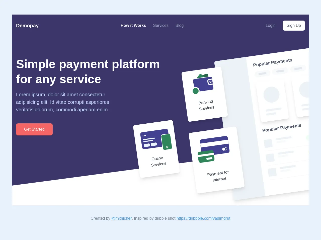
The preview of Landing Page with Tailwind CSS 2 ui component.
To create a landing page with Tailwind CSS 2, we will use a pre-built UI component. This component includes a header, a hero section, a features section, a pricing section, a testimonials section, and a footer.
Free download of the Landing Page with Tailwind CSS 2's source code
The source code of Landing Page with Tailwind CSS 2 ui component.
To create a landing page with Tailwind CSS 2, we will use HTML and Tailwind CSS classes. Here is the source code for the landing page:
<!-- This is an example component -->
<div>
<div class="bg-indigo-900 px-4 py-4">
<div
class="md:max-w-6xl md:mx-auto md:flex md:items-center md:justify-between"
>
<div class="flex justify-between items-center">
<a href="#" class="inline-block py-2 text-white text-xl font-bold"
>Demopay</a
>
<div
class="inline-block cursor-pointer md:hidden">
<div class="bg-gray-400 w-8 mb-2" style="height: 2px;"></div>
<div class="bg-gray-400 w-8 mb-2" style="height: 2px;"></div>
<div class="bg-gray-400 w-8" style="height: 2px;"></div>
</div>
</div>
<div>
<div class="hidden md:block">
<a
href="#"
class="inline-block py-1 md:py-4 text-gray-100 mr-6 font-bold"
>How it Works</a
>
<a
href="#"
class="inline-block py-1 md:py-4 text-gray-500 hover:text-gray-100 mr-6"
>Services</a
>
<a
href="#"
class="inline-block py-1 md:py-4 text-gray-500 hover:text-gray-100"
>Blog</a
>
</div>
</div>
<div class="hidden md:block">
<a
href="#"
class="inline-block py-1 md:py-4 text-gray-500 hover:text-gray-100 mr-6"
>Login</a
>
<a
href="#"
class="inline-block py-2 px-4 text-gray-700 bg-white hover:bg-gray-100 rounded-lg"
>Sign Up</a
>
</div>
</div>
</div>
<div class="bg-indigo-900 md:overflow-hidden">
<div class="px-4 py-20 md:py-4">
<div class="md:max-w-6xl md:mx-auto">
<div class="md:flex md:flex-wrap">
<div class="md:w-1/2 text-center md:text-left md:pt-16">
<h1
class="font-bold text-white text-2xl md:text-5xl leading-tight mb-4"
>
Simple payment platform for any service
</h1>
<p class="text-indigo-200 md:text-xl md:pr-48">
Lorem ipsum, dolor sit amet consectetur adipisicing elit. Id
vitae corrupti asperiores veritatis dolorum, commodi aperiam
enim.
</p>
<a
href="#"
class="mt-6 mb-12 md:mb-0 md:mt-10 inline-block py-3 px-8 text-white bg-red-500 hover:bg-red-600 rounded-lg shadow"
>Get Started</a
>
</div>
<div class="md:w-1/2 relative">
<div class="hidden md:block">
<div
class="-ml-24 -mb-40 absolute left-0 bottom-0 w-40 bg-white rounded-lg shadow-lg px-6 py-8"
style="transform: rotate(-8deg);"
>
<div
class="bg-indigo-800 mx-auto rounded-lg px-2 pb-2 relative mb-8"
>
<div class="mb-1">
<span
class="w-1 h-1 bg-indigo-100 rounded-full inline-block"
style="margin-right: 1px;"
></span
><span
class="w-1 h-1 bg-indigo-100 rounded-full inline-block"
style="margin-right: 1px;"
></span
><span
class="w-1 h-1 bg-indigo-100 rounded-full inline-block"
></span>
</div>
<div class="h-1 w-12 bg-indigo-100 rounded mb-1"></div>
<div class="h-1 w-10 bg-indigo-100 rounded mb-2"></div>
<div class="flex">
<div class="w-6 h-3 rounded bg-indigo-100 mr-1"></div>
<div class="w-6 h-3 rounded bg-indigo-100"></div>
</div>
<div
class="-mr-2 -mb-4 absolute bottom-0 right-0 h-16 w-10 rounded-lg bg-green-700 border-2 border-white"
></div>
<div
class="w-2 h-2 rounded-full bg-green-800 mx-auto absolute bottom-0 right-0 mr-2 -mb-2 z-10 border-2 border-white"
></div>
</div>
<div class="text-gray-800 text-center">
Online <br />Services
</div>
</div>
<div
class="ml-24 mb-16 absolute left-0 bottom-0 w-40 bg-white rounded-lg shadow-lg px-6 py-8"
style="transform: rotate(-8deg); z-index: 2;"
>
<div
class="bg-indigo-800 mx-auto rounded-lg relative mb-8 py-2 w-20 border-2 border-white"
>
<div
class="h-8 bg-green-700 w-8 rounded absolute left-0 top-0 -mt-3 ml-4"
style="transform: rotate(-45deg); z-index: -1;"
></div>
<div
class="h-8 bg-green-800 w-8 rounded absolute left-0 top-0 -mt-3 ml-8"
style="transform: rotate(-12deg); z-index: -2;"
></div>
<div
class="flex items-center justify-center h-6 bg-indigo-800 w-6 rounded-l-lg ml-auto border-4 border-white -mr-1"
>
<div
class="h-2 w-2 rounded-full bg-indigo-800 border-2 border-white"
></div>
</div>
<div
class="w-8 h-8 bg-green-700 border-4 border-white rounded-full -ml-3 -mb-5"
></div>
</div>
<div class="text-gray-800 text-center">
Banking Services
</div>
</div>
<div
class="ml-32 absolute left-0 bottom-0 w-48 bg-white rounded-lg shadow-lg px-10 py-8"
style="transform: rotate(-8deg); z-index: 2; margin-bottom: -220px;"
>
<div
class="bg-indigo-800 mx-auto rounded-lg pt-4 mb-16 relative"
>
<div class="h-4 bg-white"></div>
<div class="text-right my-2 pb-1">
<div
class="inline-flex w-3 h-3 rounded-full bg-white -mr-2"
></div>
<div
class="inline-flex w-3 h-3 rounded-full bg-indigo-800 border-2 border-white mr-2"
></div>
</div>
<div
class="-ml-4 -mb-6 absolute left-0 bottom-0 w-16 bg-green-700 mx-auto rounded-lg pb-2 pt-3"
>
<div class="h-2 bg-white mb-2"></div>
<div class="h-2 bg-white w-6 ml-auto rounded mr-2"></div>
</div>
</div>
<div class="text-gray-800 text-center">
Payment for <br />Internet
</div>
</div>
<div
class="mt-10 w-full absolute right-0 top-0 flex rounded-lg bg-white overflow-hidden shadow-lg"
style="transform: rotate(-8deg); margin-right: -250px; z-index: 1;"
>
<div class="w-32 bg-gray-200" style="height: 560px;"></div>
<div class="flex-1 p-6">
<h2 class="text-lg text-gray-700 font-bold mb-3">
Popular Payments
</h2>
<div class="flex mb-5">
<div class="w-16 rounded-full bg-gray-100 py-2 px-4 mr-2">
<div class="p-1 rounded-full bg-gray-300"></div>
</div>
<div class="w-16 rounded-full bg-gray-100 py-2 px-4 mr-2">
<div class="p-1 rounded-full bg-gray-300"></div>
</div>
<div class="w-16 rounded-full bg-gray-100 py-2 px-4 mr-2">
<div class="p-1 rounded-full bg-gray-300"></div>
</div>
<div class="w-16 rounded-full bg-gray-100 py-2 px-4">
<div class="p-1 rounded-full bg-gray-300"></div>
</div>
</div>
<div class="flex flex-wrap -mx-4 mb-5">
<div class="w-1/3 px-4">
<div class="h-40 rounded-lg bg-white shadow-lg p-6">
<div
class="w-16 h-16 rounded-full bg-gray-200 mb-6"
></div>
<div
class="h-2 w-16 bg-gray-200 mb-2 rounded-full"
></div>
<div class="h-2 w-10 bg-gray-200 rounded-full"></div>
</div>
</div>
<div class="w-1/3 px-4">
<div class="h-40 rounded-lg bg-white shadow-lg p-6">
<div
class="w-16 h-16 rounded-full bg-gray-200 mb-6"
></div>
<div
class="h-2 w-16 bg-gray-200 mb-2 rounded-full"
></div>
<div class="h-2 w-10 bg-gray-200 rounded-full"></div>
</div>
</div>
<div class="w-1/3 px-4">
<div class="h-40 rounded-lg bg-white shadow-lg p-6">
<div
class="w-16 h-16 rounded-full bg-gray-200 mb-6"
></div>
<div
class="h-2 w-16 bg-gray-200 mb-2 rounded-full"
></div>
<div class="h-2 w-10 bg-gray-200 rounded-full"></div>
</div>
</div>
</div>
<h2 class="text-lg text-gray-700 font-bold mb-3">
Popular Payments
</h2>
<div
class="w-full flex flex-wrap justify-between items-center border-b-2 border-gray-100 py-3"
>
<div class="w-1/3">
<div class="flex">
<div class="h-8 w-8 rounded bg-gray-200 mr-4"></div>
<div>
<div
class="h-2 w-16 bg-gray-200 mb-1 rounded-full"
></div>
<div
class="h-2 w-10 bg-gray-100 rounded-full"
></div>
</div>
</div>
</div>
<div class="w-1/3">
<div
class="w-16 rounded-full bg-green-100 py-2 px-4 mx-auto"
>
<div class="p-1 rounded-full bg-green-200"></div>
</div>
</div>
<div class="w-1/3">
<div
class="h-2 w-10 bg-gray-100 rounded-full mx-auto"
></div>
</div>
</div>
<div
class="flex flex-wrap justify-between items-center border-b-2 border-gray-100 py-3"
>
<div class="w-1/3">
<div class="flex">
<div class="h-8 w-8 rounded bg-gray-200 mr-4"></div>
<div>
<div
class="h-2 w-16 bg-gray-200 mb-1 rounded-full"
></div>
<div
class="h-2 w-10 bg-gray-100 rounded-full"
></div>
</div>
</div>
</div>
<div class="w-1/3">
<div
class="w-16 rounded-full bg-orange-100 py-2 px-4 mx-auto"
>
<div class="p-1 rounded-full bg-orange-200"></div>
</div>
</div>
<div class="w-1/3">
<div
class="h-2 w-16 bg-gray-100 rounded-full mx-auto"
></div>
</div>
</div>
<div
class="flex flex-wrap justify-between items-center border-b-2 border-gray-100 py-3"
>
<div class="w-1/3">
<div class="flex">
<div class="h-8 w-8 rounded bg-gray-200 mr-4"></div>
<div>
<div
class="h-2 w-16 bg-gray-200 mb-1 rounded-full"
></div>
<div
class="h-2 w-10 bg-gray-100 rounded-full"
></div>
</div>
</div>
</div>
<div class="w-1/3">
<div
class="w-16 rounded-full bg-blue-100 py-2 px-4 mx-auto"
>
<div class="p-1 rounded-full bg-blue-200"></div>
</div>
</div>
<div class="w-1/3">
<div
class="h-2 w-8 bg-gray-100 rounded-full mx-auto"
></div>
</div>
</div>
</div>
</div>
<div
class="w-full absolute left-0 bottom-0 ml-1"
style="transform: rotate(-8deg); z-index: 1; margin-bottom: -360px;"
>
<div class="grid--gray h-48 w-48"></div>
</div>
</div>
<div
class="md:hidden w-full absolute right-0 top-0 flex rounded-lg bg-white overflow-hidden shadow"
>
<div
class="h-4 bg-gray-200 absolute top-0 left-0 right-0 rounded-t-lg flex items-center"
>
<span
class="h-2 w-2 rounded-full bg-red-500 inline-block mr-1 ml-2"
></span>
<span
class="h-2 w-2 rounded-full bg-orange-400 inline-block mr-1"
></span>
<span
class="h-2 w-2 rounded-full bg-green-500 inline-block mr-1"
></span>
</div>
<div class="w-32 bg-gray-100 px-2 py-8" style="height: 340px;">
<div class="h-2 w-16 bg-gray-300 rounded-full mb-4"></div>
<div class="flex items-center mb-4">
<div
class="h-5 w-5 rounded-full bg-gray-300 mr-3 flex-shrink-0"
></div>
<div>
<div class="h-2 w-10 bg-gray-300 rounded-full"></div>
</div>
</div>
<div class="h-2 w-16 bg-gray-200 rounded-full mb-2"></div>
<div class="h-2 w-10 bg-gray-200 rounded-full mb-2"></div>
<div class="h-2 w-20 bg-gray-200 rounded-full mb-2"></div>
<div class="h-2 w-6 bg-gray-200 rounded-full mb-2"></div>
<div class="h-2 w-16 bg-gray-200 rounded-full mb-2"></div>
<div class="h-2 w-10 bg-gray-200 rounded-full mb-2"></div>
<div class="h-2 w-20 bg-gray-200 rounded-full mb-2"></div>
<div class="h-2 w-6 bg-gray-200 rounded-full mb-2"></div>
</div>
<div class="flex-1 px-4 py-8">
<h2 class="text-xs text-gray-700 font-bold mb-1">
Popular Payments
</h2>
<div class="flex mb-5">
<div class="p-2 w-12 rounded-full bg-gray-100 mr-2"></div>
<div class="p-2 w-12 rounded-full bg-gray-100 mr-2"></div>
<div class="p-2 w-12 rounded-full bg-gray-100 mr-2"></div>
<div class="p-2 w-12 rounded-full bg-gray-100 mr-2"></div>
</div>
<div class="flex flex-wrap -mx-2 mb-5">
<div class="w-1/3 px-2">
<div class="p-3 rounded-lg bg-white shadow">
<div
class="w-6 h-6 rounded-full bg-gray-200 mb-2"
></div>
<div
class="h-2 w-10 bg-gray-200 mb-1 rounded-full"
></div>
<div class="h-2 w-6 bg-gray-200 rounded-full"></div>
</div>
</div>
<div class="w-1/3 px-2">
<div class="p-3 rounded-lg bg-white shadow">
<div
class="w-6 h-6 rounded-full bg-gray-200 mb-2"
></div>
<div
class="h-2 w-10 bg-gray-200 mb-1 rounded-full"
></div>
<div class="h-2 w-6 bg-gray-200 rounded-full"></div>
</div>
</div>
<div class="w-1/3 px-2">
<div class="p-3 rounded-lg bg-white shadow">
<div
class="w-6 h-6 rounded-full bg-gray-200 mb-2"
></div>
<div
class="h-2 w-10 bg-gray-200 mb-1 rounded-full"
></div>
<div class="h-2 w-6 bg-gray-200 rounded-full"></div>
</div>
</div>
</div>
<h2 class="text-xs text-gray-700 font-bold mb-1">
Popular Payments
</h2>
<div
class="w-full flex flex-wrap justify-between items-center border-b-2 border-gray-100 py-3"
>
<div class="w-1/3">
<div class="flex">
<div
class="h-5 w-5 rounded-full bg-gray-200 mr-3 flex-shrink-0"
></div>
<div>
<div
class="h-2 w-16 bg-gray-200 mb-1 rounded-full"
></div>
<div class="h-2 w-10 bg-gray-100 rounded-full"></div>
</div>
</div>
</div>
<div class="w-1/3">
<div
class="w-16 rounded-full bg-green-100 py-2 px-4 mx-auto"
>
<div class="p-1 rounded-full bg-green-200"></div>
</div>
</div>
<div class="w-1/3">
<div
class="h-2 w-10 bg-gray-100 rounded-full mx-auto"
></div>
</div>
</div>
<div class="flex flex-wrap justify-between items-center py-3">
<div class="w-1/3">
<div class="flex">
<div
class="h-5 w-5 rounded-full bg-gray-200 mr-3 flex-shrink-0"
></div>
<div>
<div
class="h-2 w-16 bg-gray-200 mb-1 rounded-full"
></div>
<div class="h-2 w-10 bg-gray-100 rounded-full"></div>
</div>
</div>
</div>
<div class="w-1/3">
<div
class="w-16 rounded-full bg-orange-100 py-2 px-4 mx-auto"
>
<div class="p-1 rounded-full bg-orange-200"></div>
</div>
</div>
<div class="w-1/3">
<div
class="h-2 w-16 bg-gray-100 rounded-full mx-auto"
></div>
</div>
</div>
</div>
</div>
<div
class="mr-3 md:hidden absolute right-0 bottom-0 w-40 bg-white rounded-lg shadow-lg px-10 py-6"
style="z-index: 2; margin-bottom: -380px;"
>
<div
class="bg-indigo-800 mx-auto rounded-lg w-20 pt-3 mb-12 relative"
>
<div class="h-3 bg-white"></div>
<div class="text-right my-2">
<div
class="inline-flex w-3 h-3 rounded-full bg-white -mr-2"
></div>
<div
class="inline-flex w-3 h-3 rounded-full bg-indigo-800 border-2 border-white mr-2"
></div>
</div>
<div
class="-ml-4 -mb-6 absolute left-0 bottom-0 w-16 bg-green-700 mx-auto rounded-lg pb-2 pt-3"
>
<div class="h-2 bg-white mb-2"></div>
<div class="h-2 bg-white w-6 ml-auto rounded mr-2"></div>
</div>
</div>
<div class="text-gray-800 text-center text-sm">
Payment for <br />Internet
</div>
</div>
</div>
</div>
</div>
</div>
<svg
class="fill-current text-white hidden md:block"
xmlns="http://www.w3.org/2000/svg"
viewBox="0 0 1440 320"
>
<path fill-opacity="1" d="M0,224L1440,32L1440,320L0,320Z"></path>
</svg>
</div>
<p class="text-center p-4 text-gray-600 pt-10">
Created by
<a
class="border-b text-blue-500"
href="https://twitter.com/mithicher"
target="_blank"
>@mithicher</a
>. Inspired by dribble shot
<a
href="https://dribbble.com/shots/8807920-Quickpay-Hero-section/attachments/1015863"
target="_blank"
class="border-b text-blue-500"
>https://dribbble.com/vadimdrut</a
>
</p>
</div>
How to create a Landing Page with Tailwind CSS 2 with Tailwind CSS?
To create a landing page with Tailwind CSS 2, follow these steps:
Step 1: Set up your project
First, create a new HTML file and add the following code:
<!DOCTYPE html>
<html lang="en">
<head>
  <meta charset="UTF-8">
  <meta name="viewport" content="width=device-width, initial-scale=1.0">
  <title>Landing Page with Tailwind CSS 2</title>
  <link rel="stylesheet" href="https://cdn.jsdelivr.net/npm/[email protected]/dist/tailwind.min.css">
</head>
<body>
  <!-- Your HTML code goes here -->
</body>
</html>
This code sets up a basic HTML file and includes the Tailwind CSS 2 stylesheet.
Step 2: Add the header section
Next, add the header section to your HTML file:
<header class="bg-white shadow">
  <div class="container mx-auto py-4">
    <div class="flex justify-between items-center">
      <a href="#" class="text-xl font-bold text-gray-800">Landing Page</a>
      <nav>
        <a href="#" class="text-gray-600 hover:text-gray-800 px-3 py-2">Home</a>
        <a href="#" class="text-gray-600 hover:text-gray-800 px-3 py-2">Features</a>
        <a href="#" class="text-gray-600 hover:text-gray-800 px-3 py-2">Pricing</a>
        <a href="#" class="text-gray-600 hover:text-gray-800 px-3 py-2">Testimonials</a>
        <a href="#" class="text-gray-600 hover:text-gray-800 px-3 py-2">Contact</a>
      </nav>
    </div>
  </div>
</header>
This code adds a header section with a logo and a navigation menu.
Step 3: Add the hero section
Next, add the hero section to your HTML file:
<section class="bg-gray-100 py-20">
  <div class="container mx-auto px-4">
    <div class="flex flex-wrap -mx-4">
      <div class="md:w-1/2 px-4">
        <h2 class="text-4xl font-bold mb-4">Welcome to our landing page</h2>
        <p class="text-gray-600 leading-loose mb-6">Lorem ipsum dolor sit amet, consectetur adipiscing elit. Sed euismod, augue vel tincidunt luctus, mauris ipsum vehicula arcu, eu vulputate lectus mi eu elit. Ut euismod, turpis at semper vehicula, eros tortor vestibulum elit, vel lobortis tellus turpis vel elit.</p>
        <a href="#" class="bg-blue-500 hover:bg-blue-600 text-white font-bold py-2 px-4 rounded">Get Started</a>
      </div>
      <div class="md:w-1/2 px-4">
        <img src="https://via.placeholder.com/500x300" alt="Hero image" class="w-full h-auto">
      </div>
    </div>
  </div>
</section>
This code adds a hero section with a headline, a description, and a call-to-action button.
Step 4: Add the features section
Next, add the features section to your HTML file:
<section class="py-20">
  <div class="container mx-auto px-4">
    <h2 class="text-4xl font-bold mb-4">Features</h2>
    <div class="flex flex-wrap -mx-4">
      <div class="md:w-1/3 px-4 mb-8">
        <div class="bg-white rounded shadow p-6">
          <h3 class="text-lg font-bold mb-2">Feature 1</h3>
          <p class="text-gray-600 leading-loose mb-4">Lorem ipsum dolor sit amet, consectetur adipiscing elit. Sed euismod, augue vel tincidunt luctus, mauris ipsum vehicula arcu, eu vulputate lectus mi eu elit.</p>
          <a href="#" class="text-blue-500 hover:text-blue-600 font-bold">Learn More</a>
        </div>
      </div>
      <div class="md:w-1/3 px-4 mb-8">
        <div class="bg-white rounded shadow p-6">
          <h3 class="text-lg font-bold mb-2">Feature 2</h3>
          <p class="text-gray-600 leading-loose mb-4">Lorem ipsum dolor sit amet, consectetur adipiscing elit. Sed euismod, augue vel tincidunt luctus, mauris ipsum vehicula arcu, eu vulputate lectus mi eu elit.</p>
          <a href="#" class="text-blue-500 hover:text-blue-600 font-bold">Learn More</a>
        </div>
      </div>
      <div class="md:w-1/3 px-4 mb-8">
        <div class="bg-white rounded shadow p-6">
          <h3 class="text-lg font-bold mb-2">Feature 3</h3>
          <p class="text-gray-600 leading-loose mb-4">Lorem ipsum dolor sit amet, consectetur adipiscing elit. Sed euismod, augue vel tincidunt luctus, mauris ipsum vehicula arcu, eu vulputate lectus mi eu elit.</p>
          <a href="#" class="text-blue-500 hover:text-blue-600 font-bold">Learn More</a>
        </div>
      </div>
    </div>
  </div>
</section>
This code adds a features section with three feature boxes.
Step 5: Add the pricing section
Next, add the pricing section to your HTML file:
<section class="bg-gray-100 py-20">
  <div class="container mx-auto px-4">
    <h2 class="text-4xl font-bold mb-4">Pricing</h2>
    <div class="flex flex-wrap -mx-4">
      <div class="md:w-1/3 px-4 mb-8">
        <div class="bg-white rounded shadow p-6">
          <h3 class="text-lg font-bold mb-2">Basic</h3>
          <p class="text-gray-600 leading-loose mb-4">$10/month</p>
          <ul class="text-gray-600 leading-loose mb-4">
            <li>Feature 1</li>
            <li>Feature 2</li>
            <li>Feature 3</li>
          </ul>
          <a href="#" class="bg-blue-500 hover:bg-blue-600 text-white font-bold py-2 px-4 rounded">Get Started</a>
        </div>
      </div>
      <div class="md:w-1/3 px-4 mb-8">
        <div class="bg-white rounded shadow p-6">
          <h3 class="text-lg font-bold mb-2">Pro</h3>
          <p class="text-gray-600 leading-loose mb-4">$20/month</p>
          <ul class="text-gray-600 leading-loose mb-4">
            <li>Feature 1</li>
            <li>Feature 2</li>
            <li>Feature 3</li>
            <li>Feature 4</li>
          </ul>
          <a href="#" class="bg-blue-500 hover:bg-blue-600 text-white font-bold py-2 px-4 rounded">Get Started</a>
        </div>
      </div>
      <div class="md:w-1/3 px-4 mb-8">
        <div class="bg-white rounded shadow p-6">
          <h3 class="text-lg font-bold mb-2">Enterprise</h3>
          <p class="text-gray-600 leading-loose mb-4">$50/month</p>
          <ul class="text-gray-600 leading-loose mb-4">
            <li>Feature 1</li>
            <li>Feature 2</li>
            <li>Feature 3</li>
            <li>Feature 4</li>
            <li>Feature 5</li>
          </ul>
          <a href="#" class="bg-blue-500 hover:bg-blue-600 text-white font-bold py-2 px-4 rounded">Get Started</a>
        </div>
      </div>
    </div>
  </div>
</section>
This code adds a pricing section with three pricing boxes.
Step 6: Add the testimonials section
Next, add the testimonials section to your HTML file:
<section class="py-20">
  <div class="container mx-auto px-4">
    <h2 class="text-4xl font-bold mb-4">Testimonials</h2>
    <div class="flex flex-wrap -mx-4">
      <div class="md:w-1/3 px-4 mb-8">
        <div class="bg-white rounded shadow p-6">
          <p class="text-gray-600 leading-loose mb-4">"Lorem ipsum dolor sit amet, consectetur adipiscing elit. Sed euismod, augue vel tincidunt luctus, mauris ipsum vehicula arcu, eu vulputate lectus mi eu elit."</p>
          <p class="text-gray-800 font-bold">John Doe</p>
          <p class="text-gray-600">CEO, Company</p>
        </div>
      </div>
      <div class="md:w-1/3 px-4 mb-8">
        <div class="bg-white rounded shadow p-6">
          <p class="text-gray-600 leading-loose mb-4">"Lorem ipsum dolor sit amet, consectetur adipiscing elit. Sed euismod, augue vel tincidunt luctus, mauris ipsum vehicula arcu, eu vulputate lectus mi eu elit."</p>
          <p class="text-gray-800 font-bold">Jane Doe</p>
          <p class="text-gray-600">CTO, Company</p>
        </div>
      </div>
      <div class="md:w-1/3 px-4 mb-8">
        <div class="bg-white rounded shadow p-6">
          <p class="text-gray-600 leading-loose mb-4">"Lorem ipsum dolor sit amet, consectetur adipiscing elit. Sed euismod, augue vel tincidunt luctus, mauris ipsum vehicula arcu, eu vulputate lectus mi eu elit."</p>
          <p class="text-gray-800 font-bold">Bob Smith</p>
          <p class="text-gray-600">COO, Company</p>
        </div>
      </div>
    </div>
  </div>
</section>
This code adds a testimonials section with three testimonials.
Step 7: Add the footer section
Finally, add the footer section to your HTML file:
<footer class="bg-gray-800 text-white py-10">
  <div class="container mx-auto px-4">
    <div class="flex flex-wrap -mx-4">
      <div class="md:w-1/3 px-4 mb-8">
        <h3 class="text-lg font-bold mb-2">Landing Page</h3>
        <p class="text-gray-600 leading-loose mb-4">Lorem ipsum dolor sit amet, consectetur adipiscing elit. Sed euismod, augue vel tincidunt luctus, mauris ipsum vehicula arcu, eu vulputate lectus mi eu elit.</p>
      </div>
      <div class="md:w-1/3 px-4 mb-8">
        <h3 class="text-lg font-bold mb-2">Links</h3>
        <nav>
          <a href="#" class="text-gray-600 hover:text-gray-400 block mb-2">Home</a>
          <a href="#" class="text-gray-600 hover:text-gray-400 block mb-2">Features</a>
          <a href="#" class="text-gray-600 hover:text-gray-400 block mb-2">Pricing</a>
          <a href="#" class="text-gray-600 hover:text-gray-400 block mb-2">Testimonials</a>
          <a href="#" class="text-gray-600 hover:text-gray-400 block mb-2">Contact</a>
        </nav>
      </div>
      <div class="md:w-1/3 px-4 mb-8">
        <h3 class="text-lg font-bold mb-2">Contact Us</h3>
        <p class="text-gray-600 leading-loose mb-4">123 Main St.</p>
        <p class="text-gray-600 leading-loose mb-4">(555) 555-5555</p>
        <p class="text-gray-600 leading-loose mb-4">[email protected]</p>
      </div>
    </div>
  </div>
</footer>
This code adds a footer section with some contact information.
Conclusion
In this article, we have shown you how to build a landing page with Tailwind CSS 2. Tailwind CSS is a powerful CSS framework that allows you to create custom user interfaces quickly and easily. By following the steps outlined in this article, you can create a professional-looking landing page in no time.