- Published on
Most Effective Ways To Make A Landing Page Cards With Tailwind CSS
- What is Tailwind CSS?
- The description of Landing Page Cards UI component
- Why use Tailwind CSS to create a Landing Page Cards UI component?
- The preview of Landing Page Cards UI component
- The source code of Landing Page Cards UI component
- How to create a Landing Page Cards with Tailwind CSS?
- Conclusion
As a FrontEnd technology blogger, I am always on the lookout for new and effective ways to create stunning UI components. In this article, I will be discussing the most effective ways to create a Landing Page Cards UI component using Tailwind CSS.
What is Tailwind CSS?
Tailwind CSS is a utility-first CSS framework that allows you to quickly build custom UI components. It provides a set of pre-defined classes that you can use to style your HTML elements. With Tailwind CSS, you can easily create complex layouts and responsive designs without writing a single line of CSS.
The description of Landing Page Cards UI component
A Landing Page Card is a UI component that is commonly used on landing pages to showcase products or services. It typically consists of an image, a title, a description, and a call-to-action button. Landing Page Cards are an effective way to grab the attention of your users and encourage them to take action.
Why use Tailwind CSS to create a Landing Page Cards UI component?
Tailwind CSS provides a set of pre-defined classes that you can use to quickly style your HTML elements. This means that you don't have to write custom CSS for every UI component that you create. With Tailwind CSS, you can easily create a Landing Page Cards UI component by using the pre-defined classes for colors, fonts, and spacing.
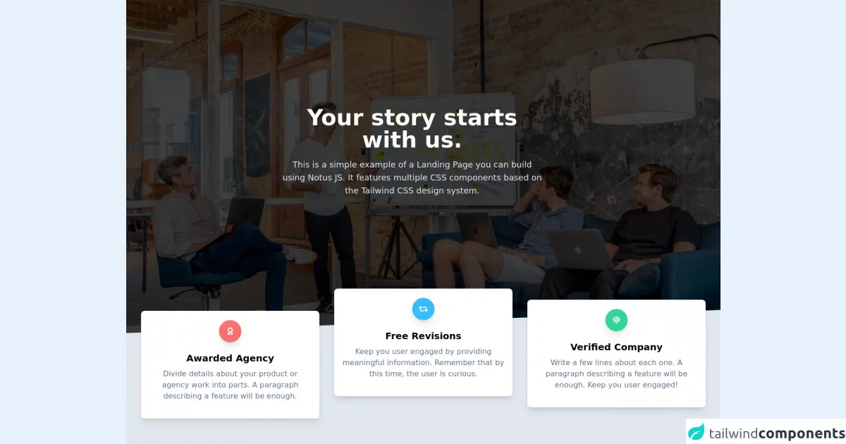
The preview of Landing Page Cards UI component
To create a Landing Page Cards UI component, we will be using Tailwind CSS classes for colors, fonts, and spacing. The final result will be a set of cards that showcase different products or services.
Free download of the Landing Page Cards's source code
The source code of Landing Page Cards UI component
To create a Landing Page Cards UI component, we will be using HTML and Tailwind CSS classes. The HTML structure will consist of a container div that holds a set of card divs. The card divs will contain an image, a title, a description, and a button.
<link rel="stylesheet" href="https://demos.creative-tim.com/notus-js/assets/styles/tailwind.css">
<link rel="stylesheet" href="https://demos.creative-tim.com/notus-js/assets/vendor/@fortawesome/fontawesome-free/css/all.min.css">
<section class="relative bg-blueGray-50">
<div class="relative pt-16 pb-32 flex content-center items-center justify-center min-h-screen-75">
<div class="absolute top-0 w-full h-full bg-center bg-cover" style="
background-image: url('https://images.unsplash.com/photo-1557804506-669a67965ba0?ixlib=rb-1.2.1&ixid=eyJhcHBfaWQiOjEyMDd9&auto=format&fit=crop&w=1267&q=80');
">
<span id="blackOverlay" class="w-full h-full absolute opacity-75 bg-black"></span>
</div>
<div class="container relative mx-auto">
<div class="items-center flex flex-wrap">
<div class="w-full lg:w-6/12 px-4 ml-auto mr-auto text-center">
<div class="pr-12">
<h1 class="text-white font-semibold text-5xl">
Your story starts with us.
</h1>
<p class="mt-4 text-lg text-blueGray-200">
This is a simple example of a Landing Page you can build using
Notus JS. It features multiple CSS components based on the
Tailwind CSS design system.
</p>
</div>
</div>
</div>
</div>
<div class="top-auto bottom-0 left-0 right-0 w-full absolute pointer-events-none overflow-hidden h-70-px" style="transform: translateZ(0px)">
<svg class="absolute bottom-0 overflow-hidden" xmlns="http://www.w3.org/2000/svg" preserveAspectRatio="none" version="1.1" viewBox="0 0 2560 100" x="0" y="0">
<polygon class="text-blueGray-200 fill-current" points="2560 0 2560 100 0 100"></polygon>
</svg>
</div>
</div>
<section class="pb-10 bg-blueGray-200 -mt-24">
<div class="container mx-auto px-4">
<div class="flex flex-wrap">
<div class="lg:pt-12 pt-6 w-full md:w-4/12 px-4 text-center">
<div class="relative flex flex-col min-w-0 break-words bg-white w-full mb-8 shadow-lg rounded-lg">
<div class="px-4 py-5 flex-auto">
<div class="text-white p-3 text-center inline-flex items-center justify-center w-12 h-12 mb-5 shadow-lg rounded-full bg-red-400">
<i class="fas fa-award"></i>
</div>
<h6 class="text-xl font-semibold">Awarded Agency</h6>
<p class="mt-2 mb-4 text-blueGray-500">
Divide details about your product or agency work into parts.
A paragraph describing a feature will be enough.
</p>
</div>
</div>
</div>
<div class="w-full md:w-4/12 px-4 text-center">
<div class="relative flex flex-col min-w-0 break-words bg-white w-full mb-8 shadow-lg rounded-lg">
<div class="px-4 py-5 flex-auto">
<div class="text-white p-3 text-center inline-flex items-center justify-center w-12 h-12 mb-5 shadow-lg rounded-full bg-lightBlue-400">
<i class="fas fa-retweet"></i>
</div>
<h6 class="text-xl font-semibold">Free Revisions</h6>
<p class="mt-2 mb-4 text-blueGray-500">
Keep you user engaged by providing meaningful information.
Remember that by this time, the user is curious.
</p>
</div>
</div>
</div>
<div class="pt-6 w-full md:w-4/12 px-4 text-center">
<div class="relative flex flex-col min-w-0 break-words bg-white w-full mb-8 shadow-lg rounded-lg">
<div class="px-4 py-5 flex-auto">
<div class="text-white p-3 text-center inline-flex items-center justify-center w-12 h-12 mb-5 shadow-lg rounded-full bg-emerald-400">
<i class="fas fa-fingerprint"></i>
</div>
<h6 class="text-xl font-semibold">Verified Company</h6>
<p class="mt-2 mb-4 text-blueGray-500">
Write a few lines about each one. A paragraph describing a
feature will be enough. Keep you user engaged!
</p>
</div>
</div>
</div>
</div>
<footer class="relative pt-8 pb-6 mt-1">
<div class="container mx-auto px-4">
<div class="flex flex-wrap items-center md:justify-between justify-center">
<div class="w-full md:w-6/12 px-4 mx-auto text-center">
<div class="text-sm text-blueGray-500 font-semibold py-1">
Made with <a href="https://www.creative-tim.com/product/notus-js" class="text-blueGray-500 hover:text-gray-800" target="_blank">Notus JS</a> by <a href="https://www.creative-tim.com" class="text-blueGray-500 hover:text-blueGray-800" target="_blank"> Creative Tim</a>.
</div>
</div>
</div>
</div>
</footer>
</section>
</section>
How to create a Landing Page Cards with Tailwind CSS?
To create a Landing Page Cards UI component with Tailwind CSS, follow these steps:
- Create a container div that will hold the set of card divs.
<div class="container mx-auto">
  <!-- Card divs will go here -->
</div>
- Create a card div for each product or service that you want to showcase.
<div class="max-w-sm rounded overflow-hidden shadow-lg">
  <img class="w-full" src="product-image.jpg" alt="Product Image">
  <div class="px-6 py-4">
    <div class="font-bold text-xl mb-2">Product Title</div>
    <p class="text-gray-700 text-base">Product Description</p>
  </div>
  <div class="px-6 pt-4 pb-2">
    <button class="bg-blue-500 hover:bg-blue-700 text-white font-bold py-2 px-4 rounded">
      Buy Now
    </button>
  </div>
</div>
- Use Tailwind CSS classes to style the card divs.
.rounded {
  border-radius: 0.25rem;
}

.overflow-hidden {
  overflow: hidden;
}

.shadow-lg {
  box-shadow: 0 10px 15px -3px rgba(0, 0, 0, 0.1), 0 4px 6px -2px rgba(0, 0, 0, 0.05);
}

.max-w-sm {
  max-width: 20rem;
}

.w-full {
  width: 100%;
}

.px-6 {
  padding-left: 1.5rem;
  padding-right: 1.5rem;
}

.py-4 {
  padding-top: 1rem;
  padding-bottom: 1rem;
}

.font-bold {
  font-weight: 700;
}

.text-xl {
  font-size: 1.25rem;
  line-height: 1.75rem;
}

.mb-2 {
  margin-bottom: 0.5rem;
}

.text-gray-700 {
  color: #4a5568;
}

.text-base {
  font-size: 1rem;
  line-height: 1.5rem;
}

.px-6 {
  padding-left: 1.5rem;
  padding-right: 1.5rem;
}

.pt-4 {
  padding-top: 1rem;
}

.pb-2 {
  padding-bottom: 0.5rem;
}

.bg-blue-500 {
  background-color: #4299e1;
}

.hover\:bg-blue-700:hover {
  background-color: #2b6cb0;
}

.text-white {
  color: #fff;
}

.font-bold {
  font-weight: 700;
}

.py-2 {
  padding-top: 0.5rem;
  padding-bottom: 0.5rem;
}

.px-4 {
  padding-left: 1rem;
  padding-right: 1rem;
}

.rounded {
  border-radius: 0.25rem;
}
- Add your product images, titles, descriptions, and call-to-action buttons to each card div.
Conclusion
Creating a Landing Page Cards UI component with Tailwind CSS is a quick and easy way to showcase your products or services on a landing page. By using pre-defined classes for colors, fonts, and spacing, you can create a set of cards that are visually appealing and effective at grabbing the attention of your users. With Tailwind CSS, you can focus on creating great content and let the framework handle the styling.