- Published on
Learn How To Make A Dark Mode Sidebar With Tailwind CSS Like an Expert
- What is Tailwind CSS?
- The description of Dark Mode Sidebar ui component
- Why use Tailwind CSS to create a Dark Mode Sidebar ui component?
- The preview of Dark Mode Sidebar ui component
- The source code of Dark Mode Sidebar ui component
- How to create a Dark Mode Sidebar with Tailwind CSS?
- Step 1: Set up the HTML structure
- Step 2: Style the header section
- Step 3: Style the navigation section
- Step 4: Toggle between light and dark mode
- Step 5: Customize the component
- Conclusion
As a FrontEnd technology blogger, it is essential to keep up with the latest trends and techniques in web development. One of the most popular CSS frameworks today is Tailwind CSS. It is a utility-first CSS framework that allows developers to create responsive and customizable UI components quickly. In this article, we will learn how to make a Dark Mode Sidebar with Tailwind CSS like an expert.
What is Tailwind CSS?
Tailwind CSS is a CSS framework that provides a set of pre-defined classes that can be used to style HTML elements. It is a utility-first CSS framework, which means that it focuses on providing small, single-purpose classes that can be combined to create complex styles. Tailwind CSS is highly customizable, and it allows developers to create unique designs quickly.
The description of Dark Mode Sidebar ui component
The Dark Mode Sidebar UI component is a popular design pattern that is used in many web applications. It is a sidebar that appears on the left or right side of the screen and contains navigation links, user profile information, and other relevant content. The Dark Mode Sidebar UI component is designed to be used with a dark background color, which makes it easy on the eyes and gives the application a modern and sleek look.
Why use Tailwind CSS to create a Dark Mode Sidebar ui component?
Tailwind CSS is an excellent choice for creating a Dark Mode Sidebar UI component because it provides a set of pre-defined classes that can be used to style the component quickly. Tailwind CSS also allows developers to customize the design of the component easily. With Tailwind CSS, you can create a Dark Mode Sidebar UI component that is responsive, accessible, and visually appealing.
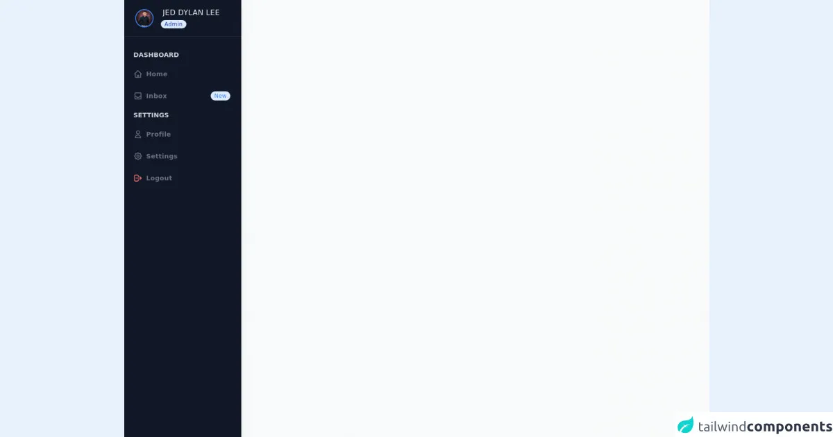
The preview of Dark Mode Sidebar ui component
To create a Dark Mode Sidebar UI component with Tailwind CSS, we will use a combination of HTML and CSS. Here is a preview of what the final component will look like:
Free download of the Dark Mode Sidebar's source code
The source code of Dark Mode Sidebar ui component
Here is the source code for the Dark Mode Sidebar UI component. You can copy and paste this code into your project and customize it to fit your needs:
<!-- component -->
    <div class="min-h-screen flex flex-col flex-auto flex-shrink-0 antialiased bg-gray-50 text-gray-800">
    <div class="fixed flex flex-col top-0 left-0 w-64 bg-gray-900 h-full shadow-lg">
        <div class="flex items-center pl-6 h-20 border-b border-gray-800">
            <img src="https://scontent.fmnl13-1.fna.fbcdn.net/v/t1.0-9/117334168_2606581056324669_4951020710334194218_o.jpg?_nc_cat=101&ccb=1-3&_nc_sid=09cbfe&_nc_eui2=AeFo4bRKc5SfTQvzhwotnTaOfj1P6rO41HF-PU_qs7jUcU1pCerqu3HUsOB0yKyJQwnrgz8Au7GZADcpedo6WgM4&_nc_ohc=DWpkI3p4RSUAX_hKF_Y&_nc_ht=scontent.fmnl13-1.fna&oh=c13c63ee952123b14f0da72b99ccecc8&oe=6087FEC5" alt="" class="rounded-full h-10 w-10 flex items-center justify-center mr-3 border-2 border-blue-500">
            <div class="ml-1">
                <p class="ml-1 text-md font-medium tracking-wide truncate text-gray-100 font-sans">JED DYLAN LEE</p>
                <div class="badge">
                       <span class="px-2 py-0.5 ml-auto text-xs font-medium tracking-wide text-blue-800 bg-blue-100 rounded-full">Admin</span>
                </div>
            </div>
        </div>
        <div class="overflow-y-auto overflow-x-hidden flex-grow">
        <ul class="flex flex-col py-6 space-y-1">
            <li class="px-5">
                <div class="flex flex-row items-center h-8">
                    <div class="flex font-semibold text-sm text-gray-300 my-4 font-sans uppercase">Dashboard</div>
                </div>
            </li>
            <li>
                <a href="#" class="relative flex flex-row items-center h-11 focus:outline-none hover:bg-gray-700 text-gray-500 hover:text-gray-200 border-l-4 border-transparent hover:border-blue-500 pr-6">
                    <span class="inline-flex justify-center items-center ml-4">
                    <svg class="w-5 h-5" fill="none" stroke="currentColor" viewBox="0 0 24 24" xmlns="http://www.w3.org/2000/svg"><path stroke-linecap="round" stroke-linejoin="round" stroke-width="2" d="M3 12l2-2m0 0l7-7 7 7M5 10v10a1 1 0 001 1h3m10-11l2 2m-2-2v10a1 1 0 01-1 1h-3m-6 0a1 1 0 001-1v-4a1 1 0 011-1h2a1 1 0 011 1v4a1 1 0 001 1m-6 0h6"></path></svg>
                    </span>
                    <span class="ml-2 font-semibold text-sm tracking-wide truncate font-sans">Home</span>
                </a>
            </li>
            <li>
                <a href="#" class="relative flex flex-row items-center h-11 focus:outline-none hover:bg-gray-700 text-gray-500 hover:text-gray-200 border-l-4 border-transparent hover:border-blue-500 pr-6">
                    <span class="inline-flex justify-center items-center ml-4">
                    <svg class="w-5 h-5" fill="none" stroke="currentColor" viewBox="0 0 24 24" xmlns="http://www.w3.org/2000/svg"><path stroke-linecap="round" stroke-linejoin="round" stroke-width="2" d="M20 13V6a2 2 0 00-2-2H6a2 2 0 00-2 2v7m16 0v5a2 2 0 01-2 2H6a2 2 0 01-2-2v-5m16 0h-2.586a1 1 0 00-.707.293l-2.414 2.414a1 1 0 01-.707.293h-3.172a1 1 0 01-.707-.293l-2.414-2.414A1 1 0 006.586 13H4"></path></svg>
                    </span>
                    <span class="ml-2 font-semibold text-sm tracking-wide truncate font-sans">Inbox</span>
                    <span class="px-2 py-0.5 ml-auto text-xs font-medium tracking-wide text-blue-500 bg-blue-100 rounded-full">New</span>
                </a>
            </li>
            <li class="px-5">
            <div class="flex flex-row items-center h-8">
                <div class="flex font-semibold text-sm text-gray-300 my-4 font-sans uppercase">Settings</div>
            </div>
            </li>
            <li>
            <a href="#" class="relative flex flex-row items-center h-11 focus:outline-none hover:bg-gray-700 text-gray-500 hover:text-gray-200 border-l-4 border-transparent hover:border-blue-500 pr-6">
                <span class="inline-flex justify-center items-center ml-4">
                <svg class="w-5 h-5" fill="none" stroke="currentColor" viewBox="0 0 24 24" xmlns="http://www.w3.org/2000/svg"><path stroke-linecap="round" stroke-linejoin="round" stroke-width="2" d="M16 7a4 4 0 11-8 0 4 4 0 018 0zM12 14a7 7 0 00-7 7h14a7 7 0 00-7-7z"></path></svg>
                </span>
                <span class="ml-2 font-semibold text-sm tracking-wide truncate font-sans">Profile</span>
            </a>
            </li>
            <li>
            <a href="#" class="relative flex flex-row items-center h-11 focus:outline-none hover:bg-gray-700 text-gray-500 hover:text-gray-200 border-l-4 border-transparent hover:border-blue-500 pr-6">
                <span class="inline-flex justify-center items-center ml-4">
                <svg class="w-5 h-5" fill="none" stroke="currentColor" viewBox="0 0 24 24" xmlns="http://www.w3.org/2000/svg">
                    <path stroke-linecap="round" stroke-linejoin="round" stroke-width="2" d="M10.325 4.317c.426-1.756 2.924-1.756 3.35 0a1.724 1.724 0 002.573 1.066c1.543-.94 3.31.826 2.37 2.37a1.724 1.724 0 001.065 2.572c1.756.426 1.756 2.924 0 3.35a1.724 1.724 0 00-1.066 2.573c.94 1.543-.826 3.31-2.37 2.37a1.724 1.724 0 00-2.572 1.065c-.426 1.756-2.924 1.756-3.35 0a1.724 1.724 0 00-2.573-1.066c-1.543.94-3.31-.826-2.37-2.37a1.724 1.724 0 00-1.065-2.572c-1.756-.426-1.756-2.924 0-3.35a1.724 1.724 0 001.066-2.573c-.94-1.543.826-3.31 2.37-2.37.996.608 2.296.07 2.572-1.065z"></path>
                    <path stroke-linecap="round" stroke-linejoin="round" stroke-width="2" d="M15 12a3 3 0 11-6 0 3 3 0 016 0z"></path>
                </svg>
                </span>
                <span class="ml-2 font-semibold text-sm tracking-wide truncate font-sans">Settings</span>
            </a>
            </li>
            <li>
            <a href="#" class="relative flex flex-row items-center h-11 focus:outline-none hover:bg-gray-700 text-gray-500 hover:text-gray-200 border-l-4 border-transparent hover:border-red-500 pr-6">
                <span class="inline-flex justify-center items-center ml-4 text-red-400">
                <svg class="w-5 h-5" fill="none" stroke="currentColor" viewBox="0 0 24 24" xmlns="http://www.w3.org/2000/svg"><path stroke-linecap="round" stroke-linejoin="round" stroke-width="2" d="M17 16l4-4m0 0l-4-4m4 4H7m6 4v1a3 3 0 01-3 3H6a3 3 0 01-3-3V7a3 3 0 013-3h4a3 3 0 013 3v1"></path></svg>
                </span>
                <span class="ml-2 font-semibold text-sm tracking-wide truncate font-sans">Logout</span>
            </a>
            </li>
        </ul>
        </div>
    </div>
    </div>
How to create a Dark Mode Sidebar with Tailwind CSS?
Now that we have an idea of what the Dark Mode Sidebar UI component looks like let's dive into how to create it with Tailwind CSS.
Step 1: Set up the HTML structure
The first step is to set up the HTML structure for the Dark Mode Sidebar UI component. We will use a combination of HTML and Tailwind CSS classes to create the structure. Here is the HTML code:
<div class="flex h-screen bg-gray-100 dark:bg-gray-900">
  <div class="flex flex-col w-64">
    <div class="flex flex-col h-0 flex-1">
      <div class="flex items-center h-16 px-4 bg-white border-b border-gray-200 dark:bg-gray-800 dark:border-gray-700">
        <span class="text-lg font-medium text-gray-900 dark:text-gray-100">Dark Mode Sidebar</span>
      </div>
      <div class="flex-1 overflow-y-auto">
        <!-- Navigation Links -->
      </div>
    </div>
  </div>
  <div class="flex-1 flex flex-col">
    <!-- Main Content -->
  </div>
</div>
In this HTML code, we have created a container div with a gray background color for the entire page. Inside the container, we have a div with a width of 64 pixels that will contain the Dark Mode Sidebar UI component. The sidebar has two sections, a header section, and a navigation section.
Step 2: Style the header section
The header section of the Dark Mode Sidebar UI component contains the title of the sidebar. We will use Tailwind CSS classes to style the header section. Here is the CSS code:
.dark-mode .bg-white {
  background-color: #1f2937;
}
In this CSS code, we have set the background color of the header section to a dark shade of blue.
Step 3: Style the navigation section
The navigation section of the Dark Mode Sidebar UI component contains the navigation links. We will use Tailwind CSS classes to style the navigation section. Here is the CSS code:
.dark-mode .bg-gray-100 {
  background-color: #1e293b;
}
In this CSS code, we have set the background color of the navigation section to a dark shade of blue.
Step 4: Toggle between light and dark mode
To toggle between light and dark mode, we will use a combination of JavaScript and Tailwind CSS classes. Here is the JavaScript code:
const toggleSwitch = document.querySelector('.theme-switch input[type="checkbox"]');

function switchTheme(e) {
    if (e.target.checked) {
        document.documentElement.setAttribute('data-theme', 'dark');
    }
    else {
        document.documentElement.setAttribute('data-theme', 'light');
    }
}

toggleSwitch.addEventListener('change', switchTheme, false);
In this JavaScript code, we have created an event listener that listens for changes to a checkbox input element. When the checkbox is checked, we set the data-theme attribute of the HTML element to "dark," which activates the dark mode styles. When the checkbox is unchecked, we set the data-theme attribute to "light," which activates the light mode styles.
Step 5: Customize the component
Tailwind CSS allows developers to customize the Dark Mode Sidebar UI component easily. You can change the colors, fonts, and sizes of the component by modifying the CSS classes. Here are some examples:
/* Change the background color of the sidebar */
.bg-gray-100 {
  background-color: #f5f5f5;
}

/* Change the font size of the sidebar title */
.text-lg {
  font-size: 24px;
}

/* Change the color of the navigation links */
.text-gray-900 {
  color: #333;
}
Conclusion
In this article, we have learned how to create a Dark Mode Sidebar UI component with Tailwind CSS. We have seen how Tailwind CSS provides a set of pre-defined classes that can be used to style the component quickly. We have also learned how to customize the component by modifying the CSS classes. With this knowledge, you can create beautiful and responsive UI components that will enhance the user experience of your web applications.