- Published on
Ways To Make A Cards Section With Tailwind CSS In 60 Minutes
- What is Tailwind CSS?
- The description of Cards Section ui component
- Why use Tailwind CSS to create a Cards Section ui component?
- The preview of Cards Section ui component.
- The source code of Cards Section ui component.
- How to create a Cards Section with Tailwind CSS?
- Step 1: Create the HTML structure
- Step 2: Create the card HTML structure
- Step 3: Add the card HTML to the grid
- Conclusion
What is Tailwind CSS?
Tailwind CSS is a utility-first CSS framework that provides a set of pre-defined CSS classes to create custom designs quickly. It is a highly customizable framework that allows developers to create beautiful and responsive user interfaces.
The description of Cards Section ui component
A Cards Section is a user interface component that displays a collection of cards in a grid or list format. Each card typically contains an image, title, and description, and may also include additional elements such as buttons or icons.
Why use Tailwind CSS to create a Cards Section ui component?
Tailwind CSS provides a set of pre-defined CSS classes that can be used to create a Cards Section quickly and easily. These classes can be customized to match the design of your website or application, and the framework also provides responsive design utilities that make it easy to create a Cards Section that looks great on any device.
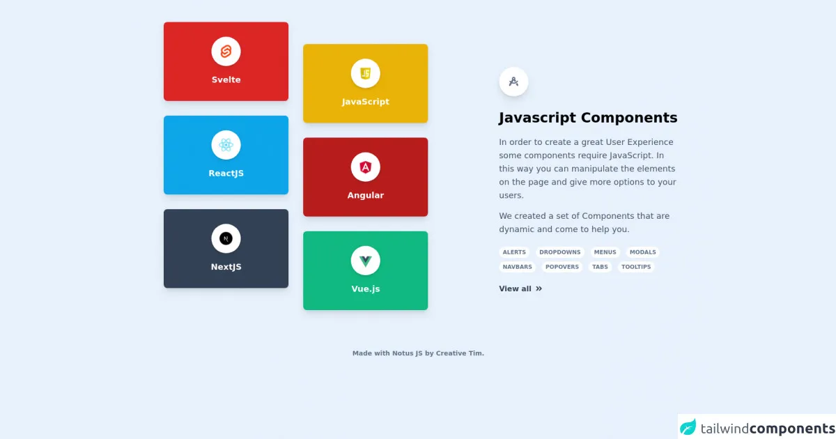
The preview of Cards Section ui component.
To create a Cards Section with Tailwind CSS, we will use a grid layout to display the cards. Each card will be contained within a div element with a set of pre-defined classes that define the card's appearance.
Free download of the Cards Section's source code
The source code of Cards Section ui component.
To create a Cards Section with Tailwind CSS, we will use a combination of HTML and CSS. The HTML will define the structure of the Cards Section, and the CSS will be used to style the cards and the grid layout.
<link rel="stylesheet" href="https://demos.creative-tim.com/notus-js/assets/styles/tailwind.css">
<link rel="stylesheet" href="https://demos.creative-tim.com/notus-js/assets/vendor/@fortawesome/fontawesome-free/css/all.min.css">

<div class="flex flex-wrap items-center pt-8">
  <div class="w-full md:w-6/12 px-4 mr-auto ml-auto ">
    <div class="justify-center flex flex-wrap relative">
      <div class="my-4 w-full lg:w-6/12 px-4">
        <a href="https://www.creative-tim.com/learning-lab/tailwind/svelte/alerts/notus?ref=vtw-index" target="_blank">
          <div class="bg-red-600 shadow-lg rounded-lg text-center p-8">
            <img alt="..." class="shadow-md rounded-full max-w-full w-16 mx-auto p-2 bg-white" src="https://raw.githubusercontent.com/creativetimofficial/public-assets/master/logos/svelte.jpg">
            <p class="text-lg text-white mt-4 font-semibold">Svelte</p>
          </div>
        </a>
        <a href="https://www.creative-tim.com/learning-lab/tailwind/react/alerts/notus?ref=vtw-index" target="_blank">
          <div class="bg-lightBlue-500 shadow-lg rounded-lg text-center p-8 mt-8">
            <img alt="..." class="shadow-md rounded-full max-w-full w-16 mx-auto p-2 bg-white" src="https://raw.githubusercontent.com/creativetimofficial/public-assets/master/logos/react.jpg">
            <p class="text-lg text-white mt-4 font-semibold">ReactJS</p>
          </div>
        </a>
        <a href="https://www.creative-tim.com/learning-lab/tailwind/nextjs/alerts/notus?ref=vtw-index" target="_blank">
          <div class="bg-blueGray-700 shadow-lg rounded-lg text-center p-8 mt-8">
            <img alt="..." class="shadow-md rounded-full max-w-full w-16 mx-auto p-2 bg-white" src="https://raw.githubusercontent.com/creativetimofficial/public-assets/master/logos/nextjs.jpg">
            <p class="text-lg text-white mt-4 font-semibold">NextJS</p>
          </div>
        </a>
      </div>
      <div class="my-4 w-full lg:w-6/12 px-4 lg:mt-16">
        <a href="https://www.creative-tim.com/learning-lab/tailwind/js/alerts/notus?ref=vtw-index" target="_blank">
          <div class="bg-yellow-500 shadow-lg rounded-lg text-center p-8">
            <img alt="..." class="shadow-md rounded-full max-w-full w-16 mx-auto p-2 bg-white" src="https://raw.githubusercontent.com/creativetimofficial/public-assets/master/logos/js.png">
            <p class="text-lg text-white mt-4 font-semibold">
              JavaScript
            </p>
          </div>
        </a>
        <a href="https://www.creative-tim.com/learning-lab/tailwind/angular/alerts/notus?ref=vtw-index" target="_blank">
          <div class="bg-red-700 shadow-lg rounded-lg text-center p-8 mt-8">
            <img alt="..." class="shadow-md rounded-full max-w-full w-16 mx-auto p-2 bg-white" src="https://raw.githubusercontent.com/creativetimofficial/public-assets/master/logos/angular.jpg">
            <p class="text-lg text-white mt-4 font-semibold">Angular</p>
          </div>
        </a>
        <a href="https://www.creative-tim.com/learning-lab/tailwind/vue/alerts/notus?ref=vtw-index" target="_blank">
          <div class="bg-emerald-500 shadow-lg rounded-lg text-center p-8 mt-8">
            <img alt="..." class="shadow-md rounded-full max-w-full w-16 mx-auto p-2 bg-white" src="https://raw.githubusercontent.com/creativetimofficial/public-assets/master/logos/vue.jpg">
            <p class="text-lg text-white mt-4 font-semibold">Vue.js</p>
          </div>
        </a>
      </div>
    </div>
  </div>

  <div class="w-full md:w-4/12 px-12 md:px-4 ml-auto mr-auto mt-16">
    <div class="text-blueGray-500 p-3 text-center inline-flex items-center justify-center w-16 h-16 mb-6 shadow-lg rounded-full bg-white">
      <i class="fas fa-drafting-compass text-xl"></i>
    </div>
    <h3 class="text-3xl mb-2 font-semibold leading-normal">
      Javascript Components
    </h3>
    <p class="text-lg font-light leading-relaxed mt-4 mb-4 text-blueGray-600">
      In order to create a great User Experience some components require
      JavaScript. In this way you can manipulate the elements on the
      page and give more options to your users.
    </p>
    <p class="text-lg font-light leading-relaxed mt-4 mb-4 text-blueGray-600">
      We created a set of Components that are dynamic and come to help
      you.
    </p>
    <div class="block pb-6">
      <span class="text-xs font-semibold inline-block py-1 px-2 uppercase rounded-full text-blueGray-500 bg-white uppercase last:mr-0 mr-2 mt-2">
        Alerts
      </span>
      <span class="text-xs font-semibold inline-block py-1 px-2 uppercase rounded-full text-blueGray-500 bg-white uppercase last:mr-0 mr-2 mt-2">
        Dropdowns
      </span>
      <span class="text-xs font-semibold inline-block py-1 px-2 uppercase rounded-full text-blueGray-500 bg-white uppercase last:mr-0 mr-2 mt-2">
        Menus
      </span>
      <span class="text-xs font-semibold inline-block py-1 px-2 uppercase rounded-full text-blueGray-500 bg-white uppercase last:mr-0 mr-2 mt-2">
        Modals
      </span>
      <span class="text-xs font-semibold inline-block py-1 px-2 uppercase rounded-full text-blueGray-500 bg-white uppercase last:mr-0 mr-2 mt-2">
        Navbars
      </span>
      <span class="text-xs font-semibold inline-block py-1 px-2 uppercase rounded-full text-blueGray-500 bg-white uppercase last:mr-0 mr-2 mt-2">
        Popovers
      </span>
      <span class="text-xs font-semibold inline-block py-1 px-2 uppercase rounded-full text-blueGray-500 bg-white uppercase last:mr-0 mr-2 mt-2">
        Tabs
      </span>
      <span class="text-xs font-semibold inline-block py-1 px-2 uppercase rounded-full text-blueGray-500 bg-white uppercase last:mr-0 mr-2 mt-2">
        Tooltips
      </span>
    </div>
    <a href="https://www.creative-tim.com/learning-lab/tailwind/js/alerts/notus?ref=njs-index" target="_blank" class="font-bold text-blueGray-700 hover:text-blueGray-500 ease-linear transition-all duration-150">
      View all
      <i class="fa fa-angle-double-right ml-1 leading-relaxed"></i>
    </a>
  </div>
</div>
<footer class="relative pt-8 pb-6 mt-8">
  <div class="container mx-auto px-4">
    <div class="flex flex-wrap items-center md:justify-between justify-center">
      <div class="w-full md:w-6/12 px-4 mx-auto text-center">
        <div class="text-sm text-blueGray-500 font-semibold py-1">
          Made with <a href="https://www.creative-tim.com/product/notus-js" class="text-blueGray-500 hover:text-gray-800" target="_blank">Notus JS</a> by <a href="https://www.creative-tim.com" class="text-blueGray-500 hover:text-blueGray-800" target="_blank"> Creative Tim</a>.
        </div>
      </div>
    </div>
  </div>
</footer>
How to create a Cards Section with Tailwind CSS?
To create a Cards Section with Tailwind CSS, follow these steps:
Step 1: Create the HTML structure
The first step is to create the HTML structure for the Cards Section. We will use a grid layout to display the cards, so we will create a div element with the class "grid" to contain the cards.
<div class="grid grid-cols-1 md:grid-cols-2 lg:grid-cols-3 gap-4">
  <!-- Cards will be added here -->
</div>
In this example, we are using the "grid-cols-1" class to display one column of cards on small screens, two columns of cards on medium screens, and three columns of cards on large screens. We are also using the "gap-4" class to add a 4-pixel gap between each card.
Step 2: Create the card HTML structure
Next, we will create the HTML structure for each card. We will use a div element with the class "bg-white rounded-lg shadow-md" to create a card with a white background, rounded corners, and a drop shadow.
<div class="bg-white rounded-lg shadow-md">
  <img src="https://via.placeholder.com/150" alt="Placeholder Image" class="w-full h-48 object-cover">
  <div class="p-4">
    <h3 class="text-lg font-medium text-gray-700">Card Title</h3>
    <p class="text-gray-500 mt-2">Card Description</p>
    <button class="mt-4 bg-blue-500 hover:bg-blue-700 text-white font-bold py-2 px-4 rounded">Button</button>
  </div>
</div>
In this example, we are using the "w-full" and "h-48" classes to set the width and height of the image, the "object-cover" class to ensure that the image fills the container, and the "p-4" class to add padding to the card content.
Step 3: Add the card HTML to the grid
Finally, we will add the card HTML to the grid container. We can repeat the card HTML for each card we want to display.
<div class="grid grid-cols-1 md:grid-cols-2 lg:grid-cols-3 gap-4">
  <div class="bg-white rounded-lg shadow-md">
    <img src="https://via.placeholder.com/150" alt="Placeholder Image" class="w-full h-48 object-cover">
    <div class="p-4">
      <h3 class="text-lg font-medium text-gray-700">Card Title</h3>
      <p class="text-gray-500 mt-2">Card Description</p>
      <button class="mt-4 bg-blue-500 hover:bg-blue-700 text-white font-bold py-2 px-4 rounded">Button</button>
    </div>
  </div>
  <!-- Repeat for each card -->
</div>
Conclusion
In this article, we have learned how to create a Cards Section with Tailwind CSS. By using pre-defined CSS classes and responsive design utilities, we can create a beautiful and responsive user interface component in just 60 minutes. With Tailwind CSS, we can focus on creating great user experiences without worrying about the details of CSS styling.