- Published on
How To Build A Input Number Custom Style With Tailwind CSS In 5 Easy Steps
- What is Tailwind CSS?
- The description of Input number custom style ui component
- Why use Tailwind CSS to create a Input number custom style ui component?
- The preview of Input number custom style ui component.
- The source code of Input number custom style ui component.
- How to create a Input number custom style with Tailwind CSS?
- Step 1: Set up your project
- Step 2: Create your HTML markup
- Step 3: Add Tailwind CSS classes to your HTML markup
- Step 4: Customize your styles
- Step 5: Test your input field
- Conclusion
Tailwind CSS is a utility-first CSS framework that makes designing and styling web applications faster and more efficient. With Tailwind CSS, you can create custom styles for your input number fields in just a few easy steps. In this article, we'll show you how to build an input number custom style with Tailwind CSS in five easy steps.
What is Tailwind CSS?
Tailwind CSS is a utility-first CSS framework that provides a set of pre-defined CSS classes that you can use to style your HTML elements. Unlike traditional CSS frameworks that come with pre-built components, Tailwind CSS provides you with a set of low-level utility classes that you can use to build your own custom components.
The description of Input number custom style ui component
An input number custom style UI component is a custom-designed input field that allows users to enter numeric values. This component is commonly used in forms and data entry applications.
Why use Tailwind CSS to create a Input number custom style ui component?
Tailwind CSS makes it easy to create custom styles for your input number fields. With Tailwind CSS, you can use pre-defined utility classes to style your input fields without having to write custom CSS code. This makes it faster and more efficient to create custom styles for your web applications.
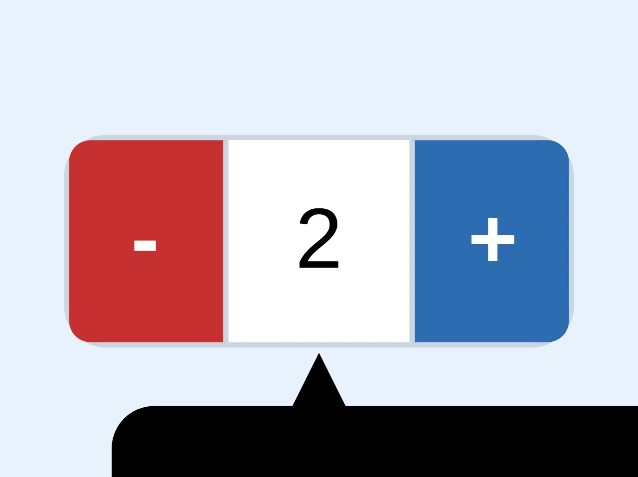
The preview of Input number custom style ui component.
Free download of the Input number custom style's source code
The source code of Input number custom style ui component.
<div
    class="flex flex-row border h-10 w-24 rounded-lg border-gray-400 relative"
  >
    <button
      class="font-semibold border-r bg-red-700 hover:bg-red-600 text-white border-gray-400 h-full w-20 flex rounded-l focus:outline-none cursor-pointer"
    >
      <span class="m-auto">-</span>
    </button>
    <input
      type="hidden"
      class="md:p-2 p-1 text-xs md:text-base border-gray-400 focus:outline-none text-center"
      readonly
      name="custom-input-number"
    />
    <div
      class="bg-white w-24 text-xs md:text-base flex items-center justify-center cursor-default"
    >
      <span>2</span>
    </div>

    <button
      class="font-semibold border-l  bg-blue-700 hover:bg-blue-600 text-white border-gray-400 h-full w-20 flex rounded-r focus:outline-none cursor-pointer"
    >
      <span class="m-auto">+</span>
    </button>
    <div
      class="absolute flex flex-col p-2 w-32 md:w-full mt-6 md:mt-8 mt-10 flex items-start justify-center"
    >
      <svg width="10" height="10" class="fill-current ml-5 md:mx-auto">
        <polygon points="0 10, 10 10, 5 0" />
      </svg>
      <span
        class="text-xs block w-48 flex flex-wrap justify-center bg-black p-3 h-auto rounded-lg text-white"
      >Input validation message</span>
    </div>
  </div>
How to create a Input number custom style with Tailwind CSS?
Step 1: Set up your project
To get started, you'll need to set up a new project and install Tailwind CSS. You can do this by following the instructions on the Tailwind CSS website.
Step 2: Create your HTML markup
Next, you'll need to create your HTML markup for your input number field. Here's an example of what your HTML markup might look like:
<label for="quantity" class="block text-gray-700 font-bold mb-2">Quantity</label>
<input type="number" name="quantity" id="quantity" class="shadow appearance-none border rounded w-full py-2 px-3 text-gray-700 leading-tight focus:outline-none focus:shadow-outline">
In this example, we've created a label for our input field and added the necessary attributes to our input field.
Step 3: Add Tailwind CSS classes to your HTML markup
Next, you'll need to add Tailwind CSS classes to your HTML markup to style your input field. Here's an example of what your HTML markup might look like with Tailwind CSS classes added:
<label for="quantity" class="block text-gray-700 font-bold mb-2">Quantity</label>
<input type="number" name="quantity" id="quantity" class="shadow appearance-none border rounded w-full py-2 px-3 text-gray-700 leading-tight focus:outline-none focus:shadow-outline focus:bg-white focus:border-gray-500">
In this example, we've added Tailwind CSS classes to our input field to style the border, padding, font color, and focus state of our input field.
Step 4: Customize your styles
Tailwind CSS provides you with a set of pre-defined CSS classes that you can use to style your input fields. However, you can also customize your styles by creating your own custom CSS classes. Here's an example of how you might customize your input field styles:
<label for="quantity" class="block text-gray-700 font-bold mb-2">Quantity</label>
<input type="number" name="quantity" id="quantity" class="shadow appearance-none border rounded w-full py-2 px-3 text-gray-700 leading-tight focus:outline-none focus:shadow-outline focus:bg-white focus:border-gray-500 custom-input">
In this example, we've added a custom CSS class called "custom-input" to our input field. We can then define our custom styles in our CSS file like this:
.custom-input {
  background-color: #f5f5f5;
  border-color: #ddd;
}
Step 5: Test your input field
Finally, you'll need to test your input field to make sure it works as expected. You can do this by entering numeric values into your input field and submitting your form.
Conclusion
In this article, we've shown you how to build an input number custom style with Tailwind CSS in five easy steps. With Tailwind CSS, you can create custom styles for your input fields without having to write custom CSS code. This makes it faster and more efficient to create custom styles for your web applications.