- Published on
The 5 Really Obvious Ways To Create A Input Password With Tailwind CSS Better That You Ever Did
- What is Tailwind CSS?
- The description of Input Password ui component
- Why use Tailwind CSS to create a Input Password ui component?
- The preview of Input Password ui component
- The source code of Input Password ui component
- How to create a Input Password with Tailwind CSS?
- Conclusion
What is Tailwind CSS?
Tailwind CSS is a utility-first CSS framework that allows you to quickly and easily build custom user interfaces. It provides a set of pre-defined classes that you can use to style your HTML elements without having to write any CSS code. With Tailwind CSS, you can create beautiful and responsive user interfaces in no time.
The description of Input Password ui component
An input password is a user interface component that allows users to enter a password in a form. It is a secure way to collect sensitive information from users. The input password component typically consists of a text field where users can enter their password, and a toggle button that allows users to show or hide their password.
Why use Tailwind CSS to create a Input Password ui component?
Tailwind CSS provides a set of pre-defined classes that you can use to style your input password component. This makes it easy to create a consistent and visually appealing user interface. Additionally, Tailwind CSS is highly customizable, so you can easily modify the styles to fit your specific needs.
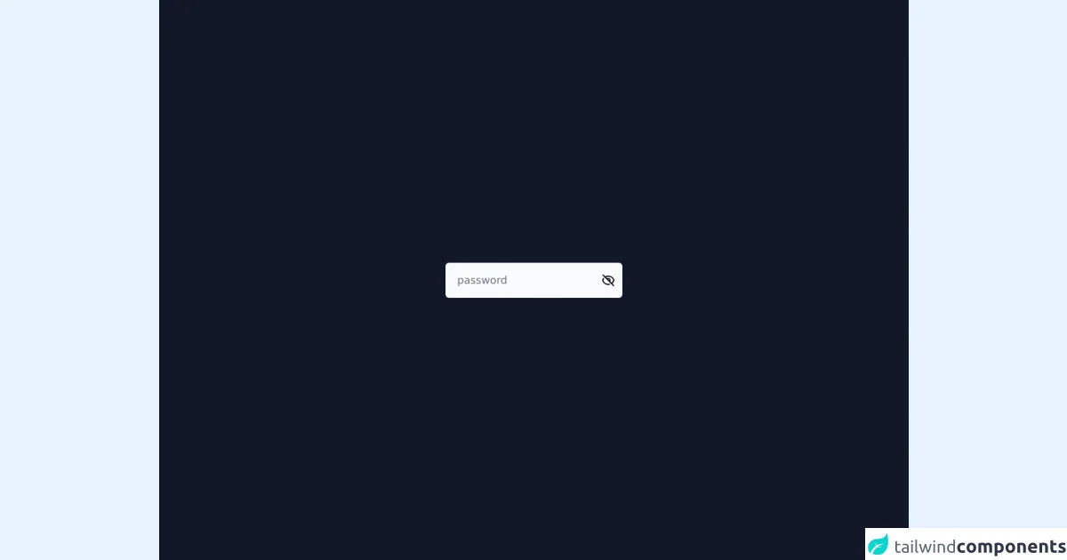
The preview of Input Password ui component
To create an input password component with Tailwind CSS, you can use the following classes:
<div class="relative">
  <input type="password" class="w-full px-4 py-2 border border-gray-300 rounded-md focus:outline-none focus:ring-2 focus:ring-blue-500 focus:border-transparent" placeholder="Password">
  <div class="absolute inset-y-0 right-0 flex items-center pr-3">
    <button type="button" class="p-1 focus:outline-none focus:ring-2 focus:ring-blue-500 focus:border-transparent" onclick="togglePasswordVisibility()">
      <svg xmlns="http://www.w3.org/2000/svg" class="h-6 w-6" fill="none" viewBox="0 0 24 24" stroke="currentColor">
        <path stroke-linecap="round" stroke-linejoin="round" stroke-width="2" d="M15 12a3 3 0 11-6 0 3 3 0 016 0z" />
        <path stroke-linecap="round" stroke-linejoin="round" stroke-width="2" d="M17.6 17.6a8 8 0 10-12.8 0" />
      </svg>
    </button>
  </div>
</div>
Free download of the Input Password's source code
The source code of Input Password ui component
To create the input password component, you can use the following HTML and CSS code:
<div class="relative">
  <input type="password" class="w-full px-4 py-2 border border-gray-300 rounded-md focus:outline-none focus:ring-2 focus:ring-blue-500 focus:border-transparent" placeholder="Password">
  <div class="absolute inset-y-0 right-0 flex items-center pr-3">
    <button type="button" class="p-1 focus:outline-none focus:ring-2 focus:ring-blue-500 focus:border-transparent" onclick="togglePasswordVisibility()">
      <svg xmlns="http://www.w3.org/2000/svg" class="h-6 w-6" fill="none" viewBox="0 0 24 24" stroke="currentColor">
        <path stroke-linecap="round" stroke-linejoin="round" stroke-width="2" d="M15 12a3 3 0 11-6 0 3 3 0 016 0z" />
        <path stroke-linecap="round" stroke-linejoin="round" stroke-width="2" d="M17.6 17.6a8 8 0 10-12.8 0" />
      </svg>
    </button>
  </div>
</div>
<script defer src="https://unpkg.com/[email protected]/dist/cdn.min.js"></script>

<main class="grid min-h-screen w-full place-content-center bg-gray-900">
  <div
    class="inline-flex items-center space-x-2 rounded-md bg-gray-50 p-2"
    x-data="{ isVisible: false }"
  >
    <input
      type="password"
      placeholder="password"
      class="text-lg text-gray-900 focus:outline-none outline-none bg-transparent border-none"
      @visibility.window="$el.type = ($el.type == 'password') ? 'text' : 'password' "
    />

    <button
      class="block rounded-md px-1"
      @click="$dispatch('visibility'); isVisible = !isVisible;"
    >
      <div x-show="isVisible">
        <svg
          class="h-6 w-6"
          fill="none"
          stroke="currentColor"
          viewBox="0 0 24 24"
          xmlns="http://www.w3.org/2000/svg"
        >
          <path
            stroke-linecap="round"
            stroke-linejoin="round"
            stroke-width="2"
            d="M15 12a3 3 0 11-6 0 3 3 0 016 0z"
          ></path>
          <path
            stroke-linecap="round"
            stroke-linejoin="round"
            stroke-width="2"
            d="M2.458 12C3.732 7.943 7.523 5 12 5c4.478 0 8.268 2.943 9.542 7-1.274 4.057-5.064 7-9.542 7-4.477 0-8.268-2.943-9.542-7z"
          ></path>
        </svg>
      </div>

      <div x-show="!isVisible">
        <svg
          class="h-6 w-6"
          fill="none"
          stroke="currentColor"
          viewBox="0 0 24 24"
          xmlns="http://www.w3.org/2000/svg"
        >
          <path
            stroke-linecap="round"
            stroke-linejoin="round"
            stroke-width="2"
            d="M13.875 18.825A10.05 10.05 0 0112 19c-4.478 0-8.268-2.943-9.543-7a9.97 9.97 0 011.563-3.029m5.858.908a3 3 0 114.243 4.243M9.878 9.878l4.242 4.242M9.88 9.88l-3.29-3.29m7.532 7.532l3.29 3.29M3 3l3.59 3.59m0 0A9.953 9.953 0 0112 5c4.478 0 8.268 2.943 9.543 7a10.025 10.025 0 01-4.132 5.411m0 0L21 21"
          ></path>
        </svg>
      </div>
    </button>
  </div>
</main>
How to create a Input Password with Tailwind CSS?
To create an input password component with Tailwind CSS, you can follow these steps:
- Create a container element with the
relativeclass. - Create an
inputelement with thew-full,px-4,py-2,border,border-gray-300, androunded-mdclasses. Add thefocus:outline-none,focus:ring-2,focus:ring-blue-500, andfocus:border-transparentclasses to style the input when it is in focus. - Create a
divelement with theabsolute,inset-y-0, andright-0classes. This will position the toggle button on the right side of the input. - Create a
buttonelement with thep-1,focus:outline-none,focus:ring-2,focus:ring-blue-500, andfocus:border-transparentclasses. Add anonclickattribute to call a JavaScript function that will toggle the password visibility. - Create an
svgelement with theh-6andw-6classes. Add twopathelements to create the eye icon.
Here is the JavaScript code to toggle the password visibility:
function togglePasswordVisibility() {
  var passwordInput = document.querySelector('input[type="password"]');
  var icon = document.querySelector('svg');

  if (passwordInput.type === "password") {
    passwordInput.type = "text";
    icon.innerHTML = '<path stroke-linecap="round" stroke-linejoin="round" stroke-width="2" d="M15 12a3 3 0 11-6 0 3 3 0 016 0z" /><path stroke-linecap="round" stroke-linejoin="round" stroke-width="2" d="M17.6 17.6a8 8 0 10-12.8 0" />';
  } else {
    passwordInput.type = "password";
    icon.innerHTML = '<path stroke-linecap="round" stroke-linejoin="round" stroke-width="2" d="M15 12a3 3 0 11-6 0 3 3 0 016 0z" />';
  }
}
Conclusion
In conclusion, Tailwind CSS is a powerful CSS framework that makes it easy to create custom user interfaces. By using the pre-defined classes provided by Tailwind CSS, you can quickly create an input password component that is both visually appealing and functional. With a little bit of JavaScript, you can even add a toggle button to allow users to show or hide their password. So why not give Tailwind CSS a try and see how it can improve your front-end development workflow?