- Published on
Best Ways To Make A Input Group With Tailwind CSS
- What is Tailwind CSS?
- The description of Input group ui component
- Why use Tailwind CSS to create a Input group ui component?
- The preview of Input group ui component
- The source code of Input group ui component
- How to create a Input group with Tailwind CSS?
- Conclusion
Tailwind CSS is a utility-first CSS framework that helps developers create custom and responsive user interfaces quickly. It provides a set of pre-defined CSS classes that can be used to style HTML elements. In this article, we will discuss the best ways to create an input group with Tailwind CSS.
What is Tailwind CSS?
Tailwind CSS is a CSS framework that provides a set of pre-defined CSS classes that can be used to style HTML elements. It is a utility-first framework, which means that it focuses on providing low-level utility classes that can be combined to create custom and responsive user interfaces quickly.
The description of Input group ui component
An input group is a user interface component that combines multiple input fields into a single form element. It is commonly used in web forms where users need to enter multiple pieces of information.
Why use Tailwind CSS to create a Input group ui component?
Tailwind CSS provides a set of pre-defined CSS classes that can be used to create an input group quickly. It also provides responsive design classes that can be used to create a responsive input group that looks great on all screen sizes.
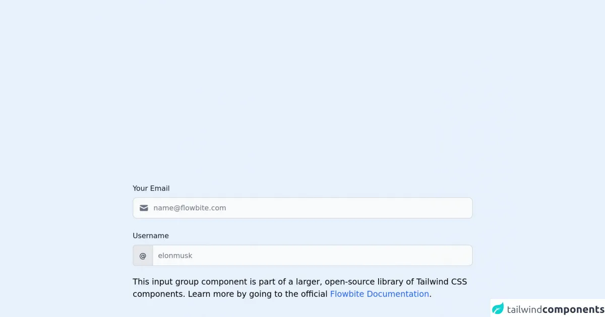
The preview of Input group ui component
To create an input group with Tailwind CSS, we will use the flex and items-center classes to align the input fields horizontally. We will also use the rounded-l and rounded-r classes to round the corners of the first and last input fields, respectively.
Free download of the Input group's source code
The source code of Input group ui component
To create an input group with Tailwind CSS, we can use the following HTML code:
<!-- This is an example component -->
<div class="max-w-2xl mx-auto">

	<label for="input-group-1" class="block mb-2 text-sm font-medium text-gray-900 dark:text-gray-300">Your Email</label>
        <div class="relative mb-6">
            <div class="absolute inset-y-0 left-0 flex items-center pl-3 pointer-events-none">
                <svg class="w-5 h-5 text-gray-500 dark:text-gray-400" fill="currentColor" viewBox="0 0 20 20" xmlns="http://www.w3.org/2000/svg"><path d="M2.003 5.884L10 9.882l7.997-3.998A2 2 0 0016 4H4a2 2 0 00-1.997 1.884z"></path><path d="M18 8.118l-8 4-8-4V14a2 2 0 002 2h12a2 2 0 002-2V8.118z"></path></svg>
            </div>
            <input type="text" id="input-group-1" class="bg-gray-50 border border-gray-300 text-gray-900 text-sm rounded-lg focus:ring-blue-500 focus:border-blue-500 block w-full pl-10 p-2.5  dark:bg-gray-700 dark:border-gray-600 dark:placeholder-gray-400 dark:text-white dark:focus:ring-blue-500 dark:focus:border-blue-500" placeholder="[email protected]">
        </div>
        <label for="website-admin" class="block mb-2 text-sm font-medium text-gray-900 dark:text-gray-300">Username</label>
        <div class="flex">
        <span class="inline-flex items-center px-3 text-sm text-gray-900 bg-gray-200 border border-r-0 border-gray-300 rounded-l-md dark:bg-gray-600 dark:text-gray-400 dark:border-gray-600">
            @
        </span>
        <input type="text" id="website-admin" class="rounded-none rounded-r-lg bg-gray-50 border text-gray-900 focus:ring-blue-500 focus:border-blue-500 block flex-1 min-w-0 w-full text-sm border-gray-300 p-2.5  dark:bg-gray-700 dark:border-gray-600 dark:placeholder-gray-400 dark:text-white dark:focus:ring-blue-500 dark:focus:border-blue-500" placeholder="elonmusk">
    </div>

	<p class="mt-5">This input group component is part of a larger, open-source library of Tailwind CSS components. Learn
		more
		by going to the official <a class="text-blue-600 hover:underline"
			href="https://flowbite.com/docs/getting-started/introduction/" target="_blank">Flowbite Documentation</a>.
	</p>
    <script src="https://unpkg.com/[email protected]/dist/flowbite.js"></script>
</div>
In the above code, we have used the flex and items-center classes to align the input fields horizontally. We have also used the rounded-l and rounded-r classes to round the corners of the first and last input fields, respectively. The w-full class is used to make the input fields take up the full width of the parent container.
How to create a Input group with Tailwind CSS?
To create an input group with Tailwind CSS, follow the steps below:
- Create a container element for the input group.
<div class="flex items-center border rounded-lg">
</div>
- Add input fields to the container element.
<div class="flex items-center border rounded-lg">
  <input type="text" class="px-4 py-2 w-full rounded-l focus:outline-none" placeholder="First Name">
  <input type="text" class="px-4 py-2 w-full focus:outline-none" placeholder="Last Name">
  <input type="email" class="px-4 py-2 w-full rounded-r focus:outline-none" placeholder="Email">
</div>
In the above code, we have added three input fields to the container element. We have used the px-4 and py-2 classes to add padding to the input fields. We have also used the w-full class to make the input fields take up the full width of the parent container. The rounded-l and rounded-r classes are used to round the corners of the first and last input fields, respectively.
- Style the input fields using Tailwind CSS classes.
<div class="flex items-center border rounded-lg">
  <input type="text" class="px-4 py-2 w-full rounded-l focus:outline-none bg-gray-100" placeholder="First Name">
  <input type="text" class="px-4 py-2 w-full focus:outline-none bg-gray-100" placeholder="Last Name">
  <input type="email" class="px-4 py-2 w-full rounded-r focus:outline-none bg-gray-100" placeholder="Email">
</div>
In the above code, we have added the bg-gray-100 class to add a light gray background color to the input fields. We have also used the focus:outline-none class to remove the default outline that appears around the input fields when they are in focus.
- Add responsive design classes to make the input group responsive.
<div class="flex flex-col md:flex-row items-center border rounded-lg">
  <input type="text" class="px-4 py-2 w-full md:w-auto rounded-l focus:outline-none bg-gray-100 mb-2 md:mb-0" placeholder="First Name">
  <input type="text" class="px-4 py-2 w-full md:w-auto focus:outline-none bg-gray-100 mb-2 md:mb-0" placeholder="Last Name">
  <input type="email" class="px-4 py-2 w-full md:w-auto rounded-r focus:outline-none bg-gray-100" placeholder="Email">
</div>
In the above code, we have added the flex-col and md:flex-row classes to make the input group stack vertically on small screens and align horizontally on medium and large screens. We have also used the md:w-auto class to make the input fields take up their default width on medium and large screens. The mb-2 and md:mb-0 classes are used to add margin to the input fields on small screens and remove it on medium and large screens.
Conclusion
In this article, we have discussed the best ways to create an input group with Tailwind CSS. We have seen how Tailwind CSS provides a set of pre-defined CSS classes that can be used to create custom and responsive user interfaces quickly. We have also seen how to create an input group using HTML and Tailwind CSS classes. With these techniques, you can create beautiful and functional input groups for your web forms.