- Published on
The Ultimate Guide To Help You Create A Header NIMBUS Desktop With Tailwind CSS
- What is Tailwind CSS?
- The description of Header NIMBUS desktop UI component
- Why use Tailwind CSS to create a Header NIMBUS desktop UI component?
- The preview of Header NIMBUS desktop UI component
- The source code of Header NIMBUS desktop UI component
- How to create a Header NIMBUS desktop with Tailwind CSS?
- Step 1: Set up a new project
- Step 2: Install Tailwind CSS
- Step 3: Create a new HTML file
- Step 4: Create a new CSS file
- Step 5: Build the CSS file
- Step 6: Link the CSS file
- Step 7: Preview the Header NIMBUS desktop
- Conclusion
As a FrontEnd technology blogger, it's essential to keep up with the latest trends and tools in the industry. One such tool that has gained immense popularity in recent times is Tailwind CSS. It's a utility-first CSS framework that allows you to create complex designs with ease. In this article, we will explore how to create a Header NIMBUS desktop UI component using Tailwind CSS.
What is Tailwind CSS?
Tailwind CSS is a utility-first CSS framework that provides a set of pre-defined classes that you can use to style your HTML elements. It's different from other CSS frameworks like Bootstrap and Foundation, which provide a set of pre-designed components. With Tailwind CSS, you have complete control over the design, and you can create complex layouts with ease.
The description of Header NIMBUS desktop UI component
Header NIMBUS desktop is a UI component that is commonly used in web applications. It's the top section of a web page that contains the logo, navigation menu, and other important information. The Header NIMBUS desktop UI component is an essential part of any web application, and it's crucial to get it right.
Why use Tailwind CSS to create a Header NIMBUS desktop UI component?
Tailwind CSS provides a set of pre-defined classes that you can use to style your HTML elements. It's a utility-first CSS framework, which means that you can create complex designs with ease. With Tailwind CSS, you don't have to write custom CSS for every element, which can save you a lot of time and effort.
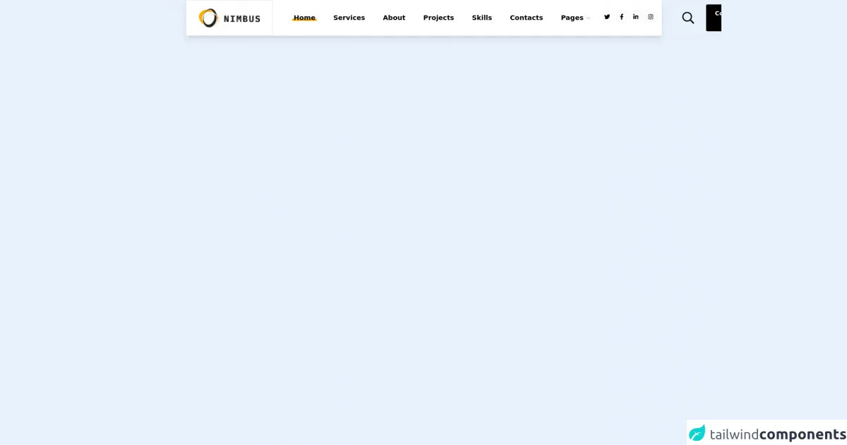
The preview of Header NIMBUS desktop UI component
In this section, we will take a look at the preview of the Header NIMBUS desktop UI component that we will create using Tailwind CSS.
Free download of the Header NIMBUS desktop's source code
The source code of Header NIMBUS desktop UI component
In this section, we will take a look at the source code of the Header NIMBUS desktop UI component that we will create using Tailwind CSS.
<style>
  .header-links li span {
    position: relative;
    z-index: 0;
  }

  .header-links li span::before {
    content: '';
    position: absolute;
    z-index: -1;
    bottom: 2px;
    left: -4px;
    right: -4px;
    display: block;
    height: 6px;
  }

  .header-links li.active span::before {
    background-color: #fcae04;
  }

  .header-links li:not(.active):hover span::before {
    background-color: #ccc;
  }
</style>

<header class="bg-white shadow-lg h-24 hidden md:flex">
  <a href="" class="border flex-shrink-0 flex items-center justify-center px-4 lg:px-6 xl:px-8">
    <img class="" src="https://i.ibb.co/W6ZXdqN/2021-10-26-16h20-21.png" alt="" />
  </a>
  <nav class="header-links contents font-semibold text-base lg:text-lg">
    <ul class="flex items-center ml-4 xl:ml-8 mr-auto">
      <li class="p-3 xl:p-6 active">
        <a href="">
          <span>Home</span>
        </a>
      </li>
      <li class="p-3 xl:p-6">
        <a href="">
          <span>Services</span>
        </a>
      </li>
      <li class="p-3 xl:p-6">
        <a href="">
          <span>About</span>
        </a>
      </li>
      <li class="p-3 xl:p-6">
        <a href="">
          <span>Projects</span>
        </a>
      </li>
      <li class="p-3 xl:p-6">
        <a href="">
          <span>Skills</span>
        </a>
      </li>
      <li class="p-3 xl:p-6">
        <a href="">
          <span>Contacts</span>
        </a>
      </li>
      <li class="p-3 xl:p-6">
        <a href="" class="flex items-center">
          <span>Pages</span>
          <svg class="h-3 opacity-30 ml-2" aria-hidden="true" focusable="false" data-prefix="far" data-icon="chevron-down" role="img" xmlns="http://www.w3.org/2000/svg" viewBox="0 0 448 512" class="svg-inline--fa fa-chevron-down fa-w-14 fa-7x"><path fill="currentColor" d="M441.9 167.3l-19.8-19.8c-4.7-4.7-12.3-4.7-17 0L224 328.2 42.9 147.5c-4.7-4.7-12.3-4.7-17 0L6.1 167.3c-4.7 4.7-4.7 12.3 0 17l209.4 209.4c4.7 4.7 12.3 4.7 17 0l209.4-209.4c4.7-4.7 4.7-12.3 0-17z"></path></svg>
        </a>
      </li>
    </ul>
  </nav>
  <nav class="hidden xl:contents">
    <ul class="flex items-center mr-4 lg:mr-6 xl:mr-8">
      <li class="p-1">
        <a href="" class="inline-block rounded-full border p-2 hover:shadow-lg hover:border-opacity-0 duration-200 hover:-translate-y-0.5">
          <svg class="h-4" aria-hidden="true" focusable="false" data-prefix="fab" data-icon="twitter" role="img" xmlns="http://www.w3.org/2000/svg" viewBox="0 0 512 512" class="svg-inline--fa fa-twitter fa-w-16 fa-9x"><path fill="currentColor" d="M459.37 151.716c.325 4.548.325 9.097.325 13.645 0 138.72-105.583 298.558-298.558 298.558-59.452 0-114.68-17.219-161.137-47.106 8.447.974 16.568 1.299 25.34 1.299 49.055 0 94.213-16.568 130.274-44.832-46.132-.975-84.792-31.188-98.112-72.772 6.498.974 12.995 1.624 19.818 1.624 9.421 0 18.843-1.3 27.614-3.573-48.081-9.747-84.143-51.98-84.143-102.985v-1.299c13.969 7.797 30.214 12.67 47.431 13.319-28.264-18.843-46.781-51.005-46.781-87.391 0-19.492 5.197-37.36 14.294-52.954 51.655 63.675 129.3 105.258 216.365 109.807-1.624-7.797-2.599-15.918-2.599-24.04 0-57.828 46.782-104.934 104.934-104.934 30.213 0 57.502 12.67 76.67 33.137 23.715-4.548 46.456-13.32 66.599-25.34-7.798 24.366-24.366 44.833-46.132 57.827 21.117-2.273 41.584-8.122 60.426-16.243-14.292 20.791-32.161 39.308-52.628 54.253z"></path></svg>
        </a>
      </li>
      <li class="p-1">
        <a href="" class="inline-block rounded-full border p-2 hover:shadow-lg hover:border-opacity-0 duration-200 hover:-translate-y-0.5">
          <svg class="h-4" aria-hidden="true" focusable="false" data-prefix="fab" data-icon="facebook-f" role="img" xmlns="http://www.w3.org/2000/svg" viewBox="0 0 320 512" class="svg-inline--fa fa-facebook-f fa-w-10 fa-7x"><path fill="currentColor" d="M279.14 288l14.22-92.66h-88.91v-60.13c0-25.35 12.42-50.06 52.24-50.06h40.42V6.26S260.43 0 225.36 0c-73.22 0-121.08 44.38-121.08 124.72v70.62H22.89V288h81.39v224h100.17V288z"></path></svg>
        </a>
      </li>
      <li class="p-1">
        <a href="" class="inline-block rounded-full border p-2 hover:shadow-lg hover:border-opacity-0 duration-200 hover:-translate-y-0.5">
          <svg class="h-4" aria-hidden="true" focusable="false" data-prefix="fab" data-icon="linkedin-in" role="img" xmlns="http://www.w3.org/2000/svg" viewBox="0 0 448 512" class="svg-inline--fa fa-linkedin-in fa-w-14 fa-9x"><path fill="currentColor" d="M100.28 448H7.4V148.9h92.88zM53.79 108.1C24.09 108.1 0 83.5 0 53.8a53.79 53.79 0 0 1 107.58 0c0 29.7-24.1 54.3-53.79 54.3zM447.9 448h-92.68V302.4c0-34.7-.7-79.2-48.29-79.2-48.29 0-55.69 37.7-55.69 76.7V448h-92.78V148.9h89.08v40.8h1.3c12.4-23.5 42.69-48.3 87.88-48.3 94 0 111.28 61.9 111.28 142.3V448z"></path></svg>
        </a>
      </li>
      <li class="p-1">
        <a href="" class="inline-block rounded-full border p-2 hover:shadow-lg hover:border-opacity-0 duration-200 hover:-translate-y-0.5">
          <svg class="h-4" aria-hidden="true" focusable="false" data-prefix="fab" data-icon="instagram" role="img" xmlns="http://www.w3.org/2000/svg" viewBox="0 0 448 512" class="svg-inline--fa fa-instagram fa-w-14 fa-9x"><path fill="currentColor" d="M224.1 141c-63.6 0-114.9 51.3-114.9 114.9s51.3 114.9 114.9 114.9S339 319.5 339 255.9 287.7 141 224.1 141zm0 189.6c-41.1 0-74.7-33.5-74.7-74.7s33.5-74.7 74.7-74.7 74.7 33.5 74.7 74.7-33.6 74.7-74.7 74.7zm146.4-194.3c0 14.9-12 26.8-26.8 26.8-14.9 0-26.8-12-26.8-26.8s12-26.8 26.8-26.8 26.8 12 26.8 26.8zm76.1 27.2c-1.7-35.9-9.9-67.7-36.2-93.9-26.2-26.2-58-34.4-93.9-36.2-37-2.1-147.9-2.1-184.9 0-35.8 1.7-67.6 9.9-93.9 36.1s-34.4 58-36.2 93.9c-2.1 37-2.1 147.9 0 184.9 1.7 35.9 9.9 67.7 36.2 93.9s58 34.4 93.9 36.2c37 2.1 147.9 2.1 184.9 0 35.9-1.7 67.7-9.9 93.9-36.2 26.2-26.2 34.4-58 36.2-93.9 2.1-37 2.1-147.8 0-184.8zM398.8 388c-7.8 19.6-22.9 34.7-42.6 42.6-29.5 11.7-99.5 9-132.1 9s-102.7 2.6-132.1-9c-19.6-7.8-34.7-22.9-42.6-42.6-11.7-29.5-9-99.5-9-132.1s-2.6-102.7 9-132.1c7.8-19.6 22.9-34.7 42.6-42.6 29.5-11.7 99.5-9 132.1-9s102.7-2.6 132.1 9c19.6 7.8 34.7 22.9 42.6 42.6 11.7 29.5 9 99.5 9 132.1s2.7 102.7-9 132.1z"></path></svg>
        </a>
      </li>
    </ul>
  </nav>
  <div class="border flex items-center px-4 lg:px-6 xl:px-8">
    <a href="" class="mr-4 lg:mr-6 xl:mr-8">
      <svg class="h-6 xl:h-8" aria-hidden="true" focusable="false" data-prefix="far" data-icon="search" role="img" xmlns="http://www.w3.org/2000/svg" viewBox="0 0 512 512" class="svg-inline--fa fa-search fa-w-16 fa-3x"><path fill="currentColor" d="M508.5 468.9L387.1 347.5c-2.3-2.3-5.3-3.5-8.5-3.5h-13.2c31.5-36.5 50.6-84 50.6-136C416 93.1 322.9 0 208 0S0 93.1 0 208s93.1 208 208 208c52 0 99.5-19.1 136-50.6v13.2c0 3.2 1.3 6.2 3.5 8.5l121.4 121.4c4.7 4.7 12.3 4.7 17 0l22.6-22.6c4.7-4.7 4.7-12.3 0-17zM208 368c-88.4 0-160-71.6-160-160S119.6 48 208 48s160 71.6 160 160-71.6 160-160 160z"></path></svg>
    </a>
    <button class="bg-black hover:bg-gray-700 text-white font-bold px-4 xl:px-6 py-2 xl:py-3 rounded">Contact Me</button>
  </div>
</header>
How to create a Header NIMBUS desktop with Tailwind CSS?
Now that we have a basic understanding of Tailwind CSS and the Header NIMBUS desktop UI component, let's dive into the steps to create it.
Step 1: Set up a new project
The first step is to set up a new project. You can use any code editor of your choice, but for this tutorial, we will use Visual Studio Code. Create a new folder for your project and open it in Visual Studio Code.
Step 2: Install Tailwind CSS
The next step is to install Tailwind CSS. You can install it using npm or yarn. Open the terminal in Visual Studio Code and run the following command:
npm install tailwindcss
Step 3: Create a new HTML file
Create a new HTML file in your project folder and name it index.html. Add the following code to it:
<!DOCTYPE html>
<html lang="en">
  <head>
    <meta charset="UTF-8" />
    <meta name="viewport" content="width=device-width, initial-scale=1.0" />
    <title>Header NIMBUS desktop</title>
    <link rel="stylesheet" href="./styles.css" />
  </head>
  <body>
    <header class="bg-gray-800">
      <div class="container mx-auto px-6 py-3">
        <div class="flex items-center justify-between">
          <div class="hidden md:block">
            <a
              class="text-gray-300 hover:text-gray-400 px-3 py-2 rounded-md text-sm font-medium"
              href="#"
              >Dashboard</a
            >
            <a
              class="text-gray-300 hover:text-gray-400 px-3 py-2 rounded-md text-sm font-medium"
              href="#"
              >Team</a
            >
            <a
              class="text-gray-300 hover:text-gray-400 px-3 py-2 rounded-md text-sm font-medium"
              href="#"
              >Projects</a
            >
            <a
              class="text-gray-300 hover:text-gray-400 px-3 py-2 rounded-md text-sm font-medium"
              href="#"
              >Calendar</a
            >
          </div>
          <div class="flex items-center">
            <button class="text-gray-500 focus:outline-none mx-4 sm:mx-0">
              <svg
                class="h-6 w-6 fill-current"
                viewBox="0 0 24 24"
                xmlns="http://www.w3.org/2000/svg"
              >
                <path
                  d="M4 6h16v2H4zm0 5h16v2H4zm0 5h16v2H4z"
                />
              </svg>
            </button>
            <div class="relative">
              <button
                class="relative z-10 w-8 h-8 rounded-full overflow-hidden focus:outline-none"
              >
                <img
                  class="absolute h-full w-full object-cover"
                  src="./avatar.jpg"
                  alt="Your avatar"
                />
              </button>
              <div
                class="fixed inset-0 h-full w-full z-10"
                style="display: none;"
              ></div>
            </div>
          </div>
        </div>
      </div>
    </header>
  </body>
</html>
Step 4: Create a new CSS file
Create a new CSS file in your project folder and name it styles.css. Add the following code to it:
@tailwind base;
@tailwind components;
@tailwind utilities;
Step 5: Build the CSS file
The final step is to build the CSS file. Open the terminal in Visual Studio Code and run the following command:
npx tailwindcss build styles.css -o output.css
This command will generate a new CSS file named output.css in your project folder.
Step 6: Link the CSS file
Link the output.css file to your HTML file by adding the following code to the head section of your HTML file:
<link rel="stylesheet" href="./output.css" />
Step 7: Preview the Header NIMBUS desktop
Open the index.html file in your browser, and you should see the Header NIMBUS desktop UI component.
Conclusion
In this article, we explored how to create a Header NIMBUS desktop UI component using Tailwind CSS. We learned about Tailwind CSS, the Header NIMBUS desktop UI component, and the steps to create it. With Tailwind CSS, you can create complex designs with ease, and it's an excellent tool for FrontEnd developers. I hope this article was helpful, and you can use it as a reference to create your Header NIMBUS desktop UI component.