- Published on
Learn How To Build A Header Show Plan With Tailwind CSS from the Pros
- What is Tailwind CSS?
- The description of Header Show Plan UI component
- Why use Tailwind CSS to create a Header Show Plan UI component?
- The preview of Header Show Plan UI component
- The source code of Header Show Plan UI component
- How to create a Header Show Plan with Tailwind CSS?
- Conclusion
As a frontend developer, you may have heard of Tailwind CSS, a utility-first CSS framework that allows you to quickly design and develop responsive websites. In this article, we will explore how to use Tailwind CSS to create a Header Show Plan UI component.
What is Tailwind CSS?
Tailwind CSS is a utility-first CSS framework that provides a set of pre-defined CSS classes that you can use to style your HTML elements. Instead of writing custom CSS, you can use these classes to quickly design and develop your website. Tailwind CSS is highly customizable, and you can modify the default styles by editing the configuration file.
The description of Header Show Plan UI component
The Header Show Plan UI component is a common design pattern used in many websites. It typically consists of a header section that displays a plan or pricing table. The user can select a plan and proceed to the checkout page. This UI component is useful for websites that offer subscription-based services or products.
Why use Tailwind CSS to create a Header Show Plan UI component?
Tailwind CSS provides a set of pre-defined CSS classes that you can use to quickly style your HTML elements. This makes it easy to create a Header Show Plan UI component without writing custom CSS. Additionally, Tailwind CSS is highly customizable, so you can modify the default styles to match your website's design.
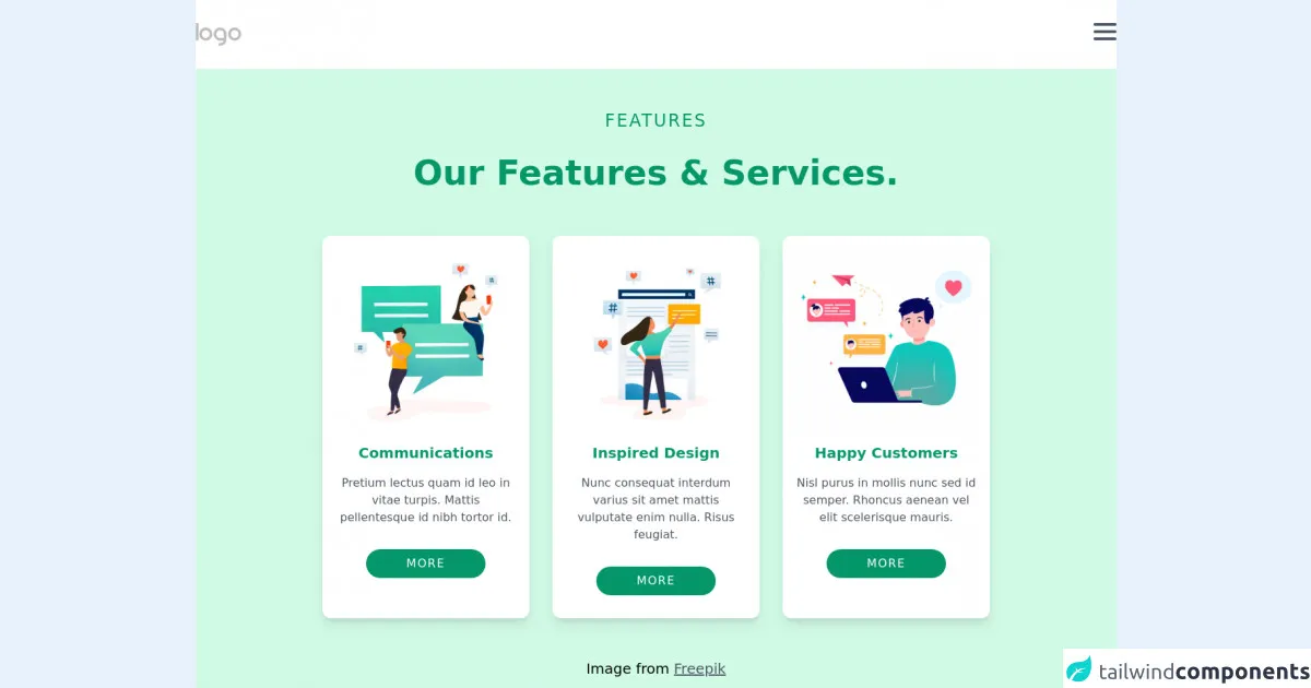
The preview of Header Show Plan UI component
To create a Header Show Plan UI component, we will use Tailwind CSS to style the HTML elements. The final result will look something like this:
Free download of the Header Show Plan's source code
The source code of Header Show Plan UI component
To create the Header Show Plan UI component, we will use HTML and Tailwind CSS. The HTML code will define the structure of the component, and the Tailwind CSS classes will style the elements. Here is the source code for the Header Show Plan UI component:
<header>
  <!-- Navbar -->
  <nav class="py-8 bg-white">
    <div class="md:container px-4 md:px-0 mx-auto flex justify-between">
      <img class="w-16" src="https://capp.nicepage.com/bf483e57c95e271afd13aa25e2ecbbe017068d1d/images/default-logo.png" alt="" />
      <div class="space-y-1.5 cursor-pointer">
        <div class="h-1 w-8 bg-gray-600 rounded"></div>
        <div class="h-1 w-8 bg-gray-600 rounded"></div>
        <div class="h-1 w-8 bg-gray-600 rounded"></div>
      </div>
    </div>
  </nav>

  <!-- Section Hero -->
  <div class="bg-green-100 py-14">
    <h3 class="text-2xl tracking-widest text-green-600 text-center">FEATURES</h3>
    <h1 class="mt-8 text-center text-5xl text-green-600 font-bold">Our Features & Services.</h1>

    <!-- Box -->
    <div class="md:flex md:justify-center md:space-x-8 md:px-14">
      <!-- box-1 -->
      <div class="mt-16 py-4 px-4 bg-whit w-72 bg-white rounded-xl shadow-lg hover:shadow-xl transform hover:scale-110 transition duration-500 mx-auto md:mx-0">
        <div class="w-sm">
          <img class="w-64" src="https://images01.nicepage.com/c461c07a441a5d220e8feb1a/a17abde8d83650a582a28432/users-with-speech-bubbles-vector_53876-82250.jpg" alt="" />
          <div class="mt-4 text-green-600 text-center">
            <h1 class="text-xl font-bold">Communications</h1>
            <p class="mt-4 text-gray-600">Pretium lectus quam id leo in vitae turpis. Mattis pellentesque id nibh tortor id.</p>
            <button class="mt-8 mb-4 py-2 px-14 rounded-full bg-green-600 text-white tracking-widest hover:bg-green-500 transition duration-200">MORE</button>
          </div>
        </div>
      </div>

      <!-- box-2 -->
      <div class="mt-16 py-4 px-4 bg-whit w-72 bg-white rounded-xl shadow-lg hover:shadow-xl transform hover:scale-110 transition duration-500 mx-auto md:mx-0">
        <div class="w-sm">
          <img class="w-64" src="https://images01.nicepage.com/c461c07a441a5d220e8feb1a/3b242447f922540fbe750cab/fdf.jpg" alt="" />
          <div class="mt-4 text-green-600 text-center">
            <h1 class="text-xl font-bold">Inspired Design</h1>
            <p class="mt-4 text-gray-600">Nunc consequat interdum varius sit amet mattis vulputate enim nulla. Risus feugiat.</p>
            <button class="mt-8 mb-4 py-2 px-14 rounded-full bg-green-600 text-white tracking-widest hover:bg-green-500 transition duration-200">MORE</button>
          </div>
        </div>
      </div>

      <!-- box-3 -->
      <div class="mt-16 py-4 px-4 bg-whit w-72 bg-white rounded-xl shadow-lg hover:shadow-xl transform hover:scale-110 transition duration-500 mx-auto md:mx-0">
        <div class="w-sm">
          <img class="w-64" src="https://images01.nicepage.com/c461c07a441a5d220e8feb1a/8cc47b39e719570b996d9879/dsds.jpg" alt="" />
          <div class="mt-4 text-green-600 text-center">
            <h1 class="text-xl font-bold">Happy Customers</h1>
            <p class="mt-4 text-gray-600">Nisl purus in mollis nunc sed id semper. Rhoncus aenean vel elit scelerisque mauris.</p>
            <button class="mt-8 mb-4 py-2 px-14 rounded-full bg-green-600 text-white tracking-widest hover:bg-green-500 transition duration-200">MORE</button>
          </div>
        </div>
      </div>
    </div>
    <h4 class="text-center font-thin text-xl mt-14">Image from <span class="underline text-gray-600 cursor-pointer">Freepik</span></h4>
  </div>
</header>

<!-- Footer -->
<footer class="text-center py-16 bg-gray-700 text-sm">
  <p class="text-white">
    Sample text. Click to select the text box. Click again or double <br />
    click to start editing the text.
  </p>
  <p class="mt-20 text-white"><span class="underline text-green-200 cursor-pointer">Website Templates </span>created with <span class="underline text-green-200 cursor-pointer">Website Builder Software.</span></p>
</footer>
How to create a Header Show Plan with Tailwind CSS?
To create a Header Show Plan with Tailwind CSS, follow these steps:
- Create a new HTML file and add the following code:
<div class="bg-gray-100">
  <div class="max-w-7xl mx-auto py-6 px-4 sm:px-6 lg:px-8">
    <div class="flex justify-center">
      <div class="max-w-md w-full">
        <div class="bg-white shadow-md rounded-lg px-10 pt-6 pb-8 mb-4">
          <div class="flex justify-between">
            <div class="text-lg font-bold">Choose a Plan</div>
            <div class="text-sm text-gray-500">Monthly</div>
          </div>
          <div class="mt-4">
            <div class="text-gray-600 font-bold text-lg mb-2">Basic</div>
            <div class="flex justify-between">
              <div class="text-gray-500">Lorem ipsum dolor sit amet, consectetur adipiscing elit.</div>
              <div class="text-gray-700 font-bold">$10</div>
            </div>
          </div>
          <div class="mt-4">
            <div class="text-gray-600 font-bold text-lg mb-2">Pro</div>
            <div class="flex justify-between">
              <div class="text-gray-500">Lorem ipsum dolor sit amet, consectetur adipiscing elit.</div>
              <div class="text-gray-700 font-bold">$20</div>
            </div>
          </div>
          <div class="mt-4">
            <div class="text-gray-600 font-bold text-lg mb-2">Premium</div>
            <div class="flex justify-between">
              <div class="text-gray-500">Lorem ipsum dolor sit amet, consectetur adipiscing elit.</div>
              <div class="text-gray-700 font-bold">$30</div>
            </div>
          </div>
          <div class="mt-6">
            <button class="bg-blue-500 hover:bg-blue-700 text-white font-bold py-2 px-4 rounded">
              Buy Now
            </button>
          </div>
        </div>
      </div>
    </div>
  </div>
</div>
- Add the Tailwind CSS CDN to the head section of your HTML file:
<head>
  <link href="https://cdn.jsdelivr.net/npm/[email protected]/dist/tailwind.min.css" rel="stylesheet">
</head>
- Save the file and open it in your web browser.
Conclusion
In this article, we explored how to use Tailwind CSS to create a Header Show Plan UI component. We learned that Tailwind CSS provides a set of pre-defined CSS classes that you can use to quickly design and develop your website. We also saw that the Header Show Plan UI component is a common design pattern used in many websites. By following the steps outlined in this article, you can create a Header Show Plan UI component for your website using Tailwind CSS.